Admin
August 2, 2024
Out-of-the-box data visualisation tools like Power BI and Tableau are great. But only up to a point. What do you do when you need to tell stories with your data, or create user-centred data experiences? Can this type of work really be done ‘off the shelf’?
As always with data insight and intelligence, the answer is ‘it depends’. Which is very much short-form for ‘you can, but you probably shouldn’t.’
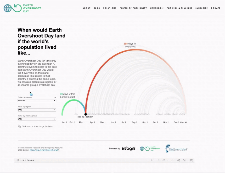
One of our Tableau visualisations for Earth Overshoot Day.
I’ve been working in Tableau for 12 years now, and with Power BI for about 4 years. In my experience, they’re incredibly powerful if you’re looking to produce dashboards that enable users to filter, drill-down, explore the data a bit, view high-level KPIs, and perhaps even look at ‘what if’ scenarios.
If you want to deviate away from that core set of functionality, though, Tableau is able to handle this a little better. You can create custom charts, use built-in functionality like Parameters and Sets to develop inventive (albeit slightly hacky) solutions that do the job.
Power BI seems a different beast altogether, with a relative lack of control over some basic elements of functionality – unless you know how to code, which seems to miss the point of out-of-the-box solution-making entirely.
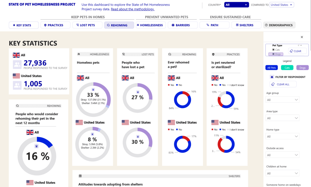
Mars Petcare asked us to build a dashboard within their Power BI platform.
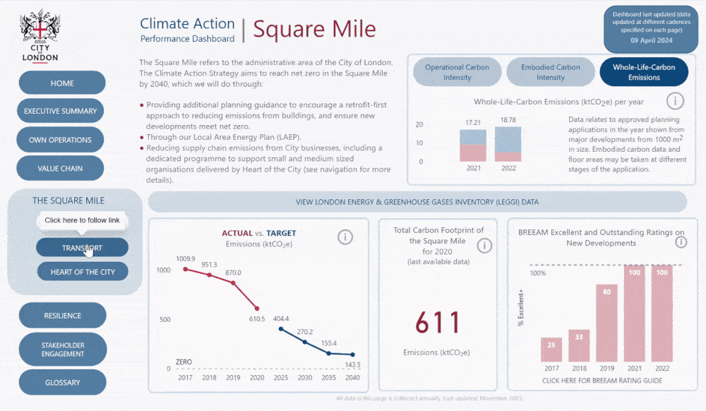
Our Power BI climate action dashboard for the City of London Corporation.
The skills required to both design and develop beautiful data visualisations are not always present within one individual. The two are very distinct disciplines that draw upon different areas of the mind. There are many talented information designers out there who can’t code or work with Tableau / Power BI, and plenty of data visualisation developers out there who don’t really have the same eye for design.
Designing visualisations, dashboards or data products for Tableau and Power BI is incredibly tricky if you aren’t totally familiar with their respective capabilities and limitations. In fact, a design that works well in Tableau might not translate very well into Power BI at all, and vice versa.
Essentially, Tableau and Power BI are both victims of their own rules. In order to facilitate a platform that enables users with minimal to no coding experience to create complex dashboards from scratch requires a plethora of in-built restrictions to hold the average user back from creating complete chaos (although this is still very much possible!).
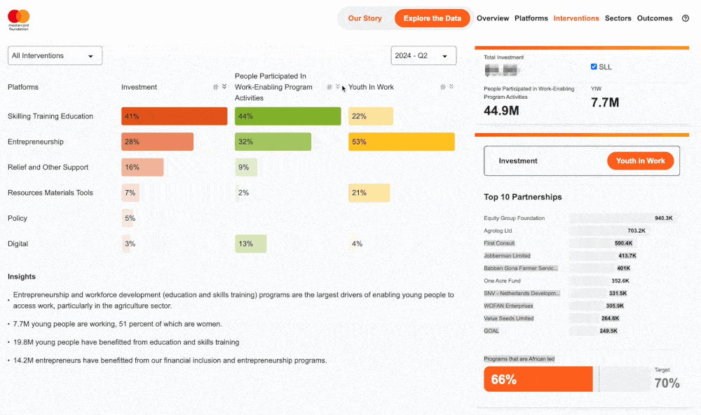
A sneak peek of our custom Integrated Reporting tool for Mastercard Foundation.
The main alternative to out-of-the-box BI tools is to code. However, the mere mention of the word ‘code’ brings up an obstacle course of barriers that need to be overcome. ‘It sounds complicated’. ‘We don’t have in-house coders.’ ‘We’ve already invested heavily in Tableau / Power BI, so why do we need code?’ ‘How do we host coded visualisations?’ ‘Isn’t that expensive?’ To name but a few.
The short answers to these concerns run something like this:
– It’s far less complicated to code something than it is to force Power BI or Tableau to do something they shouldn’t be doing in the first place.
– You don’t really need in-house coders anyway, but at the same time you’d need in-house Tableau or Power BI developers, and the skill range varies considerably from person to person. So what’s the difference?
– Investing in Tableau or Power BI is great, and each tool will absolutely serve their purpose. But if you want to go above and beyond what they’re capable of, you’ll have to start thinking… outside the box…
– Hosting coded visualisations is not necessarily that complex or expensive at all. Remember, Tableau and Power BI charge a lot of money just to let you publish your visualisations to a server/workspace and share them with your colleagues.
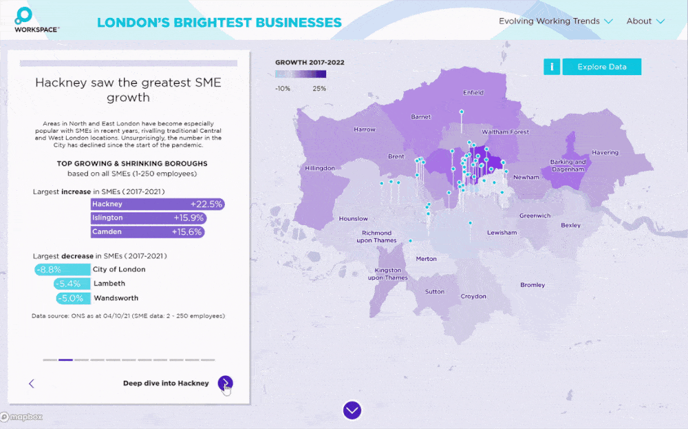
A custom interactive map of London’s Brightest Businesses for Workspace.
Our custom-built Net Zero Tracker (in partnership with dedlyne)
The benefits of coding business intelligence boil down to a few key tenets:
1. What you see is really what you get
Picture the scene. You’re looking to create a beautiful, custom visualisation that tells the story of your data to as wide an audience as possible. You bring on board a world-class designer to create some concepts, develop a prototype, and then hand over to your developer who’ll code it exactly in line with their vision. Magic.Now try the same approach with Tableau / Power BI. You’ll spend at least a week having to tell your designer ‘no, [insert tool here] can’t do that, we need something else’, and then they’ll cry because [same tool] can’t do anything they want it to. Their vision will have to be watered down, and the impact just won’t land quite so well.
Or even worse, the designer will include some very basic functionality as part of their designs, which everyone will assume is possible because ‘ha ha it would be ridiculous if it couldn’t do that’, only for everyone to discover a couple of months into the project that actually no, you can’t control the size of the text in a dropdown box in Power BI, and yes, these two dropdown boxes right next to each other seem to have different font sizes, and no, there’s no option at all to change that.
2. Accessibility
The control that you get with custom coding extends far beyond the ‘look and feel’ of a visualisation, or even just the aesthetic appeal of it. More critically, it reaches out into the world of accessibility. Accessibility is tricky at the best of times, and a lot of thought needs to go into ensuring that a visualisation aimed at telling a story is able to reach your whole audience in a way that they can consume. Out-of-the-box BI tools make this a bit challenging on more complex visuals due to that lack of complete control, whereas custom code empowers you to design and develop specifically for accessibility.
3. Your mental health
I cannot overstate this one enough, because using either of these tools to create highly customised, creative visualisations that lean in heavily on data storytelling as opposed to data exploration is a bit like taking the one ring to Mount Doom with a team of hobbits, dwarves and elves. It’s possible, you might have some fun along the way, but you’ll almost certainly want to give up several times, it’ll probably eat away at your soul, and you’ll definitely want to kill each other at some point.
4. It actually works out cheaper
It’s a common misconception that Power BI or Tableau will always work out cheaper, because all you have to do is point and click a few times to make things happen. But it rarely plays out like that at all if you’re creating a complex, highly custom visualisation.The amount of additional time your developers will spend trying to create hacky solutions, which then break as soon as you import some new data, or build another hacky solution on top of the first hacky solution, which then need to be hacked again and again, will very quickly start to build up.
And then of course, there’s the sharing. If you already have a Tableau server or a Power BI Premium licence, that’s great. If not, the costs will soon start to mount up.
To sum up, look beyond your current BI tool if you’re looking to create high-quality visualisations that really make a difference. It won’t necessarily cost you the earth, and it will be far more impactful than anything you can do in Tableau, or Power BI, or Looker, or (god forbid) Qlik.
Soho Works White City,
Television Centre,
101 Wood Lane,
London,
W12 7RJ