Fusing Power BI with design thinking for Mars Petcare
Reading time
Category
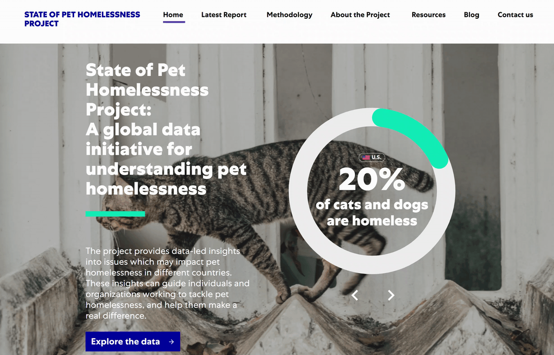
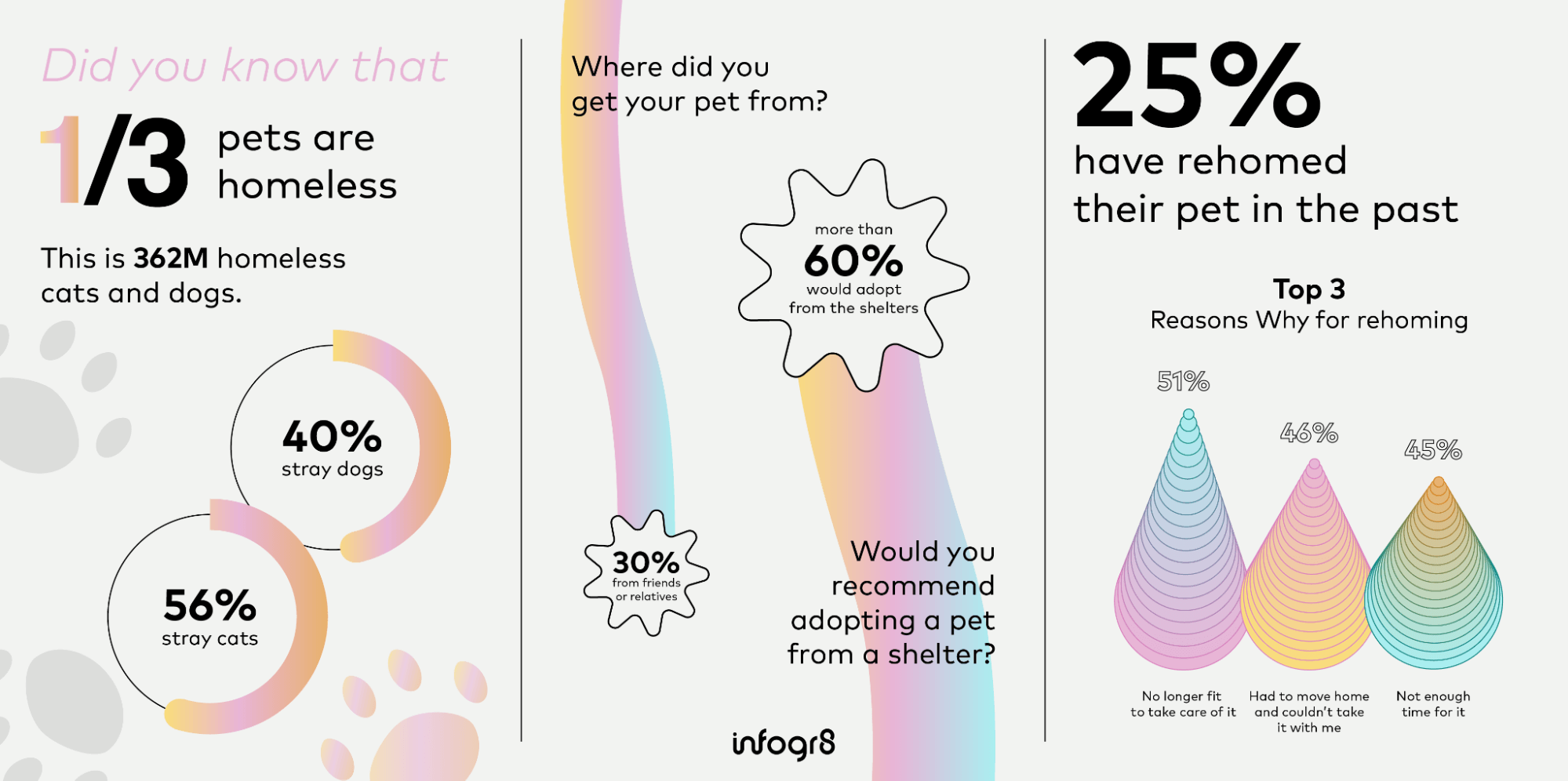
Pet homelessness affects 1 in 3 cats and dogs. That’s over 362 million animals.
In early 2023, Mars Petcare approached us to bring data to life to support their State of Pet Homelessness Project, including its website and Power BI dashboard. The team at Mars Petcare wanted to make the most of the data from their pioneering survey – of almost 30,000 people across 20 countries – on the various factors that may impact pet homelessness among cats and dogs.
Here’s how the new data-driven website and dashboard came about.
A dedicated team across data design, development and journalism
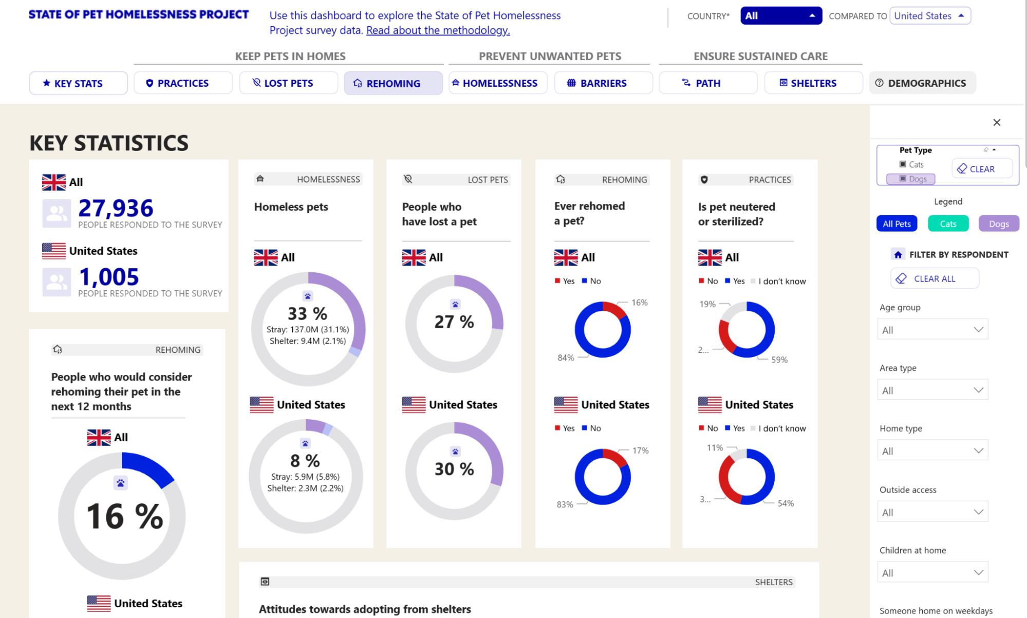
Mars Petcare is a global leader in pet health and nutrition, with around 50 brands in their portfolio. The company message around pet homelessness follows three distinct strands: Keep Pets in Homes, Prevent Unwanted Pets, and Ensure Sustained Care.
When it came to awareness-raising, however, the previous data methodology and output had often left audiences with unanswered questions around the data and its meaning.
Mars Petcare wanted a new approach to publishing and visualising their survey data. In response, we brought together a team spanning expertise in data design, dashboard development, data journalism and online UX:
 |
 |
 |
| Stewart Pickering | Josephine Brown | Wan Li |
 |
 |
 |
| Gabrielle Merite | Miriam Quick | Anthony Argires |
Wan Li worked on UX/UI design, interviewing stakeholders on their experience with the previous site. Wan then turned her findings into suggestions for an improved user flow and insights for the website and dashboard content.
Miriam Quick worked on the survey data itself, mapping and cleaning it into a clear structure and output to feed into the new data dashboard in Power BI.
Gabrielle Merite worked on design across both the website and the dashboard, aligning the brand style and feel with considerations for accessibility, and elevating the dashboard design within the limits of Power BI so that it was still engaging and inviting to use.
Anthony Argires worked with Miriam and Gabrielle to bring the data and the design to life, merging the designs from Figma and optimising performance within Power BI.
A strategic approach to data storytelling
Mars Petcare wanted to do more with the data at their disposal. Across both the project website and the interactive Power BI dashboard, our work was informed by three key principles:
1. Data mapping
By including initial phases for data discussion, mapping and cleaning, we ensured that we understood the context of the survey data, meaning we were then able to transform the data into a format that could be used within Power BI while also giving users the autonomy to filter the data and view side-by-side comparisons.
2. Data design and storytelling
By creating a data structure and hierarchical flow under the three key themes and nine subcategories, we made sure that users were able to find and follow the data easily and draw out their own specific narratives. This meant balancing the amount of data shown on the Power BI dashboard to present enough detail without becoming imposing or overwhelming.
3. Enticing design within Power BI constraints
By using a combination of standard Power BI charts and custom-designed charts, we created a dashboard that feels public-friendly rather than overly plain or technical, encouraging deeper and wider exploration.
“I was excited by the brief because of the subject matter – I always like projects that do some good in the world, in this case for homeless pets – and also because of the opportunity to work with a large survey dataset.
“Survey data brings specific challenges, as you have to understand the structure of the original questionnaire (including any question routing), and often the raw data produced by survey software is not very compact, or very easy to understand at first glance.
“One of my tasks was to process the dataset and turn it into a form that could be understood by a human and also read efficiently by Power BI. Another was to sketch out a structure for the dashboard that would make the most of the stories contained within the dataset.”
Miriam Quick, data journalist

Output 1: A new data-driven website
Based on our user interviews, we were able to understand the challenges that users were experiencing with the previous version of the State of Pet Homelessness site. We translated this insight into a new user flow and navigation, meaning that users can find and explore the value within the core data more easily. We also applied best practice for design accessibility and responsiveness, including the use of colours and imagery, along with a modular, device-agnostic design.
The designs we created were tailored to work within the client’s internal software and tools and to allow as much flexibility for internal teams to add new content as the initiative develops over time.
We also revisited the website user journey, design and data dashboard to bring greater transparency and insight to the various challenges of pet homelessness among both internal associates and external policymakers.
Output 2: A fresh take on a Power BI data dashboard
We wanted to take a different approach to creating data dashboards in Power BI – pushing the boundaries of Power BI design away from the overly technical and towards creating something more engaging and accessible to a wider audience.
To do this, we initially designed in Figma before building out into Power BI. This allowed us to co-create the design and UX with the Mars Petcare team, and to ensure the designs remained clear and engaging throughout, before building out adaptations in Power BI itself.
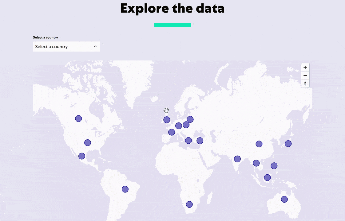
For the dashboard, we wanted to provide some key functionality that would allow users to draw comparisons and filters for specific insights. To do this, we created a combination of both general and chart-specific filters that enable users to filter the data by pet type and key demographics, as well as the ability to see more granular drilldowns.
A standout feature we included was the view to compare two countries side-by-side. This provides a level of autonomy and dynamism that standalone reports cannot without taking up a lot of time and effort.
Ultimately, our data-led website and dashboard enables Mars Petcare to:
– Showcase the value of their survey data more effectively
– Support their audiences to find, access and interact with the data, allowing them to easily find the information most relevant to them
– Work within a platform built for growth, development and flexibility as their journey to end pet homelessness progresses.