 Insight
Hey Tableau, where are all the sustainability dashboards? 🔋
Tableau Public makes it easy for data viz professionals to hone their skills by creating dummy sales dashboards. But wouldn’t all this creative energy be better placed into something more impactful?
You may have heard of GoodGym. They’re a UK charity that replaces traditional gym workouts with practical volunteering tasks that help community organisations and isolated older people.
In the same way, and with the right dataset, all that Tableau power could be redirected for social good.
The curse of the Tableau sales dashboard

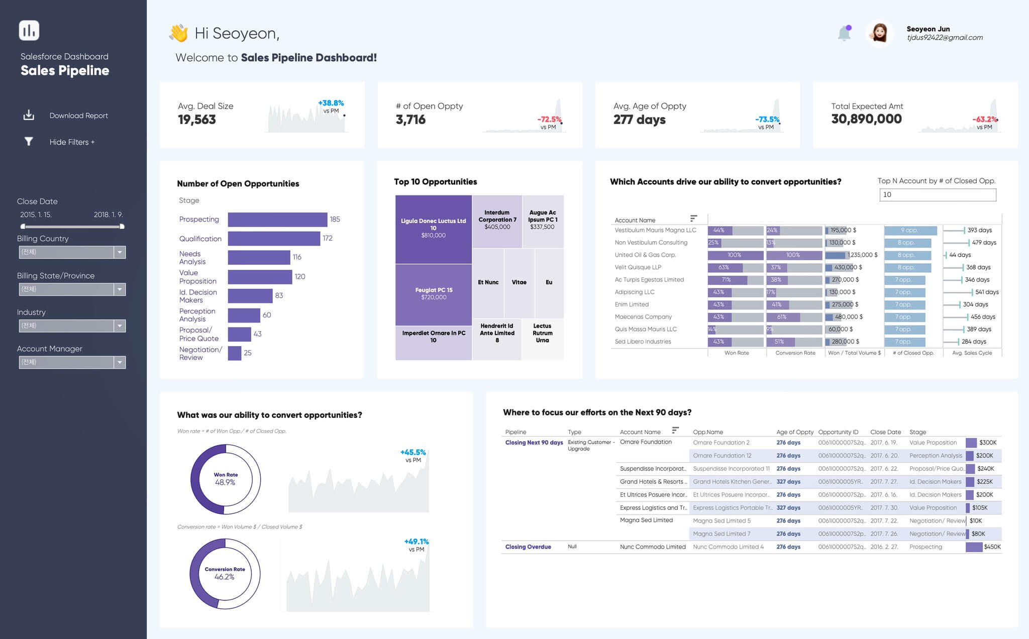
An example of a sales dashboard created in Tableau Public
It’s been over 12 years since I was first introduced to Tableau, and since I was able to shift away from creating 50-slide PowerPoint decks full of mind-numbing variations of charts that just seemed meaningless.
My main source of inspiration as I was learning my way around the tool was, of course, Tableau Public. And the main source of data I used was, of course, the Sales Database that comes with Tableau Desktop.
It’s a fantastically useful dataset, one that enables all budding developers to get into some interesting, deep analysis, and to produce dashboards that touch upon the more complex features and functionality within Tableau.
What this means is that, quite naturally, a significant amount of the published content on Tableau Public, and within the wider data visualisation community on X and LinkedIn, is focused on sales dashboards.
This makes perfect sense, as tracking sales is a critical function of any business, and what better way to do that than with a shiny, functional dashboard that gives you easy access to all the numbers you need?
But what if we could do more with such dummy data and experiment with sustainability dashboards instead?
Sustainability dashboards are the new imperative for business performance
These days, sustainability, climate action and monitoring carbon emissions have become almost as important for businesses to track as sales. Some may argue that it’s even more important, so why are we not seeing this trend reflected within the data design community?
Sure, there are countless data dashboards looking at sustainability topics and emissions, but do they ever go into the same level of detail as all those Tableau sales dashboards? Rarely, if ever. But organisations now really need to be able to do so.
It would be impossible to imagine a major organisation operating without some form of a sales dashboard or reporting tool to track performance, so why should that be any different for tracking something as timely (and time-sensitive) as sustainability or ESG metrics?
When I moved away from financial services and into sustainability in 2017, I found that data was still a bit of an afterthought for most of the organisations I was working with. And, by extension, the visualisation of that data was practically non-existent.
The good news for me, and my clients, was that pretty much everything I’d learned in Tableau through my corporate work, and through my personal projects on Tableau Public, could be applied to this exciting new field, too.
But seven years on, in the community space at least, I’m still not seeing levels of sustainability dashboards that are remotely comparable to those of sales, financial or even HR dashboards.
It got me thinking about why that might be, and the answer seems a little too obvious. Data… or lack of it.
Tackling the challenge of disparate data
There’s a lot of sustainability-related data out there in the public domain, but as with my experience working behind corporate firewalls, the data is disconnected, fragmented and frankly all over the place.
As a result, it’s pretty difficult to find some good open-source sustainability data that enables a developer to create visualisations that facilitate drill-downs or filters to the same degree as we can with Tableau’s Sales Database.
Simply put, it’s too much work to find good data, and aspiring Tableau developers want to spend more of their time actually developing in Tableau and honing their craft, as opposed to scouring the internet looking for a series of data sources to pull together that gives them what they need.
The great irony here is that, behind those corporate firewalls, the data is getting better and better.
Most organisations nowadays can and do have data on their emissions, the visualisation of which is crucial to understanding what’s going on, where it’s going on, and why it’s all happening in the first place.
So what’s the solution here? In my view, someone needs to create an anonymised, randomised, fictitious set of data that has all the sustainability information that an organisation needs to track, monitor and analyse their emissions.
A fictitious GHG Inventory, if you will.
This data then needs to be made easily accessible and readily available to all, and it needs to contain data that spans across geographies, divisions, departments and reporting units.
I’m up for the challenge, and I’ll be looking to incorporate this thinking into Future Fridays, our joint innovation initiative with the DVS. Let’s create this fictitious dataset, and challenge DVS members to create compelling dashboards and visualisations based on it.
If this is in your wheelhouse, drop me a line and let’s make it happen!
Perhaps one day we’ll see as many climate action dashboards on Tableau Public as there are sales dashboards.
We build teams of data experts for sustainability projects
Do more with your data
See more of our work