Why showing off your sustainability data is easier than you think – and three ideas for how to do it
Reading time
Category
Long gone are the days when concern for the environment was a niche issue that meant shopping in health food stores and the odd high street pioneer such as The Body Shop. Today sustainability is a major factor shaping consumer behaviour. According to recent research by Deloitte, for example, “43 percent of consumers are already actively choosing brands due to their environmental values”.
This is an encouraging finding for brands and organisations who have a commitment to the environment at their core. But what are the most effective ways to share your environmental values with consumers? How can you showcase your sustainable practices and establish credibility to a public that is increasingly cynical about corporate greenwashing?
Data is key to proving credibility. Measurable targets and solid evidence are what distinguish those who are genuinely committed to making a difference to the environment from those whose claims are a mere tick-box exercise to make them look good.
1. Share your journey through data
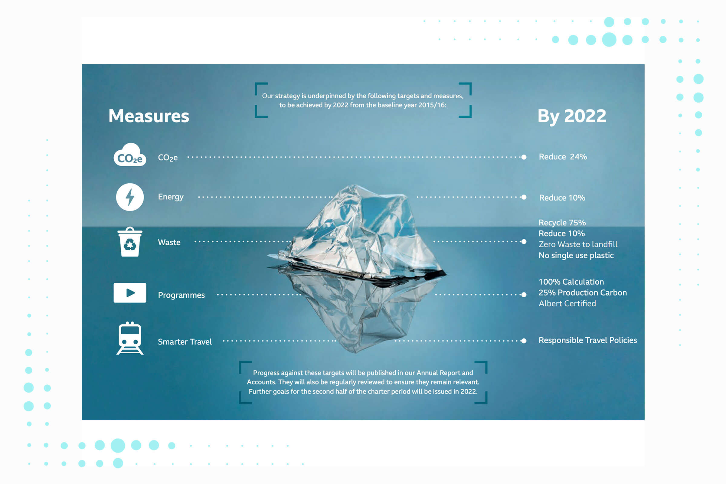
The BBC, Green Broadcasting Report, 2018
Tessa Clarke is co-founder of OLIO, the app that allows users to share food with others in their local area in order to counter the enormous problem of food waste. When it comes to sustainability, Clarke sees three types of businesses: “Those who walk the talk (the minority); those who greenwash (a growing number); and those who are afraid to put their head above the parapet until their house is in order (the majority)”.
However, there are alternatives. “I would strongly recommend that honesty is the best policy,” says Clarke. “If businesses can take their customers on a journey with them, then they can avoid the twin evils of either greenwashing or staying silent”.
Don’t feel that you have to achieve your long-term sustainability goals before you speak up. Think instead about how you can use the data you’ve already collected to show progress in the areas that you monitor. Share how far you’ve come as well as how far you have left to go – and draw upon data to do so.
In its Greener Broadcasting report, for example, the BBC lists five distinct areas of action (CO2 equivalent, energy, waste, programmes and smarter travel), a clear goal for each (such as reducing CO2e by 24 percent) and a specified time frame (by 2022).
2. Make it visual
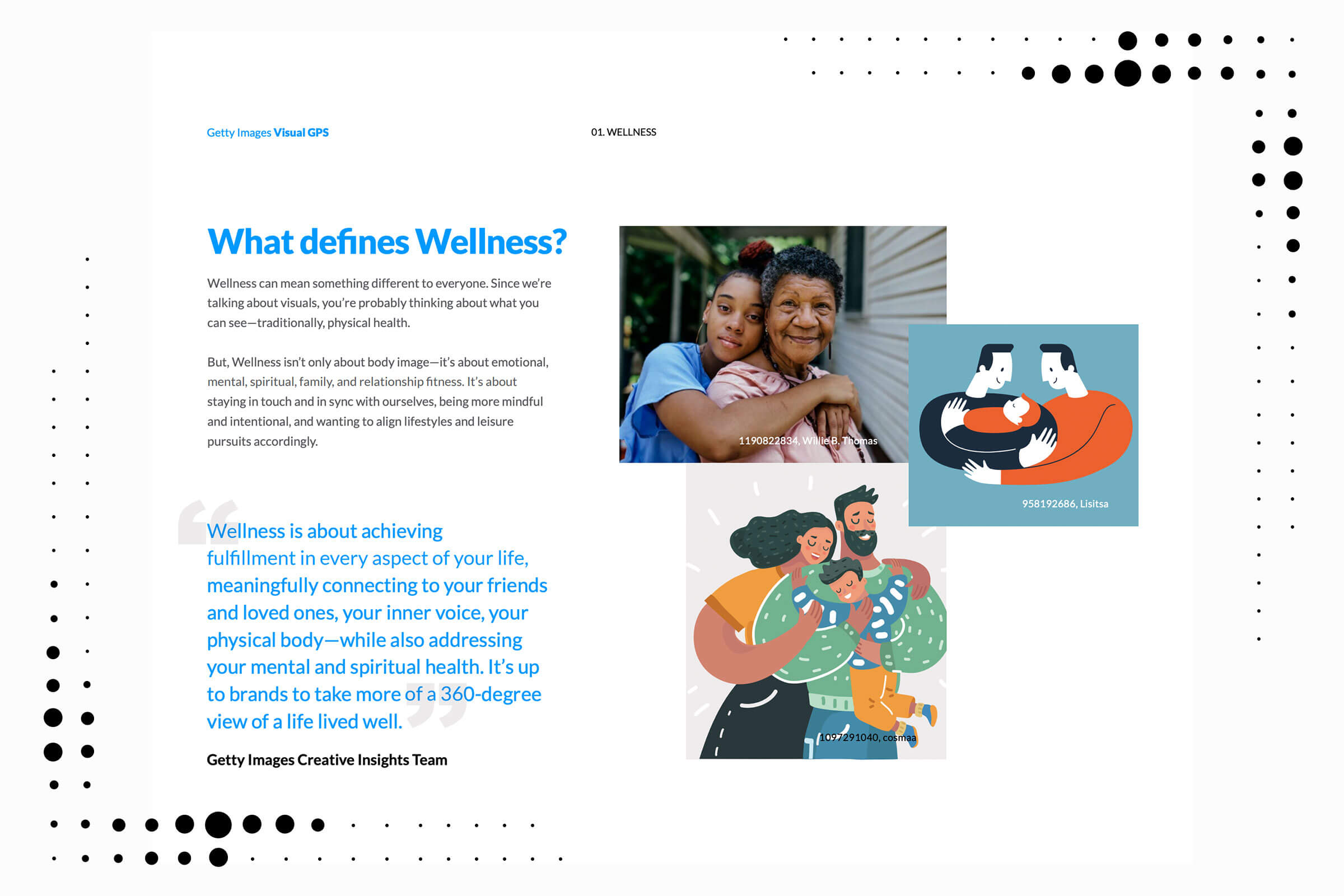
Getty Images, Visual GPS Global Report, 2020
Also consider how best to present your sustainability data. We only have to consider how we consume our information online to see that creative visualisation is now a top priority. As Getty puts it, “We live in a visual world. And having the perfect image, video, illustration, vector, or GIF can mean the difference between connecting with your audience or them passing you by”.
Data visualization specialist Andy Kirk offers us some timely guidance for choosing the right visual format. “Learn from the experience of the data issues and visual communication experiences throughout the coronavirus outbreak,” he advises.
Ask yourself questions about the data you’ve seen visualised during the course of the pandemic. “What displays have helped, and which have hindered? Why is that?” says Kirk. “Is the level of information presented too technical or scientifically sophisticated or has it been overly simplified? Have you found the data understandable or have you missed explanations of the nuances of counting rules and qualifying assumptions?”
3. Focus on your most relevant data
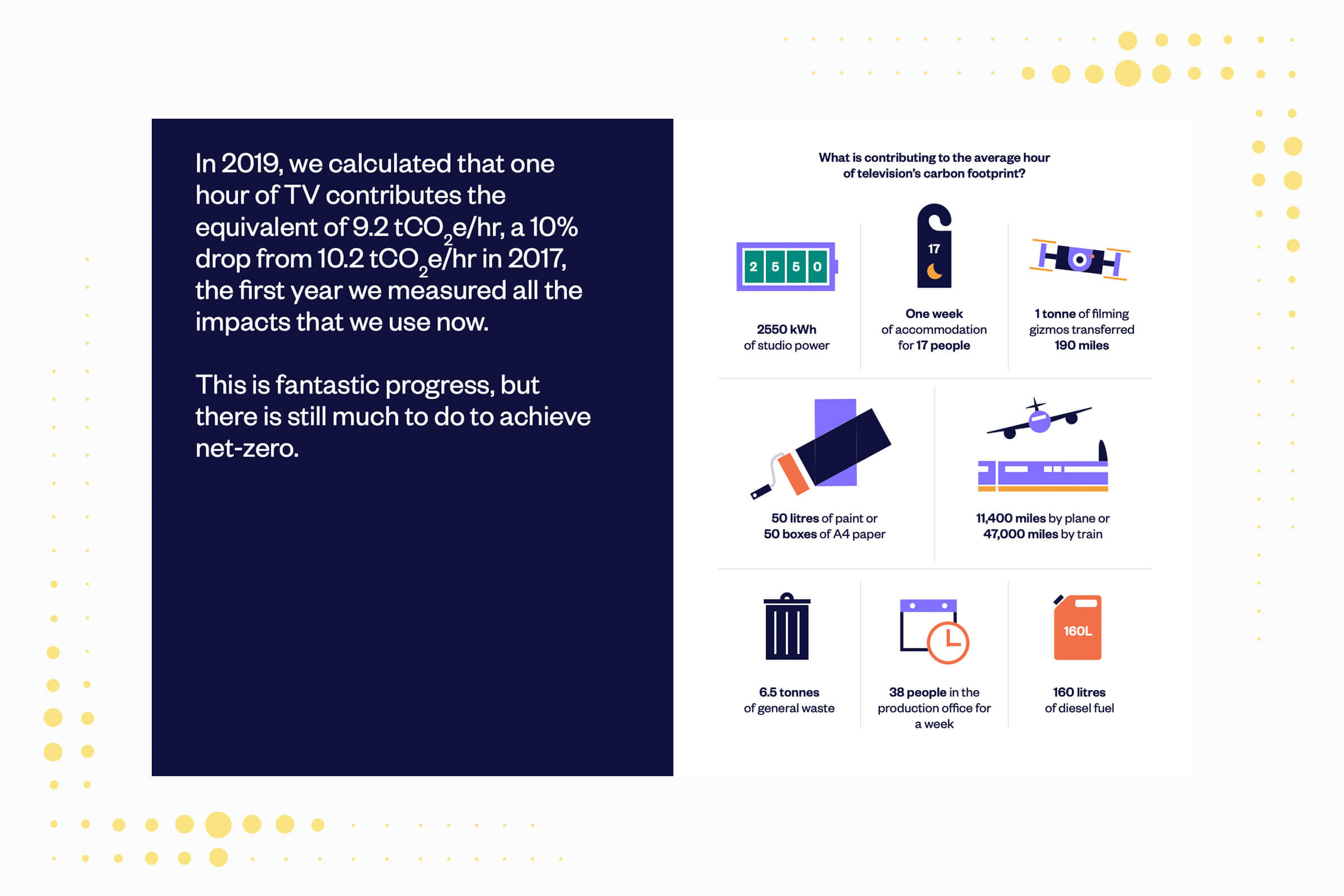
Albert, Annual Report 2019-2020, 2020
Start where you are and focus, at least initially, on those areas most relevant to your operations, such as the UN Sustainable Development Goal(s) that your brand is committed to. For many, this might be carbon emissions. What is your carbon footprint, what contributes to it and how has it changed over time? Illustrating this can be a useful educational tool as it demonstrates to consumers exactly what is involved in the process of providing your goods and/or services, much of which may be hidden.
The film and television environmental sustainability authority, albert, calculated that, on average, making one hour of television emits the equivalent of 9.2 tonnes of CO2. But what does that actually mean? Using a range of icons, the organisation breaks these emissions down by source: accommodation, studio power, travel and so on.
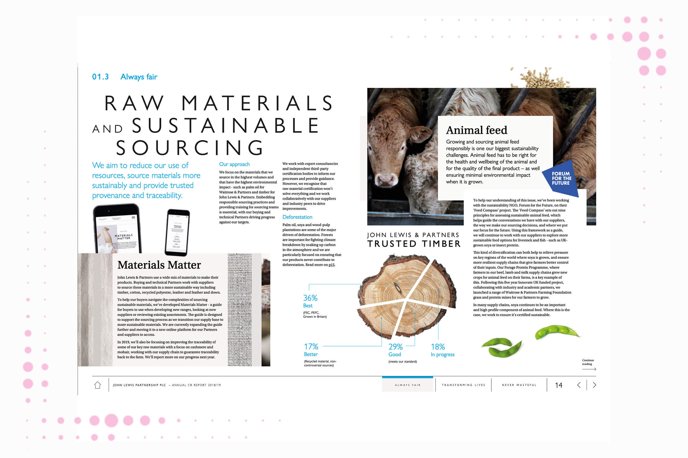
John Lewis, Corporate Responsibility Report 2018/19, 2019
Another angle is material usage. What data do you have about the materials you use and how they are sourced? And can you create a visual that’s clearly connected to that material? In the information about raw materials and sustainable sourcing shared in its corporate responsibility report, for example, the John Lewis Partnership includes a pie chart in the form of a piece of wood, with segments ranking its timber according to levels of sustainability.
A more challenging area, both in terms of data and the visuals, is your supply chain. This is an area of growing concern among consumers. A recent study by the IBM Institute for Business Value reported that “71 percent of those surveyed who indicated that traceability is very important are willing to pay a premium for brands that provide it”. It is also an area of high risk for companies; as a spring 2020 article on sustainability in the supply chain in the Harvard Business Review concluded “A supply chain is only as strong as its weakest link”.
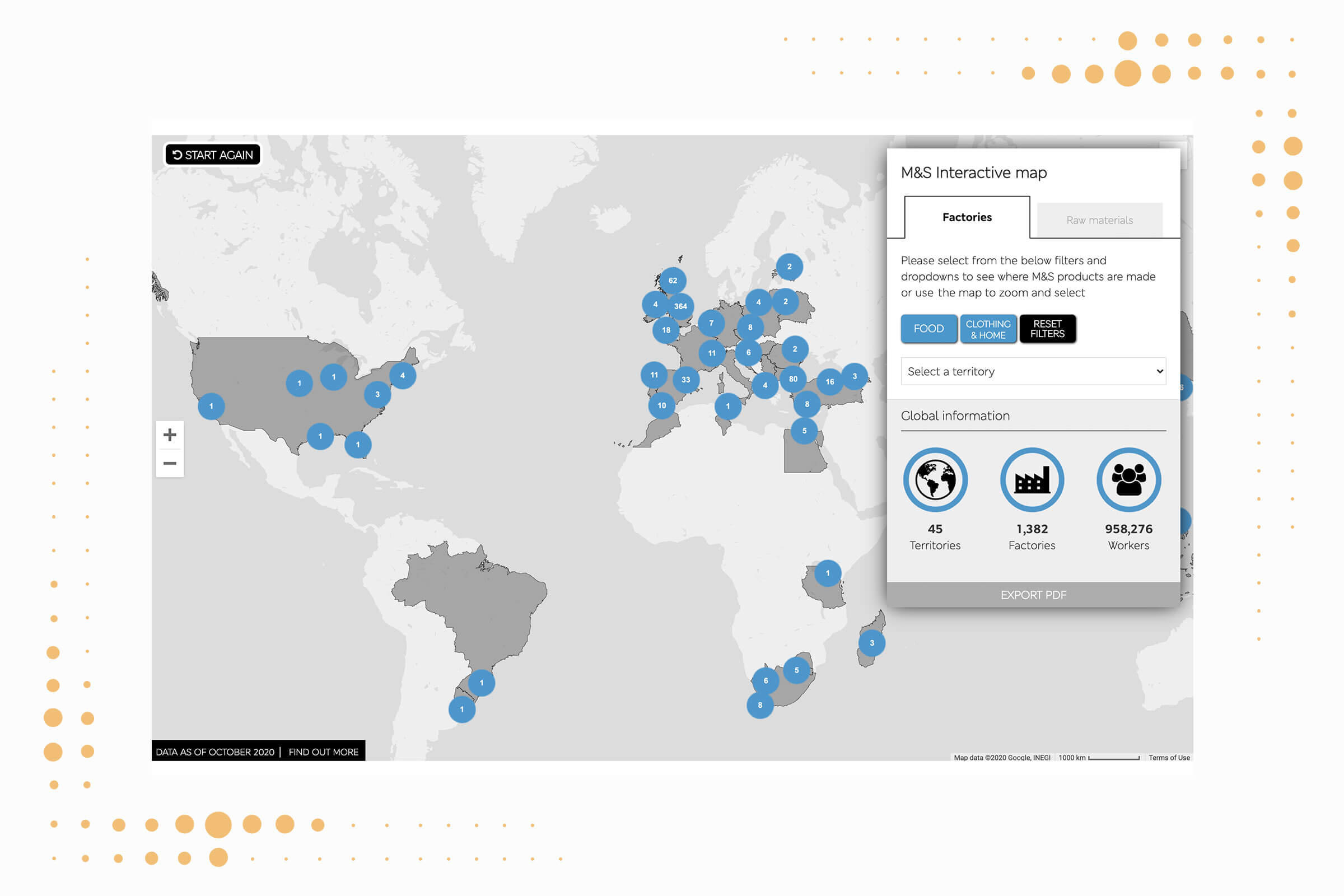
Marks & Spencer, Interactive Map
However an example of what can be achieved comes from Marks and Spencer, which offers an interactive map of global suppliers on its website along with information such as whether that factor is unionised.
A checklist for getting started
To ensure you’re creating the most effective sustainability data visualisation, Kirk suggests three questions to ask yourself:
✔ Is the content reliable and the data behind it trustworthy?
✔ Is it sufficiently accessible, requiring no excessive or unnecessary thinking work in order to perceive, interpret and comprehend?
✔ Is it elegant, presented in a way that aesthetically charms and sustains that engagement?
Finally, avoid hackneyed symbolism, such as a child with cupped hands full of soil with little green shoots growing. “Just don’t do that stuff,” Kirk says.
Clarke agrees. “The biggest error we see with data visualisation in the sustainability space is the over-utilisation of clichéd stock imagery – such as lightbulbs, or trees in the palm of a hand. Instead we need to try and select imagery that’s more relatable to everyday life”.
infogr8 works on a range of creative solutions to helps organisations visualize their sustainability and diversity data, including DNV-GL, ODI and Jobsite.