The sustainability transition: What else can we track beyond carbon?
Reading time
Category
![]()
Last time out in our traceability series, I talked about how visually mapping out your supply chains can play a big part in tracking your organisation’s emissions profile and aiding decision-makers to reduce your carbon footprint. This time, we’re stepping away from the carbon tunnel vision and looking at sustainability transition – specifically the other environmental impacts and risks that visual data mapping can help to address.
Everything, everywhere, all at once – What else could we track?
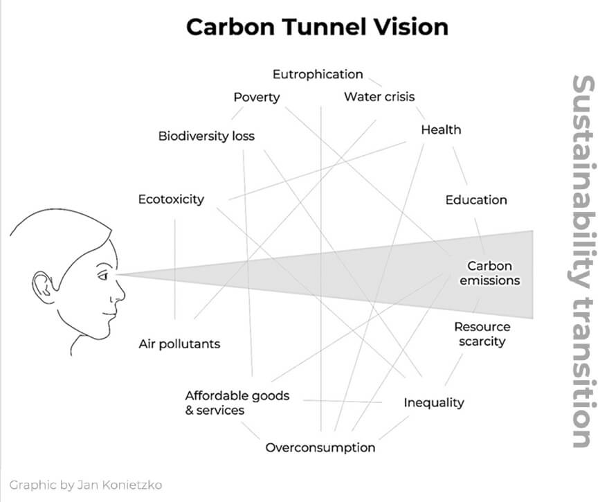
We’ve already touched on a few of the issues identified in Jan Konietzko’s carbon tunnel vision graphic, namely emissions, poverty and inequality. But there are a vast number of factors at play when we think about climate change that don’t quite get the same amount of press as those headline CO2 emissions.
I definitely won’t go into detail on all of them here, but it’s fair to say that if an organisation is obtaining data from their suppliers around carbon, it isn’t too much of a stretch to expand beyond that and start collecting data on water consumption, wastewater disposal and chemical usage, too.
Dive a little deeper than that, and you can start compiling data about the actual materials and components that go into your products as well.
Why does this wider take on traceability matter?
By gathering additional data over and above energy consumption and carbon emissions alone, you can start to put together a broader picture of your organisation’s impact on the environment as a whole, as well as a better understanding of the risks that exist across your supply chain.
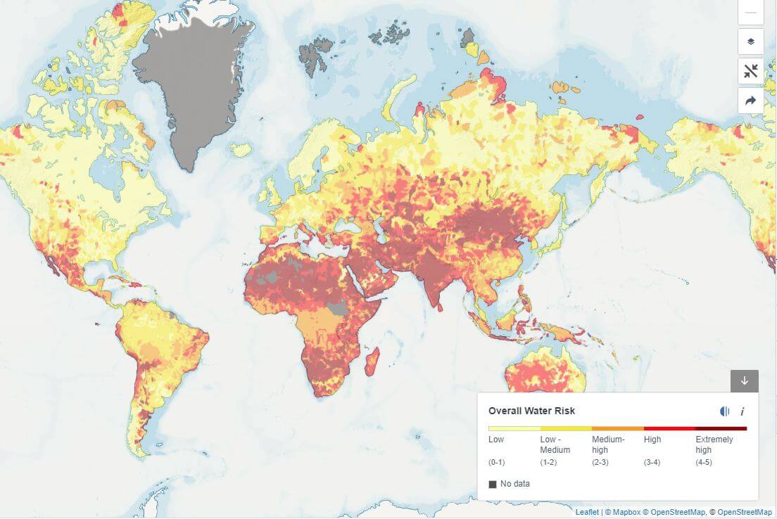
Take this one example, which considers both points. Your organisation sells a product with a water-intensive production process. To serve your global customer-base as efficiently as possible, you have factories all over the world. Some of your factories are in areas of high water stress or with a high propensity for drought. Several questions emerge from this scenario. Could the water you withdraw from high water stress areas serve a better purpose? And if there is a severe drought in the region, would your production fall behind demand?
In this single example, you’ve exposed a potential supply-chain risk, but you’ve also unearthed a pretty sizable impact on the local area surrounding your factory. Now that you’re armed with this information, on a global scale and across your entire supply chain, you can pinpoint high-risk factories – whether that’s water or otherwise – and begin to devise strategies to mitigate your environmental impact and risk.
Guided by the visual data, your business can then start asking more pertinent questions like: Should we move our production to a facility a few hundred miles away where water is in greater supply? Or can we innovate the production process to consume less water in the first place?
What’s the data challenge?
Of course, I’ve made it all sound remarkably simple so far, but as with forced labour and GHG emissions, this is no small task. If you’ve already been able to identify every link in the supply chain, great. The next step is to strategise. Think about the key risks to your business. What data would you need to quantify these risks in the supply chain, and how can you go about obtaining such data?
From here, you can map out what a data collection programme for this data might look like. You can also think about a data management system in the background to actually store all of this valuable data.
How can data visualisation support traceability?
Once you have your data management system in place and the data starts feeding in, you can then begin to conduct your analysis, visualise it, and identify your sustainability hotspots. Done effectively, this can begin to open doors for people across your entire organisation, regardless of their various focus areas.
This way, your entire business is effectively at your fingertips, and you can start to isolate your key risk areas and design strategies to mitigate those risks, lowering your total impact on the environment around you. And not just the carbon.
For more opinion pieces on sustainability and data storytelling, subscribe to our newsletter.