Kenneth Odoh on the value of visual data when skilling up for a career move
Reading time
Category
If you want to get ahead in your career in today’s tech-powered world, you may want to consider visual solutions to speed up the process, whether that’s mapping out your career options or boosting your skill-set. We asked data analyst Kenneth Odoh for some tangible visual data tips for all the career shifters and switchers out there.
Phase 1: Use visual data to optimise your everyday productivity
The dynamic nature of the modern-day workplace has made it necessary for many professionals to continually invest in career development programs. Today’s world moves at a fast pace; we have so much to cover in so little time. But the many productivity tools out there can better help us stay on track, plan better, and grow professionally. Increasingly, these tools are incorporating visual data-led solutions as well.
I enjoy using several of these tools to strategize and track my endeavours. If you have experience with tools like Trello or Asana for task scheduling and project management, Slack for collaboration, or even Grammarly for copyediting, you might agree that these tools streamline tedious tasks and enable us to accomplish more in less time. More importantly, we’re fortunate to live in the era of big data, where productivity tools are starting to incorporate AI, data visualisation and personalised recommendations. Many professionals are still yet to benefit from using these more visual tools as part of their personal and professional development.
By incorporating visual data into these productivity tools, we can better quantify our career goals and track our progress more effectively. For example, we can extract insights from our activities over time and use them to inform our future decisions. Some of these solutions even enable us to compare our efforts against others in the industry and gain valuable insights.
Example 1: Grammarly Insights
Grammarly is already a household name as a popular writing assistant that simplifies content formatting and editing. Grammarly Insights is a feature that provides users with insights into their weekly writing performance in an appealing visual format. The Insights progress report looks at three main components:
- Activity – provides you with usage statistics such as word count and shows how they compare with other Grammarly users.
- Mastery – analyses how many (or how few) mistakes have been corrected.
- Vocabulary – examines lexicon and word usage to let you know how dynamic your vocabulary is, relative to other Grammarly users.
As a non-native English speaker, these statistics have definitely helped me improve my writing in English, and the visual presentation of data encourages me to keep up the good work.
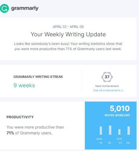
Screenshot showing my weekly activity report from Grammarly Insights. Impressive results as I outperformed 71% of Grammarly users in terms of productivity. But there’s still room for improvement in accuracy, which fell below the average for that week. Time to step up my game!
Example 2: Google Health
Digital skills are one thing, but what about data-hacking physical health as well? I use the Google Health app to track certain fitness metrics. Towards the end of each day, I review the app’s visual data dashboard. The app might ‘scold’ me (politely, though) if I haven’t met my daily targets. On other days, it cheers me up for surpassing them 💪. This is the kind of emotional response that visual data solutions can provide that less dynamic tools cannot. I can even see the estimated calories I’ve burnt over the month, week, or day and adjust my lifestyle appropriately.
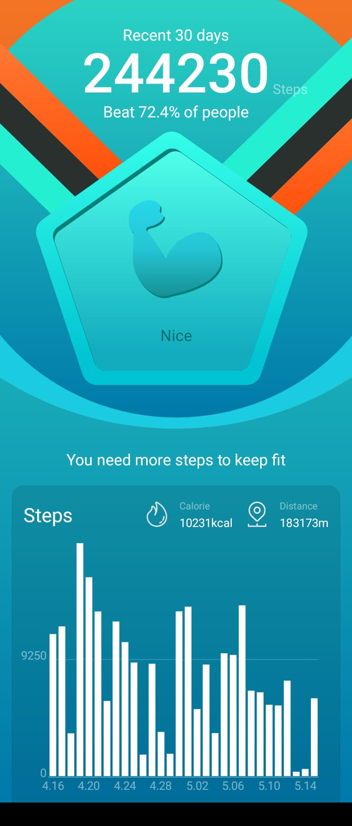
Check out my activities over the last 30 days on the Google Health dashboard. The results indicate that I surpassed the activity levels of 72% of fellow app users in achieving my daily fitness goal (total steps), along with other valuable insights.
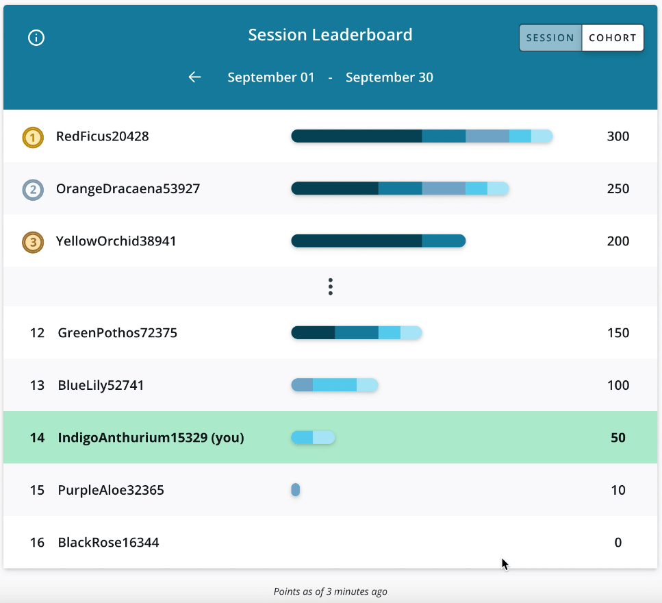
Example 3: MOOC visual leaderboards
Imagine you’ve enrolled in a new skills development program on Coursera or Udacity. You’ve started out highly motivated and can actively learn for up to two hours every day. Three weeks down the line, though, and you’re starting to feel demoralised. Thirty minutes of daily commitment is becoming a problem, and the temptation to quit the course creeps in. But you need to graduate from this program, not necessarily because you enjoy the experience but because you need the skills you will learn in order to move your career forward, or even switch careers completely.
This is a common experience with MOOCs and other online learning platforms. But the incorporation of visual data solutions such as weekly leaderboards and user statistics serves as a key source of motivation to keep you going. These features also forge a sense of community and belonging, of working towards a shared goal despite never actually meeting the people you’re learning with.
Indeed, in the hybrid workplace, this type of visual data tool could be used to foster collaboration, knowledge-sharing and high performance among even the most distributed of teams.
All three of these tools have one thing in common: they provide a visual representation of data that makes something that could be complex very easy to comprehend. They also offer tailored insights by acting directly on the user and/or community data to help the end-user see and learn from their own activities and those of other users.
The above examples illustrate how visual data can help professionals unlock new possibilities and propel their careers forward. Regardless of your career goals, most can be tracked or measured in some way. The challenge, therefore, is to identify some relevant metrics to track your efforts towards achieving those goals. Next, I’ll present some measurable career goals and some relevant metrics to track them.
Kenneth shows the value of representing data for ease of use, which is especially useful for anyone who wants to identify potential opportunities to bolster their career development. When we partnered with the Association for Financial Professionals, we created a tool that would show modern-day financial professionals the career pathways to follow, the best skills to learn, and the salaries they should expect to earn, all in one efficient, credible and shareable experience.
Phase 2: Visualise your career aspirations, then track your progress
When it comes to career shift/progression and the skills development that goes with it, the list of goals and metrics can seem endless. But here are four relevant and (most important) measurable aspects to focus on:
Efficiency and time management
If accomplishing more in less time matters to you, visualising metrics such as task completion rate, time spent on different activities and overall productivity might help you see how you progress closer to your goals each day.
Personal brand and influence
To measure your brand and influence, consider visualising metrics like social media analytics (number of followers, likes, comments, shares, etc) and audience feedback (testimonials, reviews, comments, and direct messages that reflect how your personal brand has influenced or impacted others), as well as successful collaborations and partnerships.
Commitment to continuous development
You may choose to visualise the number of courses or certifications completed as shown above, but other visual solutions include how many books you’ve read each month, how many new skills you’ve acquired, and so on.
Work-life balance
Measure and visualise your work-life balance by tracking the number of hours worked, quality time spent with family and friends, self-care activities, and so on. You can also use visual mood-tracking apps to record your emotional state of mind each day and reflect on professional purple patches or periods of distress.
Now that we’ve outlined some possibilities for tracking our career journey, how exactly can we start?
- Identify your target roles
As a professional, you certainly assume many roles. These roles typically span across multiple strata of life. For instance, you could be the CEO of a multinational company, and at the same time, a parent, an MBA student at Harvard Business School, a career mentor, a volunteer for a social cause, etc. As much as it can be difficult to meet the demands of each one of these roles, leaving any one of them to suffer also brings consequences. In identifying your roles, you do not necessarily have to limit yourself to your current ones. You can also factor in your future aspirations.
- Set your career goals
After identifying your roles, the next step is to set realistic goals relevant to those roles. A realistic goal is one that defines a desired outcome while considering the available resources, time constraints and any other key factors necessary for accomplishing it.
- Define your tracking metrics
During this phase, you can determine what metrics are relevant to the goals you’ve established earlier on. This phase is particularly crucial because the metrics you define here will determine the tools you will use to track them; using the wrong metrics to track a goal will ultimately do no one any good.
- Review activities and improve
Now the actual work of career development begins. By setting up weekly or daily tasks and maintaining the discipline to accomplish them, you’re pushing your career forward, one step at a time. This is also where visual data comes in. With visual data solutions, you can visualise your incremental steps and how these are compounding into something great. By taking a long-term view (e.g. quarterly or semi-annually), you will start to see patterns emerge. Visual data solutions make it easier to extract insights from data, enabling one to track progress across multiple dimensions and identify any bottlenecks. With the insights gained, you can improve in your future efforts. This is where the power of visual data is most keenly felt, personally and professionally.
Time for an illustrative example of this process in action.
Taking a visual data-led approach to constant career renewal
Alex is an ambitious and driven sales professional at Ziko. Reflecting on her career progression to date, she carries out a SWOT analysis. With clear and measurable objectives in mind, Alex commits to dedicating substantial time and effort over the next three years to achieve at least 75% of her set milestones.
To support her endeavours, Alex chooses to leverage MyPadi, a fictitious productivity software application. MyPadi offers a comprehensive suite of features, including task management, time tracking, integrated collaboration, and seamless information sharing. MyPadi surpasses conventional task management tools by providing users with invaluable data insights, analytics, and productivity metrics. Through data visualisation and report generation, users can identify bottlenecks, monitor progress, and make informed decisions to enhance their overall productivity.
Guided by the advice of her co-worker Timi, Alex is proactive in integrating MyPadi into her daily workflow. Before embarking on this journey, Alex must establish a concrete plan by outlining her targets and selecting or customising metrics that will serve as benchmarks of progress. Here are some of the targets that Alex lays out for her three-year timeframe:
| ROLE | GOALS | METRICS |
| Individual |
|
|
| Parent |
|
|
| Sales staff at Ziko |
|
|
| Student |
|
|
| Sales professional |
|
|
| Mentor/Coach |
|
|
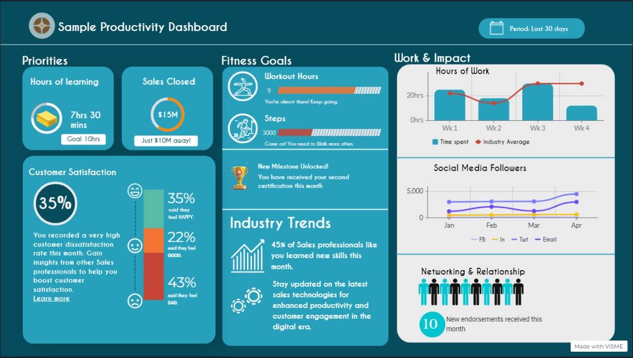
Here is a sample dashboard showcasing some of the goals that Alex has decided to pursue, along with some measurable metrics:
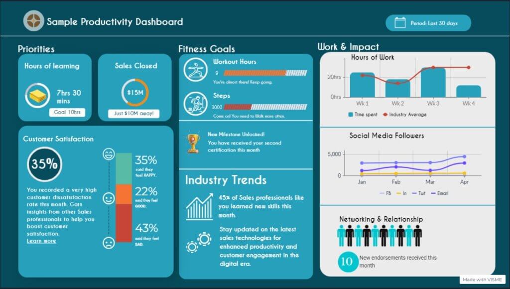
Sample dashboard from our fictitious app, MyPadi. The dashboard displays Alex’s chosen goals and their measurable metrics. Alex has the flexibility to analyse her activities based on various timeframes, such as day, week or month, and gain valuable insights into her personal achievements.
Before wrapping up, it’s worth mentioning some of the limitations you might encounter when applying these solutions. No solution is set in stone. Just as these visual tools are themselves being constantly developed and iterated, the same applies to professional development: using the feedback from your previous actions to inform your future ones. Likewise, you may find it difficult to find a single integrated tool for multiple data sources. Many of the data-driven productivity tools currently on the market are highly specialised, so you might need separate tools to track time management, another for health and wellbeing, another for project management, and so on. The important thing is that visual data tools like Alex’s dashboard above can bring this suite of tools into one all-encompassing view. Get the minimum set of tools that can help you achieve your goals, don’t get entangled with always searching for a better tool, and then bring everything together into one vibrant and accessible place.
Kenneth has listed only a handful of factors to consider when creating visual solutions to support working professionals. If you’re considering a new tool to elevate careers for professionals in your industry, reach out to us to learn how we can help.
About Kenneth Odoh

Kenneth Odoh is a data storyteller and visualization professional from Nigeria. He enjoys using data to drive action through elegant visuals that convey powerful messages. He is a regular volunteer at Viz For Social Good where he helps impact-driven organisations to communicate their impact through data.