Jake Madsen
August 13, 2024
The Edelman Trust Institute has been studying and measuring public perceptions of trust since the year 2000. The Trust Barometer is their annual measure of trust taken globally.
Edelman’s reports, analysis and insight are phenomenal. Their team knows their stuff. So I was thrilled when, earlier this year, they reached out to us to bring their data to life as part of the Trust Barometer’s 25th anniversary.
With Edelman, and like so many other leading organisations we partner with, our initial conversation tends to start in so many words like this: “Okay, we have this data, but we don’t know how to unlock its value and make it accessible”.
Here’s a 5-step framework we follow to do exactly that.

Let’s quickly address the definition of accessibility here. Johny Cassidy makes the point that the whole reason for data visualisation is accessibility. Quite literally, it’s a case of taking data in its raw format (in many cases, just numbers) and structuring it in a way that us humans can make sense of. We can then start to consider accessibility in terms of web and digital accessibility, with the goal of increasing the ‘access’ to a fuller range of demographics.
Here, we’re going to look at data accessibility – somewhere in between the lens of Johny Cassidy’s view. I like to think about the two sides to data accessibility. First, making it literally available to the public. Think census data. Second, making it accessible to audiences to make sense of. This is the exciting part, and unlocking the potential of data relies on effective visualisation.
Data is more readily available now than ever before. No surprises there. But taking it to the next level – unlocking its potential to influence, demonstrate, convince, understand, inform, and more – is still a challenge that doesn’t seem to be going anywhere in the near future.
As a consultation practice, the five steps below offer a high-level understanding of how we approach this challenge with you, using real-world examples from our recent work in the Edu-Workforce space.
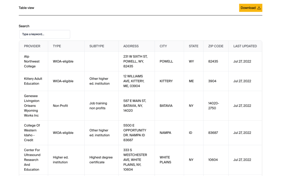
Harvard Kennedy School’s Workforce Almanac is the culmination of a research programme uncovering the relationship of the US workforce and the workforce development sector. The data identified here was the novel data set compiled by the team’s researchers. It’s novel and unique in that the data had not been compiled before, drawing on four categories of publicly available data.
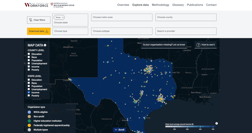
The challenge here is, while the data does a job in categorising and illuminating the geographic spread of the workforce development sector, it doesn’t do much to go beyond that. The data itself is mostly provider names and addresses, as shown below.
To help give the full spectrum of understanding, we decided to complement the data and overlay US census data such as employment, income, and education.
The effect was profound. Now users can start to draw conclusions from the relationship between clusters of workforce development sectors and employment rates.
Outcome: The sooner we can get our hands on the data at your disposal, the quicker we can review, discuss and provide recommendations if anything additional is needed to elevate the end-product.
CompTIA’s Career Explorer is a dynamic career exploration platform. At its core, it seeks to change people’s perceptions of what a career in tech looks like.
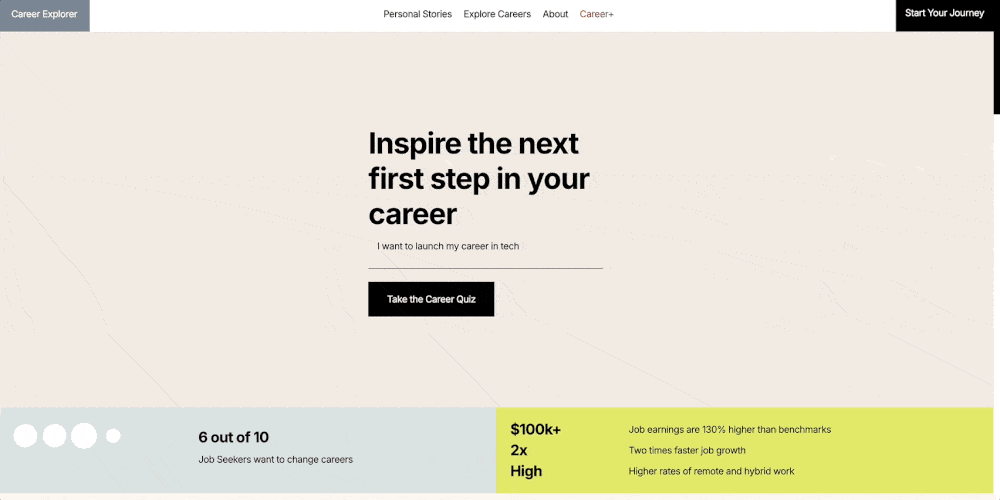
For context, the career exploration space is already crowded, with many organisations creating solutions that promise to ‘demystify’ job search. And yet, they always seem to fall short. Career Explorer changes that received narrative, and then some.
The focus on the audience here was paramount to delivering an experience that would cut through.
To create a tailored experience, we ran a strategic discovery phase that would lay the foundations and success criteria for the platform, understanding the user needs in a way that placed the emphasis on ease of use and empathy.
We then delved deeper through UX research methods such as user interviews to understand how this audience consumes data. What level is their data literacy? What are their pains, gains and jobs to be done when considering careers?
In practice, this led to a creative strategy that is naturally simple to understand, including real-work people testimonials, immersive job-role scenarios, and data deep-dives per occupation, all driven by slick and simple navigation.
Outcome: Audience is key to an effective data experience, so know who you’re speaking to. If you’re unsure, we’ll help you identify them.
Coming back to Edelman and how best to disseminate 25 years of trust data, there were many ways to tell the story and many angles to approach it from. How has trust changed as a macro view? What does it look like across the world? How does it change by age group and demographic?
Before diving in and making recommendations, we first analysed the data and gauged what patterns emerged. We let the data guide us, rather than us guiding the data, being careful not to manipulate. In this process, we ran a rapid analysis in a collaborative step in which we presented the data in a new light, sometimes in very rudimentary charts. This step also got us thinking about the type of chart best used to represent the data and communicate the story.
After drafting the rudimentary chart and analysis that focus on what data do, we prioritise. We put this into a high-level storyboard to show how the different data points and charts flowed together and to develop a clear narrative. This allowed us to focus solely on the content of the copy and the key message for each part. It was a three-step approach that allowed curiosity, scrutiny and focus at each stage.
Outcome: Let the data guide the narrative, not the other way around. Include rapid analysis to gain a view of the patterns emerging, so your strategy stays data-first from the outset.
Now the fun part. We can start to compile the building blocks based on what we know about the audience, the data and the story, and start considering the design solution(s).
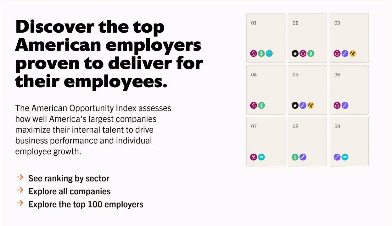
The American Opportunity Index is a revelatory corporate scorecard measuring how opportunity is afforded among the 400 largest companies in the US. In designing a solution, we need to consider each of the building blocks addressed so far to think about whether the design should be functional or beautiful (can’t it be both?). Likewise, should the data visualisation be actionable or exploratory? What do we want users to feel, think and do with the data experience?
We start this process by sketching out possible solutions. On a scale it’s typically mild to wild. Safe to adventurous. Again, it’s a collaborative process that iterates incrementally, ratcheting up the gears in fidelity until we have a solution we think hits the brief. This particular data experience won a Webby in 2023.
Outcome: Unlocking data requires compiling the building blocks of data, audience and narrative to create a design solution that fulfils each need.
Now that your data is accessible, so what? This is just the beginning. Now it’s time to ensure you have the success criteria set up to know what impact your accessible data will have. Then keep fine-tuning as the project develops.
Success criteria can be varied depending on the organisation, initiative or end objective. For Edelman, it was to present trust in a new light. For CompTIA, it was to change perceptions of a career in tech. For the American Opportunity Index, it was to catalyse change, boost understanding and start conversations.
Not all of these success criteria are measurable, but they do point to purpose-driven impact.
Outcome: Keep an unwavering focus on what success looks like from the beginning. Doing so is key to maximising the impact of your data experience.
Soho Works White City,
Television Centre,
101 Wood Lane,
London,
W12 7RJ