Data visualisation is shaping the future of work: 3 live examples
Reading time
Category
As GM of our EdTech pod, I was recently invited to speak at the EdTech World Forum in London. I was thrilled to share more on how we believe that data visualisation can help shape EdTech and the future of work, using three real-world use cases across:
– Effective workforce development
– Levelled up corporate practices
– Enhanced industry-wide upskilling
The future of work faces three key challenges
1. Rapid tech advancements mean that innovation is happening faster than skills development can catch up. As a result, there’s a growing skills gap and a need for upskilling workforces.
2. The world of work is fractured between globalisation and the on-shoring of industries. And the necessary skills and jobs for those industries just aren’t there right now.
3. The nature of work is constantly evolving – whether it’s remote teams, greater automation through generative AI and machine learning, or the gig economy. In response, organisations need to adapt and understand what this means to them.
None of these challenges are new, extraordinary or exhaustive. But they’re important to bear in mind when thinking about data and the roles it can play in enriching tomorrow’s education and workforce for the better.
Why data visualisation for EdTech?
Whether you’re an educator, employer, policymaker or student, data visualisation continues to have untapped value in helping to shape and solve the challenges the EdTech industry faces.
Here’s a visual story by way of illustration. It’s more commonly associated with the psychology of survivor’s bias, but it’s also a true expression of the value of data visualisation.

The story goes that, in World War II, military analysts were trying to figure out how to better armour their planes from enemy attack. The data began to show a clear pattern: most of the damage was to the wings and body of the plane. So the analysts thought the solution to their problem was clear – increase the armour on the plane’s wings and body.
But US statistician Abraham Wald intervened. These were the planes that had returned. Wald was curious: what was happening to the planes that didn’t make it back? A crucial part of the dataset was missing. Wald’s insight was to ask the question “Where are the missing holes?” This led to a move to reinforce the areas where there were no bullet holes on the returning planes. The result was a far greater success in the subsequent campaign.
What does this tell us? When data is transformed into visualisations, it has the power to unearth outliers. These outliers help us to find insight, patterns and observations that lead to positive outcomes. The process also supports greater engagement and/or excitement, and it bolsters more effective decision-making.
There is so much data available in the world of education and workforce development. But unlocking its value and making it accessible, clear and exciting isn’t easy.
Which brings me to three live examples that demonstrate how data visualisation is delivering positive outcomes in EdTech and the future of work.
1. Workforce development: The Workforce Almanac
This year, infogr8’s EdTech pod collaborated with Harvard University’s Project on Workforce on a new interactive data portal called the Workforce Almanac. The beta was released just last week, and it’s the first of its kind.
The Workforce Almanac is a multi-year research project focused on understanding short-term, post-high school workforce training provision across the US, a country where a ‘good job’ is associated with post-secondary education (usually a university degree). But nearly one-third of American workers, 62% of Black workers and 55% of Latinx workers are skilled through routes other than a degree.
Like Abraham Wald in WWII, the team at Harvard were curious. Where is the important cohort of the American workforce getting their professional education and training? They set their sights on the workforce development sector, about which so little is known due to its fragmented and siloed nature.
The new data portal aims to bridge those gaps.
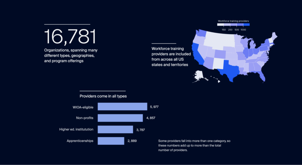
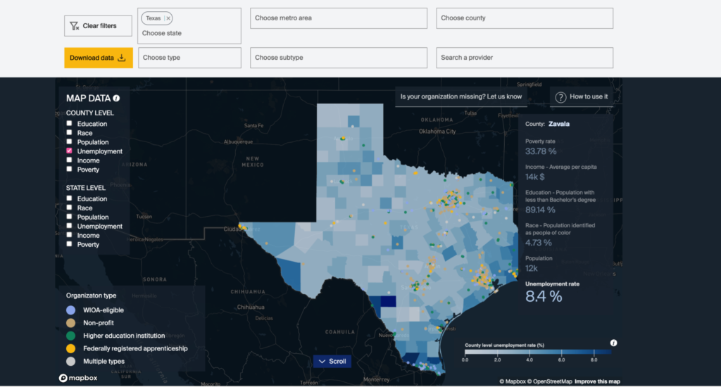
For the first time, the infogr8 team mapped out nearly 17,000 data points from workforce training providers, thereby building a clearer picture of the locations, key characteristics, relationships and dependencies of these organisations.
The team then overlaid US census data to complement the novel dataset. This gives the user the ability to toggle between different data points, creating a unique picture of conditions on the ground.
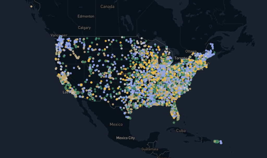
As with the WWII planes, using this portal means we can start to unearth the outliers and become more curious about what this tells us about the sector. Why is there clustering of workforce training providers, especially when unemployment is so high? Is something amiss with the efficacy of those providers?
As an example, the visualisation shows the disparity in provision between certain states. Maine counts 32 workforce training providers per 100,000 workers; in Connecticut, this ratio falls to just 6 providers per 100,000 workers.
We encourage users to explore the data to find their own narratives and key takeaways:
– Policymakers can integrate the data to improve their decision-making around funding and resource allocation
– Training providers can explore coverage in other areas to benchmark and collaborate
– Researchers can explore local labour markets, ranging from metropolitan areas to rural areas, to product new insights into the workforce development sector
Nathalie Gazzaneo, the project’s associate director at Harvard, has called this first iteration “breadth”. The next iteration will target “depth”, especially around the worker outcomes of the training providers profiled.
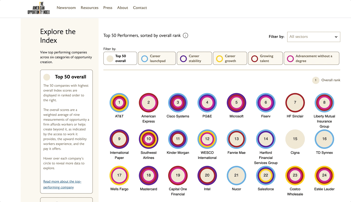
2. Diversity, equity and inclusion: The American Opportunity Index
In 2022, infogr8 collaborated with the Schultz Family Foundation and the Burning Glass Institute to create the American Opportunity Index.
Upward mobility is a cornerstone of the American Dream. But the reality is that, while 90% of children born in 1940s America would go on to earn more than their parents, the same was true for just half of those born in the 1980s.
The American Opportunity Index is the first attempt to measure worker mobility in the US. It seeks to answer the question: Which are the best US companies for worker advancement, and why?
To paint a clearer picture of corporate worker mobility, the Burning Glass Institute conducted big-data analysis of career histories, job postings and salary sources from 250 of the US’s largest publicly listed companies. Our task was to illuminate this data in clear, accessible and interactive ways, shining a spotlight on the individual merits of those companies leading the way. Our information and technical design challenge was to place as much consideration to giving parity among companies – careful to celebrate and not punish.
For the first time, our custom-coded, interactive solution allows users to measure each firm based on the level of opportunity they afford workers within the company and beyond.
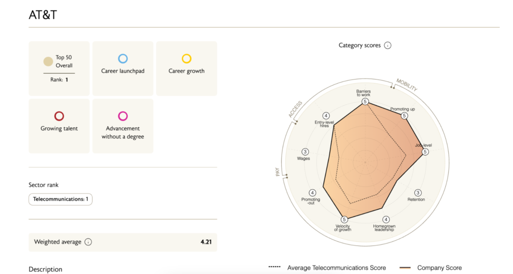
Using the Index, users can clearly assess how well companies are doing based on six categories of opportunity creation:
– Top 50 Overall
– Career Stability
– Career Growth
– Growing Talent
– Advancement without a Degree
As a company/employer, I can see how I compare with peers in my industry by benchmarking my category scores. I can also start to form probing questions: CitiGroup, for example, is a great place to advance without a degree (ranking in the top 20), but as a company hiring workers without experience, it doesn’t even feature in the top 50.
The American Opportunity Index won a Webby Award in 2023. A new iteration will launch on 30th November, including many more data points and analysis from over 400 companies.
3. Industry skills gaps: Association of Financial Professionals
My third and final example brings us back to a focus on industry. Attracting talent to close skills gaps and fuel growth is a constant challenge within various industries, especially emerging ones like the green economy or AI.
The Association of Financial Professionals shared this challenge. How could they change perceptions of what a career in finance looks like? How could they use the data available to paint a clearer picture of the skills, qualifications, job roles, career progression pathways and salaries involved?
Our response was to create an accessible web-based data tool, powered with world-leading workforce analytics data from Lightcast.
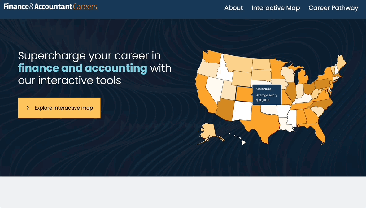
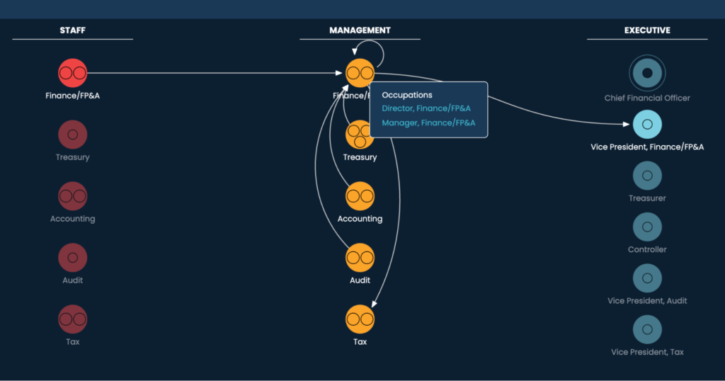
The result is a comprehensive industry landscape, mapping the skills, training and education needed across the key roles in finance. The tool also includes intuitive career ladders to help users understand how to progress from entry-level to advanced roles in the industry, along with a rich heatmap showing supply and demand for roles across the US, from state to metro areas.
This type of in-industry data tools brings value to a range of user segments:
– Current finance professionals can identify the skills needed to move into the next role on their career journey. This level of insight is invaluable in helping users formulate a structured personal development plan to get to that next step in their career.
– Career changers can gauge which skills they already possess that can be leveraged to move into a new position in financial services.
– Employers can gain insight that informs strategy for finding, developing and retaining the best talent. The tool provides the data needed to develop formalised talent initiatives as well as salary benchmarks so firms can stay competitive in the jobs marketplace.
– Students can use the tool to figure out their next steps after graduation. This is especially useful since many finance careers are not explored in a university setting, and the industry’s career pathways go beyond the roles covered in an undergrad programme.
3 examples, 3 takeaways
As more and more data becomes available in educational and workforce development settings, what do the examples above tell us about the EdTech state of play?
1. Be curious. Is your data in a format that allows you (and others) to look at it curiously and see the full picture?
2. Define your use cases. What other applications or contexts can you see beyond those in use today? Which audiences can you reach, and how do they stand to benefit?
3. Prototype and test. Use the wide range of data tools available today to create something tangible, then quickly test it to validate your solution-making.