Rita Giordano on humanising healthcare infographics with patient feedback
Reading time
Category
The human body is extremely complex, which poses a challenge to create educational resources that can effectively inform patients. Data viz consultant Rita Giordano draws on her personal experience with chronic pain to uncover how healthcare infographics could be transformed to better reflect patients’ needs.
During the pandemic, I began to feel unwell. When I discussed my pain with my family, friends and GP, they said I was stressed. But my pain continued for more than a year. I honestly felt that it was not stress-related, so I started doing some research.
I went to the local library to search for books about pain, such as The pain-free mindset (1) and Pain is really strange (2) and looked at scientific articles (3). I also searched for information on several websites, such as the International Association for the Study of Pain (IASP), where I learned about the definition of pain as: “An unpleasant sensory and emotional experience associated with, or resembling that associated with, actual or potential tissue damage.” This definition doesn’t include chronic pain, which is a different experience.
Chronic or persistent pain is a pain that persists during the normal time of healing. The IASP defines chronic pain as a pain that persists for more than three or six months (4). We can further classify pain by distinguishing between acute and chronic pain. Acute pain is, for example, when we prick ourselves with a needle. We immediately feel the pain. In this case, the neurons send an impulse to the brain that lets us know that there is a danger (Figure 1 a). So we feel the pain. In the case of chronic pain, there is no immediate danger, but our brain continues to send the stimulus that we are in danger, and we continuously feel the pain (Figure 1 b). This does not mean that the pain is just in our heads; the pain and the sensation are both real.
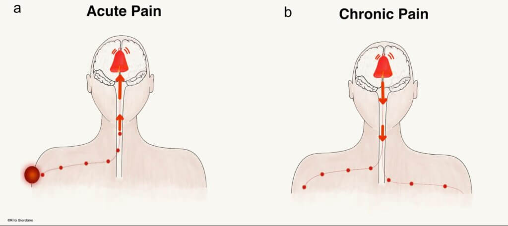
Figure 1: The two primary types of pain, namely (a) acute and (b) chronic. From ‘The invisible persistence of pain’ infographic. Designed by the author.
We have to think of our brain pain system as an alarm. When this alarm is broken and continues to ring, we experience constant pain – it continues to send faulty messages to the body.
The absence of infographics that humanises data
As a visual person, I looked for visual representations and infographics that could give me a deeper understanding of chronic pain. I managed to find one from the UK government, but it was unhelpful: it had numbers with stock-quality illustrations of people. The visualisation was not humanising because I didn’t feel my health condition was properly represented.
I wanted to learn more about how to incorporate a human touch into the data, so I turned to designers such as Giorgia Lupi. Her work focuses on what she calls soft data (5), the human context surrounding data. I was also inspired by Katie McCurdy and her work for Pictal Health (6).
During a visit to my GP’s office, I didn’t see any educational materials such as posters or brochures about pain. Everyone, at some point, experiences pain, and it’s unlikely to be unique to me. However, all I saw in the waiting room was information about cancer, diabetes, cervical screening, among other health issues. The absence of pain resources planted a seed of doubt; is this all just in my head?
Visual information is important in these settings because it can capture the attention of patients who are waiting and inform them about significant healthcare issues. A recent article published in Nature Medicines (7) highlights the importance of communicating health information with visual displays. The authors state that well-designed information can help people to understand complex information.
Determined to understand what I was experiencing, I looked for data about chronic pain. Public Health England conducted a chronic pain survey in 2017 and released the results in 2020 (8). I discovered this survey in 2021, when the paper was updated.
Equipped with this data, I set out to visualise it with the {ggplot2}, a visualisation package for the programming language R. As part of my student project for the 2022 Information Design Summer School, I created an infographic that clearly communicated chronic pain to patients. At the time, I wanted to understand visual information from the patient’s perspective.
In a 2017 study, Yeoman et al. (9) said that patient-centricity means putting the patient first and working with them to make their experience and outcomes the best for them and their family. This definition could also be more broadly applied to designing products, clinical trials, visual communications, and so on.
Putting patients first should be the initial approach when designing visual material in the field of healthcare. We need to be careful about how we display the information and communicate clearly with plain language while avoiding jargon. More importantly, we need to involve patients; their input is critical in shaping the final product. As information designers, we need to not only understand how patients understand visual information, but also how they respond to it emotionally.
Communicating chronic pain visually
Giving patients a voice
Before embarking on this project, I was already collecting data on my health condition, including areas of my body experiencing pain and my daily meals. Although this was helpful to help me understand my chronic pain, it was limited to my experiences. Throughout the project, I read blogs by people suffering from chronic pain and reached out to people who I knew in a similar situation. I wasn’t really surprised to learn that physicians did not believe patients’ stories at first (10). More often than not, physicians begin to listen only after several visits from patients.
There were many challenges to designing an infographic about chronic pain. The 2017 PHE survey (9) had an overwhelming amount of data drawn from questions that spanned 29 spreadsheets. Another challenge was checking other perspectives from people suffering from chronic pain. It is difficult to find patients, so I decided to involve some people I know in the process. It was important to me to listen to others suffering from chronic pain. Involving patients allows them to take control of their narrative and help them feel less alone in their suffering.
Designing infographics that humanise healthcare data
Illustrations humanise numbers and bring infographics to life. To explain chronic and acute pain, I created two illustrations (shown in Figure 1).
A key consideration in the design process was to keep the language simple and apply best practices of typography so that the text is readable. During my journey to demystify my chronic pain, I found that 34% of the population in England suffer from chronic pain, according to the PHE survey of 2017 (9).
To make the infographics easy to understand, I used a different way of writing percentages in the infographics. For example, rather than saying “34% of the population aged over 16 and over suffer from chronic pain”, I used: “One in three people aged 16 and over suffer from chronic pain.” In this particular instance, the removal of the percentage and the use of the notation one in three renders the numbers more comprehensible.
The data I chose to include was intended to help patients understand that their condition is more common than they think. To clearly illustrate this data point, I used a donut chart showing two categories: 1) chronic pain in red, and 2) no pain for more than three months in grey. This chart simplifies the definition of chronic pain while allowing patients to identify with others living with chronic pain.
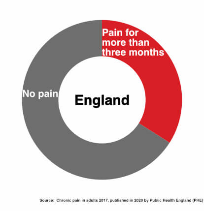
Figure 2: Donut chart representing 1 in 3 people suffering from chronic pain in England. From ‘The invisible persistence of pain’ infographic. Designed by the author.
Another question in the PHE survey explored how many areas of the body people were suffering from chronic pain. To show this data, I created a waffle chart with 100 squares and divided it into three sections. The chart shows the number of people who felt pain in one area, two areas, and three or more areas. I wanted to make it easy to understand that feeling pain in more than one part of the body is normal.
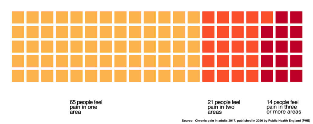
Figure 3: Waffle chart showing in how many areas people suffer pain. From ‘The invisible persistence of pain’ infographic. Designed by the author.
Visualising this data, then, creates a connection with the patients. It shows them that what they feel is normal, and that other people are also suffering in the same way. An additional question I decided to visualise was in which part of the body the participants located their pain. I decided to use a human body to display the data (Figure 4).
![]()
Figure 4: Human body wrapped in a ribbon. From ‘The invisible persistence of pain’ infographic. Designed by the author.
The infographic creation process involved different techniques. First, I used R’s {ggplot2} library to create the charts. Then I created the illustrations manually, starting with pencil and paper. After the sketch was completed, I digitised the drawings and refined them in Photoshop and Affinity Designer. At the time, I was using Affinity Designer for the first time to create graphical elements, so I had to spend a lot of time Googling tutorials to use the tool.
Gathering design feedback from patients and physicians
During the Information Design Summer School, I attended some lectures on design testing by Karel van der Waarde (11). The lectures explained how to involve patients in the design process when designing for healthcare.
To apply what I had learned during the lectures, I contacted three people I personally knew for feedback. I asked if they were keen to help me because I knew they had a long-term condition involving chronic pain. I shared the early sketch of the infographic with them. Their feedback was useful to help me check whether the design and text were clear to them.
Each of them offered unique feedback. In an early sketch (Figure 5), I drew a human figure with a ribbon, which I sketched as a thread wrapped around the body. I was inspired by my personal experience with pain, which felt like being trapped in something.
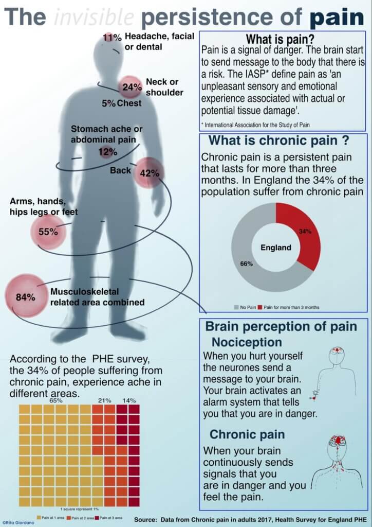
Figure 5: First draft of the infographic used to gather initial feedback about the project. Designed by the author.
One of the responses I received from the feedback sessions validated this design direction:
“This is all I felt, wrapped in a ribbon of pain every day.”
Another said:
“It is a relief to see this image because you can finally understand how I feel every day.”
Another pointed out that the ribbon was more like a spring than a ribbon. This answer also helped me to refine the shape of the ribbon.
To echo another participant’s feedback, the image made one participant feel sad because she felt trapped by the pain. Learning that the feeling of being trapped was shared among participants helped me improve the infographic.
Another piece of feedback was about the text, which in the first draft still contained difficult words, such as nociception. In the final infographics, I used more simple text and ‘acute pain’ rather than nociception.
I found it extremely helpful to test my infographic with people who were suffering from chronic pain. Having only three people with a similar background meant that I received limited feedback. I believe that the infographic could be further enhanced by identifying additional participants from diverse backgrounds. However, for the purpose of the course and my learning, it was already a good starting point and gave me the possibility to test my infographics with real-world patients.
After speaking with patients, I started to chat with physicians. Their feedback was very useful in checking the accuracy of the information. I also received feedback about my illustrations and their perspectives on the problem.
For example, in one version of the infographics where I was still using percentages, one physician’s comment was:
“I think the text around the donut chart in the top-right could read as 1/3 of the adult population suffers with chronic pain.”
The same physician also suggested that it would be a good idea to include a QR code so that the infographic could link to an online version with additional information. This was a good idea that I didn’t implement due to time constraints, but it was an interesting suggestion to augment the educational experience.
Another physician asked me to remove the neurons I had drawn in one version that showed how pain was activated like an alarm system (Figure 6 a). She explained that since there are different neurons, I should draw the right one carrying the pain message. So her suggestion was to remove it. In the final infographic, I removed the neurons and left only the bell (Figure 6 b).
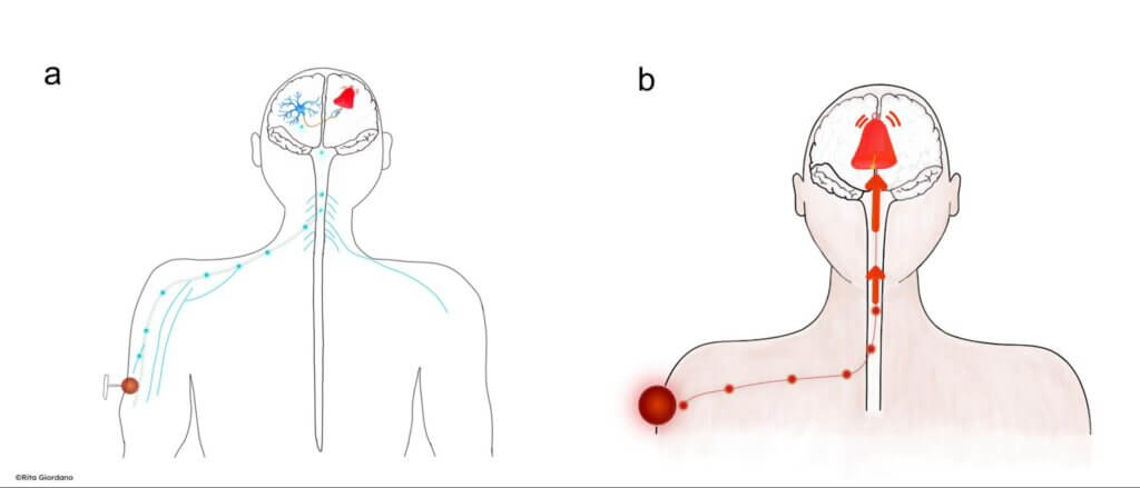
Figure 6: (a) Initial sketches of the brain pain system. (b) Final illustration of the brain pain system. From ‘The invisible persistence of pain’ infographic. Designed by the author.
Doing this project, I also had the possibility to get feedback from Clive Richards, who was my tutor on the project. He helped me improve the design and typography and reviewed the writing to check the clarity of the language.
Figure 7 shows the final infographic I created after all the feedback.
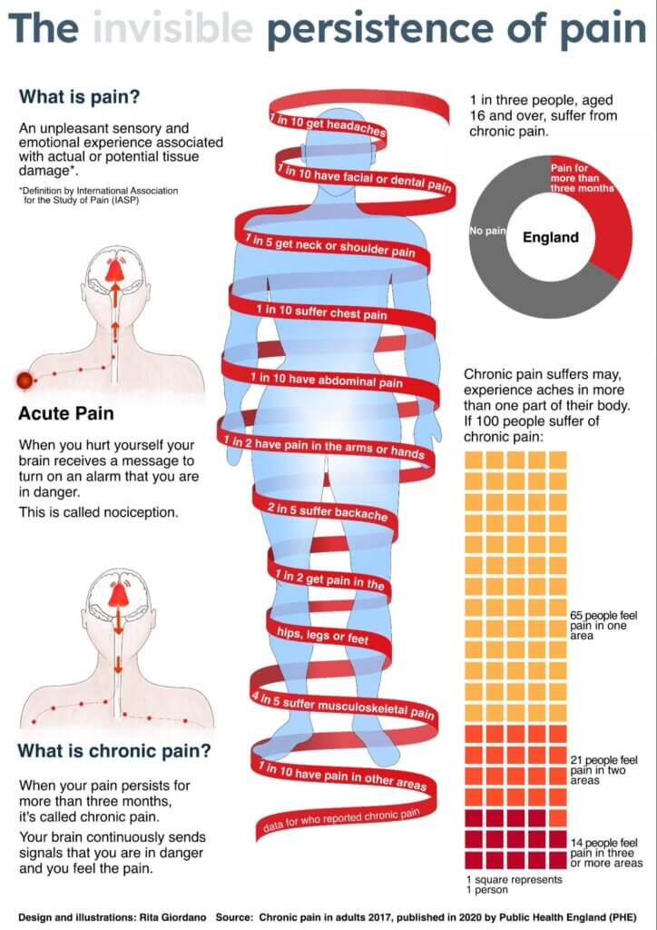
Figure 7: The final infographic ‘The invisible persistence of pain’. Designed by the author.
Improving information design for patients by involving them in the process
Taking the approach of involving patients during the design of healthcare infographics can provide benefits to all parties. The patients benefit because they get their voices heard and understood; the designer creates a visualisation that makes sense and humanises the information. The role of the designer is to be the voice of those who cannot be heard. As a result of this process, we can create designs that better inform patients so they can make better choices.
Reflecting on my experience with this project, I learned many new things about designing infographics in healthcare. I enjoyed the experience of speaking with patients and listening to their stories. However, only speaking to three patients, in my opinion, was not enough. Since it was a project for a summer school, it was okay because it helped me better understand the patient-centred approach. Next time, I will look to find more people to share their stories and give me more feedback. The involvement of medical professionals was also significant. Their input was incredibly valuable, allowing me to examine chronic pain from two perspectives: the patient and the medical professional.
In addition to the feedback provided by patients and physicians, Clive Richard’s contribution to the design was invaluable. It was beneficial for the creation of the infographics that someone else looked at the design.
To summarise the knowledge, I gained from this project:
- Never assume. Always ask for feedback. Many people are willing to help.
- Engaging patients in your healthcare project will be rewarding.
- Ask medical experts for their thoughts and insights into the scientific findings.
Above all else, aim to be credible in your design. Look for trustworthy references, and ask experts in the sector you are designing for to validate your ideas. Then add the incredible, extraordinary parts to engage your audience. Don’t limit yourself to only charts, either – explore other avenues to create outstanding infographics that humanise real-life experiences.
We thank Rita for opening up about her own struggles with chronic pain and how it inspired her to co-design an infographic with patients and healthcare providers. If you’re looking to create a bespoke solution to your data visualisation needs, reach out to us to learn more about how we can help you do more with data.
References
- Ravindran. The Pain-Free Mindset (2021) Vermilion London.
- Haines. Pain is Really Strange (2015) Singing Dragon.
- Bushnell, M., Čeko, M. & Low, L. Nat Rev Neurosci (2013) 14, 502–511
- IASP (2012). ‘Introduction’, in ‘Classification of pain, second edition, revised in 2012’
- Liz Stinson (2018). https://eyeondesign.aiga.org/how-kaki-king-and-giorgia-lupi-used-data-to-make-sense-of-a-childs-illness/, accessed in June 2022 and December 2023
- Katie McCurdy. https://www.pictalhealth.com/, accessed in May 2022
- Woloshin, S., Yang, Y. & Fischhoff, B. Nature Medicine (2023) 29, 1085-1091
- Public Health of England (2020). https://www.gov.uk/government/publications/chronic-pain-in-adults-2017, accessed in July 2021 and May 2022
- Yeoman G, Furlong P, Seres M, et al. BMJ Innovations (2017) 3, 76-83.
- TED: The bias behind your undiagnosed chronic pain (2022). https://www.ted.com/talks/sheetal_decaria_the_bias_behind_your_undiagnosed_chronic_pain?language=en, accessed in June 2022
- Van der Waarde, K. Information Design Journal (2008) 16(3), 216-228
About Rita Giordano

Rita Giordano is an Italian, UK-based, independent data visualisation consultant and scientific illustrator. She has expertise in data analysis, statistics, and visualisation in the domains of research and data science industry. In addition, she is a LinkedIn instructor for data visualisation with R.