David Pao on the undervalued contribution of clinician data visualisation to patient-centric healthcare
Reading time
Category
While the Electronic Health Record (EHR) is the cornerstone data tool for clinicians in providing patient care, it comes with a reputation for poor clinical usability. Dr. David Pao argues that visualisation is key to the EHR user experience because it can support how clinicians think. In doing so, it can unlock the digital benefits that improve patient-centric healthcare.
The medical record: The data tool that supports clinical reasoning
In her book How Doctors Think, anthropologist Kathryn Montgomery (1) reminds us that, contrary to popular belief, doctors are not scientists. I say ‘reminds us’ because ‘the art of medicine‘ is not a new term: it has been a well-recognised facet of the profession for many years. Rather than a science, Montgomery’s observations point towards a practice through which clinicians interpret science. They do this by looking at a patient’s data through the lens of clinical theory.
This unfolding, unpredictable and complex interpretation lies at the heart of clinical practice and is known as clinical reasoning.
To support clinical reasoning, the clinician needs – arguably above all else – a suitable tool with which to explore this data landscape. The medical record is that tool through which the clinician builds – and holds in tension – the clinical narrative. This is done through a formalised approach to storytelling that for over a century has come to define professional clinical practice (2).
As a physician with an estimated 100,000 patient consultations under my belt, I am in no doubt: the medical record is the cornerstone tool of patient-centric care.
A brief history of the Electronic Health Record
In the 1990s, the paper medical record began to be supplanted by the Electronic Health Record (EHR). In the UK (where I work), every GP practice and almost every outpatient clinic use EHRs to some degree, even if they are not yet fully ‘paperless’. In the US, as of 2023, at least 92% of office-based physicians use an EHR (3). In 2021, the global EHR market was worth $29 billion.
The core property inherent to the digital medium – that data are infinitely shareable without degradation – has expanded the scope of the EHR almost unimaginably beyond its paper record predecessor’s focus on individual patient care. This single property positions the EHR as an overarching software system that, in an ideal world, connects patient data with all stakeholders within a healthcare ecosystem. In Figure 1, the trapezoidal dotted area represents the EHR backbone connecting patient, professional and organisational stakeholders (4).
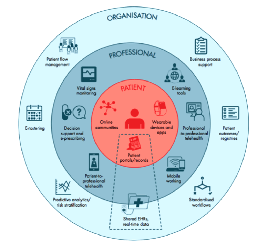
Figure 1. EHR connectivity in a digital health ecosystem (4)
This connectivity promises huge benefits to any healthcare system. As well as informing individual patient care, data held within the EHR directly inform population health, including disease surveillance and intervention; service provision, including planning and audit; clinical research; local, regional, national and international health policy; and our fundamental understanding of disease. Again, the EHR stands as the cornerstone tool of the entire healthcare ecosystem.
In her book, Design as an Attitude, Rawsthorn (5) asserts that design has always had ‘one elemental role’ as an agent of change that interprets shifts of any type (social, political, economic, scientific, etc.) so that anything new ‘will affect us positively, rather than negatively.’ In other words, that design is less about the status quo and more about envisioning change. The advent of the EHR undoubtedly represents such a shift.
The role of the EHR interface in clinical consultations
Regardless of the EHR’s massively expanded scope, it is the EHR interface that remains synonymous with the paper record, through which clinicians review, collect, interpret and curate patient data. A typical interface example is shown in Figure 2 below.
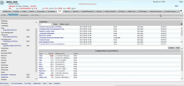
Figure 2: Conventional EHR interface (6)
The clinical consultation that the EHR interface supports is neither a predetermined nor a linear sequence of tasks. Rather, it is an unfolding, unpredictable and often unstructured conversation:
For the patient, the consultation can be considered a liminal space where transformation often occurs. This space is suspended between the ‘what was’ and ‘the next’, health and illness, safety and fear – all of which can pivot dramatically on a single piece of data.
For the clinician, the consultation is an exploration of that exact same worldview, additionally anchored to each patient’s clinical data landscape. These patient-facing, primary users of the EHR interface are typically at their screens for 6 hours a day or more (7).
The EHR interface plays a central role in the consultation: a significant presence that can be thought of as a collection of ‘silent but consequential voices’ (8). There is no doubt that the EHR has agency in the sense that, expressed simply, an agent is ‘one who acts.’
The Personal Health Record (PHR), which offers patients the ability to access and contribute their own health data, is yet another agent in the consultation.
This means that there are at least three simultaneous, interdependent ‘conversations’ at work here, as shown in Figure 3:
- The clinician has a conversation with the EHR interface (usually before meeting the patient) to assimilate clinical information, including the patient’s lifetime narrative history and clinical data. This is typically an explorative process. In real time, the clinician then has to contextualise these data to the patient and their current health needs, before inputting further clinical information, interpretations and agreed outcomes back through the EHR interface.
- The patient will likely have their own conversation with their own PHR or health app(s). This is typically an explanatory process. Apps are typically not integrated with EHRs, and PHRs only sometimes. Often, the patient will be in conversation with their companion or advocate.
- It is only after the clinical data landscape is adequately known that the clinician can begin an informed conversation with the patient. This is the primary conversation flow that engages with the existential concerns of the patient. Supporting this conversation is the deeper goal of the EHR interface, and where the work of the clinician truly lies – beyond the data.
In the real world, it is the throttling of the first of these conversations, between the clinician and their EHR interface, that most damages the clinical consultation. This is a major pain point and a significant cause of burnout among clinicians (9).
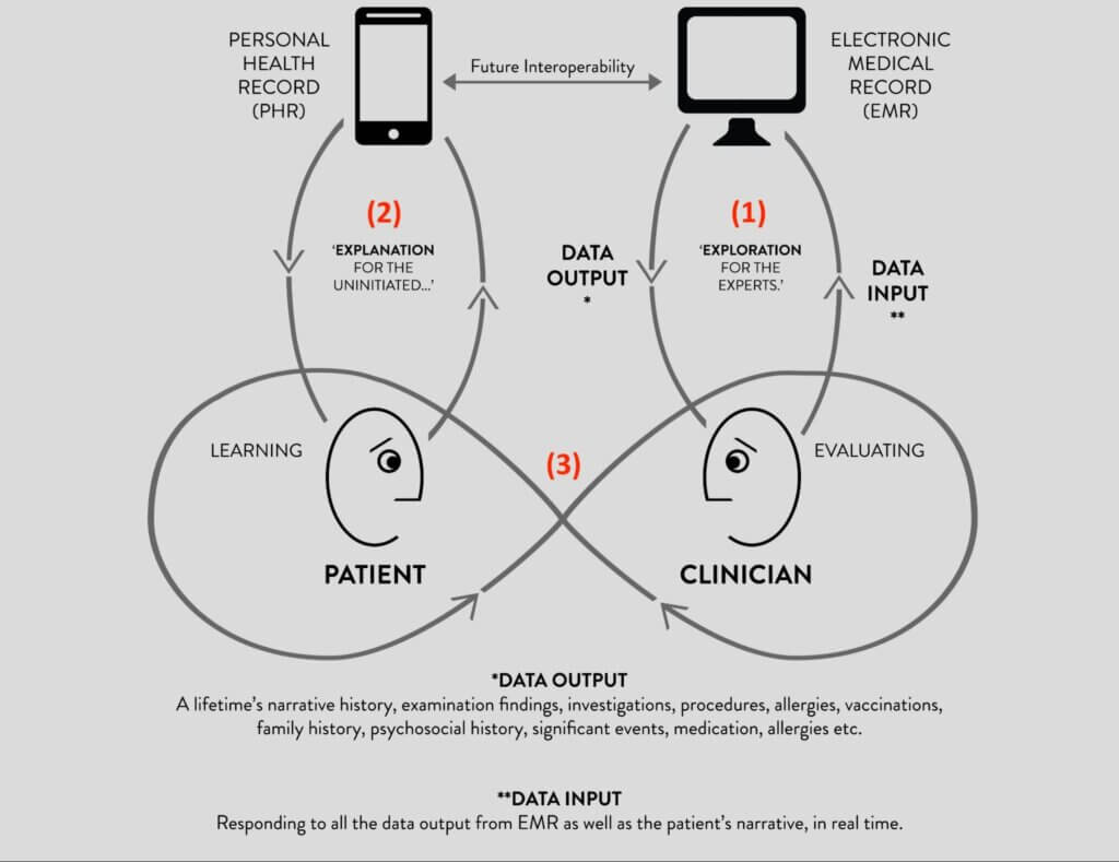
Fig 3: The three conversations of the clinical consultation (10)
Write once, read never: Criticism of the EHR interface
Every year, the dissonance grows between the digital tools that clinicians use at work and those they use at home and on their smartphones. Behemoth providers roam the EHR market, selling outdated interfaces that do not manifest the digital innovation seen in other technology markets. Notably, there is a single-minded focus on interoperability at the expense of the clinician user experience.
When a new EHR system replaced paper records in the London teaching hospital where I worked, my first patient had been a patient of the clinic for 18 years. Before being of any use to him as a doctor, I needed to understand at least an outline of his history, which the EHR interface simply could not provide. In response to my repeated interrogations, he gestured to the EHR screen with a question patients often ask, often resignedly: ‘Isn’t it all in there somewhere?’
It was all in there, somewhere. The moniker ‘Write Once, Read Never‘, or WORN, remained perfectly apt 20 years after it was coined in The Lancet by Powsner and Tufte (11).
While the defining characteristic of paper records is that they are created (through pen and paper) by clinicians for their own use, the defining challenge of the EHR interface is that they are built by people who are not clinicians. The medical record is no longer an artisanal tool that mirrors clinical reasoning; indeed, there is no inherent connection to the clinician. As a result, the medical record is no longer anchored to a framework of clinical theory.
This disconnect between the clinician user and their most important tool is negatively consequential, because the precision, richness and fluidity of their interaction directly determine the quality of clinical care. Inaccurate, imprecise, corrupted, misinterpreted, mis-curated, missing, misplaced, displaced, duplicated – or simply unintelligible – data propagate throughout the entire healthcare system, infinitely and without degradation. Errors are amplified, omissions disappear and the clinical perspective fades to obscurity. In other words, with increasing connectivity, digital’s shadow side looms ominous and dark.
One way of describing this disconnect, in human-computer interaction (HCI) terms, is to say that EHR interfaces demonstrate poor clinical usability. This can be described by modifying the well-known but generic ISO usability definition (12) to become: the extent to which a product can be used by clinicians in their practice with effectiveness, efficiency and satisfaction.
Poor clinical usability is a seam that runs heavy and thick through published observations of EHR user experience. In his New Yorker magazine article, ‘Why Doctors Hate Their Computers‘, the surgeon, writer and public health researcher Atul Gawande (13) echoes thousands of others – in books, academic papers, lay articles, forums, social media and hospital coffee rooms around the world – when he tells us that the medical profession ‘actively, viscerally, volubly hate their computers.’ Glyn Elwyn (14) nails the grinding digital reality of the lost clinical perspective when he says, ‘We have [electronic] medical records, but they are like the shadows on the wall of a cave, punctuated by codes and jargon.’
In the Harris Poll (15), which reported the EHR experience of 521 US primary care physicians, 71% said that improving EHR interface design was the highest priority short-term goal. Only 8% felt that the ‘primary value’ of EHRs was related to supporting their clinical practice. In the 2022 NHS EPR Usability Survey (16), UK acute care clinicians reported satisfaction below the 17th percentile (range 5th to 17th percentile) for all categories related to clinical care.
Data visualisation holds the key to clinical usability
My everyday experience as an EHR user made me wonder how much EHR interface designers actually care about clinical usability. My conclusion, at the end of my PhD research journey, is that they want to care more than anything else; user-centredness is, after all, a time-honoured and beautiful design tenet. In many ways, medicine is no more or less complex than other professions, but clinical usability is opaque, steeped in sometimes inaccessible traditions of knowledge, theory and practice. The challenge is to elicit, understand and communicate how clinicians think.
Rawsthorn (5) again focuses on a belief that ‘artists, designers and scientists [note the designers in the middle] should work in collaboration with industry to build a better, fairer society.‘ She echoes Moholy-Nagy (17), who describes a broad approach to design when he asks for projects to be seen not in isolation but in relationship with the needs of the individual and their community. The inclusion of members of the community, regardless of their background, is a theme that often runs through descriptions of design (18).
Florence Nightingale is an example of community contribution to healthcare through data visualisation. A nurse in the Crimean War, she ‘designed’ information in such a way as to understand why fatalities among soldiers were so high (19). Her visualisations revealed a grim reality in which many more soldiers were dying from post-battle infections than on the battlefield (Figure 4). Through her modified pie charts, she came to understand infection control.
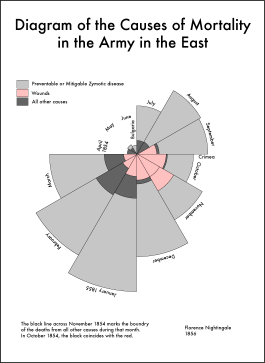
Fig 4. A ‘coxcomb’ diagram highlighting the number of unnecessary deaths during the Crimean War as a result of preventable infections (19)
Data visualisation is arguably the most powerful means of not only demystifying how clinicians think but, crucially, communicating how clinicians think. Of all the perceptual senses, vision is arguably man’s most dominant, with a deeply embedded connection to cognition. The role of the external world in supporting thought and reasoning, known as external cognition (20), is central to visualisation: ‘The power of the unaided mind is highly overrated. Without external aids, memory, thought, and reasoning are all constrained‘ (21).
As Zhang (22), a cognitive scientist, observes, the form of a visualisation is so important that it often determines what information can be perceived, what processes are activated, what structures can be discovered, what errors are generated, and what strategies are learned and adopted. Within the overarching arena of clinical usability, visualisation is key to supporting the clinician user. Clinically appropriate EHR visualisation has the potential, therefore, to transform the working lives of clinicians (and the real lives of their patients), by supporting clinical reasoning rather than the struggle against unnecessary cognitive load.
Many commercial EHR interfaces do not yet benefit from data visualisation in this way. When they do, the design of their visual elements is dictated by the first-order characteristics inherent to the data. This results in conventional table and graph formats that, while syntactically clear, lack semantic depth. In other words, they are accurate but cannot convey clinical meaning.
While clinicians do want visualisations that show characteristics inherent to the data, more fundamentally they want an interface tailored to the way they think. For this, we need to turn to EHR visualisation in the research rather than the commercial arena. Here, user-centredness has been authentically practised, and its value realised. The three examples discussed below offer exemplars of collaborative visualisation design.
1. Static configural chart: Powsner and Tufte (11), a physician and statistical artist, respectively, collaborated on a pioneering visualisation of a single data variable (blood glucose measurements) over time. Their ‘basic graph’ charted 50+ blood glucose measurements against a non-linear timeline scale while showing reference ranges and highlighting clinically salient data (see Figure 5). Their visualisation justified their conclusion: ‘… a graphical summary should encourage doctors and nurses to reshape, perhaps re-invent, the medical record before computer programmers cast institutional convenience into silicon.’
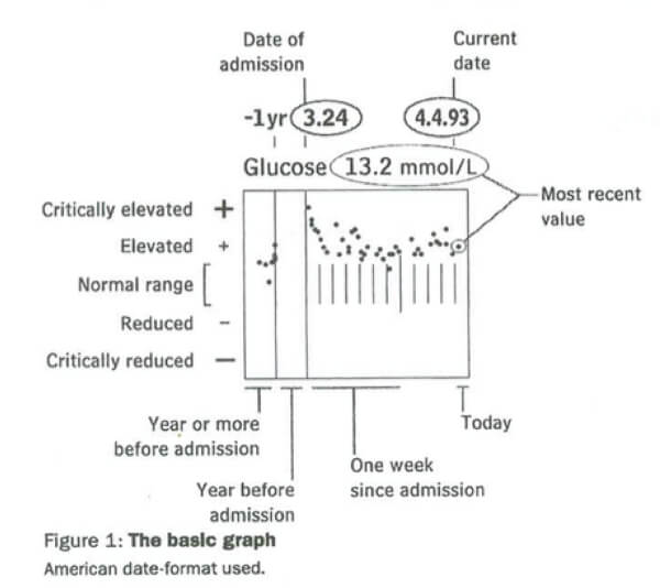
Figure 5: A ‘basic graph’ of glucose measurements (11)
2. Animated configural chart: Horn et al.’s (23) dynamic metaphor graphic of intensive care data over time, VIE-VISU, was created within the Medical University of Vienna’s Medical Informatics department, reflecting an inherently collaborative approach (Figure 6). The glyph looks and indeed is complex, but the clinical user rapidly perceives 15 data variables through the use of visual variables and annotations. In this single visualisation, all the data necessary for the management of an unconscious patient in an ICU bed are shown in real time: cardiovascular, respiratory and fluid balance status of the patient, plus the catecholamine (drugs to enhance cardiac performance), oxygen and mechanical ventilatory support given to the patient.
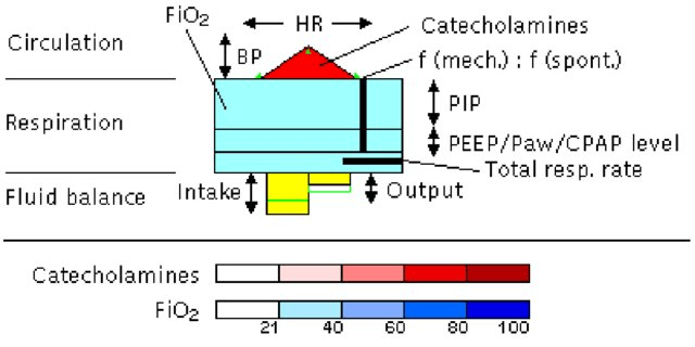
Figure 6: Metaphor graphics (VIE-VISU) to visualise ICU data over time (23)
3. ‘Epistemic’ visualisation preserves the conceptual structure of clinical knowledge within the representation and is the focus of my PhD research (10). I use Cheng and Barone’s (24) Representational Epistemic (REEP) approach to provide an explicit, granular blueprint for the design of epistemic visualisations, such that clinical theory can be incorporated within the interface design specification – to any level of sophistication. This is achieved by specifying the entire conceptual structure of a knowledge domain in terms of: domain concepts; their constituent conceptual dimensions; the intra- and inter-relationships within and between them; and precisely how these will be expressed visually.
A key benefit of any epistemic approach is that visual elements are determined not only by the inherent characteristics of the data but also by clinical theory. This means that data can be represented in a way that is appropriate to clinical practice. The Sexually Transmitted Infection Query Interface (STIQI) is an epistemic prototype from my research (Figure 7), in which visualisations are vehicles for surrogative reasoning. For example, the use of aggregated ‘sets’ mean that six different gonorrhoea (GC) tests – different assays at different anatomical sites – are visible in the Detail Panel (on the right) but are aggregated into a single set on the Timeline (on the left).
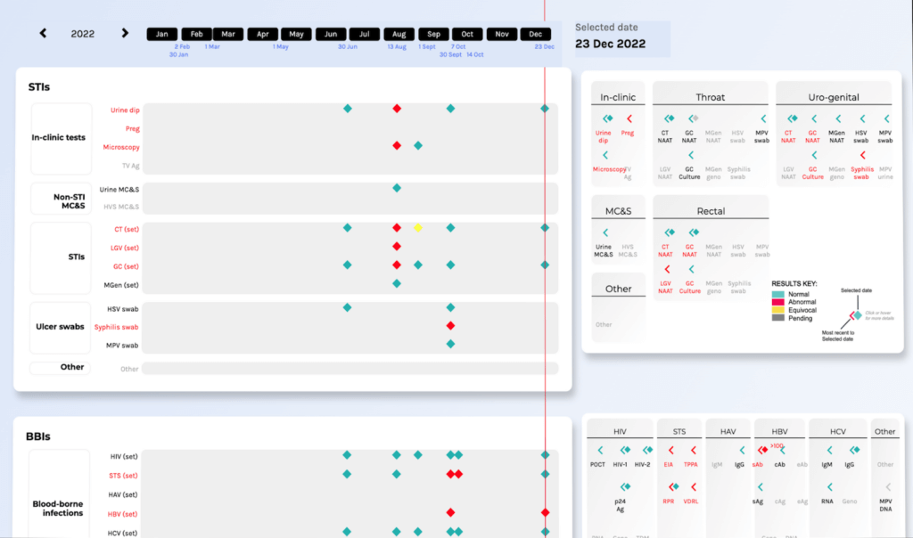
Figure 7: Partial screenshot of the STIQI showing adjacent Timeline and Detail Panels (10)
The STIQI was shaped by deep engagement with the clinician community through participatory action research (PAR), an approach that involves researchers and community members working together to generate practical knowledge about a problematic situation, and changing it for the better (25). PAR’s three primary goals are to produce practical knowledge; make that knowledge accessible through action; and effect transformation.
Towards truly trans-disciplinary collaboration
How can EHR companies, computer programmers and clinicians make EHRs better?
EHR companies need to understand the unique but (digitally) unrealised value that clinician users bring to the quality of healthcare systems. This means that as well as focusing on their quest for interoperability, they must authentically champion clinical usability. All the methods and techniques enshrined within the design lexicon will work, but these stand for nothing without user-centred, participatory approaches that actively engage the clinician user at the earliest possible design stage.
Designers looking to work with an EHR company should look for tangible examples, no matter how small, where innovation shows a clear and systematic connection to clinical practice. R&D methodology should be examined carefully. For example, does an EHR company use experimental prototypes as a starting point, or are they too heavily invested in their existing interface? Is an EHR company’s engagement with their users truly participatory, with time and workforce dedicated to user group engagement? What do they do with feedback, and does evaluation systematically loop into design outcomes?
Clinicians looking to find the optimal EHR for their specific use case should look for any resources that defragment their effort in a siloed commercial landscape. This may take the form of resources within their speciality: for example, in UK sexual health medicine, we have an EHR working group within the national speciality association, which has published consensus EHR specification requirements and a procurement tool (26). Such resources empower clinicians to voice their requirements in a language that can be understood across the EHR procurement landscape – they enable focused communication and mitigate frustration and resignation.
Relevant to all, there is an increasing number of resources that focus on the reality of implementing EHR systems, such as KLAS Research, the Health Tech Newspaper and the Digital Health Networks.
Design is the discipline that brings sufficient empathy, appropriateness and optimism to re-frame clinical usability as less of a wicked problem (27) – one that defies any standard attempt to find a solution because of multiple, contingent and conflicting issues – and more as a talented design collective. And visualisation is the common language that can support their authentic collaboration.
We’re grateful to Dr. David Pao for lending us his expertise and perspective as a physician and design researcher on the pivotal role data visualisation can play in improving patient care. If you’re looking to create a bespoke solution to your data visualisation needs, reach out to us to learn more about how we can help you do more with data.
References
- Montgomery (2005). How doctors think: Clinical Judgment and the Practice of Medicine. Oxford University Press
- Hutchison (1897). Clinical Methods. Lea Bros
- Medscape (2023). https://www.medscape.com/slideshow/2023-docs-ehrs-6016793?ecd=WNL_physrep_231206_EHR_etid6126914&impID=6126914&icd=login_success_email_match_norm, accessed on December 20, 2023
- The Nuffield Trust (2015). https://www.nuffieldtrust.org.uk/sites/default/files/2017-01/delivering-the-benefits-of-digital-technology-web-final.pdf, accessed on December 20, 2023
- Rawsthorn (2018). Design as an attitude. JRP Ringier
- Senathirajah, et al. Journal of Medical Internet Research Human Factors (2020); 7(4): 1-16
- Arndt, et al. Annals of Family Medicine (2017); 15(5): 419–426.
- Swinglehurst, et al. Communication and Medicine (2011); 8(1): 3–15
- Melnick, et al. Mayo Clinic Proceedings (2020); 95(3), 476–487
- Pao (2023). https://davepao.com/, accessed on December 20, 2023
- Powsner and Tufte. The Lancet (1994); 344(8919): 386–389
- International Standards Organisation (2018). https://www.iso.org/obp/ui/#iso:std:iso:9241:-11:ed-2:v1:en, accessed on December 20, 2023
- Gawande (2018). http://www.tramuntalegria.com/wp-content/uploads/2018/11/Why-Doctors-Hate-Their-Computers-The-New-Yorker.pdf, accessed on December 20, 2023
- Elwyn. British Medical Journal (2014); 348: 2078
- The Harris Poll (2018). https://med.stanford.edu/content/dam/sm/ehr/documents/EHR-Poll-Presentation.pdf, accessed on December 20, 2023
- Storey, et al. (2022). https://pixl8-cloud-techuk.s3.eu-west-2.amazonaws.com/prod/public/a7291891-62c7-436d-b909ce30b16f579e/NHS-Acute-Supplier-6-30-22-Presentation.pdf, accessed on December 20, 2023
- Moholy-Nagy (1947). Vision in Motion. P. Theobald
- Simon (1969). The Sciences of the Artificial. M.I.T. Press
- Nightingale (1858). Notes on Matters Affecting the Health, Efficiency and Hospital Administration of the British Army. Harrison and Sons
- Scaife and Rogers. International Journal of Human-Computer Studies (1996); 45(2): 185–213
- Norman (1994). Things that Make Us Smart: Defending Human Attributes in the Age of the Machine. Basic Books
- Zhang. Cognitive Science (1997); 21(2); 179–217
- Horn, et al. https://www.ifs.tuwien.ac.at/~silvia/linz/vu-infovis/PDF-Files/InfoVis-2c.pdf, accessed on December 20, 2023
- Cheng and Barone (1997). Learning to Solve Complex Scientific Problems. Routledge
- Reason and Bradbury. The SAGE handbook of action research: Participative inquiry and practice. SAGE Publications (2007)
- The British Association for Sexual Health and HIV (2023). https://www.bashh.org/about-bashh/publications/electronic-health-record-ehr-for-integrated-sexual-health/, accessed on December 20, 2023
- Rittel and Webber. Policy Sciences (1973); 4(2): 155–169
About Dr. David Pao

Dr David Pao is a doctor turned design researcher, having recently submitted his PhD in design at the Royal College of Art in London. His thesis, ‘How visualisation contributes to the clinical usability of EHR interfaces’, engages the clinician community through a Participatory Action Research approach to understand ‘what clinicians want’ from their EHR interface. He is a champion of trans-disciplinary collaboration (and not a fan of inter-disciplinary silos). Details of his research can be found at www.davepao.com. David lives and works in the UK.