Miriam Quick on communicating sustainability data to hard-to-reach audiences
Reading time
Category
Communicating sustainability data comes with its own challenges. Audiences may be sceptical of the data presented. Perhaps they feel apathetic, or don’t have the time to engage with it. We asked data journalist Miriam Quick for a fresh take on communicating sustainability data to new or disengaged audiences.

Stefanie Posavec and Miriam Quick – Air Transformed (2015). Photo: Steve McInerny.
Look at the chart below. It shows that average global temperatures have risen since the Industrial Revolution because of humans burning fossil fuels.
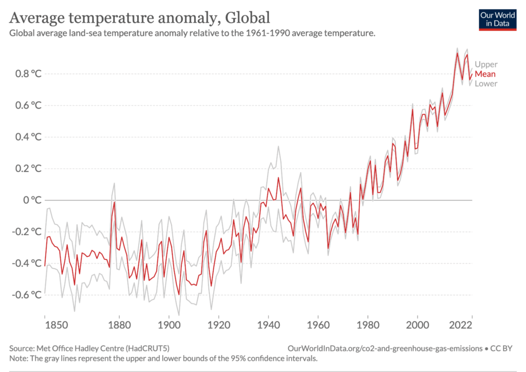
Source: Met Office Hadley Centre via Our World in Data
Unless you’ve been living under a rock for the last 20 years, you will have seen charts like this many times. The line is rising, temperatures are rising, yadda yadda blah blah. It’s easy to switch off.
Now compare the chart to the video below, which represents global temperature anomalies over a similar time period – except in sound. The siren sound represents annual atmospheric carbon dioxide (CO2 ) concentrations, and the twangy ping-pong sound represents annual average global temperature anomalies.
Which is more engaging – the chart or the sound?
I’d argue the sound. By far. There are three reasons why:
- It’s emotional. It taps into the strong associations we have between sounds and feelings, in this case the rising panic of a rising siren and the unsettling quality of plucked strings (think horror movie soundtrack).
- It’s immersive. You have to listen from start to finish to hear the whole trend. Nothing happens for ages and then, suddenly, CO2 and temperatures shoot up. There’s no snapshot overview, as there is with a basic chart, so you’re compelled to go with the pace of the unfolding data, enhancing the narrative drama.
- It’s unusual. Because it represents familiar data in an unfamiliar way, it provokes you to think about the topic of climate change as though coming to it for the first time.
The track, by composer Chris Chafe, is a sonification: a way of systematically representing data in sound, usually by mapping data variables to sonic variables such as pitch, loudness and timbre.
I love experimenting with novel and unusual ways of representing data like this. And I’m passionate about engaging new, hard-to-reach or ‘difficult’ audiences with data on climate change and environmental issues.
That might mean audiences who are unfamiliar with data or science (or even suspicious of it, such as those who still doubt human-caused climate change). It might mean children. Or it might mean the time- and bandwidth-poor. That’s most of us, at least some of the time!
In fact, I believe these two things go together: that representing sustainability data in novel, unusual or creative ways can help actively engage these harder-to-reach audiences.
If you’re looking to use data to drive action on climate change in your organisation, but you’re facing the apathy, disengagement or resistance that’s so common whenever these issues are raised, then you may be wondering how on earth to break through these barriers and reach people.
Here are five strategies that may be helpful when presenting environmental data to employees, customers, clients and other stakeholders.
- Make data tangible
Sustainability data often represents real ‘stuff’ – carbon, energy, water. But data can seem abstract, especially when it sits in a spreadsheet. One way of making it feel more concrete and real – and so important – is to transform it into something people can literally touch and feel.
Back in 2015, artist Stefanie Posavec and I created Air Transformed – two sets of wearable data objects based on air quality readings from sensors in Sheffield, UK (currently on show in Bletchley Park’s Art of Data exhibition).
Three pairs of glasses represent average pollutant levels on three days, with each of the three lenses on each pair representing a different pollutant. Etched on the glasses are patterns that increase in size the higher the pollution readings were that day. When you put the glasses on, these patterns blur. On bad air days, the lenses are hard to see through.
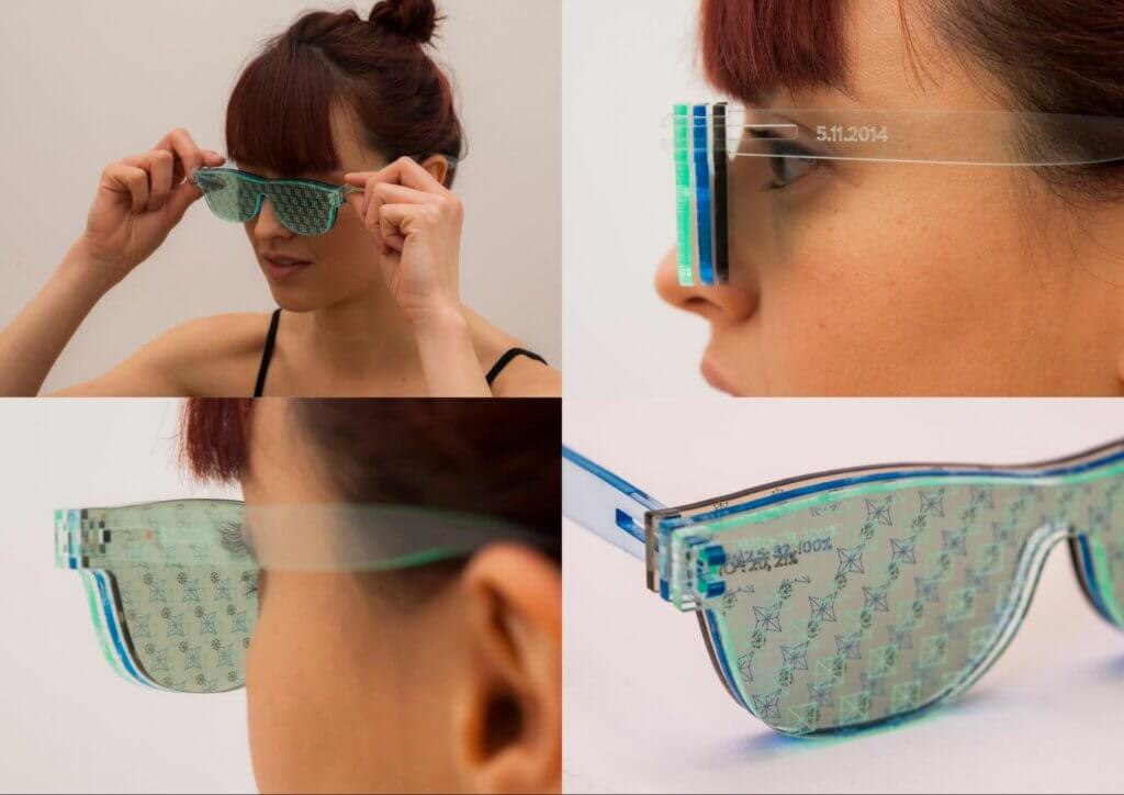
Stefanie Posavec and Miriam Quick – Air Transformed (2015). Photo: Steve McInerny.
We also made three sets of necklaces, each representing a week of particulate matter (PM10) data and having 28 beads, each corresponding to a six-hour period. The larger, spikier, and brighter the bead, the worse the air was. The big spiky beads are sharp to touch, and the necklaces sit heavily on the chest, mimicking the damaging effects of air pollution on the heart and lungs.
Here’s a visual, tactile representation of the impact of the week of Bonfire Night on local air quality.
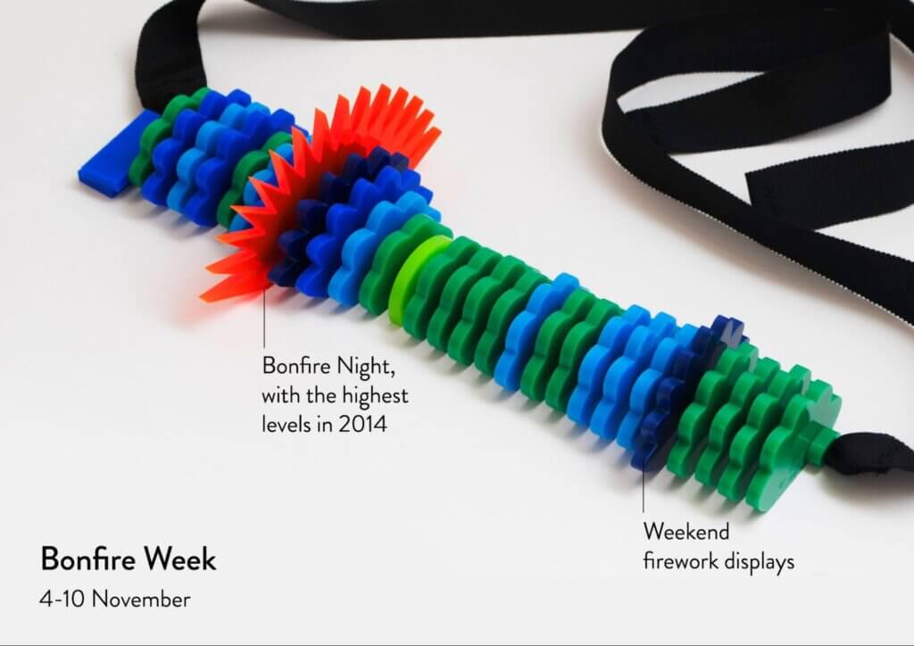
Stefanie Posavec and Miriam Quick – Air Transformed (2015). Photo: Steve McInerny.
While these were physical artworks, you can also make data feel more tangible using visuals alone: by connecting it to people’s everyday experience.
A classic example is found in Real World Visuals’ Carbon Majors report from back in 2013, which featured realistic illustrations of drinks cans branded with logos of oil giants such as Chevron, Exxon and BP. The cans are shown filled or part-filled with carbon dioxide to represent, by volume, exactly how much CO2 is in the air of a typical small room because of these companies’ activities.
These innovative visualisations work so well because they represent abstract, hard-to-relate-to numbers (atmospheric carbon dioxide concentrations, cumulative emissions) in relation to a quantity most people know well – the volume of a regular drinks can.
2. Keep it simple (if you can)
Last year, I was commissioned by an arts organisation in Bristol, UK to make an artwork based on air quality data gathered by citizen scientists as part of a project called Slow the Smoke. The goal was to engage the local community with an air quality campaign, mostly people without a data or science background, and no special interest in air quality other than living nearby.
I decided to make a musical sonification of particulate matter levels (PM10) in Bristol over the previous year. I mapped the data to a drone that gets louder and harsher the worse the air quality at the time. The drone plays alongside a dub- and dancehall-influenced track, with vocals by talented Bristol artist T. Relly, at times almost drowning out the music.
Bristol Burning (2022). Music: Miriam Quick and T. Relly. Video: Rosana Warshawski and Esme Rose Warren. Commissioned by Knowle West Media Centre.
I started with a dataset of over 300,000 hourly air quality readings from various sensors. After experimenting with sonifying daily and weekly averages, I eventually stripped out almost all the detail and sonified just 12 data points corresponding to average particulate levels for each of the previous 12 months, from August 2021 to July 2022. This showed a broad seasonal trend: pollution is worse in winter, so the drone gets louder and harsher in the middle of the track and fades out towards the end.
This approach would not satisfy an audience of scientists looking to analyse air quality, but it worked very well for an audience of local people: when we played the track at community events in Bristol, many people told me that they had been unaware of this seasonal fluctuation before.
Tailoring the complexity of your data representation to your audience’s level of expertise is a good idea. And sometimes, simple is best.
3. Innovate with your format
Before you rush to make a bar or line chart, stop. Think. Is this the most effective way of presenting my data? Or will my audience switch off instantly?
There are many ways to represent data in static charts, from the familiar to the weird and wonderful, and they all suit different types of data. But would your data be better represented as a scrolling story, an animation, a video with voiceover, even a game? Time spent experimenting to find the most impactful visual format is well spent.
Ed Hawkins’ Climate Stripes graphic is famous because, like Chris Chafe’s sonification, it finds a new and surprising way to represent all-too-familiar temperature data.
You could even think beyond visuals. Data can be represented through all the senses – sight, sound, touch, and even taste and smell. While baking data-driven cakes might be taking it a bit far, communicating data in a non-visual way can circumvent people’s usual defences (apathy, disengagement, resistance), encouraging them to think about your topic afresh.
Sustainability data can require some scientific knowledge to understand, and sonification can be valuable here, by helping to overcome data communication barriers caused by audiences’ lack of scientific literacy or numeracy. Sonification can create “an alternate way to engage with complex scientific data”, say the authors of a 2020 study. While sonification isn’t suitable for every data project, it can be a valuable part of your communication toolkit.
In our podcast Loud Numbers, Duncan Geere and I explored the capacity of sound to tell data-driven stories using audio only. In the first episode, The Natural Lottery, we sonified 100 years of climate data in a techno track. The higher the chords, the earlier the ice melted on a particular Alaskan river that year.
Multisensory representations of data can be even more engaging. Research in cognitive science shows that when people take in information from many senses at once, and when that information is integrated (for example, sound and visuals correspond to one another), they learn faster and remember better – by up to 80%. In practical terms, this could mean representing data using both sonification and animation, as in these Covid data projects from the BBC, Noah Wall, and Duncan Geere and Valentina D’Efilippo.
4. Create an experience
When visualising data, we typically think we’re transforming numbers into things – charts, graphics, dashboards. But thinking in terms of creating rich, data-driven experiences instead can help reach new audiences.
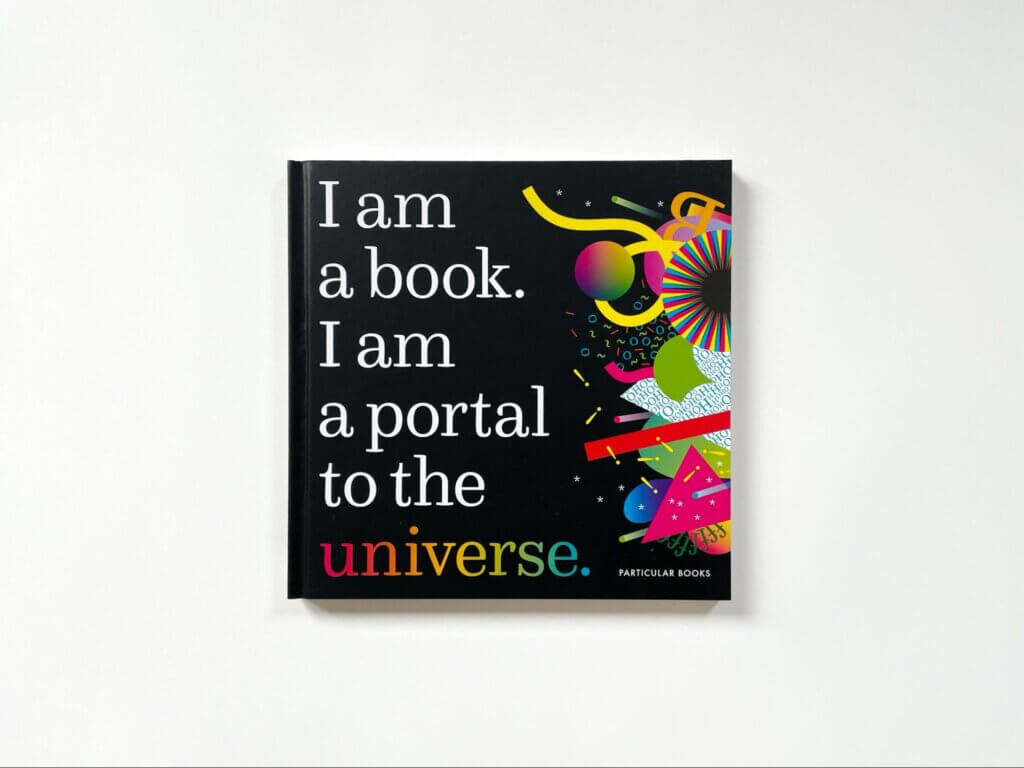
Stefanie Posavec and Miriam Quick – I Am a Book. I Am a Portal to the Universe. Photo: Stefanie Posavec
My book I Am a Book, I Am A Portal to the Universe, written with Stefanie Posavec, is a book based on data. But there isn’t a single chart in it. The book was written for people who would never pick up a book with ‘data’ or ‘science’ in the title. In fact, the word ‘data’ only appears in our author biographies.
Bravo Stefanie and @miriamquick. Somehow I managed to buy your book and make it a couple of pages into it before realizing it was a science book. Imagine my delight. I’m glad it’s getting recognition and more exposure. May it have a long (shelf) life!
— Voilà: Francis Gagnon (@chezVoila) December 1, 2022
Instead, all the data is embodied by the book itself on a 1:1 scale. In one spread, you are invited to hold the book up to the sky, at arm’s length, and imagine the 6,000 billion billion (or 6 quadrillion) stars lying behind the footprint of its two pages.
In another, we count the relic neutrinos (tiny subatomic particles left over from the Big Bang) floating through the book’s pages, based on its volume.
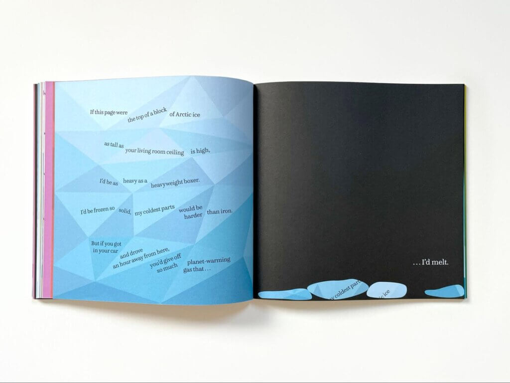
In another, we calculate how far you’d have to drive in an average car to produce enough CO2 to melt a block of Arctic sea ice with a top the same area as a single page.
Stefanie Posavec and Miriam Quick – I Am a Book. I Am a Portal to the Universe. Photo: Stefanie Posavec
I Am a Book is a book about our environment. There are spreads on sea level rise and every aspect of the living world. We wanted to engage people’s natural curiosity about the universe around them and create intrigue for science – among adults as well as children. By reimagining the traditional format of the book, we hoped to inspire people to look at familiar things in a new way.
And by reimagining the ways you can present data, we hoped to inspire people to think about data in a new way. We wanted people to experience the data, not just read about it! It’s a book you interact with – by picking it up and dropping it, wearing it as a hat to feel its weight, slamming its pages shut to hear the sound, even sticking your tongue out to compare its length to that of a butterfly.
Feedback we’ve received so far suggests we succeeded in these goals. I met a man who worked in government and was inspired by our approach to data. It was going to ‘change the way they do things’ in the office, he said. Whether or not it did, it was a lovely thing to hear.
I just devoured @miriamquick book "I am a book. I am a portal to the universe." How amazing is this book?? Well I snapped it shut at 100 decibels, put it on my head, looked at a billions of stars through it and used it to measure my tongue!
What an experience!!— Lud (@lud_wyg) October 8, 2022
“Somehow I managed to buy your book and make it a couple of pages into it before realising it was a science book.” – Francis Gagnon of Canadian sustainable information design studio Voilà.
“Well I snapped it shut at 100 decibels, put it on my head, looked at a billions of stars through it and used it to measure my tongue! What an experience!!” – Twitter user @lud_wyg
5. Adapt this advice to your own situation
You might be thinking: ‘Fine, but I’m not an artist, I work in finance.’ Data art projects like these are great for showing what’s possible, but you don’t have to do something so out-there. Not all data is suited to creative representations. Sometimes you need to communicate quickly, efficiently and precisely, using familiar formats.
So adapt all the above advice to your own circumstances. For example, innovating with your format might mean making pencil sketches of data visualisations before using a computer, so you’re thinking outside the box of possibilities offered by your visualisation software. Even if the visual solution you eventually choose is a conventional one, you will have explored the options to make sure it’s the right one for you.
Making sustainability data tangible might simply mean getting a smart meter for the office, with a dashboard so that employees can see their energy use in real time. Or it might mean making quantities relatable in your data-driven communications by always converting them to a human scale, such as water use per person per day. Or by expressing abstract quantities like carbon emissions in everyday terms, such as equivalent distance travelled in the average car.
Creating an experience with data might mean thinking about how to better control the pace and flow of information in a slide deck of charts, by weaving them into a narrative. And keeping it as simple as you can is advice everyone in communication should be following anyway!
Ultimately, this is about making environmental data accessible to as many people as possible. If you’re stuck for inspiration or trying to reach audiences without success, try something different. By thinking outside the box and taking an innovative approach, you can inspire action.
We hope you feel inspired by Miriam’s tips on how to think outside the box when visualising the data at your disposal. Do you need to take your data products to the next level? Be part of our data-led innovation lab and partner with us for FutureFridays™.
About Miriam Quick

Miriam Quick is a journalist, author and musician who explores novel and diverse ways of communicating data. She is the co-founder of the Loud Numbers data sonification studio. Her book, ‘I am a book. I am a portal to the universe.‘ won the Royal Society’s Young People’s Book Prize 2021.