This week we have an ICYMI with a twist. Delighted to be longlisted in The Information is Beautiful Awards we present you with our favourites from the data visualisation category. Now in its fourth year, the standard of entries has never been higher, and picking just 8 our favourites was difficult enough. We certainly don’t envy they job of the judges as they whittle down the list even further. But for now, these are the team’s top picks…
Ben’s top picks
Lightyear.fm – a journey through space, time & music
Mike Lacher, Brian Moore, Chris Baker, Mika Chernov
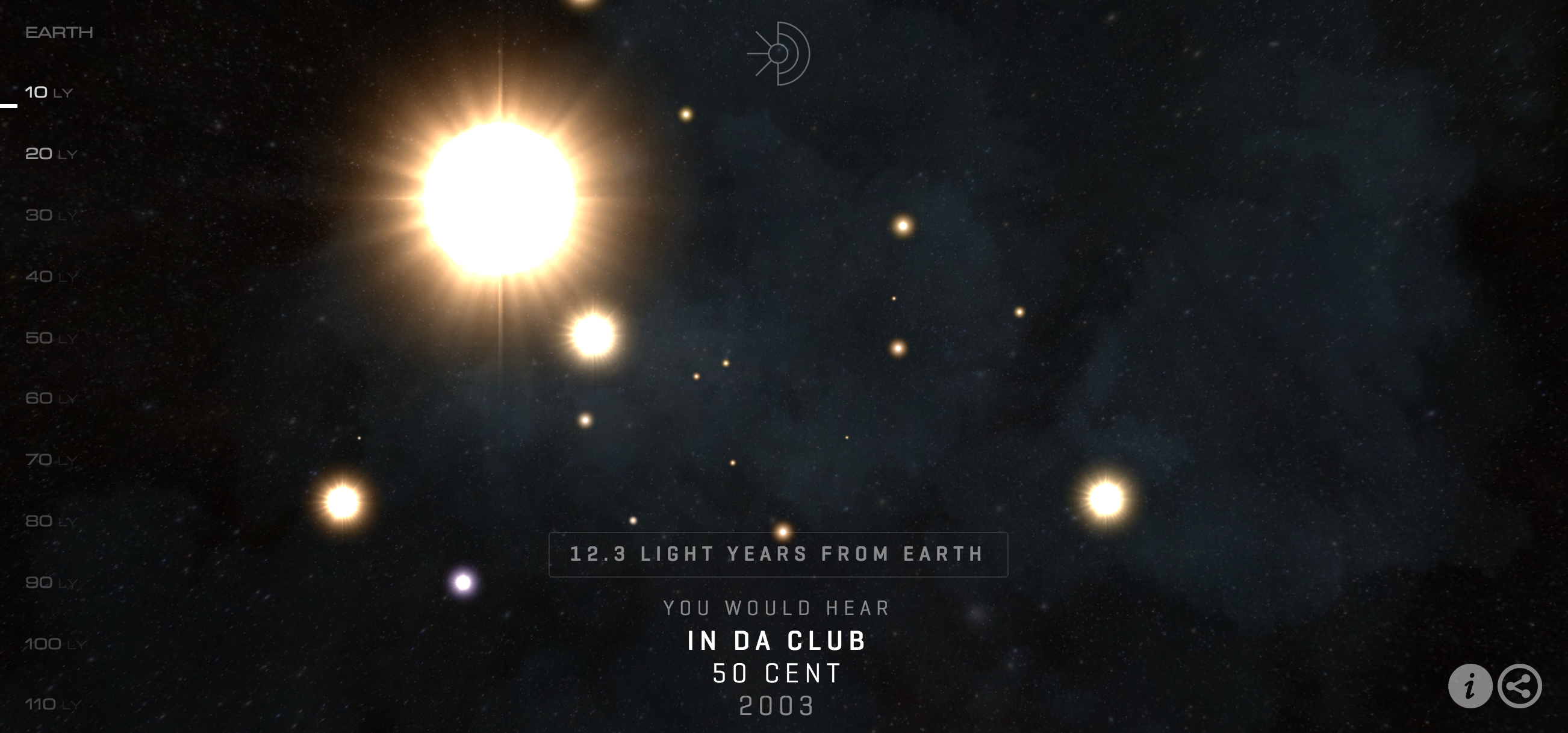
The Information is Beautiful Awards longlist contains many fantastic data visualisation entries this year, but this one shines particularly brightly. We first stumbled across Lightyear.fm back in July, showcasing it in volume 25 of our weekly ICYMI, and we still think is light years ahead of anything else we discovered since. We are treated to a cosmic journey covering 120 years of musical hits, and at the same time we learn just how expansive our own Milky Way is. In fact it will take many more hundreds of years before our first radio broadcasts reach the far corners of our galaxy, despite traveling at almost 300,000 km per second. We think you’ll agree, it is simply out of this world.
infogr8

Anyone who has seen the Life On The Limit documentary will know just how dangerous the world of Formula One was in the early days. With 11 driver fatalities in the first decade alone, drivers were risking their lives every time the took to the starting grid. Various safety improvements that were implemented in the years which followed have drastically cut the number of drivers who lost their lives, however the recent death of Jules Bianchi in 2014 reminds us that risk has not been entirely removed from the sport.
As avid racing fans, the team here at infogr8 recently shifted through piles of datasets to learn more about the history of the sport. By visualising driver career achievements, team, championship position and the race circuit where they finally came to the end of the road, we can see some intriguing stories. Senna had a career which eclipsed all others, with more wins than all the other unfortunate drivers combined. The only other world champion was Jochen Rindt, although he never knew he would ultimately take the title, as he died with four races to go. Other trends in the safety of F1 are enlightened here, and we are reminded how much these brave drivers were willing to risk to be crowned champion.
David’s top picks
Our Own Thing

There are 4.7 Billion adults that share the World’s $236 Trillion wealth between us, when we do that math that means each of us could have a share of $56,000 but as well all know thats not how the world works. That’s why I personally love this piece from Our Own Thing we’ve all heard and read the sensationalist headlines ‘1% of the world population hold 99% of the Worlds wealth” but its not until you actually see these claims visualised that it really starts to hit home. We have featured this in our ICYMI Vol.14.
The duo paced this data visualisation to be a engaging story, revealing the data step by step stating on a home screen depicting 4 equal quadrants with containing varying piggy-banks, over-feed or starved depending on if they represent the larger individual wealth greater than 1M and those worth $100k-1M, or the lower end of earning between 10K-100K and the measly less than $10K quarter. Clicking the screen then transforms the 4 quadrants of the tree-map as they resize to represent, first the percentage of the population that fit into those categories and then on another click the tree-map visualises how is the world’s total wealth divided between these groups. This all leads into a map that shows where they worlds wealth is, with clickable info points containing interesting facts about wealth around the globe. Insightful, engaging and relatable, with a clean design and art style ‘Who hogs the worlds wealth’ is the complete package.
Adam Peace, Blacki Migliozzi (Bloomberg Graphics)

While internet providers and services are obsessed with laying down as much cable as they can in a bid to get the world online another is looking to the skies, deemed the new space race Greg Wyler’s first space Internet startup, O3b Networks, has positioned a ring of satellites in medium-earth orbit around the equator—high enough to cover large portions of the planet, but not so high to make apps sluggish. The idea is to connect the unconnected, and as someone who has lived in many different areas with different levels of cable internet services ranging from slow to non-existent this is definitely something i’m taking interest in. To support the article the graphic team members Adam Peace and Blacki Migliozzi at Bloomberg created an incredible animated globe with orbiting satellites to show the increase in O3b Networks satellites from 4 in 2013 to 12 in 2014. The styling of the visualisation is very reminiscent of early low-poly video-games like Asteroids or Battlezone , with the Satellites showing the areas they cover by sparking lines off to the globe as it rotates in-front of us. This then leads into another globe graphic that reveals O3b Networks future plans of launching 648 Satellites into low-earth orbit by 2018. With its retro styling, smooth animation and clear informative pacing, I find ‘The New Space Race’ by Bloomberg graphics a truly engaging offering.
Maria’s top picks
Kevin Wu

If you are like me, you probably go to IMDb to check ratings before you commit your time to TV Series bingeing. The site offers several layers of information as it covers everything from cast to storyline. But have you ever wondered which specific episodes triggered the most popularity? Kevin Wu created a very simple interactive data visualisation to give you the answer.
Graph TV is a nifty tool that lets you dive a little deeper into the data behind every TV episode ranked on IMDb – you can find patterns in the shows quality.
My first inquisitive search started with Two and a Half Men. The results were as I expected – from strong, stable ratings of 8 points on average, the series have dipped since Charlie Sheen was fired with his tiger juice in tow and Ashton Kutcher stepping in as a replacement. The show had taken a different direction, struggling to keep rankings high. Then I dived into the best of the best obviously – Game of Thrones. No surprise there, the show is continuously breaking records, series after series. What is really interesting though is spotting the highest rated episode each season, with Hardhome of Season 5 peaking at 9.8! No winter for these guys!
The Vocal Ranges of the World’s Greatest Singers
Distilled

You would expect evolution to have effect on all our senses and capabilities. But have you ever wondered how vocal ranges have evolved over time? This stunning piece from Distilled we tweeted a while back, cross references wealth of data from the Rolling Stones magazine, Billboard and The Range Place forum bringing you the vocal ranges of World’s Greatest Singers. The execution is delightful and you can explore the songs signers have hit those notes. It would have been even better if the viz integrates with Spotify and you can hear those songs on the spot. Just a thought for the next one Mark Johnstone! 😉
Aaron’s top pick’s
South China Morning Post

We spotted and highlighted the China overseas investment visualisation, in Vol14 of our ICYMI series it stood out for me then so I’m glad to see it made the IIB Awards 2015 longlist. Chinese economy, now worth $17.6tn, has overtaken the US and knocking it off the top spot, a position it has held for more than a century. It is to be expected then that Chinese companies are looking to expand through mergers and acquisitions of their oversees counterparts. This data visualisation from the South China Morning Post displays attempted transactions – both successful and failed – of Chinese companies into foreign organisations over the last decade. With deals visualised according to size, country and sector, we can gain a real insight into the shifting investment patterns of the world’s biggest superpower.
Robin

Robin’s visualisation of her dating life to date stood out for me this year, purely for the share effort to record the data. As an avid fitness fanatic, recording and monitoring my activities has always been a must. After all were all slowly coming to the realisation of the benefits of the a quantified life. However, Robin’s piece visualised her dating history. The results weren’t particularly insightful, but the fact she recorded all these interactions over a long period manually (I presume) is certainly an impressive feet. You can see how her history breaks down by established relations in purple, casual relations in green and first dates presented in black. The darker shades of green and purple present the days when Robin actually met the lucky boy in real life. I do wonder how this would looking if millennials were asked to unveil their dating history over the past 8 year especially with the introduction of Tinder and PoF.
What are your picks? Tweet us @infogr8!