Musical Map: Cities of the World
Spotify insights
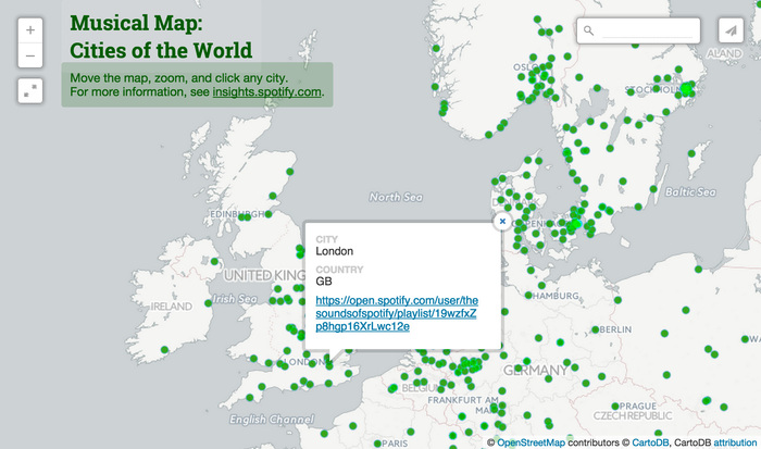
The world is a very diverse and individual place when we travel to a different country we don’t just go to have the same experiences, as we do every day. We visit different places to experience things we cannot at home, whether it be food, geography, culture or the people that make somewhere distinctive. Spotify, one the world largest music streaming services, has taken this principle and applied it to the music that people listen to that makes their city distinct. What do they mean by distinct? Well by analysing approximately 20 billion listener/track relationships, the clever people over at Spotify have looked at what music was popular in a particular city that wasn’t popular in other cities at all. Meaning the music that makes that city unique. They then plotted the results to the related cities on an interactive audio map of the world. Clicking on a city will bring up a link to a playlist containing the songs that make that city unique, in comparison to the others around the world. Go have a look and see what music makes the city you live in unique about the rest of the world.
Rodales Organic Life

The Sun is out, and so are the BBQ’s! You can smell the mouth-watering aroma of grill masters at work floating from back gardens all across the country, and when it comes to BBQ condiments, ketchup is king. Burgers, chips, and countless other meals are smothered in the condiment every day here in the UK and around the world. If you are looking for your ketchup to turn heads at your next BBQ, look no further than this fantastic Infographic from Rodale’s Organic Life, designed by Stephen Wildish. It shows you how to spice up any Ketchup by adding a variety of healthy ingredients, creating exciting table sauces that wouldn’t be out of place in any restaurant or cool pop-up in Shoreditch!
How Men Dominate The U.S. Media Landscape
Forbes business

Slowly the gender wage gap is being closed, and while there is still a disparity between what men and women get paid for the same job there never has been a time when the gap has been closer. A gap that is continuing to shrink with each passing year. Everyone should have the right to equal treatment and pay in the workplace, but what about equal representation? In an article by Forbes this week, they present an infographic showing the shocking lack of female reporters in America’s media landscape. According to the Women’s Media Centre 63% of all byline credits are attributed to men across print, television and online media. This disparity is even more evident when concentrating on select media outlets themselves. The infographic illustrates that in most media outlets female reporters very rarely out number men in any given sector with one of the worst being sports reporting, where 9 out of 10 of the people reporting are male. In comparison women just manage to break even when it come to reporting on health and religion and just edge it past men when it comes reporting on education.
#GameChangersIBM Wimbledon round-up
IBM
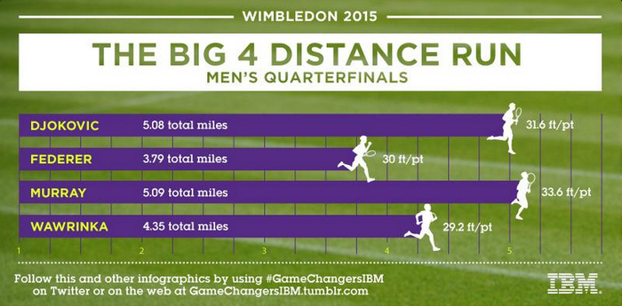
Regular readers of our weekly ICYMI posts will have seen a trend over the last two entries, a healthy amount of Wimbledon tennis news! Well now the tournament is well and truly over, and what a tournament it was! Between Serena Williams completing her goal of holding all 4 of the grand-slam single titles in a single year, or the incredible display by Novak Djokovic to claim Wimbledon goal over Roger Federer there was no shortage of exciting tennis or statistics. Anyone who was paying attention to social media, like us, throughout the competition, will have come across the #GameChangersIBM hashtag and the wonderful bitesize data-vis posts they were sharing throughout the competition. Using their real time data,IBM shared bitesize match stats relevant to what was happening as we watched it. What more they uploaded all of these posts to their Tumblr site so you can see all of the bitesize infographics they shared throughout the competition. Check out how much distance Djokovic ran on his way to the title, or who out of the top four had the highest percentage of first serves in play. There are plenty of statistics to pour over for anyone missing their tennis fix.
The New York Times
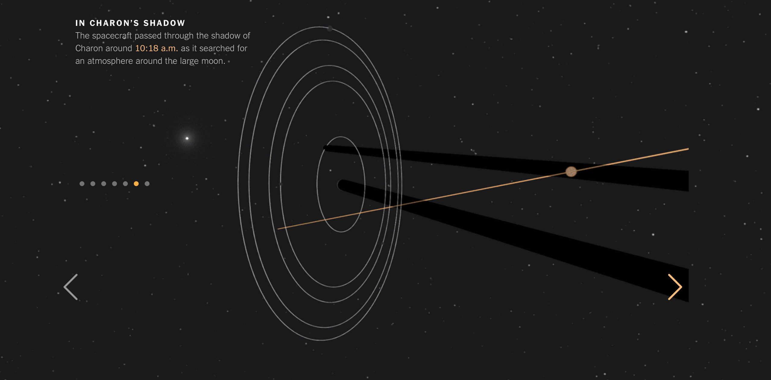
This week the world gazed towards the Kuiper belt as NASA’s New Horizons spacecraft beamed back incredible images of everyone’s favourite dwarf planet. Until now, Pluto has remained somewhat of a mystery. We could only squint at blurry telescope images and imagine what this alien world would look like, but New Horizons has captured some incredibly detailed pictures during its flypast. The New York Times produced an illustrated guide to explain what happened during the final approach, and how the spacecraft was able to study the atmosphere of Pluto and its closest moon by passing through their shadows. The photographs were breathtaking enough, but we were even more impressed after learning how precise NASA needed to be to complete this incredibly complex mission.
Lightyear.fm
Mike Lacher, Mika Chernov, Brian Moore and Chris Baker

For all we know, extraterrestrial life could be tuning in right now to Earth’s radio stations. Those living 50 lightyears away would almost certainly be rocking to the Stones and The Beatles about now, but will have to wait another four decades to sample the audio delights of Justin Bieber. In fact, the Milky Way is so enormous it will take many more hundreds of years before our first radio broadcasts reach the far corners of our galaxy despite traveling almost 300,000 km per second. To help put this into perspective, Mike Lacher, Mika Chernov, Brian Moore and Chris Baker have created Lightyear.fm, an interactive that takes us on a cosmic journey covering 120 years of musical hits. We think you’ll agree, it is simply out of this world.
What is the World’s Deadliest Animal?
GOOD
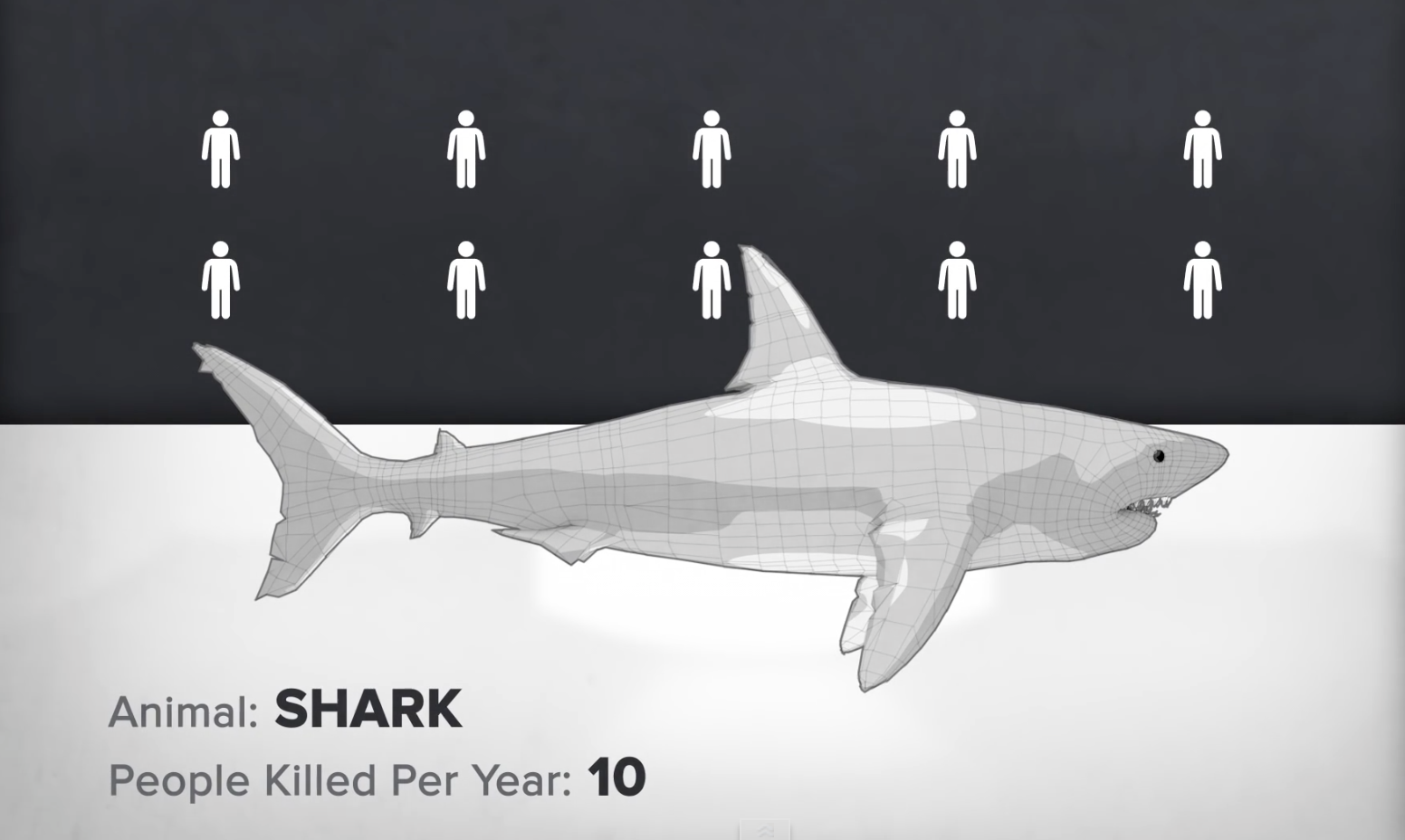
It is often said that we are born with only two fears, of falling and loud noises. Other fears are acquired through life experiences, leading some people to develop some rather bizarre phobias. Take sharks for example. They may look dangerous, but they are only responsible for around ten human deaths per year. These people should probably reconsider their priorities and shift their suspicions to the devious freshwater snail, a silent but deadly assassin that claims 110,000 human victims every year. GOOD have produced a handy animation to highlight some of the stats that will no doubt help us stay alert on our summer hols. If there’s someone you care about that refuses to swim for fear of sharks, but happily sleeps without a mosquito net, you may want to show them this video before they travel.
Lifeboats
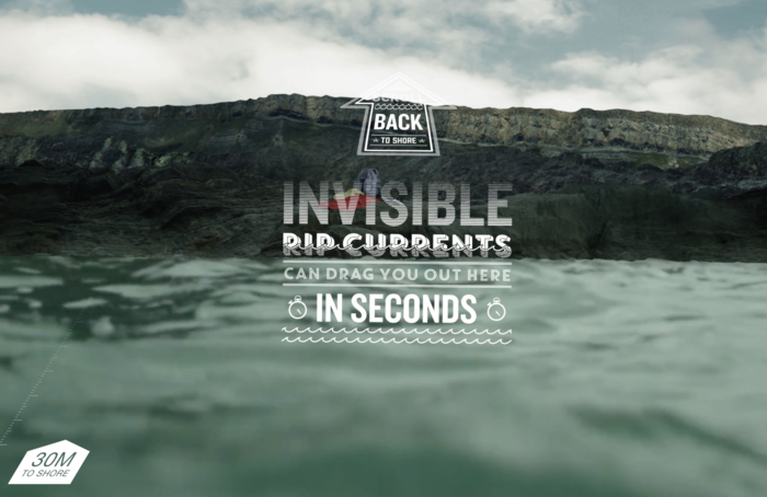
You may consider yourself a competent swimmer, but how well would you cope if you found yourself fighting rip currents while swimming around the British and Irish coasts? Even an Olympic swimmer would be powerless against their force, which could explain why 200 people die accidentally every year around our shores. To help us experience what it would be like, the Royal National Lifeboat Institution have produced an immersive interactive that challenges us to get back to land after being swept away. Just when you think you are making progress, you are dragged under and find yourself battling with a tone of water on top of you. It’s enough to make us want to stay away from Mother Nature entirely, next time a swimming pool will suffice.