Richard Silvester
May 1, 2015
Financial Times
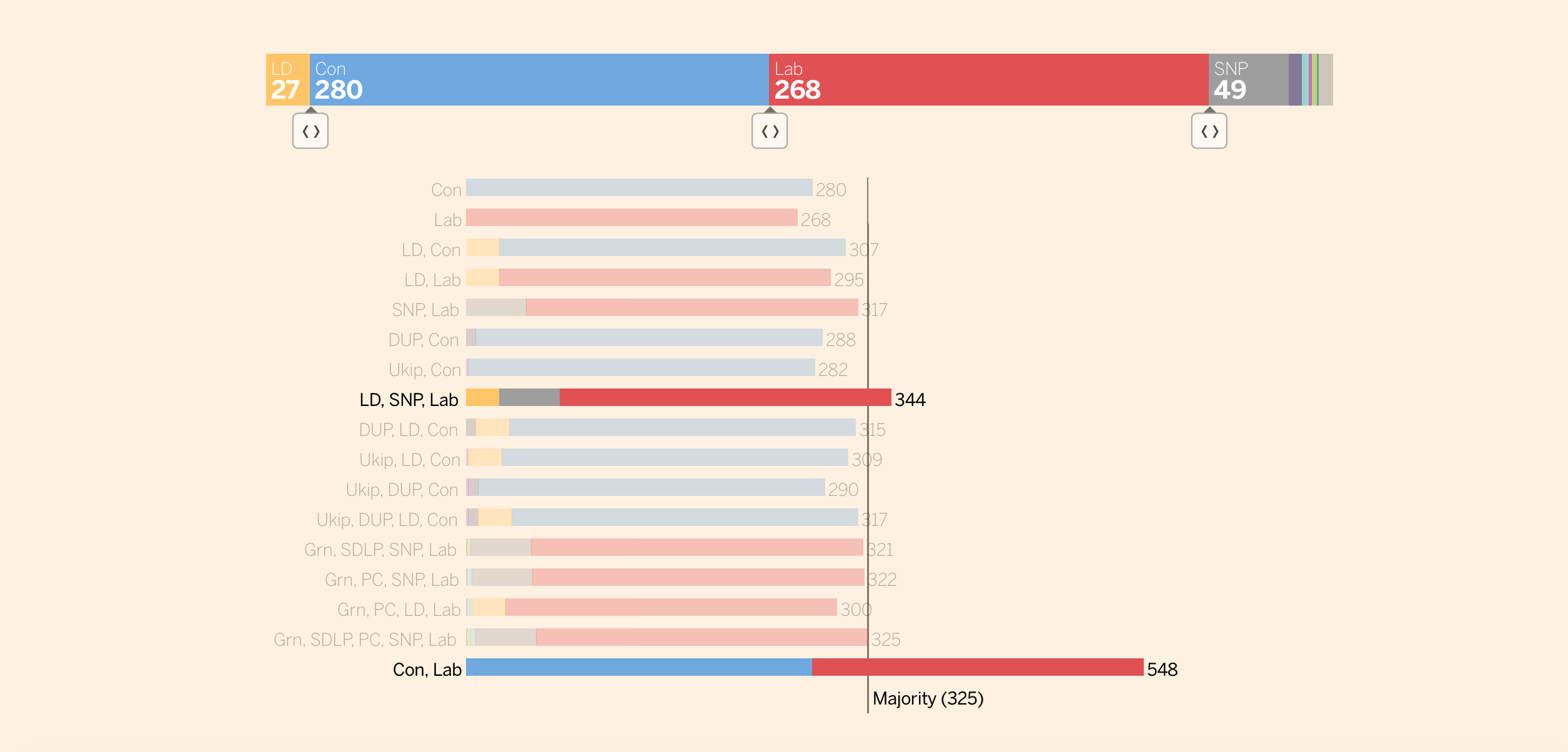
As we enter the final week of campaigning, the polls still suggest that the UK general election on May 7 will result in a hung parliament. The idea of a coalition government may have caught many by surprise in 2010, but this time we are well and truly prepared. This is partly thanks to media groups like the Financial Times who have produced an interactive tool which allows us to experiment and see how possible governments could be formed from a combination of parties, should no one reach that magical majority of 326 seats. Now all we need is someone to create an app which would allow us to determine who to tactically vote for in order to keep our least favourite party out.
1000Heads

Once again the world can’t sustain its excitement about the new royal baby coming any day now. 1000 heads have compiled a handy infographic if you are interested to see how the conversation is developing on social media. We can only assume these numbers tripling once the princess (or prince) is born.
Was the Nepal earthquake twice as big as we thought?
Quartz

This author clearly recalls the traumatic events of 27 February 2008 when an earthquake measuring 5.2 on the on the Richter scale shook the city of Lincoln in the UK, causing untold damage to loose roof tiles across the city. With a magnitude of 7.8, the earthquake which recently left Nepal devastated may not sound all that different, but the damage here was on a different scale completely. This is because the Richter scale is logarithmic, and an infographic from Quartz helps puts this into perspective by comparing tremors of different sizes. Magnitude 5.2 suddenly feels a lot less sensational.
Infographics the new CTA in email marketing?
Marketo

A trend we’re seeing more of, infographics being the big and only CTA on mail campaigns. It makes a lot of sense with our inboxes being overflowed nowadays, email marketing taking a new shape adopting towards visual content: serving insight in a snappy digestible way, instead of the copy leading.
South China Morning Post

Last year it was reported that the Chinese economy, now worth $17.6tn, has overtaken the US and knocking it off the top spot, a position it has held for more than a century. It is to be expected then that Chinese companies are looking to expand through mergers and acquisitions of their oversees counterparts. This data visualisation from the South China Morning Post displays attempted transactions – both successful and failed – of Chinese companies into foreign organisations over the last decade. With deals visualised according to size, country and sector, we can gain a real insight into the shifting investment patterns of the world’s biggest superpower.
Beautiful maps drawn by Flickr data
Mapbox

We were instantly drawn by these beautiful maps. The magic lies in the data behind the drawn paths: Mapbox have used open source data from Foursquare, Flickr, Evernote, Square, to crate the most visited locations in iconic cities. You can zoom and and explore the paths, we’d like to see this over-layed on Google Maps to add context. Anyway, have a stroll and feast your eyes.
Our Own Thing

If the world’s wealth were divided equally, we would all own £36,000. It probably comes as little surprise that this situation is far from reality, in fact half of all adults have less than £2,400. This interactive from Our Own Thing reveals this and further insights, including where all those fat cats live. Or perhaps that should be fat pigs…
Eurovision song contest 60 years
European Broadcasting Union
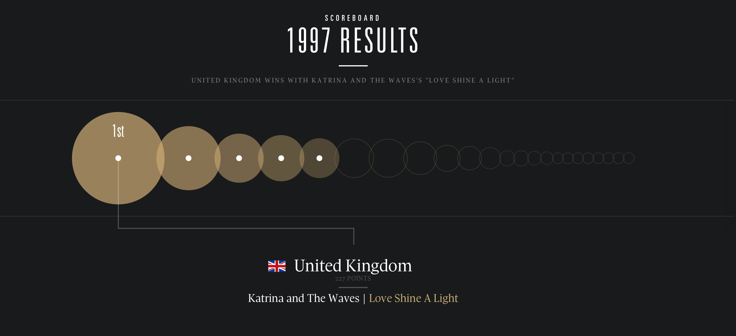
Eurovision fever is fast approaching and we can hardly contain our excitement. This years song contest will be coming live from Vienna on May 23, and we will all be cheering for Electro Velvet who are representing the UK. For those who have not been following as keenly as ourselves, the organisers at the European Broadcasting Union have put together a rather handy guide detailing every event since it began almost six decades ago. Within it are photographs, videos and data visualisations showing points awarded, so we can all relive the glory days when Katrina and The Waves lead the UK to victory in 1997 as if it were yesterday.
We’re hiring! Several new awesome roles within the infogr8 family including account management, information designer & web development.
Soho Works White City,
Television Centre,
101 Wood Lane,
London,
W12 7RJ