Best of Data for Everyone, February 2024: Drivers, birders, and digital nomads 🕊️
10 mins
Reading time
Reading time
all
Category
Category
Each month we share some of the best dataviz the world has to offer.
On the menu this month:
- Risky Business? The 7 Indicators of Shell Company Risk by Moody’s Analytics
- 2023: Birding’s Bounce-Back Year by Jer Thorp
- Global Coal Countdown by Bloomberg Philanthropies
- Applying for Spain’s Digital Nomad Visa by Amber Lee Fawson
- A wide ideology gap is opening up between young men and women in countries across the world by the FT
- Countries that drive on the right or left by Damola Ladipo
Risky Business? The 7 Indicators of Shell Company Risk by Moody’s Analytics
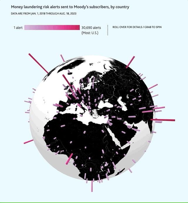

- Intro: This is an excellent investigatory data storytelling piece from Dan Grunebaum and Moody’s Data Story Team, putting together some fascinating insight and analysis into the phenomenon of shell companies, and shining a light on the risks associated with them.The story unfolds over a number of tabs, diving deeper into the occasionally murky waters surrounding the incorporation of shell companies. For example, did you know there are over 22,000 companies registered at the Giza pyramid complex in Egypt?The story is generously sprinkled with fascinating tidbits of information, and is well worth 10 minutes of your time to follow through to its conclusion. And the interactive globe on the opening screen is a joy to behold.
- Why it matters: Shell companies are a complex topic, having been thrust into the public consciousness around the time of the Panama Papers. They’re often associated with nefarious activities, particularly around tax evasion and avoidance. And while it’s true that there are genuine, legitimate and legal reasons for shell companies to exist, it’s also healthy to acknowledge that it’s high risk. This story breaks down those risks through the use of beautiful data visualisations and gives the reader a helping hand in what to look out for.
Birding’s Bounce-Back Year by Jer Thorp
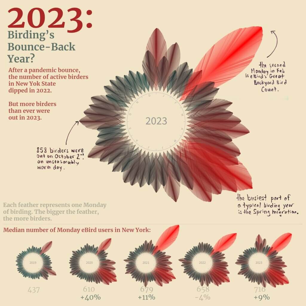

- Intro: Jer Thorp has created a visualisation looking at the incredibly vast data from the eBird API. He highlights a huge boost in birders after the pandemic, but a 4% drop of active birders in New York in 2022. However, 2023 has seen more birders than ever, so with Spring fast approaching, what will 2024 look like?
- Why it matters: I’ve been thinking a lot lately about imagery within data visualisation to help the reader instantly understand the context, trends and impact of the data. Before reading anything on this graphic, I instantly knew it was about birds with the clever use of feathers to show the data. The colour and size made it effortless for my brain to quickly summarise the trends and understand the overall takeaways. The further subtle touches with handwritten text make this feel friendly – almost like a birdwatcher’s notebook. This was simple but so effective: it instantly got me thinking about my own birdwatching and how this sort of data imagery could be used to the same effect for other subjects.
Global Coal Countdown by Bloomberg Philanthropies
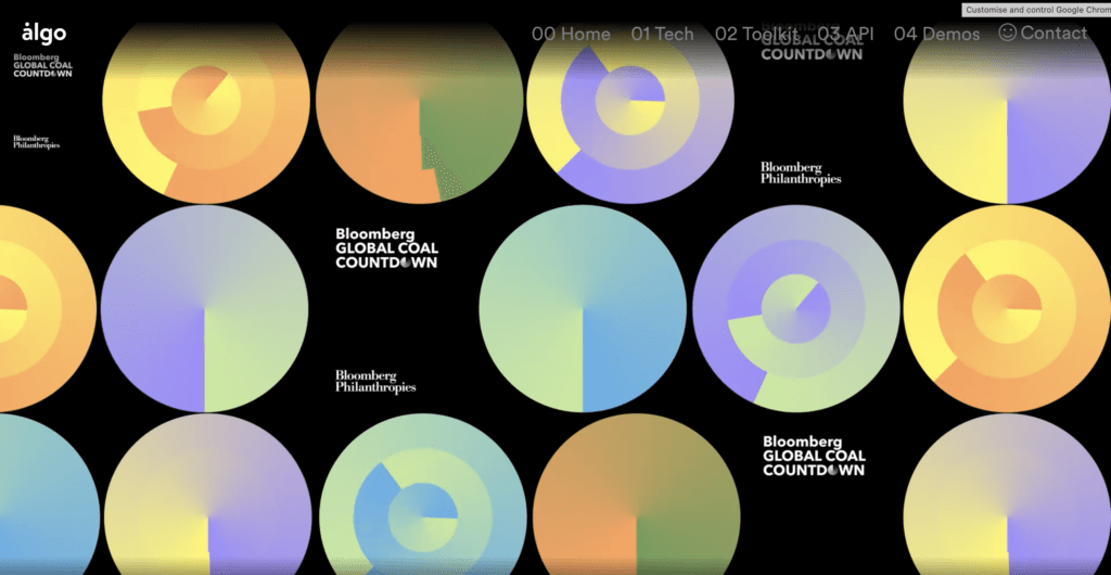

- Intro: Bloomberg have created this video report to showcase coal plant closures around the world as governments transition from coal to clean, renewable energy sources. Through clever design and compelling storytelling, the report achieves a rare blend of beauty and impact, distinguishing itself from the others.
- Why it matters: To me, this project stands out for three key reasons: its innovative use of video to convey data, its thoughtful colour selection, and its commendable mission. Design studio Algo specialises in unconventional data visualisation, leveraging video animation and bold shapes. Their distinctive approach seamlessly integrates simple bubbles with soft gradients and interactive elements that create an immersive experience, captivating viewers in a continuous loop of engagement. This unconventional approach demonstrates the power of visual storytelling, proving that effective data communication transcends traditional charts and figures, evoking emotions that resonate deeply with audiences.
Applying for Spain’s Digital Nomad Visa by Amber Lee Fawson
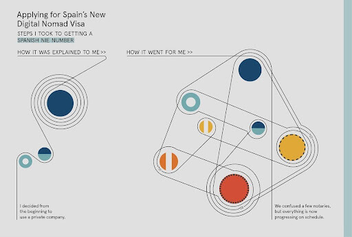

- Intro: This visualisation piece highlights the differences between expectation and reality when it comes to applying for Spain’s new visa for digital nomads.
- Why it matters: As in previous months, I’ve focused solely on the visualisation technique used. In this case, this great piece of dataviz uses the Rube Goldberg machine as a visual metaphor. While the results closely resemble a standard network chart, it’s interesting that the links have directions while also allowing multiple connections between others and self. And we can still see how many times we will need to visit each specific place and what comes next.
A wide ideology gap is opening up between young men and women in countries across the world by the FT
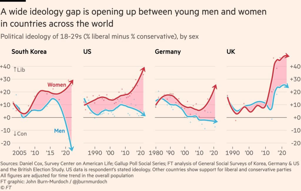

- Intro: This dataviz by John Burn-Murdoch from the Financial Times examines how ideologies among women and men have diverged over the last couple of decades.
- Why it matters: I’m not the type of person who likes to talk about topics that would divide the room, so I didn’t pick this dataviz because of that. I’m more interested in people’s response to it. I stumbled onto this chart via Reddit, and the comments section was replete with heated discussions on gender expectations, cultural differences, and changing social norms. Indeed, this chart is extremely thought-provoking – immediately I was rapid-firing questions about the data. What’s driving this trend? How is this affecting dating prospects? What does this mean for outliers not part of the majority? How will it change in the next 10 years?Some charts barely get a glance. This one had 26 million views after one week. I wonder what we can take away from this data viz. How was it capable of stirring the public in this way? Is it because of how shocking the finding is? Perhaps it’s how it captures the tumultuous social changes we’re experiencing? Or something else?Of course, not every chart created needs to shake the audience in this way. But it’s worth thinking about how audience relevance comes into play and how we can leverage that to create engaging dataviz.
Countries that drive on the right or left by Damola Ladipo
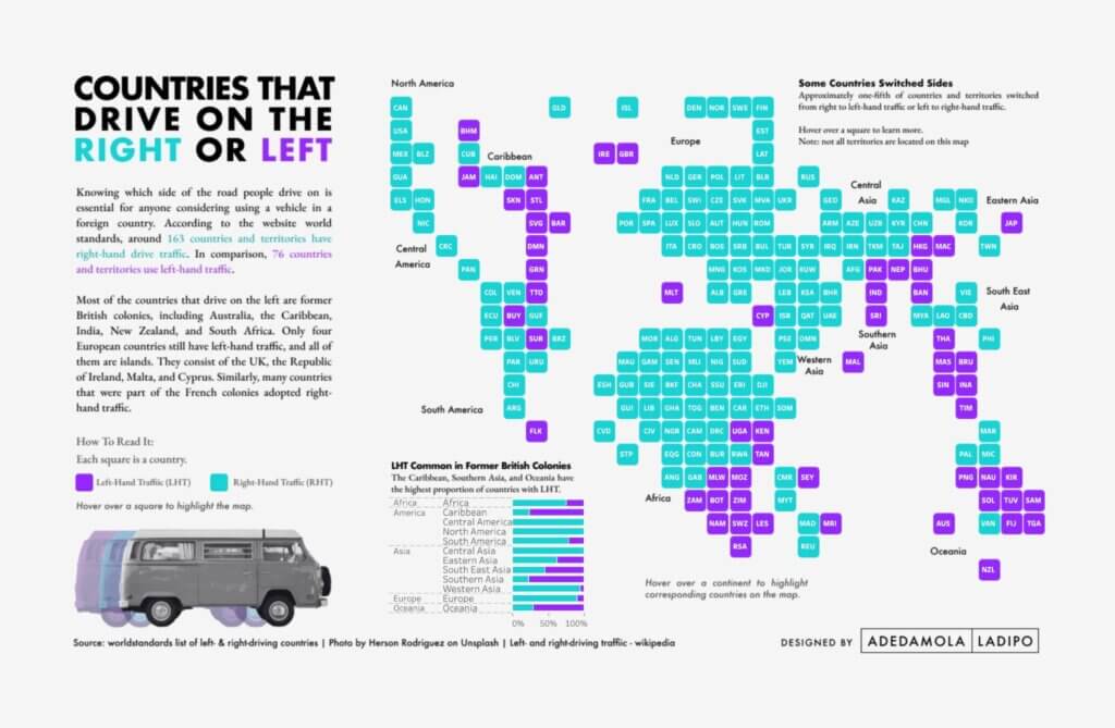

- Intro: Savoy Court in London is famously the only street in the UK where traffic drives on the right (something to do with ladies/dignitaries sitting behind the chauffeur in the days of horse-drawn carriages). Here, Tableau Public ambassador Damola Ladipo takes driving differences global, tracing another enduring impact of British colonialism around the world. (Apparently, around a fifth of countries have switched sides of the road. Imagine the chaos.)
- Why it matters: I chose this visualisation not because it does a beautiful job of highlighting societal difference on a global scale in a single graphic, but because of the way Damola walks us through his design thinking process: from a road trip across Europe to colour-blind-safe background layer design in Figma to the data-rich tiled world map in Tableau. The result is a very human story told through eye-catching data design.