Best of Data for Everyone, March 2024: AI, PD, VVG & the PGA
9 mins
Reading time
Reading time
all
Category
Category
Each month we share some of the best dataviz the world has to offer.
On the menu this month:
- How can AI transform risk and compliance? by Moody’s
- Farm the Gap by Plotline
- Population Density in Asia by Visual Capitalist
- Explore Vincent Van Gogh’s art collection by Stefan Pullen
- Matt Miller’s data visualisation design for clients in sport
- Day in the life of your Muslim colleagues by Gulrez Khan
- On Upward Mobility by The Pudding
How can AI transform risk and compliance? by Moody’s
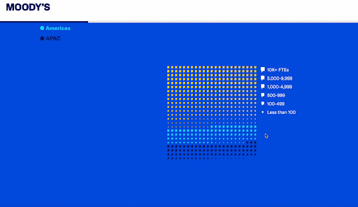

- Intro: This recent scrollytelling piece by Moody’s looks at survey data from their Navigating the AI Landscape study. The data story visualises the survey results based on geography, company size, sectors, stage of adopting AI, and how AI is being deployed, to name just a few.
- Why it matters: This read was such a treat! The blend of narrative, visualisation and interaction was a great experience throughout and turned what could be considered ‘dry’ information into an engaging and insightful experience. I felt informed, I was engaged, and I wanted to read the whole story. Before reading the article, my assumption was that it might be too technical for me, but by using a simple and consistent data visualisation and cleverly incorporating the speech bubble imagery throughout, it felt playful, accessible and friendly from start to end. A masterclass in making the complex simple and appealing to everybody!
Farm the Gap by Plotline
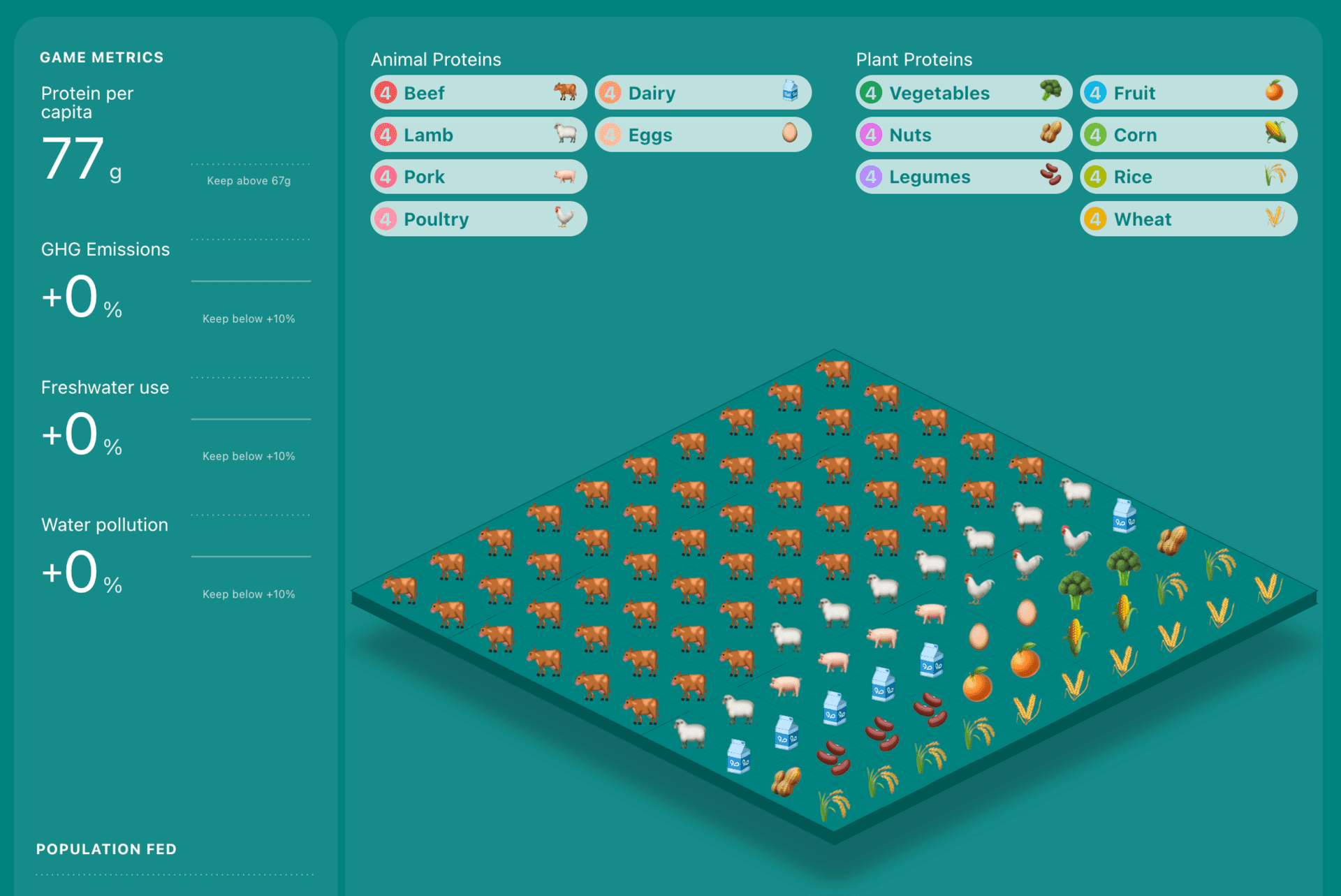

- Intro: Farm the Gap is a game and education platform about sustainability feeding the future. You can play, trying to keep a good balance between the calories needed and the environment. Place the proteins, check the trend and the counters, and reach the +50% calorie production to win in less than 30 moves.
- Why it matters: Gamification has always been a great way to engage users. Through the platform, you can play, perhaps randomly at first, and learn new facts about the environment and its needs through the data, counters and table charts on the platform. The intuitive and familiar design makes the experience effective and immersive. I hope to see more and more of this mix of data, visualisation and interactivity in education.
Population Density in Asia by Visual Capitalist
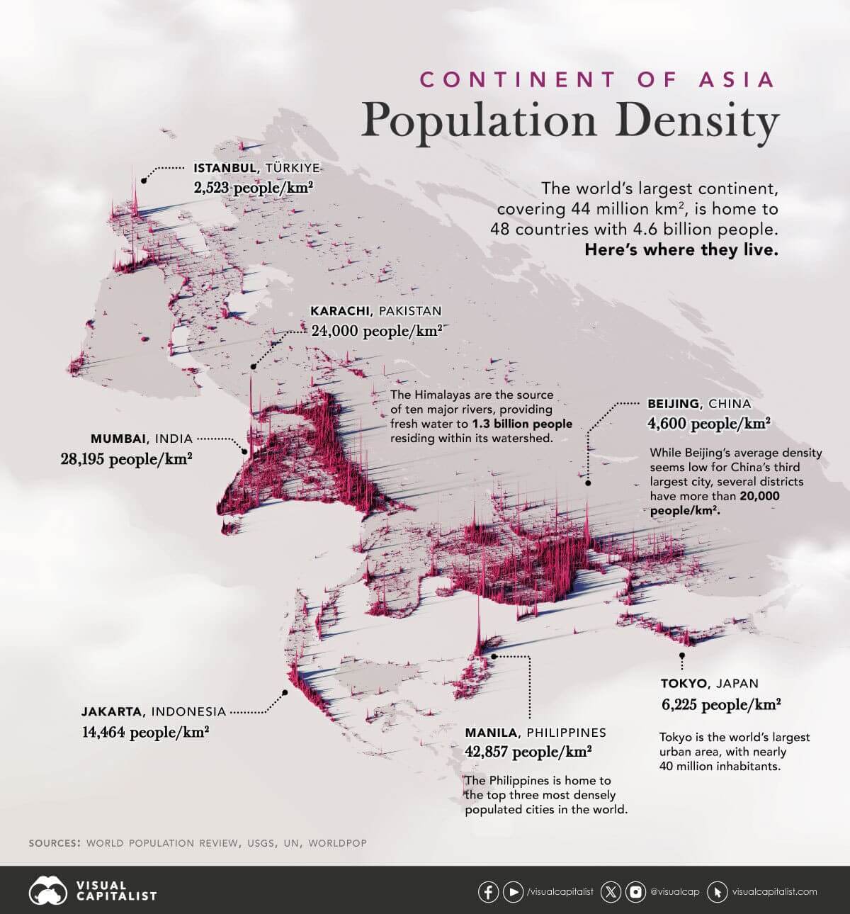

- Intro: A fascinating, striking visual that looks at population density (PD) across Asia. Travelling across the continent, from Istanbul in its westernmost reaches through to Tokyo in the far east, it’s a vast continent, with huge population centres squeezed into relatively small areas.
- Why it matters: It’s very easy for us to have perceptions that just ‘feel right’, but are in fact… not. For example, if you asked 100 people to name the densest cities in the world, Tokyo or Beijing might come out pretty high. But the reality is that despite being so populous, they have incredibly large administrative areas within which to spread out. This visual takes the data and challenges our perceptions in a way that makes us feel as though we aren’t being challenged, or questioned – more surprised or delighted.
Explore Vincent Van Gogh’s art collection by Stefan Pullen
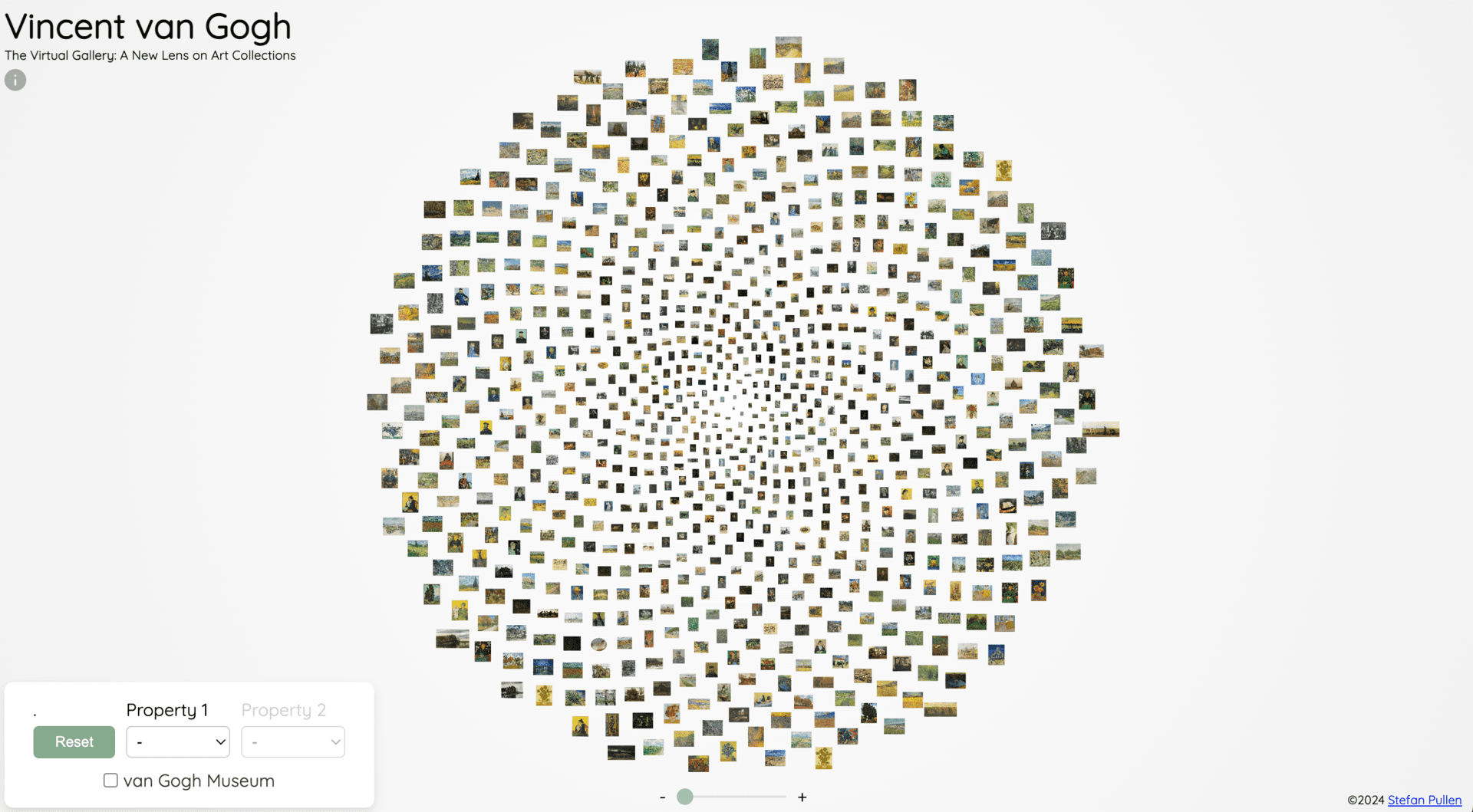

- Intro: If you can’t traverse the globe to see each and everyone of Vincent van Gogh’s (VVG), I mean who can? This new viz-powered site by Stefan Pullen has you covered. Users can explore an interactive gallery showcasing Vincent van Gogh’s oil paintings, and use filters to uncover surprising patterns and insights among his works.
- Why it matters:This project serves as a proof of concept, showcasing the vast potential of cultural heritage data. The aim is to render cultural data both accessible and engaging, while also providing educational value – proving that even the most traditional of cultural icons can be cast in new, data-driven lights.
Matt Miller’s data visualisation design for clients in sport
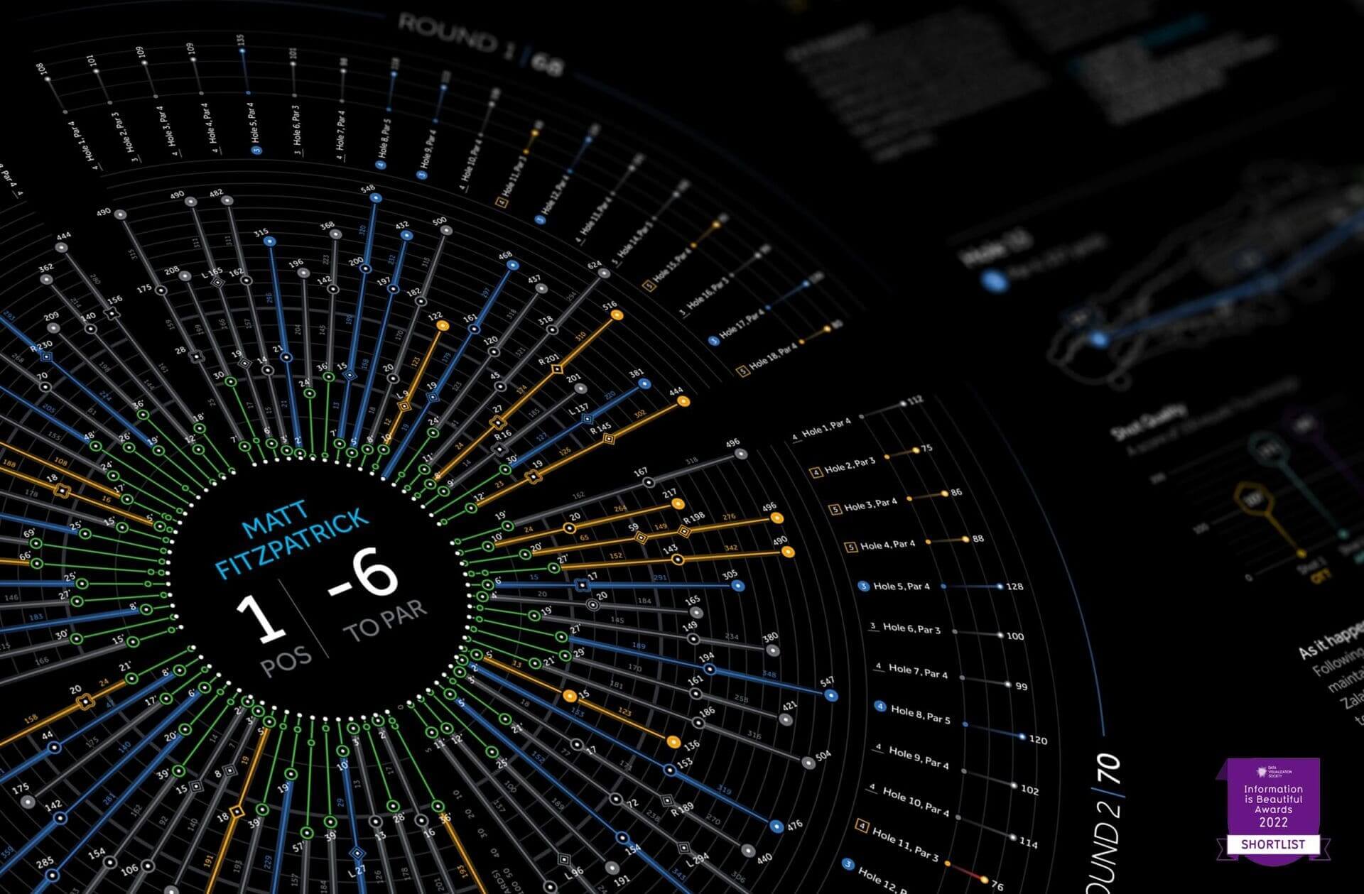

- Intro: April means that the Masters golf at Augusta is on the horizon, so here’s a series of impressive data visualization components and dashboards tracking player performance data from the PGA Tour by Matt Miller. (And if golf isn’t your thing, there are F1 visuals, too.)
- Why it matters: Dark-mode, futuristic-looking dashboards and data visualization components have always been among my favourites. When designed in the right way, they improve data analysis and decision-making processes. Here, the professional level of design and the visual appeal of the tools themselves attract the user and encourage deeper engagement with the corresponding products.
Day in the life of your Muslim colleagues by Gulrez Khan
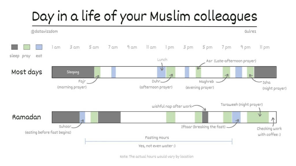

- Intro: Gulrez Khan, author of Drawing Data With Kids, has documented what his life was like during Ramadan compared to most days. Although it’s a simple visualisation that breaks down the times he sleeps, eats, and prays, it gives you insight into how his schedule changes as he observes Ramadan and prompts you to consider how you could support your Muslim friends or colleagues during this time.
- Why it matters: This type of visualisation quickly draws you into Gulrez’s personal experiences. Imagine trying to relay the same information in words—how boring! There’s a lot of potential in visualising people’s experiences in this way because it provides depth without sacrificing space. This aids comprehension and gets the message across very quickly. A large part of the role of communication is persuasion, leading to someone changing their minds, taking action, or both. Having visualisations like this on hand becomes an indispensable tool to support arguments and implement change.
On Upward Mobility by The Pudding
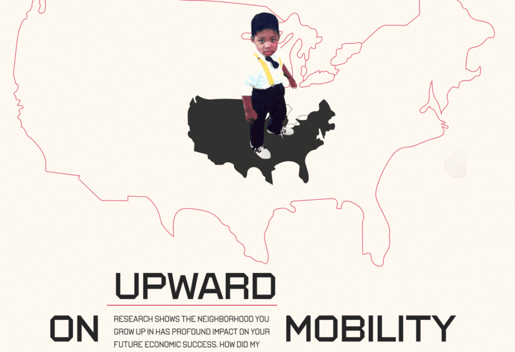

- Intro: This personal piece of data scrollytelling by Aaron Williams deftly interrogates the myth of America as the land of opportunity. Aaron recently returned to Los Angeles having left the city as a child, his family seeking better opportunities in the Bay Area (home to Silicon Valley). The story traces the family narrative back to the 1940s, citing the expected median income for each neighbourhood along the way. Fast forward to the late 2010s, and the contrasting opportunities between some of those neighbourhoods have become stark.
- Why it matters: Data can often feel inhuman and distant. By integrating hard census data and opportunity insights with family photos, autobiographical text and hand-drawn illustrations, this story humanises the hot topic of meritocracy and offers a unique addition to the Great Migration narrative.