Have you ever shared a dataviz in a presentation only for the response to come up short? This happens more often than one would expect; crafting data narratives that resonate relies heavily on the audience, all of whom bring their own biases, expectations, and data literacy levels. In this data story, Arpit Arora runs an experiment to learn about how people interpret dataviz and shares actionable tips to help you build relevant data narratives.

Even with the best of intentions, dataviz may not always land. As data designers, how can we respond?
August 2023 was not all that different from many other months at work. We’d recently conducted a big market survey, and a meeting had been organised to review its findings. The results helped shed light on a region’s transformation, the resilience of the key stakeholders, and potential strategies for support. Such surveys have become pivotal in measuring the impact of our livelihood programmes across India. The insights allow us not only to gauge market shifts but also to craft actionable plans that can guide our programme towards a more favourable future.
This time around, the survey was observing the actions of a particular stakeholder group, and the ways we could nudge them towards a desirable outcome. Excited to showcase my findings, I had prepared a crisp presentation with a strong narrative. On the day of the presentation, I had successfully captured my audience’s attention. Taking advantage of the moment, I presented a data visualisation that effectively conveyed the overarching trend and proposed a course of action. However, the response from my audience was unexpectedly muted, and even more surprisingly, the follow-up questions I was asked were about areas completely unrelated to the key findings.
Are you seeing what I’m seeing?
After the presentation, I pondered over the lukewarm reaction to the critical reveal, and I couldn’t help but wonder what could’ve gone differently. Did the insights I showcased not matter to the team? Surely not, as that was the entire goal of the survey. Did I make a judgement error in how I presented the information? Possibly, but after employing all the best practices of how to communicate through data visualisations, I was unsure what else could’ve been done.
Seeking clarity, I approached my team for feedback. One member responded, “I’m not sure if I’m seeing the same thing you’re presenting or interpreting it as you expect me to.”
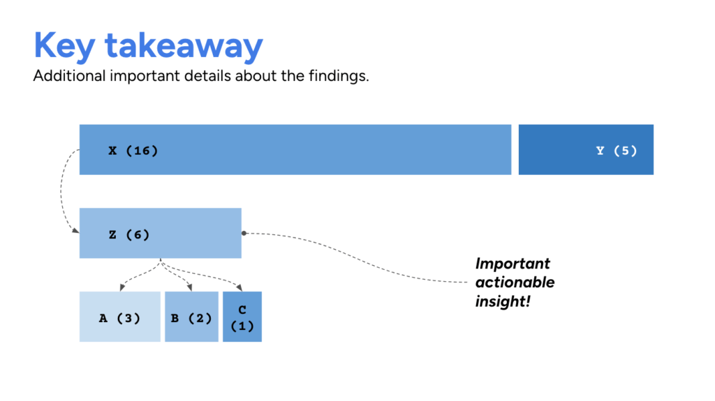
Draft representation of the survey insights presented to the team.
My team member’s feedback came to me as a surprise, and brought up a lot of questions in my head. How could I create data visualisations that better aid the process of information discovery for my audience? What role does their data literacy play in the consumption of a data visualisation? How do these data visualisations adapt to the social development space and context? And does building data visualisations for the Indian subcontinent look different to other widely accepted practices?
To answer some of these questions, I thought about conducting a small experiment to understand how people in my team and other individuals working in the social development context are interpreting the data visualisations they encounter everyday. Do they also struggle with processing and acting on the information presented to them, and how much of their decisions are influenced by their background and comfort around data?
According to research, “For people to engage with data, it may be necessary to not only provide mechanisms that allow people to explore personal dimensions of data, but to make sure those personal dimensions are front-and-centre in first encounters with a visualisation” (1).
To ensure that my data visualisations resonate with the audience, it was crucial for me to not only meet them at their level of understanding, but also tailor the results to their relationship with the information. I wanted to build a space of shared knowledge around the visualisations between me and my audiences, and aid their decision-making process and path towards creating impact.
Creating effective data visualisations involves a delicate balance between clarity and creativity. I was curious to explore what that balance could look like in the social development context I’ve been operating in.
Surveying how different people interpret data visualisations
How does one craft a data visualisation that goes beyond mere “information to decipher” and inspire action from their audience?
To explore this question, I ran a survey and gathered inputs from a diverse group of individuals by showing them the same three data visualisations. The experiment aimed to observe their key takeaways from the visualisation, the actions they would consider based on the data, and what further information they desired beyond the visualisations presented.
When selecting the final data visualisations for the survey, I considered the following criteria:
Variety in complexity: The data visualisations ranged from simple charts with clear messages and takeaways to more abstract representations of data.
Diversity in types: Different types of visualisations (bar, line, etc.) were chosen to prevent any learned behaviour from influencing audience responses to subsequent data visualisations.
Accessibility: The selected data visualisations were not overly complex, ensuring that survey responses could be easily captured. To this end, map-based visualisations were also avoided.
Based on the above criteria three visualisations were selected from the following sources:
- Saving (For) The Planet: The Climate Power of Personal Banking by Project Drawdown
- Women’s football is becoming bigger and better by The Economist
- Promises That Matter to Indian Democracy: A Study of Election Manifestos Since 1952 by Centre for Policy Research
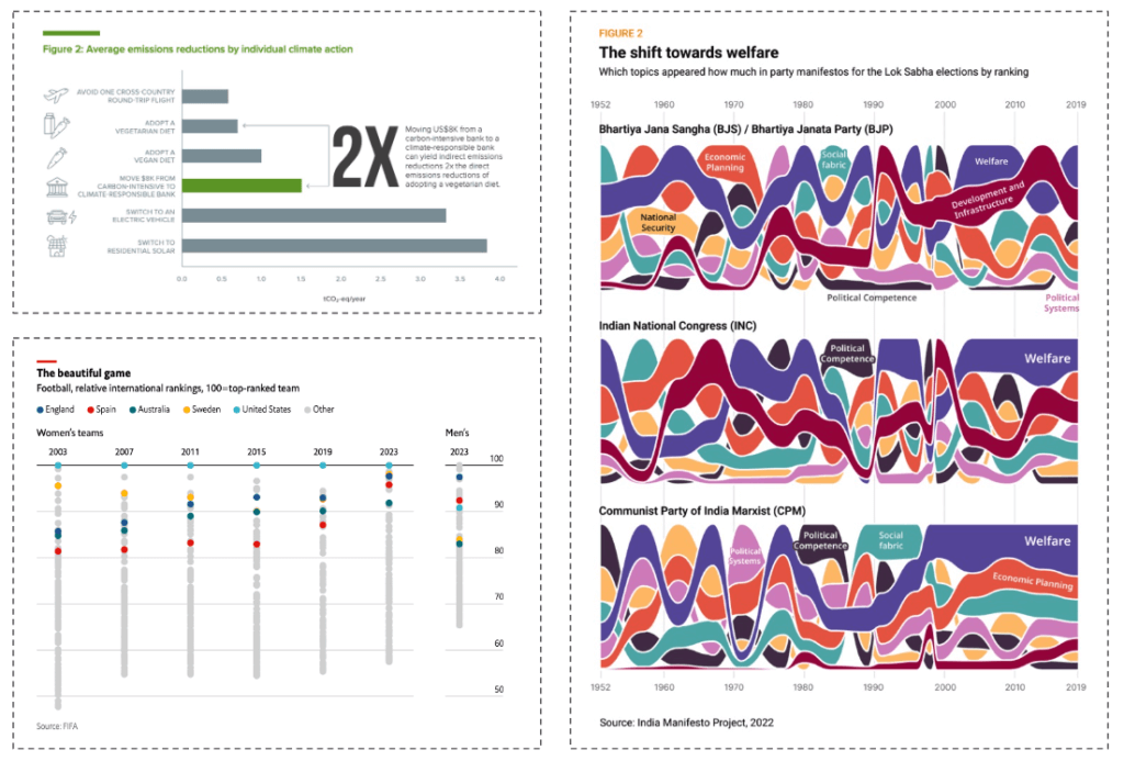
The three visualisations selected for the experiment.
Along with the participants’ responses to the visualisations, basic information about the age, sector, role and experience was collected to better understand their background and correlate it to their responses. The data visualisation survey in its entirety can be found here.
The survey garnered a total of 13 responses, with participants hailing from diverse backgrounds as follows:
- 8 respondents were aged between 25 to 34, and 5 were aged 35 to 44.
- 6 respondents worked in the private sector, 5 in non-profits/NGOs, 1 in academia, and 1 was a freelancer.
- 4 respondents held managerial positions, and 4 others were in technical roles like software engineer, data analyst, etc.
- The median overall experience among respondents was 8 years, with a median data visualisation experience of 1 year.
- Data visualisation was not a primary focus for any respondent, and was an important secondary focus for only 2 participants.
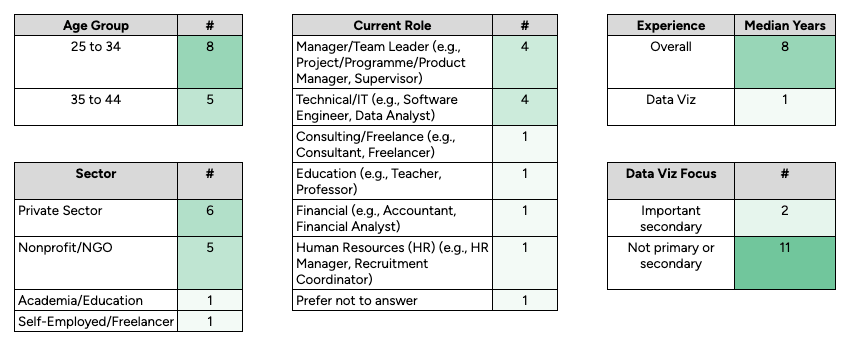
A quick snapshot of the 13 survey respondents.
In addition to the 13 survey responses, in-depth interviews were conducted with the following three respondents to capture the experience and nuance of engaging with these data visualisations from a diverse perspective:
- Shaoni Dasgupta, English teacher, high school (data literacy = low)
- Aparna Sanjay, training manager, non-profit (data literacy = medium)
- Akshita Arora, financial auditor, private sector (data literacy = high)
Understanding people’s data visualisation consumption patterns
Before we dive into the findings from the participants’ responses, it is important to note that none of these discoveries are meant to be a critique of the data visualisations used in the experiment. On the contrary, these visualisations were selected because I believe they do a great job of communicating their findings and the goal was to observe how different audiences interpret them.
Visualisation #1
The first data visualisation is about average reduction in emissions through individual action from the report Saving (For) The Planet: The Climate Power of Personal Banking by Project Drawdown. The chart highlights that the impact of moving $8K from a carbon-intensive bank to a climate-responsible bank is 2x the direct emission reduction from adopting a vegetarian diet for any individual.
Among the survey respondents, however, only 4 participants had the same primary takeaway about the climate-responsible bank as the one highlighted in the visualisation; 7 out of the 13 respondents highlighted other areas like switching to electric cars, solar power at home, vegan diet, etc. as actions that resonated more with them. Research in the field explains these findings as follows: “… personal framings may fundamentally alter attention towards or away from a visualisation before those interactions occur” (1).
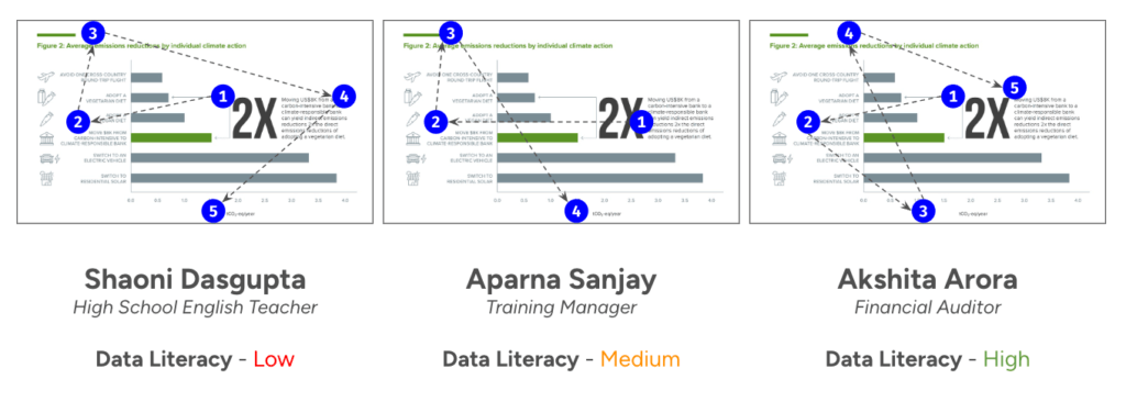
Tracking the order of observations for three different users through the first data visualisation.
Beyond the survey responses, the personal interviews shed further light on how the data visualisation was being consumed by the different interviewees. Beyond the first interaction of noticing the big “2X” annotation, all the participants took very different journeys through the data visualisation.
Based on the interviews, the act of being able to compare the emission reductions impact of a single lifestyle choice over the others was a more important aspect than decoding how many emissions are created through each individual choice. According to research highlighted in The Conversation, our brains are built to compare not count. “The significant impact of switching to residential solar or an electric vehicle is very appealing to me compared to the other options. These are also possibilities that seem more possible for me to seize,” says Aparna, a training manager at a non-profit in India.
Visualisation #2
The second visualisation presented to the participants was about the state of women’s football from the article Women’s football is becoming bigger and better by The Economist. The visualisation shows the consistency of the US women’s team ranking at the top, with teams like England and Spain progressively improving over the years.
This data visualisation was most consistently received among the survey participants, with 7 out of the 13 respondents having a similar primary takeaway. At the same time, the visualisation did not garner a lot of further interest from the participants, with 5 of them not excited about the topic. The type of visualisation also threw off 3 of the participants completely, as they felt confused by the representation and asked for a different way to view the data.
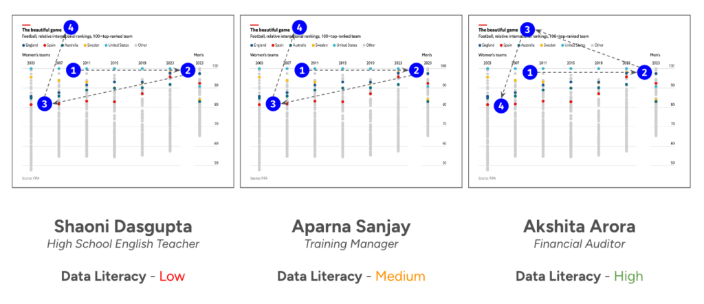
Tracking the order of observations for three different users through the second data visualisation.
Among the interviewees, this visualisation was much more consistently consumed, with nearly all of them following a similar pattern of reviewing the data visualisation. That said, none of them felt particularly confident about their conclusions. “I’m not sure which type of data visualisation this is, and if I am reading it correctly,” wondered Shaoni, a high school English teacher.
This is a very common conclusion among readers when the data visualisation breaks away from well-known formats like bar, pie or line charts. According to the research on the subject (2), “… bar charts are a suitable visualisation medium to support reading exact values, identification of maxima, and describing contrasts in data. More interestingly, this study highlighted a shortcoming in the ability of average, non-expert viewers to recognise the limitations of different chart types—viewers don’t know what they don’t know.”
Visualisation #3
For the final visualisation, a political subject was selected about the most frequently occurring topics in the manifestos of India’s leading political parties from 1952 onwards. Among other trends, the visualisation shows how topics like “political competence” took up more space during the 1980s, before making way for topics like “welfare” and “development and infrastructure” in the 2000s.
Out of all three data visualisations shown, this was the one where the survey participants struggled the most: 5 of the 13 participants were unclear about the primary takeaway for them from the data visualisation, and another 2 potentially misread the visualisation. Some of the participants also tried to relate the trends in the chart to their understanding of the political sphere from the corresponding periods.
Visually, the response received around the chart was similar from all participants. They were intrigued by the chart, but not all of them were able to make the association of this being a chart that presents trends over time. “The colours captured my attention immediately, but it took me a while to understand that these are trends across political parties,” mentioned one respondent.
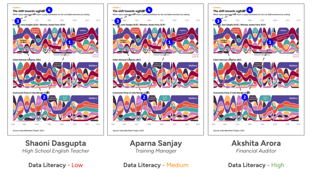
Tracking the order of observations for three different users through the third data visualisation.
Due to the political nature and wider appeal of the subject, the reception and conversation around this chart from the participants was the most inquisitive, especially during the interviews. For Akshita, a financial auditor in the private sector, she would have liked the data to be presented to her in a different format: “Although I follow the trends shown, I find myself not being able to take the clear decisions on how well I understand the data.”
What to keep in mind when building your next data visualisation
As I reviewed the results of the experiment, I reconnected with my team member to discuss his experience with my data visualisations. His feedback echoed the insights gained from the respondents: “Being on the ground most of the time, my understanding of the situation changes quickly. I would appreciate it if your work could make space for my updated worldview and provide direct suggestions for the next set of actions.” The team’s context of running programme operations on the ground meant I could have done more to understand the current set of problems that they are already working on, and what they have learnt from engaging with the programme stakeholders. Even though the original goals of the data visualisation were important, the current context of the team’s knowledge added much needed detail.
Creating effective data visualisations requires a nuanced understanding of not only your audience’s level of comprehension, but also their relationship with the information presented. Here, for example, the respondents more often related to the first visualisation based on their personal perspectives of reducing emissions, rather than following the key insight presented. It therefore becomes important to understand the information your audience is currently working with, and what key problems they are trying to solve. Meeting the reader at their level ensures that the visualisations are accessible and meaningful, fostering a connection between the data and the audience’s experiences.

When the goal is to build a clear understanding and drive action, especially in the social development context, opting for tried-and-tested methods is often the best approach. These methods have time and again proven their effectiveness in conveying information in a straightforward manner, as readers feel comfortable about how to consume the information rather than having doubts about their understanding of the data or the visual insights. This was seen in the second data visualisation, where the unfamiliarity with the type of chart made some respondents question their understanding of the data.
However, it’s important to recognize that the interpretation of data visualisations is not solely based on the data presented; it’s also influenced by the viewers’ experiences. People bring their own perspectives and biases to the interpretation of data, which can affect how they understand and react to the visualisation. While discussing the third data visualisation, many users’ perspectives on the information were coloured by their own political leanings, even leading to misinterpretation of the visualisation. Balancing these aspects in your data visualisation is crucial to ensure that the intended message is communicated effectively while acknowledging the diverse backgrounds of your audience.
At the same time, the emphasis on accessibility and clarity does not mean that creativity should be sacrificed. On the contrary, creativity plays a vital role in making data visualisations engaging and memorable. A beautiful crafted visualisation is loved universally, including by the participants of this experiment. The challenge lies in finding the right balance between creativity and clarity, ensuring that the final visualisations are both aesthetically pleasing and informative.
By understanding your audience and tailoring your approach to their needs, you can create data visualisations that not only convey information effectively but also resonate with viewers on a deeper level.
We hope you’ve gained a new perspective on how to build relevant and engaging dataviz from Arpit’s experiment by carefully considering the needs of the audience. At infogr8, we have a world-class team of designers who know the ins and outs of creating class-leading data narratives. Contact us to learn how we can help you do more with your data.
Research referenced in this article:
- Evan M. Peck, Sofia E. Ayuso, & Omar El-Etr. (2019). Data is personal: Attitudes and perceptions of data visualization in rural Pennsylvania. CHI Conference on Human Factors in Computing Systems Proceedings (CHI 2019), May 4–9, 2019. https://doi.org/10.1145/3290605.3300474
- A. Zubiaga & B. MacNamee. (2016). Graphical perception of value distribution: An evaluation of non-expert viewers’ data literacy. Journal of Community Informatics, 12(3), 138—159.
About Arpit Arora

Arpit (who likes to go by ‘cube’), a statistician by trade, works at the intersection of data and technology to increase access to information, improve data literacy, and drive action towards impact in the social development space. Arpit’s work includes measuring the impact of programmatic interventions on the livelihoods of street side nano-preneurs in India, designing a data platform for the Scottish Education Department, and publishing a report on the state of free and open-source Software in India. To find out more, visit https://thedataareclean.com/