Best of Data for Everyone, December 2023: Back to the Future (Fridays)
7 mins
Reading time
Reading time
all
Category
Category
Something different for our last roundup of the year.
2023 was the year we launched FutureFridays, our data-led innovation lab. Each month, we dial into our community to come up with prototypes and MVPs to tackle a pressing societal challenge.
Here are the team’s favourites:
- Sustainability Product Labelling
- Learning Management System
- Climate Action Dashboard
- Dedlyne Tracker
- 5-D Global Health Tool
Sustainability Product Labelling
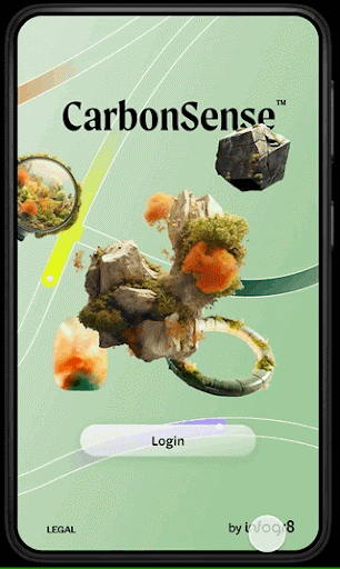

- Intro: Throughout 2023, as a team, we explored so many great ideas in our Future Friday sessions, it makes it really tough to choose just one. However, the one that really stands out for me, is the Sustainability Product Labelling tool we developed with Gabrielle Merite.For the consumer, making good decisions on products that we buy is almost impossible, due to a chronic lack of data (or willingness to share said data). So we set about creating an app, based on a utopian scenario where this data is freely shared, to show how data can be a part of the solution.
- Why it matters: This is significant because, at the moment, there is no global, unified standard that provides consumers with information about the environmental impact of the products we purchase. This includes not only CO2 emissions but also factors such as land usage, water consumption, labor, traceability, biodiversity, and so on, affecting the world around usIt’s all confusing and relies on the customer being able to make their own decisions about what’s important to them, even when they may not necessarily have all the information needed for these decisions. This prototype serves as a thought leadership piece, envisioning a future (hopefully not too distant) where organizations open up their data and become more transparent. The goal is to design and create more sustainable products. It’s important to note that in the example shown, this is entirely fictitious data!
Learning Management System
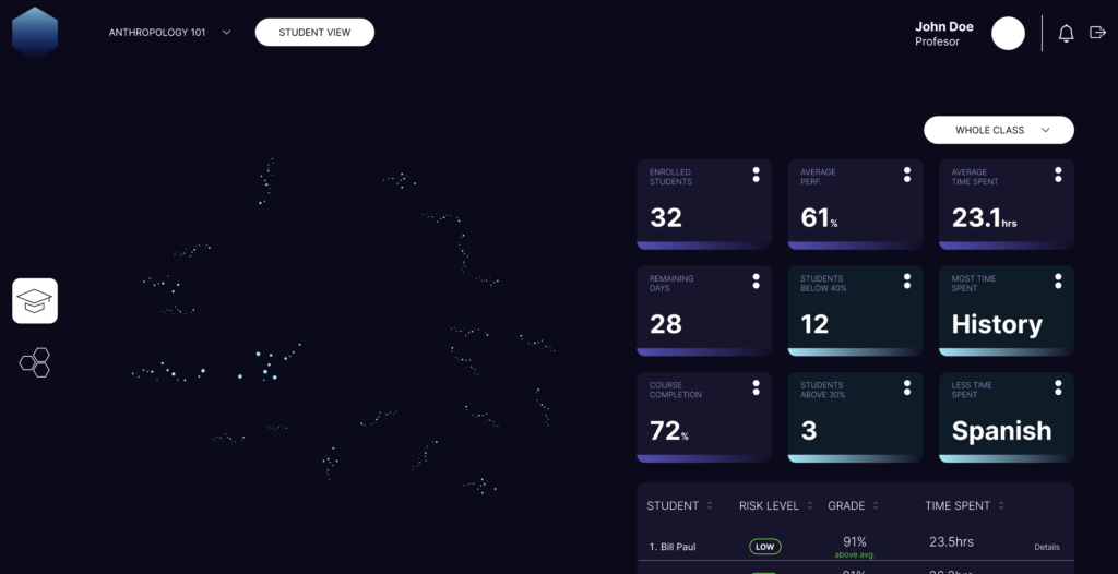

- Intro: Through anecdotal research, we discovered that educators do not make use of learning outcome dashboards. The reasons are many, though most troubling is that they don’t surface the insights that matter to drive educational outcomes.
- Why it matters: EdTech is a big space, and our focus tends to be on workforce and careers. There’s untapped opportunity in enhancing the effectiveness of education with data. However, this opportunity feels wasted due to the poor use of effective data visualization. While this Future Fridays solution is not perfect in its prototype state, it provides a glimpse of the art of the possible achieved in one Future Fridays theme. Just imagine what we could achieve with more time.
Climate Action Dashboard

- Intro: My favorite Future Friday for 2023 was our prototype on a climate action dashboard for Local Authorities. It was our first theme to kick us off in January, and it was exciting to see what we could produce with a few creative sessions.
- Why it matters: Creating a tool that could bring all climate data and insight into one space, tailored to different audiences and using innovative ideas to engage communities, seemed to solve many challenges that organizations often face and opened up new potential. Often, existing options result in having many different tools that do different things for various people and often still result in complexity, silos, and a bit too much thinking to make use of it.
Dedlyne Tracker
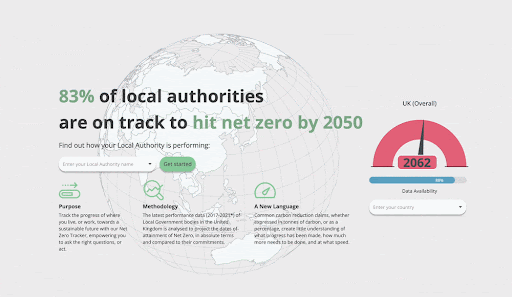

- Intro: Dedlyne Tracker checks the percentage of local authorities that are on track to hit net zero by 2050.
- Why it matters: The latest performance data shows that only 10% of local authorities are on track to achieve the net-zero goal. The Tracker is designed to monitor the progress of each local authority, provide detailed projections, and illustrate the general status of the country.
5-D Global Health Tool
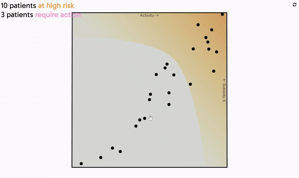

- Intro: Created in collaboration with award-winning information designer Stefan Pullen, this 3D visualization maximizes insights from complex clinical data to improve clinical outcomes. Almost like a small multiple, each dot on the chart clicks into a card that contains specific patient details such as medical images taken, comorbidities, and the last consultation.
- Why it matters: Despite the criticism 3D pie charts have received over the last five years, we shouldn’t overlook contexts that could benefit from this unique application. Adding a new dimension to the analysis has its challenges from a UX perspective, as we don’t expect users to be familiar with 3D charts. However, there is a payoff to exploring new tools and methods as it uncovers new opportunities to tell a richer story with data.