Benjamin Cooley
December 19, 2017
This year was another big step for data-driven content. We know that people are far more likely to interact with data-driven content that is visually-led: according to Quartz, 68% of executives are most drawn to a piece that features data visualisations. Now, more brands and publishers than ever before are beginning to see the value in telling stories with their data, and doing so in beautifully visual ways.
Last month the infogr8 creative team attended the Kantar Information is Beautiful Awards, a consistent source of inspiration for the year ahead. We saw some truly innovative work—pieces that drew nodding heads from our data scientists and won the hearts of our creative team, from interactive experiences to data sculptures encoded into personalised clay pots.
While the competition was fierce, these 8 pieces stood out as game-changers for our industry and a benchmark for success in the year to come. They also embody of the key values and services we offer as an agency. Here are our picks for the best data-driven content of 2017.
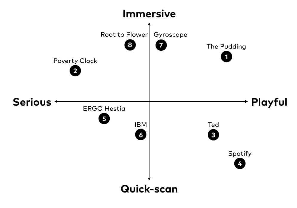
We’d be dropping the ball if we didn’t mention The Pudding at least once in our best-of roundup. Since it’s inception at the beginning of the year, this publication of visual essays has been setting the benchmark for how to present data-driven scrollable stories on the web.
“The Unlikely Odds of Making it Big” checks all the right boxes for great data storytelling: it starts with a question people are fascinated by (how does a band make it “big”?), investigates the data to find the trends, and then displays the findings in an immersive and visually engaging format. This is one of those pieces that makes it into our favourite references time and time again.
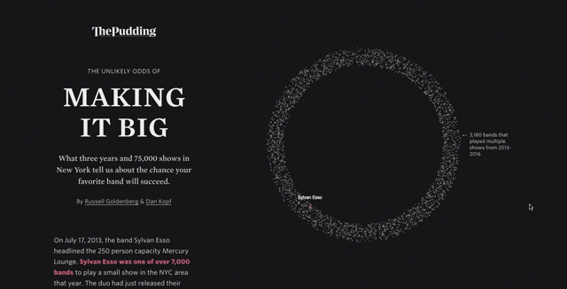
The World Poverty Clock first caught our attention as an exceptional use of live data in a visualisation. The interactive is a project by World Data Lab for the United Nations as a way to visualise Sustainable Development Goal 1: to end poverty in all its forms everywhere.
This work resonated with us for lots of reasons. The use of real-time data through an open API is impressive in itself. But the World Poverty Clock also does something absolutely essential to good data storytelling—it takes a big, scary number like people in global poverty and makes it more tangible. The small animated figures escaping the extreme poverty bubble put a memorable visual to a number that fluctuates every day.
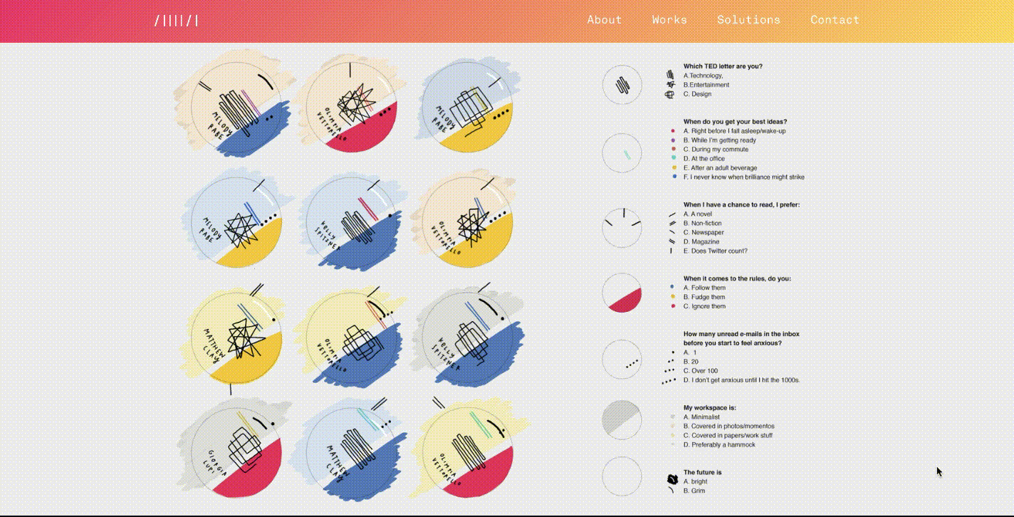
There’s no one quite as talented at making data personal than information designer Giorgia Lupi. For a Ted Talk event in Valcouver, Giorgia and the Accurat team led guests through the creation of “Data Portraits” to wear as pins throughout the conference.
These pins were all uniquely encoded through patterns, all of which revealed something about the person wearing it. We hear loads of people talking about “big data” these days. But data can also be deeply personal. It’s not all about the huge datasets with lots of quantifiable numbers. It’s also about making data feel human.
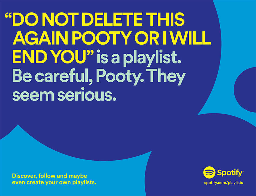
Spotify’s user data billboards have made lots of waves in the creative and advertising industries this year, both good and bad. On one hand, their bold brand is immediately recognisable, and the use of listeners’ data to create fun, playful billboards is an innovative take on traditional adverts. But on the other, some people have found it a bit, well, creepy.
We get it: seeing a random user’s playlist name splashed on a billboard causes lots of questions to arise (what ELSE do they know about me…). But the reality is that if you use service-based applications, the data created within that app has always been available. The difference is that now, brands like Spotify are learning how to use that data in a fun and interesting way. In the years to come, we expect to see more brands following suit.
In fact just the other week, Netflix sparked outrage in some users on Twitter after posting this tweet about viewer’s watching habits. And with that comes another question: will brands use this data responsibly? That’s one for another blog post.
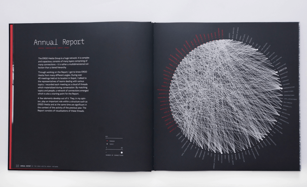
This annual report from the ERGO Hestia group features stunning data visualisations and graphics. So stunning in fact, that the creator of the report won a gold prize in the community category at the Kantar Information is Beautiful Awards.
The use of a black background colour and bold type throughout puts the data at the forefront of the report. We loved how the report doesn’t shy away from complex visualisations by merging data science and art to show company networks.
Not all annual reports will be this complex, but the eye for design and attention to detail marks a new direction for reports. It’s not enough to just have data in report—data needs to be at the forefront, in a beautiful layout with a strong editorial flow.
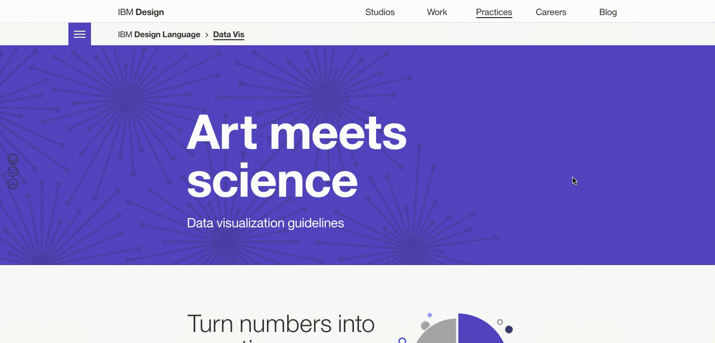
We work with lots of different clients on the data literacy spectrum. Some are well-versed in telling stories with numbers, while others are a bit new to the concept. They just need a bit of guidance on how to start. IBM’s Data Visualization Guidelines, produced by Accurat, are a perfect example of this concept.
IBM needed a consistent style and method to produce charts and infographics for their content marketing efforts. These data viz guidelines are a case study in spreading the data love in a clear, practical manner.
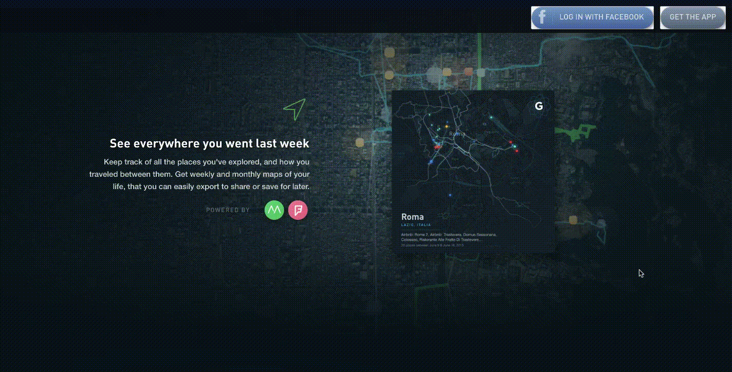
Gyroscope is a new mobile app with one bold goal: to be the “new operating system for the human body”. Similar to other popular apps like Fitbit, Gyroscope tracks a user’s health habits to spot trends and themes. But in our opinion, Gyroscope goes a few important steps further.
The app doesn’t just track your steps and sleep habits. It also taps into the data in other areas of life such as time spent on a screen, stress levels and mindfulness exercises. And best of all, it displays this data as bold, beautiful visualisations. Plus our favourite bonus feature: a glossy hardcover annual report full of data visualisations showing the highlights of your year.
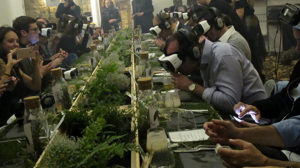
Spoiler alert: this one was a project we designed for. Root to Flower was an immersive dining experience held at YFoods London Food Tech week. The 7-course meal encouraged diners to interact with their surroundings throughout the night using a custom augmented reality app and virtual reality headset. In doing so, attendees learned more about the food they were eating and how they could reduce food waste.
There were plenty of leaps and bounds made in the AR/VR world this year, with Apple’s new AR kit hitting the market and tools like Oculus technologies becoming more and more affordable. Taking part in this collaborative project taught us a lot about the challenges of designing for augmented reality: how do you create an infographic that a user can interact with? How do you connect the physical to the digital using AR technology? Our final output of AR infographics and recipe cards brought diners closer to the food they were eating by visualising data on food waste and sustainable eating practices (full case study coming soon!).
So there you have it: 8 stand-out pieces of data-driven content to set the pace for 2018. As an agency, we’ve bookmarked these pieces as inspiration for the year ahead as we look to continue our expansion into data science, information visualisation, AR/VR and producing content with an element of live data. Here’s to another year of inspiring content ahead.
Soho Works White City,
Television Centre,
101 Wood Lane,
London,
W12 7FR