Transform 100-page sustainability reports with scrollytelling
Reading time
Category
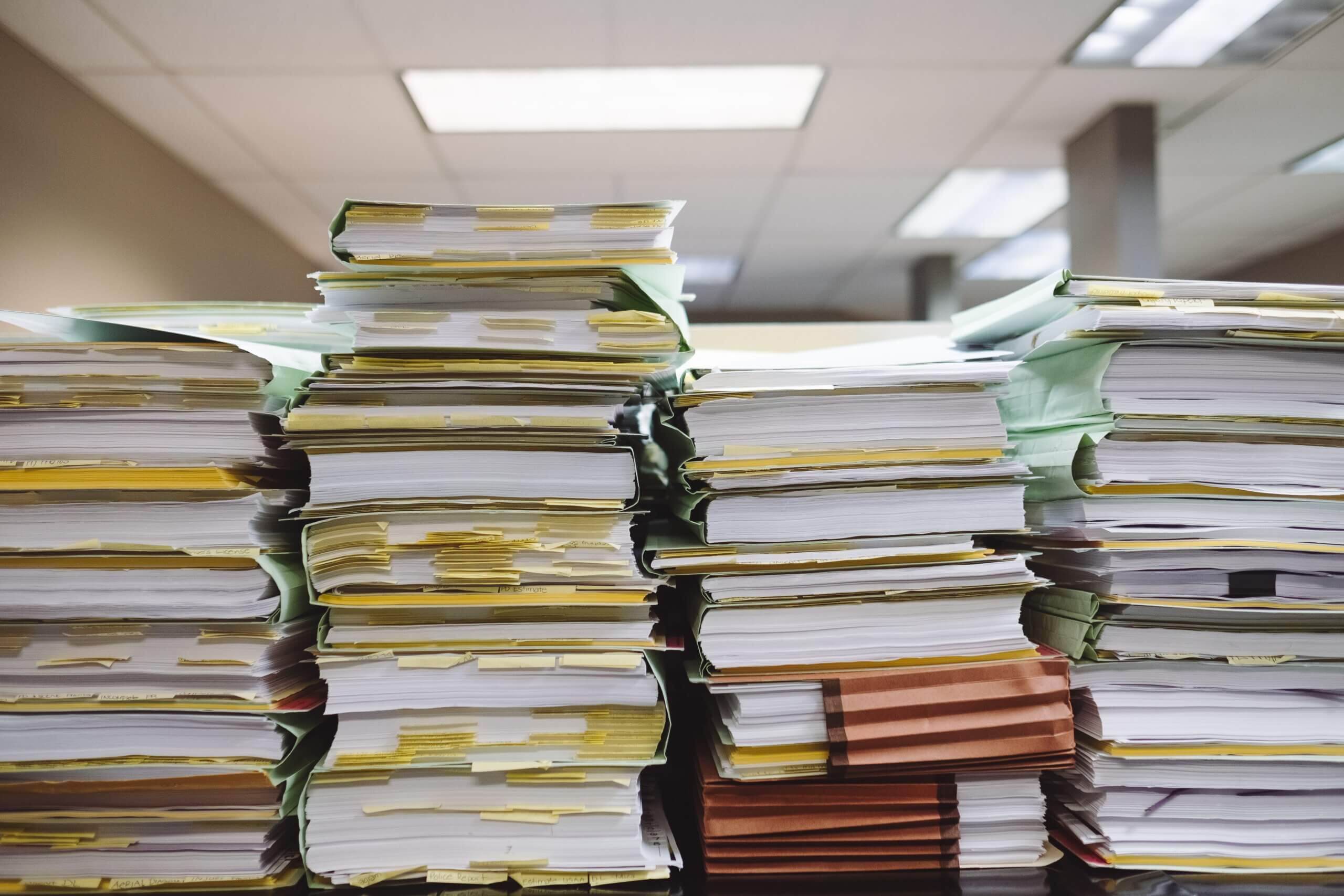
Every single time I log in to LinkedIn, I see a new sustainability report with 100 or so pages. Typically there’s a nice, albeit slightly clichéd opening image, equal parts inspirational and hopeful for the future, followed by 99 pages of text and uninspiring charts.
Of course, different reports have different intended audiences. Some are deeply technical, others are highly specialised, yet others still are academic in nature, but overall sustainability seems to have a little bit of a communications problem. Or rather, organisations tend to have a bit of a problem communicating their sustainability credentials, efforts and progress being made.
As humans, our brains tend to look for little shortcuts to make our lives just that little bit easier, so we don’t have to be constantly and continually thinking about everything all at once. Change comes from challenging these little defaults our brain selects for us, and choosing a different path.
Nobody (at least, I think nobody) enjoys producing a 100 page report, it’s even more tedious and monotonous to put it together than it is to read it, indeed, if it’s even read at all (The solutions to all our problems may be buried in pdfs that nobody reads, by the Washington Post)
Reports of this nature immediately prompt several questions: how do you manage and maintain accessibility across 100 pages? Can mobile users read it? How does the user find the content that really matters to them? Yet so many jump beneath the comfort blanket of a PDF. So why don’t we try something a little different, is there even another way?
The rise of data journalism as a discipline, alongside data visualisation and UX & UI design, has seen a new form of storytelling emerge: scrollytelling. (https://infogr8.com/products/interactive-report/)
Sure, it may not be appropriate for every single report you produce, but if you do have a story to tell, and this is backed up by data, it’s a really effective and accessible way to get that story out there and engage your audience.
Here’s one we made for Jobsite, looking at research they produced on the cultural misunderstandings that can occur within diverse workplaces. This could very easily have become just another static PDF that barely anyone would read, but instead, the lovely people at Jobsite elected for a smarter solution, with engaging results.
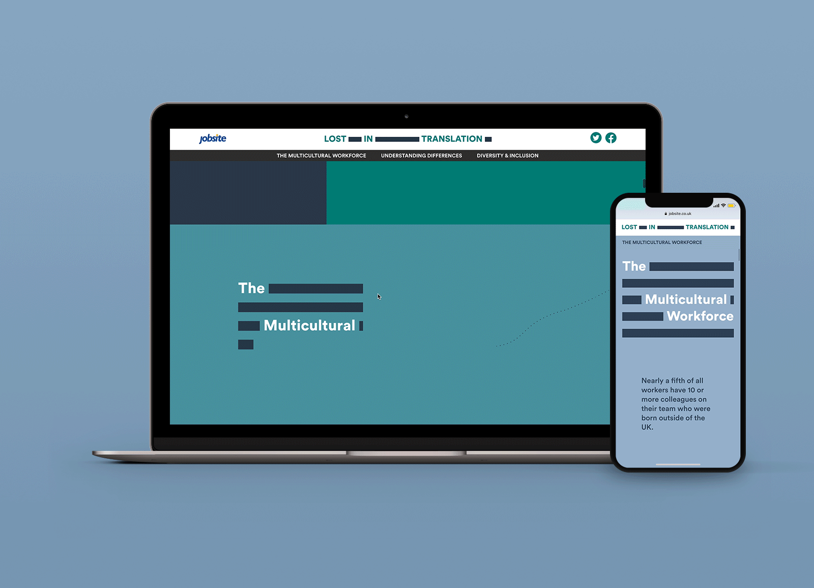
The outcome was a scrollable story that could be experienced seamlessly on both desktop and mobile, rich content that was cited, shared and supported Jobsite’s search visibility across gaps in subject matter topics the organization genuinely cares about having a voice in.
Infogr8 have been working with City of London Corporation, Mars Petcare and Friends of the Earth, enabling their communications on net zero, climate action and pet homelessness to be more accessible, effective, and tailored to the audience. I’m available anytime to chat about how we can support you. You’re welcome to book a time with me in my diary.