Duncan Geere on the importance of centring the reader in data visualization
Reading time
Category

One of infogr8’s favourite data viz champions, Duncan Geere, shares a powerful approach to creating stories that resonate with an audience.
Imagine two examples of data storytelling. Both are about people struggling to feed their families in a place that is known to be relatively prosperous. Both are well-written, compelling, and full of real human voices. Both are backed by robust data analysis, as well as attractive, insightful visualisations of that data.
The only difference between the two stories is that one is set in a neighbourhood on the other side of the world, and the other is set in the neighbourhood where you live. Which are you most likely to click on?
The answer, for almost everyone, is that you’re most likely to click on the one happening where you live. When all else is equal, and often even in situations when it’s not, humans have a strong preference for stories that are about things that they identify with and relate to.
This could be seen in a negative light, as a triumph of self-interest. But there’s a more generous interpretation too – these stories offer a strong and instant connection with the subject, as well as a feeling of familiarity and comfort. They tickle the subtle emotions like identity, pride and belonging that quietly drive a large part of our behaviour.
As data storytellers, this is a vital lesson for us to learn. To ensure that our stories resonate with the audiences we want to reach, it’s important that we allow those audiences to find themselves in those stories. By doing so, we make our work more meaningful, shareable, and ultimately achieve greater impact as a result.
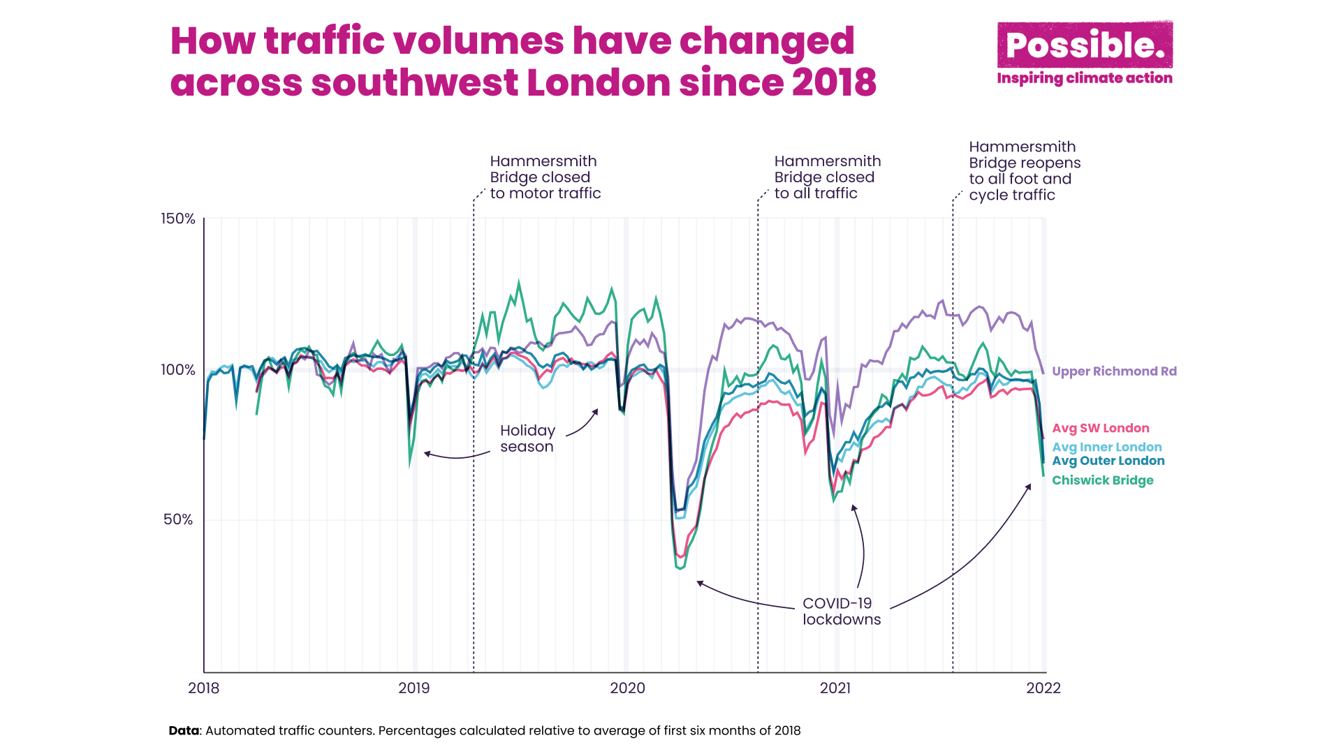
So how do we go about doing this? The answer depends on the story that we want to tell, and the audience that we want it to reach. If that audience is clustered in a single geographic location, then it’s easy – set the story in that location. For example, I worked on a project about Hammersmith Bridge in London for the climate charity Possible. Our audience for the project was entirely local, so we used local air pollution and traffic data to make the case that the bridge should remain closed to car traffic after renovations.
While it may seem challenging to create compelling stories with data, Duncan’s point of view emphasises the importance of understanding your audience and putting yourself in their shoes. For instance, in our recent work with the Schultz Foundation, on their innovative American Opportunity Index, we wanted to create a unique visual language to celebrate the success of the top ranking organisations, across multiple categories, in a way that doesn’t overcomplicate, is easy to digest and accessible, to ensure that people across the breadth of corporate America can quickly derive meaningful insight.
3 powerful ways to keep your data viz reader-centric at scale
But what if your audience is distributed across a wider area? Then you need to shift your perspective a little and think laterally. If your audience primarily lives in suburban areas, for example, they’ll be able to identify with a story set in any old suburb, as the landscape will still be pretty recognisable. Same for city centres, or rural areas. The common ground doesn’t need to be geographical either – a sports fan in one country will find a lot in common with a sports fan in a totally different place, for example.
In some situations, the audience is so broad that even this approach can be challenging, so we must give our audience the tools to centre themselves. A map is an incredibly powerful example of this, because any reader will immediately try to find themselves on it. Geospatial data can allow you to centre readers across a region, country, or even the entire world.
Another powerful reader-centring approach is interactivity. Filtering and sorting can allow a user to personalise their view of the data, drilling in to what interests them and hiding what doesn’t. For bonus effect, allow the user to share their view of the data with others – so they can do the work themselves of personalising your data for their own audiences.
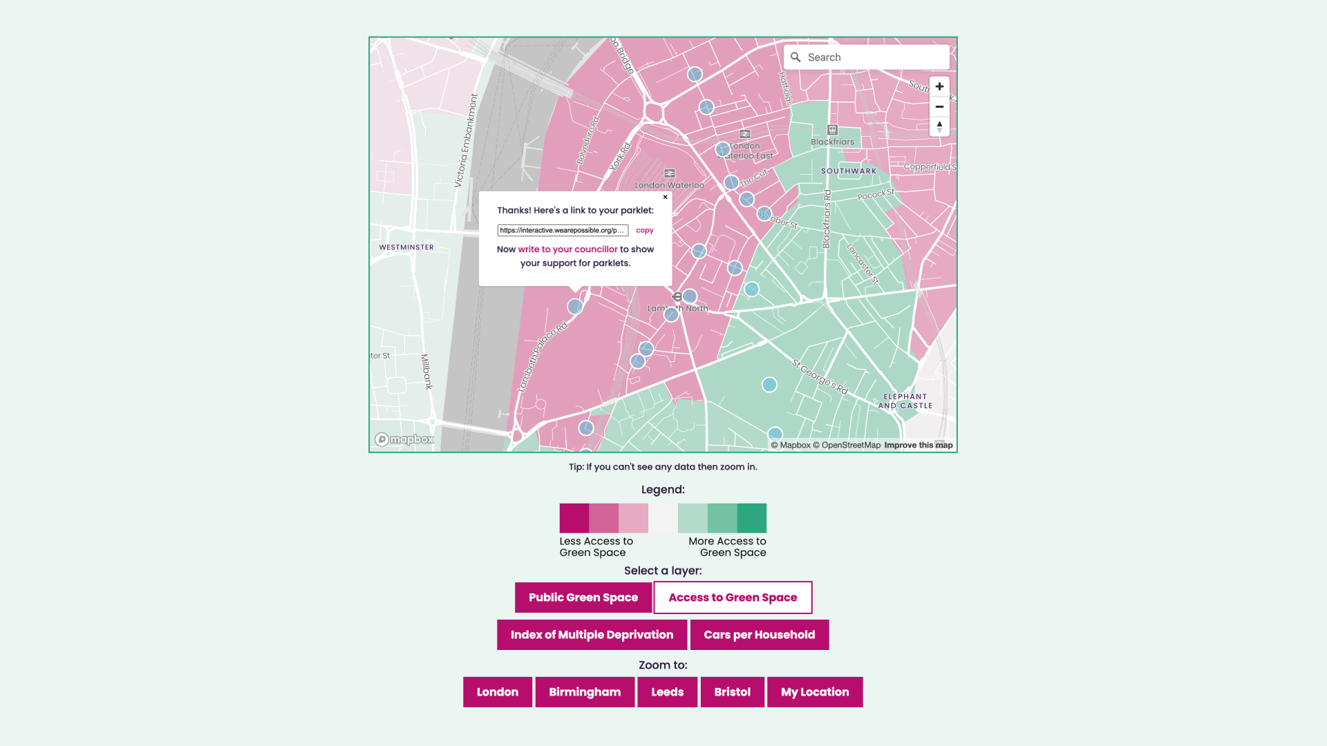
These techniques were put to good effect in the Parklet Plotter that I created for climate charity Possible. It uses geospatial data to draw a link between car ownership, deprivation and poor access to green space. Users can not only locate themselves (with links to four major cities, as well as a “zoom to my location” button), but they can also suggest a location for a parklet to be built – and share a link to that parklet with their friends, family, or local councillors.
Data storytelling is about making data meaningful, but ultimately it’s also about making it relevant. If we can find a way to make our stories resonate with the people we want to reach, then those stories will carry greater impact – and centring the reader is a great place to start.
We’re so glad to have Duncan share his insights with us about creating data stories that audience members could relate to. If you’re looking to create engaging and interactive stories through data, reach out to us at [email protected].
About Duncan

Duncan Geere is an information designer based in Helsingborg, Sweden. He’s the founder of the Loud Numbers data sonification podcast and the Elevate dataviz learning community. He also works with clients like Information is Beautiful, the Gates Foundation, Project Drawdown, and Conservation International to help communicate complex, nuanced information to a wider audience.