Welcome to the new and improved round up – the same great examples of data visualisation and storytelling we’ve spotted, with the added insight from our global network of data experts aka our friends.
Data visualisation has exploded in interest and application as it informs and guides us on pretty much everything as we wake, work, relax and sleep. (Check sleep trackers in our first ever round up from 2015 link at the bottom  )
)
For October, we take a look at some of the ‘Information Is Beautiful’ awards entries that caught our attention and more…
.
 Stew’s pick
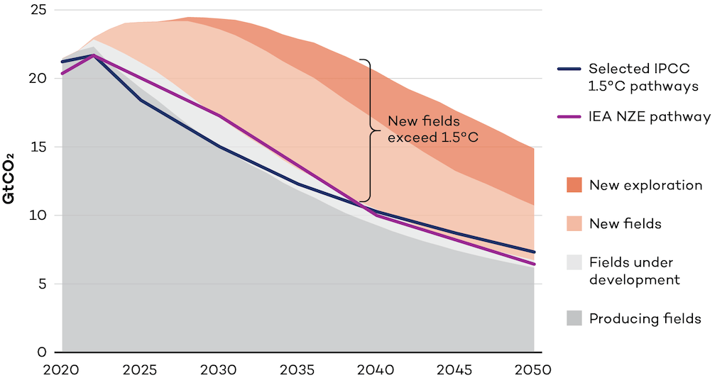
Oil & Gas exploration is not compatible with 1.5C
This month, I’ve gone with something very simple yet immediately impactful. Typically, we are all about interactivity and exploration, however the key is communicating the key message(s) through visual storytelling, and this chart lands heavily on that front.
Research from the International Institute for Sustainable Development shows that any amount of new oil & gas exploration is incompatible with 1.5C pathways set out by the IPCC.
Why it matters?
Put simply, we must stop all new oil & gas exploration today in order to stop our climate reaching the tipping point of 1.5C above pre-industrial revolution global temperatures. This chart conveys that conclusion spectacularly well, through clever, yet clear, use of colour. Simple, yet effective.
“The simplicity of this visualisation belies the complexity of the underlying data, which is what all good data viz should do.”
Stewart Pickering, Sustainability Pod GM
 Alli’s Pick
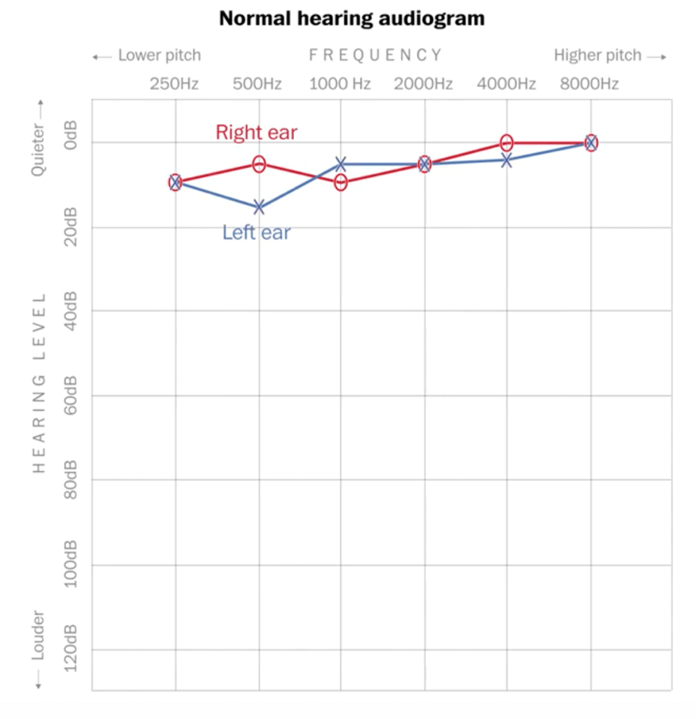
Why it matters?
It’s important for us to understand what’s happening with our health so we can advocate for ourselves and our family members. Hearing loss can greatly impact someone’s quality of life.
.
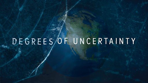
 Jo’s pick
This month I took a look at some of the entrees for the Information is Beautiful Awards, presented by the Data Visualization Society. One entree in particular stood out to me, Degrees of Uncertainty by Neil Halloran really captured my imagination and resonated with my passion for the Climate. It’s an animated data-driven documentary about climate science, uncertainty, and knowing when to trust the experts.
It makes complex concepts seem simple, granular data seem clear, whilst also making the story visually engaging. Not only that but Neil provides a thought-provoking and honest narrative, everything has been done with the audience in mind.
Why it matters?
Climate change is a complex and global issue, with many different perspectives and ideas rooted in science, data, politics and human behaviour. I believe that there are 2 key barriers to action. Firstly, showing these concepts in engaging ways that are accessible to everyone and second that people feel confident in the evidence to come to their own conclusions. I believe this documentary tackles both.
“We need more like this in the field of sustainability to inform and inspire audiences from all different backgrounds, continuing our steps towards getting Climate on the agenda and the public empowered to talk about it.”
Josephine Brown, Sustainability Pod Strategist
.
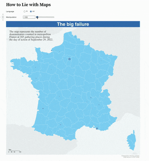
 David’s pick
This month my attention was grabbed by seemingly simple, yet very important data visualization piece. Almost all concepts behind data visualizations like scaling, projections, colouring, shape choices e.t.c are generalisation of a raw data and they can be manipulated/distorted.
This visualization shows how the same data can be shown in different ways, which can convey different messages.
Why it matters?
Given how tightly the world is connected now and how social media functions (viral/attention grabbing news usually gains more traction), it’s very important to stay aware of possible issues associated with different ways of visualizing data, since it will also have influence on how we make decisions .
“In this particular case, the choice of colours, shapes and most importantly transitions between different states makes it very clear for the viewer that the same data can be visualized in different ways.”
David Bumbeishvili, Senior Data Visualisation Developer
.
 Jake’s pick
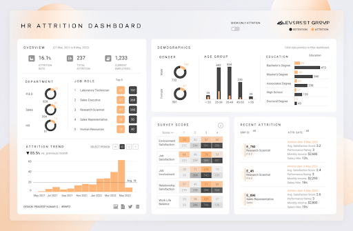
My October Pick is a Human Resources trends dashboard I spotted amongst the IIB awards shortlist, which provides insights on the attrition trends and themes within an organisation – broken down by department, job role, demographics, and survey scores.
It provides a one-page view of the key analytics any HR department needs to know in order to compile actionable trends to identify areas that improve retention and understand the factors that drive staff retention.
Why it matters?
Companies often have detailed insights of who they want to hire but rarely understand why people leave in the first place. After all, hiring staff is much more expensive than keeping them.
“I think it’s a powerful and attractive dashboard that utilises a white label solution, in this case Tableau. So I can see how it can be rolled out at speed and volume across other businesses and corporations.”
Jake Madsen, EdTech Pod Producer