Missing your weekly infographic and data viz fix? Fear not, in case you missed it the infogr8 team have curated some of the best bits we’ve stumbled on this week.
56 Wearables, choose one
Harrison Weber

Wearables was a big buzzword in 2014 and one infogr8 have kept a close eye on in terms of seeing how information design & data visualisation brings value to the understanding and presentation on such devices. This year we’re going to see a deeper penetration of the main players Nike fuelband, Jawbone, fitbit not to mention a whole host of indie innovations bubbling up to the surface via funding platforms such as Kickstarter.
As CES 2015 draws to a close, it was a moment to analyse the myriad of interesting new gadgets that caught our attention. Being wearable users and enthusiasts ourselves, we admire the dedication of Harrison Weber, testing a whopping 56 wearables!
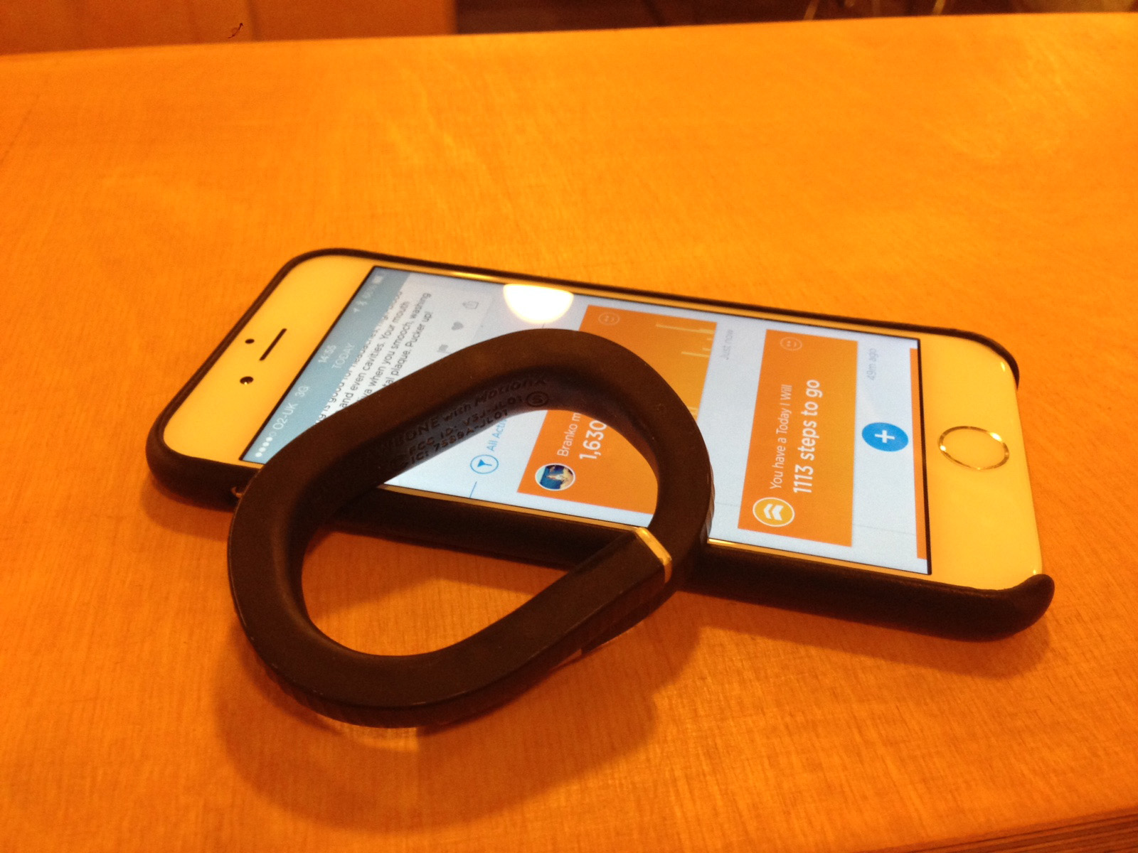
Image credit: Jessika Hunter
Keep your eyes peeled for next months infogr8 trend report where we designate a double page feature on the future of visualising wearable interfaces.
How to build a human
Eleanor Lutz, Tabletop Whale

GIF animations have been around longer than the internet itself, however we were all blown away by the attention to detail in this example showing the development of a human embryo and fetus from fertilisation to birth. A total of 396 sketches have miraculously been compressed into just 9 frames of animation, a miracle almost as great as life itself.
Turning 30: Described in Charts and Graphs
Cecilia Rabess

If Quentin Blake ever turned his hand to data visualisation, his work would probably look something like this. With all of the infogr8 team passing the 30 year-old barrier in the last few years, we found a lot to enjoy in these simple observations about growing old. Whether it’s the type of content you see most on your Facebook feed, or what time you call bedtime these days, we are sure you oldies will find lots to relate to in this fantastic tongue in cheek collection.
Weather Eindhoven 2014
Sonja Kuijpers, STUDIO TERP

We know the British love to discuss the weather at every opportunity, but now the residents of Eindhoven in the Netherlands can actually see how 2014 faired for them. With wind speed, precipitation and temperature plotted everyday from January to December, it may just be possible to use this visualisation to plan the ideal time to visit Eindhoven in 2015*.
*infogr8 take no responsibility for the resurgence of last years data, always bring a brolley.
The politics of British housing
John Burn-Murdoch, Financial Times

It comes as little surprise to us that property value and rentals skyrocket around the London area, but this interactive visualisation tool does a great job in allowing us to see the disparity and explore hotspots around the UK. The map seamlessly transforms into a scatter plot allowing us to compare regions with even greater accuracy in a beautifully simple, clear way.
The Best Data Visualization Projects of 2014
Flowing Data

This collection of work from last year does a great job of demonstrating how diverse the world of data visualisation is, as well as hinting at the possibilities that are yet to come. The infogr8 team could not agree on an overall favourite, but the tech geeks in us all love the prospect of sky writing with LEDs mounted on quadcopter drones, dive in and take a look.
Bubbleized
infogr8

In November 2014 we beta released bubbleized, an interactive tool to help visualise the buzz on Twitter around the VISUALIZEDiO event in London. Inspiring talks we’ve pocketed in our collection from Pascal Raabe, Marcin Ignac, Stephanie Posavec, Valentina D’Efilippo to name a few, left us buzzing for weeks to follow. It turned out that the community enjoyed playing with bubbleized as much as we did, so with a few tweaks and stripping back some less important elements we have now opened up the tool to the public so that you can explore your own topic.
By Shan Carter, Wilson Andrews, Derek Watkins And Joe Ward, The New Your Times
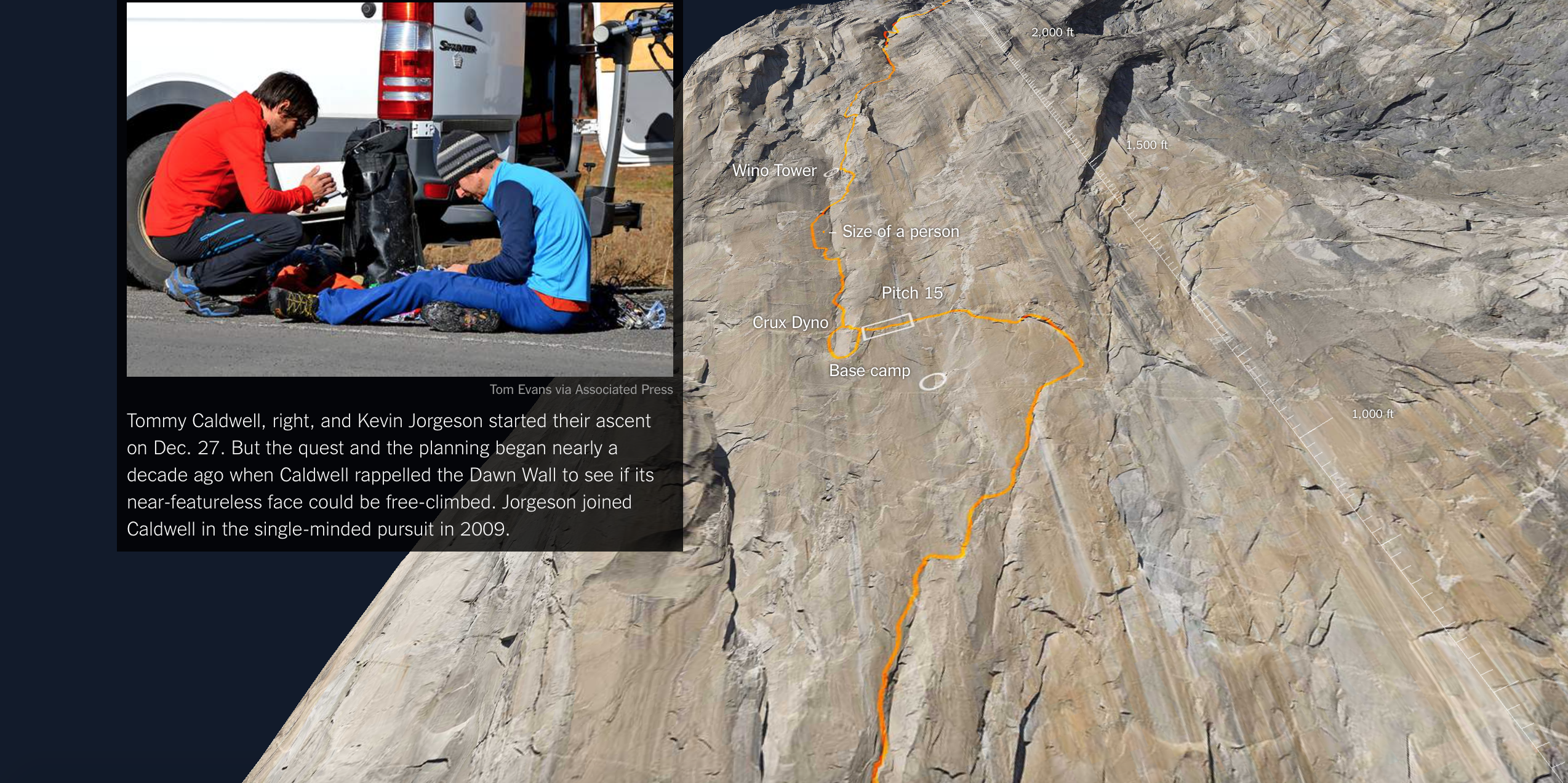
Being submerged in the urban landscape of London we find it difficult to imagine what a 3,000-foot vertical sheet of granite would actually look like, let alone the challenges two american climbers face as they attempt to scale El Capitan in Yosemite National Park, California. Luckily, the New York times has produced a parallax infographic unlike any we have seen, charting the journey of Tommy Caldwell and Kevin Jorgeson as they attempt what has been described as most difficult climb in the world.
What inspiration have you seen this week? Keep us updated via @infogr8. Until next week..