Sunny Zhao on how local governments can drive climate action
Reading time
Category
What are the key data barriers that local governments experience in their efforts to enforce climate action? We asked Sunny to share her insights based on her conversations with data specialists from CivicWell and the City of Palo Alto in California.
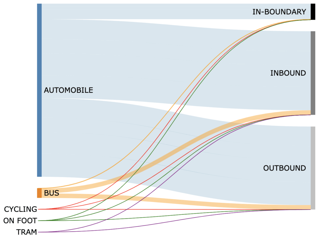
Transportation Emissions (tCO2e, GPC Protocol compliant) for the City of Santa Monica, CA, USA, in 2021. Santa Monica is one among 667 places with data available to the public in Google Environmental Insights Explorer. Data Source: Environmental Insights Explorer (May 2023). Sankey Chart developed with D3.js by author.
Throughout my experience working in local government in the US, I was drawn to maps as tools for planning and decision-making. From 2019 to 2020, I was embedded in the City of Culver City as part of my CivicSpark Fellowship, a California Governor’s Initiative Americorps program partnered with the State of California, USA.
I soon noticed the efficacy of maps for supporting projects such as bike path improvement, plastic pollution legislation, and augmented reality for stormwater outreach. As I built capacity for sustainability and community climate resilience, my interest in GIS grew, and this led me to specialise in spatial data.
Looking back, my thoughts are drawn to how data drives climate action in local public agencies. Even in a big data world, communities are a critical arena for climate action – an opportunity to reduce emissions and increase energy savings in a direct local context. According to the City of Palo Alto, the local level is where climate adaptation planning is most effective.
![]() Climate action plans are strategic roadmaps for reducing greenhouse gas emissions. This map from the California Air Resources Board visualises climate action planning throughout California at the city and county levels.
Climate action plans are strategic roadmaps for reducing greenhouse gas emissions. This map from the California Air Resources Board visualises climate action planning throughout California at the city and county levels.
With an interest in how data makes change at the local scale, it’s worth zooming in to where climate action involves communities. During my project, I worked closely with two local government professionals from CivicWell and the City of Palo Alto; I recount their insights here.
Data inconsistency in local governments
For my first conversation, I reached out to CivicWell, a nonprofit dedicated to supporting sustainable policies, building climate-resilient communities, and cultivating leaders in climate action. They address program areas including climate change and energy, water, and community design. They are also the program organisers of the CivicSpark program. I value their perspectives on how data drives climate action at the local level because they have a strong network and provide resources for local governments, nonprofits, and other public entities and coalitions.

Savannah Rose, CivicWell’s Data Marketing and Recruitment Manager, shared how local governments are often challenged by data inconsistency across space and time.
Consistent data is an important foundation for climate action, as it illuminates and evidences areas of necessary improvement and priority, while being considered alongside other factors such as cost and community pushback. Awareness and monitoring provide the basis for targeted action and policy.
As numerous interest areas compete for attention in public agencies, initiatives may require months and years of sustained momentum and dedication to gain approval and priority in planning or policy. For example, the City of Culver City sought evidence for the effectiveness of an existing plastic pollution ordinance before they considered passing a stronger amendment. They drew the attention of public leaders by demonstrating urgency with a quantitative and qualitative rationale.
There are two dimensions to focus on when talking about data inconsistency:
Data inconsistency across space
Data may be inconsistent due to independent data collection efforts of separate jurisdictions. Data collection may be highly particular to the needs of local areas and lack unified data standards for cross-comparison. These data silos may impede more comprehensive opportunities for collaboration and lead to redundant efforts and investigations. In the process, regional scale trends and data stories may be left out of the picture.
Data sharing can address this issue. For example, organisations such as the Southern California Association of Governments (SCAG) and the California Air Resources Board provide extensive programs, tools, and data to support local public agencies in issues relating to transportation improvement, air pollution mitigation, and emissions reductions. Many cities also have their own open data portals. However, disadvantaged areas and agencies that lack funding or resources may find it more difficult to establish and maintain such resources.
Data inconsistency across time
Data collection may be inconsistent as a result of changing policies. Local government officials often juggle multiple responsibilities, and data collection may cease in the absence of continued policy pressure. As a result, staffing focus turns elsewhere, and data gaps begin to form. Another source of inconsistency may be related to changing data collection procedures rather than discontinuation. Metrics and KPIs are altered when language around a topic evolves, improves, or when priorities shift.
Long-term data is vital for tracking the effectiveness of climate action policies, as it may take years for implementation and beneficial effects to be measurable and for informing future decisions. Policies with successful track records may be likely to receive continued funding and support. However, this may be more challenging for resource-poor areas to sustain.
Data visualisation for climate action in local government
In my conversation with Rose, we also discussed the importance of presenting data to the general public, policy-makers, and funding sources. Data that seems abstract and associated with complicated statistics can be made accessible and intuitive through well-designed data visualisations.
Rose also mentioned how climate action data visualisations for local government would need to creatively address data gaps and inconsistencies. Transparent understanding around climate policy elucidates impact and fosters feedback and engagement from the communities served.
To add to Sunny’s point on presenting data to the public, it can also bring clarity, transparency, and accountability to climate emergency policies. Our work with City of London Corporation tracked 52 key indicators on climate action that help residents, committee members, and business leaders track their local authority’s pursuit of hitting net-zero emissions by 2027.
As a case in point, the City of Palo Alto provides examples of engaging local government data visualisations that connect the community to climate action. I spoke with Cameron Grannis, their Sustainability Environmental Specialist, to learn more about their efforts.
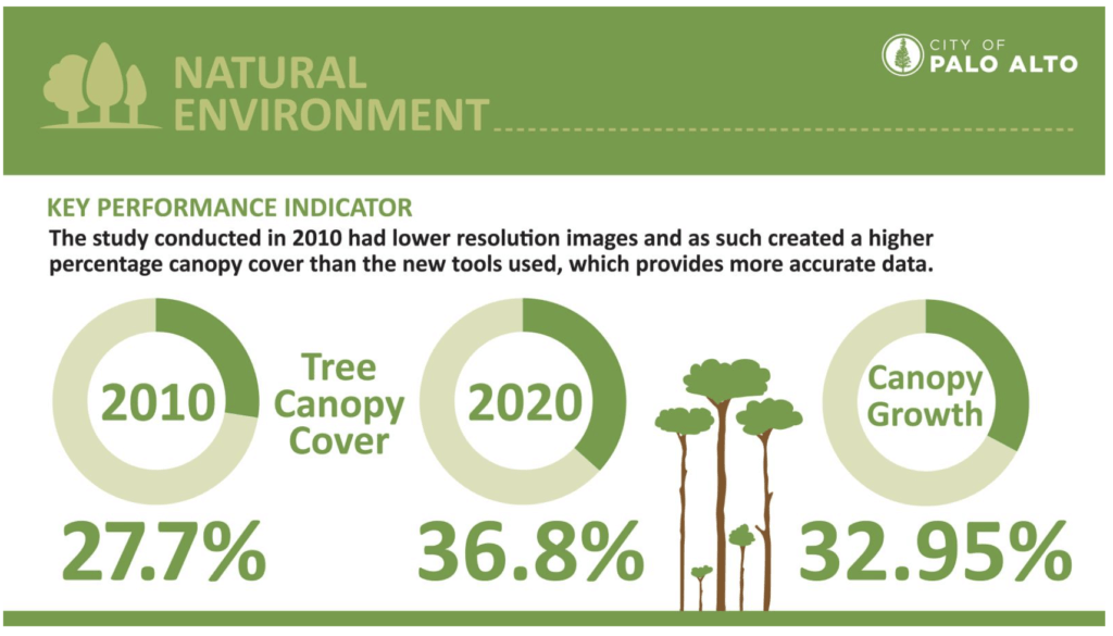 The “Natural Environment” section of the City of Palo Alto’s “Sustainability and Climate Action Goals and Progress” infographic demonstrates adaptive visualisation for a temporal data inconsistency, explaining an improvement in imagery resolution since 2010.
The city has a Sustainability Hub as a part of its Digital Forum. Under Goals and Progress, there is a multi-panel infographic. Each section of the infographic features a motif corresponding to a section of the city’s Climate Action Plan. The Sustainability Hub also has an interactive Climate Action Map that encourages community input on how individuals are taking climate action steps. Overall, data visualisation appears to play an active role in community engagement. Meanwhile, they are also developing a new interactive Sustainability Dashboard using Power BI.
Enabling steps for climate action with Google’s Environmental Insights Explorer
Data availability for local governments improves with new tools and resources. For example, data monitoring is necessary for greenhouse gas (GHG) inventories, which are important for informing climate action plans. Many cities, including Palo Alto, are using a new data tool called Google Environmental Insights Explorer (EIE) to help complete their GHG inventories.
EIE is a free data tool for cities, regions, consultants, and NGOs that measures and analyses emissions, enabling steps for climate action. It makes use of Google Maps (Google Location History) big data and machine learning models, providing data for thousands of cities and regions across five continents. It encompasses the core areas of Building Emissions, Transportation Emissions, Solar Potential, and Tree Canopy, as well as a beta option for Air Quality.
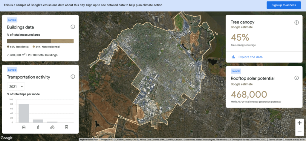 EIE dashboard for the City of Palo Alto.
More specifically, the City of Palo Alto uses EIE to estimate vehicle miles travelled (VMT) in their GHG Inventory. Previously, an external consultant estimated this metric for the city using travel forecast models and big data such as massive cell phone data. This level of complication meant that the metric was not estimated annually. Likewise, the model did not reflect changes in decreased traffic well during the pandemic. Now, EIE has done the modelling legwork and provides a direct baseline estimate of VMT that is free, timely and accurate, while accounting for multimodal transportation.
EIE has worked to improve its usefulness for city needs over time. However, GHG inventories represent only the start of the Google EIE Team’s vision to drive local climate action. Spatial analysis on EIE’s data could further benefit action planning and performance tracking, including how it can inform city investment decisions on different modes of transportation.
Driving climate action at the local authority level
Data visualisation is crucial to making data accessible for all while helping us track our progress towards a more sustainable world.
Data drives climate action at the local scale from the ground up, providing the evidential basis for building policies and making decisions. With more complete and consistent data, climate action plans and policies can be formed and tracked with greater awareness and transparency.
Indeed, emerging data tools like EIE seem promising for providing new realms of consistent data for local government. Meanwhile, climate action data dashboards help communicate current data trends to the public. As EIE continues to evolve and make data available for cities, perhaps cities will shift to using EIE for more of their data needs for GHG inventories, climate action planning, and performance tracking. By adding consistency and completeness, local authorities can be empowered to fill data gaps where local resources fall short.
Our Sustainability pod runs Lunch & Learn sessions to dive into the benefits of our Climate Action Dashboard for local authority teams. Contact our GM Sustainability Stewart Pickering to find out more.
About Sunny Zhao

Sunny Zhao is a data visualisation freelancer currently based in Los Angeles County, USA. After working as a GIS Specialist, she went on to expand her spatial expertise with an MSc in Spatial Data Science and Visualization from University College London, where she enjoyed learning about urban spatial science, networks, agent-based modelling, and machine learning. For her dissertation, she used percolation analysis to detect clusters in Europe’s road network of Europe, extracting data from OpenStreetMap and evaluated their correspondence with human geography.