Rutuja Pawar on navigating dashboard design: 6 mistakes to avoid
Reading time
Category
After many years of working as a data design consultant, Rutuja Pawar has seen the same mistakes over and over again in dashboard design. Here she shares her observations by placing six mistakes in a Tableau dashboard as a fun way to test your knowledge of design best practices. Can you spot all six?

What is wrong with this data dashboard? (Image generated using DALL-E)
As I sat down to write this article, I pondered over all the client meetings that I’ve had as a data design consultant. Interestingly, the pattern was the same in each case: all of them were baffled by their existing dashboards! The dashboards were not being understood, let alone, used by the intended audience. As it turns out, the problem is usually not the data itself but the user experience that the developers had not crafted. This is a striking reminder of an often overlooked aspect in data analytics: data experience design.
What is data experience design?
Data experience design refers to the interface between data visualisation and possibilities for enhancing the user experience, creating meaningful and presentable dashboards that enhance user journeys. It aims to create aesthetically pleasing data dashboards using visual design principles by strategically combining images, colours, fonts, and other dashboard elements.
This is important for two reasons:
- Improving the UX – Guiding and engaging the user aids their understanding while accurately conveying the core information.
- Informed decision-making – By accurately identifying patterns and trends in the data, users can minimise risks/errors and avoid implementing flawed business strategies, helping to align their data strategy with the organisation’s goals.
At this point, you may be thinking ‘I understand the theory and the importance of this aspect, but how do I practically implement this?’ To begin with, having a user-centric mindset and empathising with the user always helps. Only the wearer knows where the shoe pinches, right?
Let’s dive into a working example of crafting a data dashboard that delights.
Data dashboard design: Experiential learning in Tableau
You’re probably already familiar with the concept of experiential learning or, in simpler terms, learning by doing. In the words of Benjamin Franklin, “Tell me and I forget, teach me and I may remember, involve me and I learn.”
So here’s a small challenge for you. I’ve used the Tableau Accelerator Supply Intelligence workbook and modified it to create six design errors. Tableau Accelerator workbooks are expert-built and ready-to-use dashboards for a variety of use-cases – supply chain analysis in our use case. You can use the workbooks as a starting point, customise them and combine with your own data to speed-up your data analysis.
Your task is to inspect the Dashboard (Tab Before) below (full-screen mode is recommended) and try to identify as many design errors as you can. Be good and try not to cheat!
Take a pause here to complete this activity and then continue reading this article further.
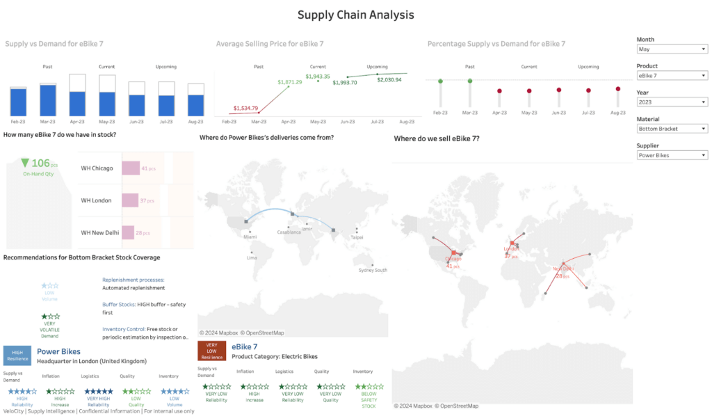
Tableau data dashboard – Before (modified by the author with design errors)
Six common design errors in dashboard design
At this point, I’m assuming that you’ve brainstormed and already identified some design errors in the sample dashboard. Now let’s take a closer look at all six of the data design errors and their detailed explanations.
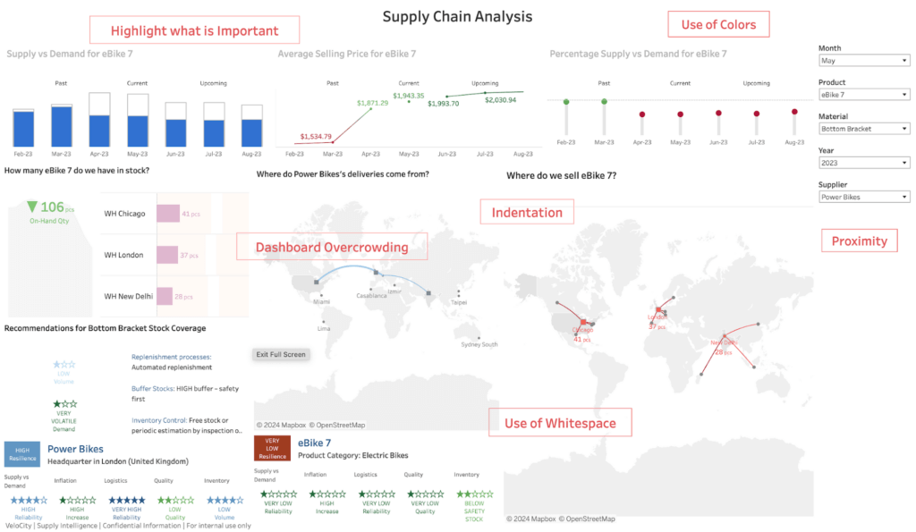
Tableau data dashboard – Design_Errors (modified by the author)
1. Dashboard overcrowding
Looking at the dashboard, it’s clear that it contains a lot of visualisations. This results in overcrowding of the information and hinders interpretability. To make a data dashboard easily interpretable by its users, it’s always recommended to limit the number of data visualisations that appear within it.
In our sample dashboard, we can observe that there are visualisations related to three elements in the supply chain: Product, Supplier, and Material. Hence, we can easily split them into three dashboards and add page navigation for ease of access.
2. Use of colours
As we observe the dashboard, we see that the colours are not coherent and appear to have been selected at random. The same colours are also used repeatedly for different legends. This should be avoided.
Colours should always be used sparingly in data dashboard design. Try to use softer colours and vary their saturation levels; harnessing the power of the colour grey is an optimal choice.
Most importantly, you should always consider the topic of data dashboard accessibility, ensuring that the end product can be used by as many people as possible. This becomes crucial especially when colour is the distinguishing factor for the chart values. It is always important for your dashboard to be colour-blind-friendly. If you need to inevitably use specific colours that are not colour-blind-friendly, colour can’t be the only distinguishing factor. Instead, create visualisations that are supplemented with the use of icons and labels that provide easy differentiation. It is also useful to check your data dashboard for colour-blind-friendliness through a simulator like Coblis .
The topic of accessibility is a sensitive one, and many people may hesitate to speak out due to the fear of judgement or misunderstanding. Your very first step in creating accessible data dashboards should be creating an inclusive culture – an environment where people feel free to discuss openly on this topic with an assurance that their needs will definitely be catered for.
As you’ll see later in the revamped dashboard, I’ve made use of the colour-blind-friendly palettes provided by Tableau. For further insights on this important topic, Jeffrey Shaffer has put together a brilliant article on 5 Tips on Designing Colorblind-Friendly Visualisations, which should be your next read.
3. Highlight to show what is important
In the current dashboard, we see that not all the important information is highlighted or even present. Consider the titles of the visualisations in the top row: they are all light in colour and do not stand out. Lower down, some of the charts (including the bar chart and the lollipop chart) are missing values, which makes it hard for the user to gauge them without an axis to refer to.
Chart titles and annotations inform users about the data visualisations they are looking at, and the chart values convey important data figures. In response, the titles here can be highlighted consistently by formatting them in black, and the missing values can be displayed on the charts, both of which will aid the user in their analysis.
4. Proximity
Next, we see that the relevant information is not placed or grouped together. Take a look at the filters: the date filters are stacked in between the other filters. Or for the eBike7 product, the different charts are not meaningfully placed together.
The proximity of relevant elements on a data dashboard establishes a relationship between them providing a meaningful structure. In the revamped dashboard, by contrast, I’ve incorporated this sense of proximity by placing the date filters together. The views on the product dashboard are also placed in such a way that the KPI cards and high-level visualisations are in the left-hand group, with the more detailed deep-dives in the right-hand one.
5. Use of white space
On further inspection, we see that trying to cram too many visualisations into a single data dashboard reduces the space between them. This is often the result of dashboard overcrowding, perfectly illustrating the notion that one design mistake leads to another.
An effective data dashboard always has an optimal number of visualisations, with sufficient spacing between them. White space is like oxygen that your dashboard needs to breathe. The use of white space on a dashboard reduces visual stress and allows the user to differentiate between the visualisations and to pause and reflect on one before moving onto the next in their analysis.
6. Indentation
The last of the six errors comes from the fact that the visualisations are all scattered on the sample dashboard and are not properly indented or well-aligned with each other.
Providing proper indentation to the data visualisations results in their correct alignment. This not only looks neater, it also minimises eye travel, allowing the user to focus on the most important content.
Correcting design errors: the revamped data dashboard
Identifying the errors is only half the job. Now we need to go ahead and fix them. Of course, there can be many potential solutions, but here is mine:
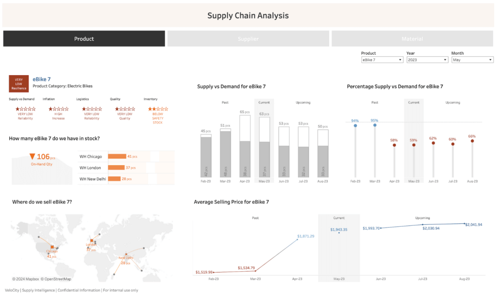
Tableau data dashboard – After with design errors fix (modified by the author)
Now we have a more user-friendly, comprehensive data dashboard solution with a sleeker design.
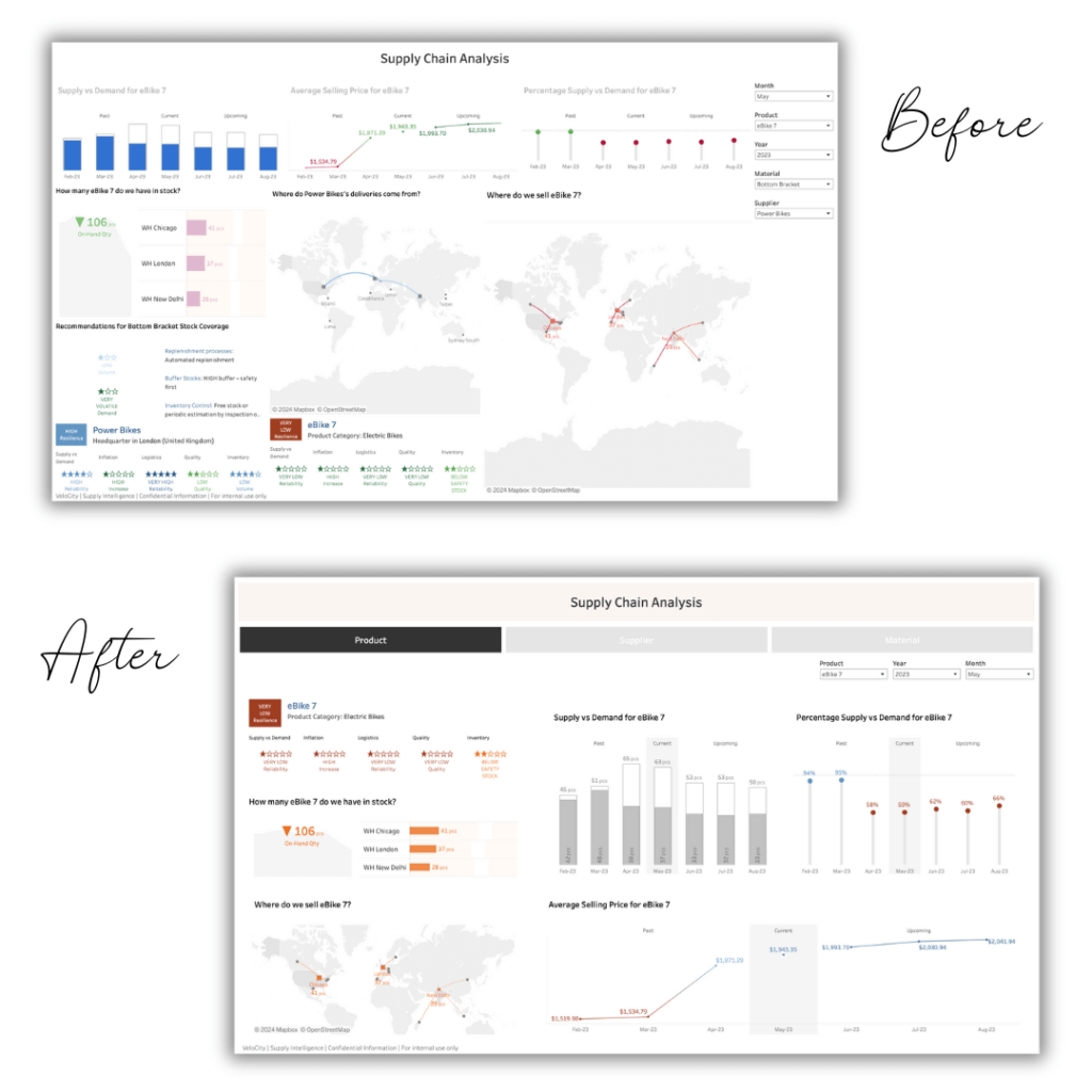
Tableau data dashboard – Before and After comparison (modified by the author)
With this exercise, we’ve only scratched the surface of data design. In my opinion, data experience design should be shipped together with the data analytics curriculum. The exercise above is a clear reminder that, irrespective of how skilled a data analyst you may be, if you don’t consider the UX aspect in your dashboards, your skills will not shine through.
Wrapping up, I’ll leave you with some (written and visual) food for thought: “Your visualisations should act like a campfire around which your users, stakeholders gather to tell stories.” Done right, data design keeps the campfire burning, and the most engaging stories to emerge.

Data + Design Storytelling Metaphor (Image generated using DALL-E)
We thank Rutuja for such a fun and engaging exercise about dashboard design best practices. At infogr8, we have a world-class team of designers who know the ins and outs of creating class-leading data dashboards. Contact us to learn how we can help you do more with your data.
About Rutuja Pawar

Rutuja Pawar is a Visualization & Interaction Science Consultant at Accenture Germany, where she focuses on data and design to empower her clients, unlocking critical business data through intuitive, user-centric dashboards. Rutuja is also a mentor, a design thinking coach, a tech trainer and an #IAmRemarkable Facilitator.