3 examples of data viz at the boundary of tech and reality
Reading time
Category
In 2021 we’ll see technology increasingly blurring the boundaries between the real and the digital – no more so than in data visualisation. Plus, some of the most exciting creative work today involves code.
Take a look at three of our favourite recent ‘real or no real’ data visualisations.
1. Do these people look real to you?
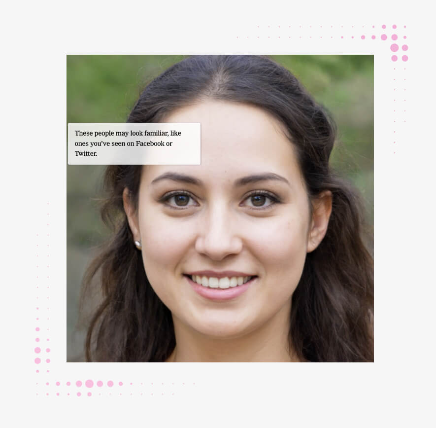
The New York Times / Nvidia
It may surprise you to learn that the woman in the picture above is a data visualisation.
The New York Times recently ran a story about businesses that sell ‘fake people’, featuring a series of algorithmically generated, but very real-looking, faces. As you scroll, they morph into one another in a rather unsettling way.
None of them are faces of people who ever lived. All of them were created by a kind of neural network called a GAN, or Generative Adversarial Network, built by computer graphics company Nvidia.
Faked profile pictures can be bought for as little as a dollar each online and used by anyone – from a business that wants to appear more diverse to an online troll posing as a friendly face.

As technologies like face generation and deepfakes get more powerful, they threaten to undermine consumers’ trust in brands. Brands and media companies that want their customers to keep trusting them will have to work hard to maintain that confidence. Brand managers take note when opening up creative decisions to the public, social teams be on alert when fake content surfaces and amplifies.
2. Explore the forest of 2050
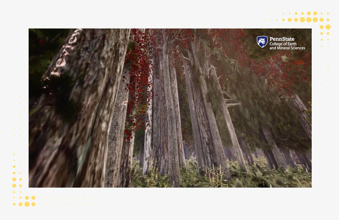
A fake forest, a bank of ecological data and a variety of modelling scenarios combine to impressive effect in Penn State University’s VR Forest – built to demonstrate what a typical Wisconsin forest might look like in 2050 in the context of climate change.
The team began by simulating a 2020 forest – using procedural methods that allow the trees to appear in randomised, organic ways – before layering in a range of data points that allow the user to walk around and explore how it may change over time.
One of the biggest climate emergency challenges is communicating what it looks like in the real world – now and in the future. This tool strikes an effective balance between the highly scientific and the naturalistic, providing a data-based experience for non-experts to understand.
3. Beautiful threats

Trend Micro
Generative artist Brendan Dawes recently created this beautiful 3D motion graphic for IT security company Trend Micro.
Made from 48 hours of cyber threats detected by the company’s system, each flower-like object represents one hour of data. The more complex the pattern and the redder the colour palette, the more risk the threat carried. Danger has never looked so appealing.
Generative and algorithmic elements have become increasingly common in recent data visualisation. By blurring the boundaries between art and information, data art is a powerful tool brands can use to engage new audiences and open up new perspectives.