Data design system
Moody's | Data Design Guidelines
Challenge
-
As a global leader in financial intelligence, Moody’s needed to evolve its brand to better reflect its role in turning data into insight. Following a comprehensive brand transformation led by Interbrand, Moody’s sought to bridge the gap between branding and data design, ensuring that their data visualisation standards aligned with their new strategic positioning—one centred on clarity, confidence, and impact.
The challenge was to create a cohesive, scalable data design system that empowered teams across Moody’s to present financial and risk intelligence in a way that was consistent, compelling, and instantly recognisable.
Solution
-
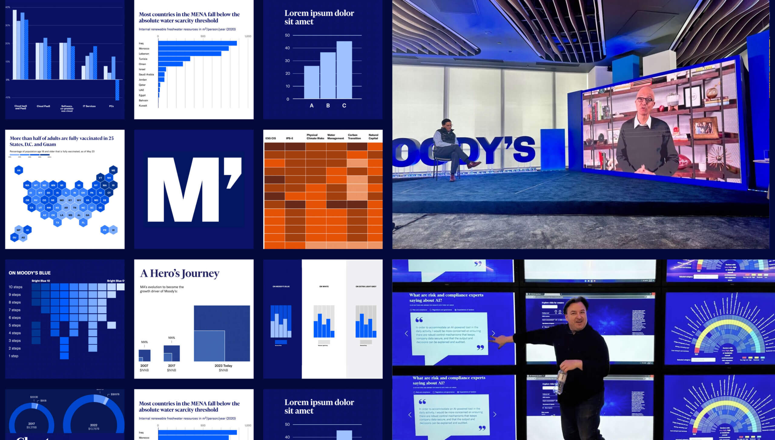
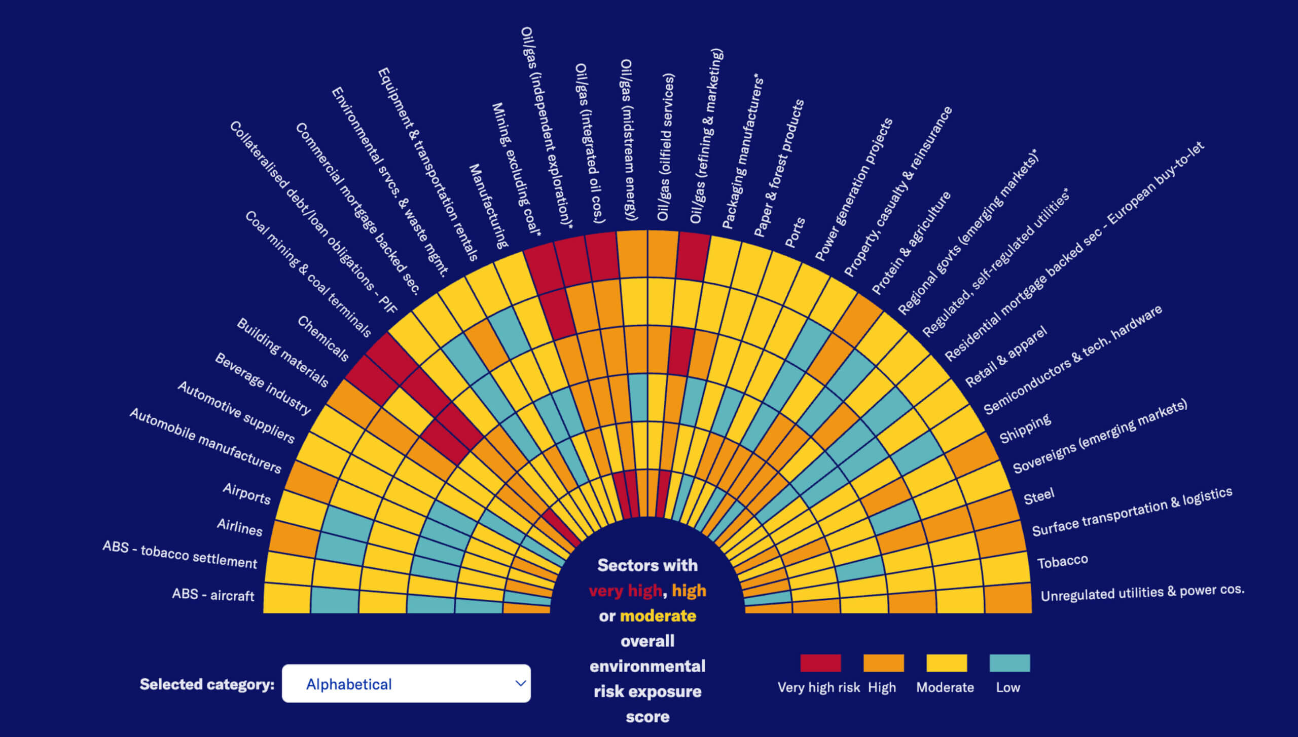
Infogr8 partnered with Moody’s to develop the Moody’s Data Design Guidelines, a comprehensive framework that transforms complex financial datasets into intuitive, visually compelling insights. Designed to seamlessly integrate with Interbrand’s new brand identity, the guidelines ensure that every chart, graph, and visual element adheres to the same principles of precision, clarity, and trustworthiness that define Moody’s.
By blending data intelligence with human-centric design, we created a modular system covering:
- Data visualisation principles—ensuring readability, accessibility, and brand consistency.
- Scalable design frameworks—adapting data storytelling across Moody’s global ecosystem.
- Styling and formatting rules—optimising colours, typography, and layout to enhance credibility and comprehension.
Results
-
- Seamless Brand Alignment: The guidelines ensured that every data-driven output—from investor reports to interactive dashboards—was a true extension of Moody’s brand identity.
- Empowering Teams at Scale: By establishing a clear, structured approach to data visualisation, Moody’s teams across the world could communicate insights faster and more effectively.
- Enhancing Market Leadership: The project reinforced Moody’s position as a trusted authority in financial intelligence, aligning its data storytelling with the clarity and confidence of its broader brand transformation.
Led by Infogr8 in partnership with Moody’s, this project was supported by expert contributors from our global Data for Everyone® network:
Gabrielle Merite, Creative Data Visualisation Lead
Amy Cesal, Data Visualisation Strategy Lead


