Kate Miller on sparking social change with visual data
Reading time
Category
Tackling social injustices through an equity lens requires an intentional process. Kate Miller examines how data analysts and designers can create charts that lead to more equitable solutions.
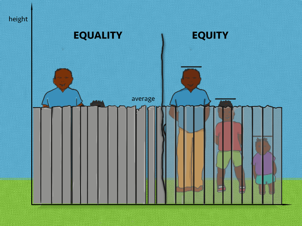
Image credit: “Illustrating Equality Vs. Equity”, Interaction Institute for Social Change | Artist: Angus Maguire
Plotting behind the fence: Equity in visual data
‘Equity’ as a concept can be difficult to grasp. It is not the same as ‘equal rights’. It has very little to do with the stock market. It can coexist with diversity and inclusion, but is also important in its own right. Before I start to sound like a riddle, I’ll share what helped shape my mental model around ‘equity’ and how I distinguish it from ‘equality’ in my work as a data analyst.
It wasn’t until I came across the following infographic that it really clicked. It shows three people standing behind a fence, each of varying heights. On the opposite side of the fence, a baseball game is being played. The tallest person enjoys an unobstructed view, while the other two struggle to see. The concept of equality suggests giving everyone the same size of box to stand on. This would allow the tallest person to see better and the middle person to have a partial view, but the shortest person would still face difficulties. Equity takes a different approach – by allocating boxes based on individual needs. In this particular situation, the tallest person doesn’t receive a box, the middle person gets one box, and the shortest person receives two boxes, ensuring everyone has an opportunity to see and enjoy the game.

Image credit: “Illustrating Equality Vs. Equity”, Interaction Institute for Social Change | Artist: Angus Maguire
Now let’s imagine going back to a time before the boxes and looking at the infographic from the perspective of the people in the stands. The fence makes the shortest individual completely invisible. Similarly, graphs and charts can hide disparities or divert attention away from equitable solutions by concealing crucial data points.
This idea of charts acting as obscuring fences, even when their explicit purpose is to highlight inequities, serves as the inspiration for this article.
Here are three real-world examples that illustrate this concept.
Example 1: Gender pay gaps – How effective stratification creates more equitable solutions
When approaching a chart, the first thing I consider is, “What message will decision-makers take away from this, and how are they likely to act upon that information?”
The two charts below depict the gender pay gap in the US in 2021. The first chart, ‘Median weekly earnings by gender’, compares the median values between genders, essentially assigning the same height to all men and all women behind the symbolic fence. One could readily understand if the takeaway then was that women should receive a 20% pay increase across the board.
In contrast, the chart labelled ‘Women’s Earnings’ provides a more detailed comparison, stratifying the data by profession. When considering this breakdown in conjunction with the other chart, it becomes evident that a universal 20% wage increase for women would actually create new disparities. Male statisticians would suddenly make almost 20% less than their female counterparts, while male dentists would still garner approximately 9% higher earnings than women in the same field. In this way, the effective use of stratification in this chart guides the audience, including decision-makers, to consider more equitable solutions.
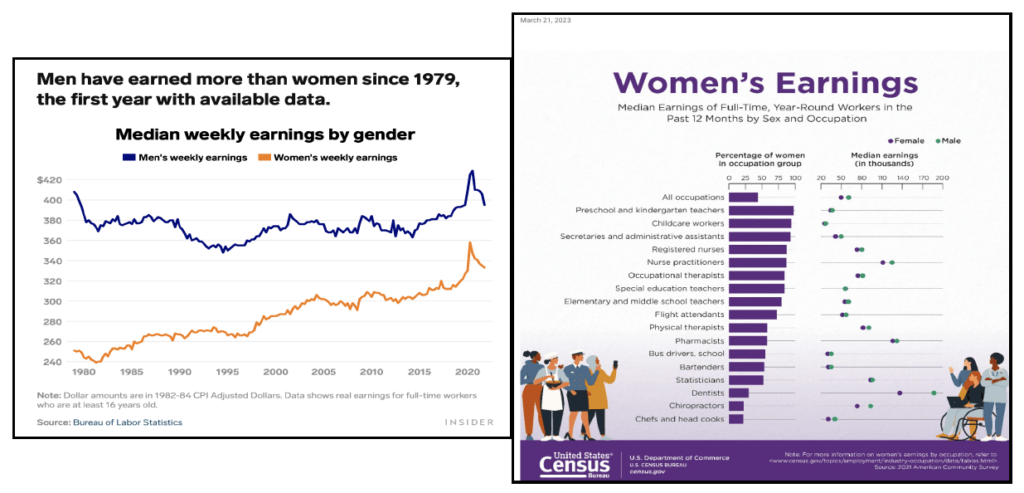
Image credits: Left: “These 8 charts show the glaring gap between men’s and women’s salaries in the US”, Business Insider; Right: “Women’s Median Earnings”, Census Bureau
Example 2: Racial disparities in COVID-19 deaths – Gathering a full picture of the data through contextual information
In Example 1, we looked at two standalone charts and were able to craft a plausible narrative. Let’s see if we can do it again.
Both charts below use data from The COVID Tracking Project and were published one week apart. They highlight the disproportionate burden of COVID-19 deaths on black individuals in the US, surpassing their representation in the overall population. This statistic raises questions the chart can’t answer, but one it can answer is this: “Which are the most impacted states?”

Image credits: Left: “What Do Coronavirus Racial Disparities Look Like State By State?”, National Public Radio (NPR); Right: “Black Americans face higher COVID-19 risks, are more hesitant to trust medical scientists, get vaccinated”, Pew Research Center
In the chart on the right, we see the four states at the top are: District of Columbia, Louisiana, Mississippi and Georgia. Compare this with the chart on the left, specifically the one depicting deaths, and the four most deeply vermillion states are Wisconsin, Michigan, Kansas and Missouri.
Wait — if these charts are displaying the same data, why are the lists different?
The reason is that each uses a slightly different methodology for ranking the states: the left chart appears to use the absolute difference, whereas the right chart seems to use the relative difference. The point here is not that one graph is right and the other wrong, but rather that these decisions are not trivial – they inform the narrative and the conclusion.
For clarification, we turn to context — the accompanying article — and learn that officials in New Orleans used Census tract data and existing research to identify transportation as a barrier to low-income African-Americans accessing drive-through coronavirus testing. This caused them to alter their strategy and deploy mobile testing vans. The chart says nothing about access to transportation, so it is more of a retroactively useful tool to monitor the impact and identify locations that could benefit from a similar intervention.
In finding the solution, there are inevitably limits to what a chart can achieve. Additional data sources, subject matter experts and boots on the ground are critical to developing a complete picture and a clearer path towards equity.
Taking this back to our fence, while a chart comparing spectator heights could inform a box distribution strategy, it might take someone familiar with the situation to ask: Why are people behind the fence to begin with, and not in the stands?
Example 3: Geo-based food insecurity – Know your audience to help them make actionable decisions
At this point, it’s worth stating that developing the full picture is insightful, especially at scale, but it takes time. In the interim, should boxes still get distributed at the fence so everyone can enjoy today’s game? Do transient fixes still have value?
Food insecurity stems from a household’s inability to afford or access balanced meals. It can lead to numerous health problems. To inform solutions, officials rely on location-specific data, ranging from community gardens to soft drink taxation. So, consider carefully your audience’s jurisdiction and scope of influence when determining the level of aggregation for your chart.
Essentially, apply the product development principle of “working backwards from the customer”, but replace ‘customer’ with ‘audience’. Work backwards from what they’re able to do and build a graph that tells them how to allocate resources.
The graphs below use different calculations and draw on data from different years, so we cannot compare them directly. But they can still serve a purpose to the right audience. Take, for example, a grocery store owner who looks at the graph on the left and decides to build a store in Massachusetts. To identify where it would have the greatest impact, they refer to the graph on the right and hone in on the west. For a grocery store owner, then, it is appropriate to start at the state level then drill down to the county level.
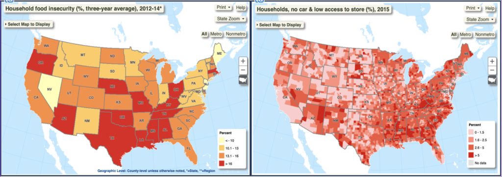
Image credits: Economic Research Service (ERS), U.S. Department of Agriculture (USDA). Food Environment Atlas.
In contrast, the mayor of a small town in Northeast Maine doesn’t have power at the state level. So while aggregation at that level (left chart) is interesting, it can distract them from problems they are able to address. By looking at the right chart instead, they observe their jurisdiction has a disproportionately high percentage of households with low access to food supply, and can use that data to justify a rideshare program. They may even want to go a step deeper and view street-level data for more targeted solutions.
Now, returning to our question. How you respond to a disparity — found in real life or in a chart — depends on the tradeoffs, and the resources at your disposal. If you have spare boxes, great, walk to the fence and distribute them today. If you own a grocery chain and want to help with national food insecurity, wait for the data to show you the way.
Ensuring equity in data visualisation: 3 key considerations
So what’s the takeaway here? If you’re creating charts that tackle issues of equity, consider three key points.
- Anticipate the message that decision-makers will extract and consider who will be affected, positively and negatively, by their consequent actions.
- Understand both the power and limitations of a solo chart. Communicate how it fits into the bigger picture and provide context when possible.
- Consider the appropriate level of data granularity for your audience, weighing up the trade-off between reliability and actionability.
Finally, look back at your outliers and make sure everyone’s still there.
If you’re the decision-maker who consumes charts, reads articles, or takes action to reduce disparity, the takeaway is relatively simple. Start small. Data becomes less intuitive and less personal the more layers you add, and the further you get from the individual, the less critical equity seems. Go bigger only once you fundamentally understand the problem.
We hope Kate has expanded your data toolkit to help you create charts that address equity challenges more effectively – and impactfully. At infogr8, we join the dots so you can do more with data. Send us a message to find out more.
About Kate Miller

Kate Miller is a data analyst with over a decade of experience working at global companies. She has expertise in speech and natural language modelling, growth marketing and, more recently, healthcare equity. Her educational background includes a BA in International Business with additional certifications in Mandarin, Russian and Spanish, enabling her to engage with a wide range of cultures and markets. Owing in part to her MA in Screenwriting, she approaches data visualisations as a storytelling tool and method of influencing audience perspectives. Kate’s personal projects can be found at https://linktr.ee/kate_miller.