infogr8’s Top 8 ‘Information is Beautiful’ Awards Nominees
Reading time
Category
The Kantar Information is Beautiful Awards 2018 shortlist was revealed last week. We’ve looked through the list, picked our top 8 entries and below share our thoughts on why they are so inspiring. In true award show style, we’ve given them our own special awards starting with….
1.
Best Art Direction
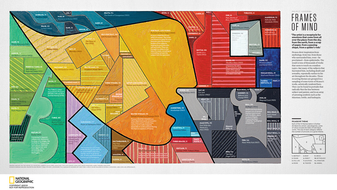
Summary: National Geographic created this infographic using oil on canvas to show the 12 most common themes in Picasso’s work.
Why we love it: It’s in itself a piece of fine art, which teaches us Art History using data.
Be Inspired: Look for data in places you wouldn’t expect it. Just because you don’t have spreadsheets full of numbers, doesn’t mean you can’t discover impactful data in non-traditional places.
2.
Diverse Casting Award
Summary: SRF did a data analysis of 20 years of data on the tennis star Roger Federer. The scrollable story takes masses of data and makes it digestible, accessible and exciting.
Why we love it: They have taken large data sets and used a diverse range of graph and chart types to tell a compelling story. They translated the data story into many languages. Then they made the code open to all.
Be Inspired: Simple actions like flipping a chart on its head can help support the perspective of a story.
3.
Best Visual Metaphor
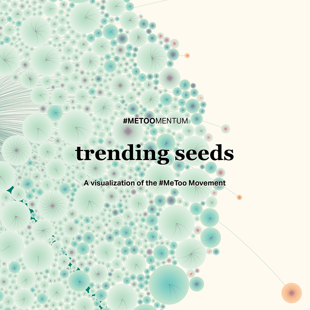
Summary: A data visualisation showing the growth of the ‘Me Too’ hashtag on Twitter.
Why we love it: Data is visualised as clusters in the shape of a dandelion with each node a seed. As the story flows, we see how the ‘Me Too’ trend went from a seed, blossomed and pollinated to become the movement it is today. It’s a clever conceptual and visual motif that demonstrates the power of social media activism beautifully.
Be Inspired: Resist throwing in all your ideas and concepts in at once and build your story around one strong idea. This ensures the content is easy to follow and is memorable.
4.
Best Original Screenplay
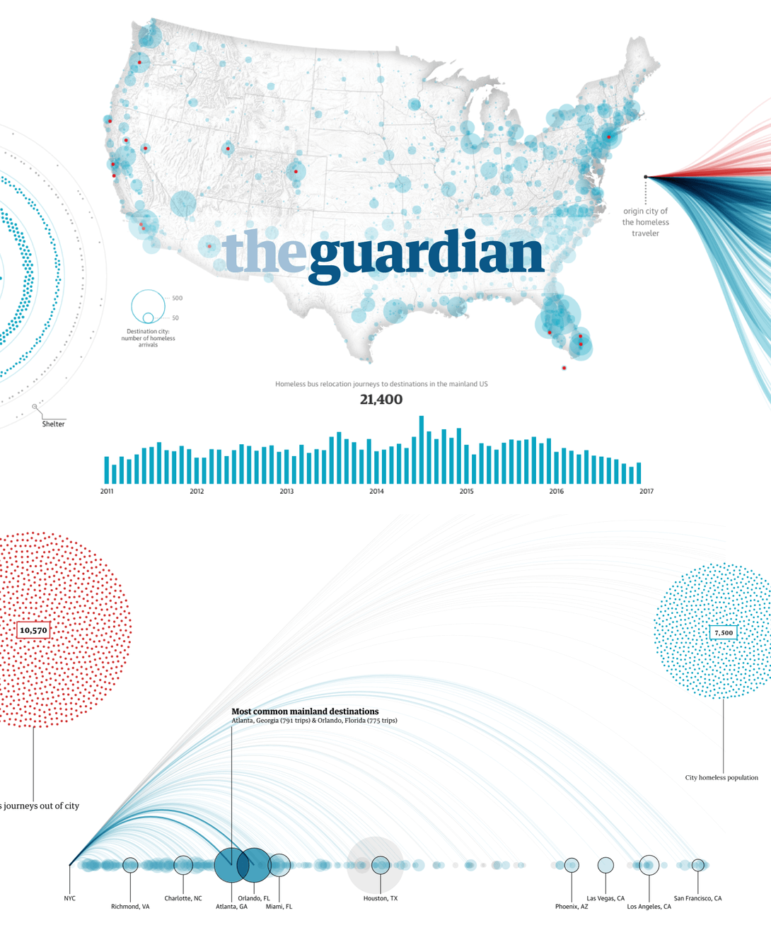
Summary: ‘Bussed Out’ is The Guardian’s interactive investigative report in the format of a scrollable story with data visualisation. It exposes some US cities’ controversial tactic of issuing their homeless population one-way tickets out of the city.
Why we love it: A thorough long read that’s punctuated with large high definition cinemagraphs, animated maps, and dynamic charts. A deep dive into an untold story.
Be Inspired: Break up copy in a traditional narrative in a way that’s visual yet informative with a data visualisation.
5.
Best Action

Summary: This in-depth interactive is a guide to the Marvel Cinematic Universe. The interactive 3D model is made up of complex connections. You can explore the universe by film, film group, phase, character etc.
Why we love it: The design is cinematic and slick and the UI is easy to navigate despite the complexity of all the connections.
Be Inspired: When visualising complex information in an interactive, its good to give users several different ways to navigate it. Users can process the information in a way that they understand and enjoy.
6.
Christopher Nolan Award
‘Atlas of Economic Complexity’
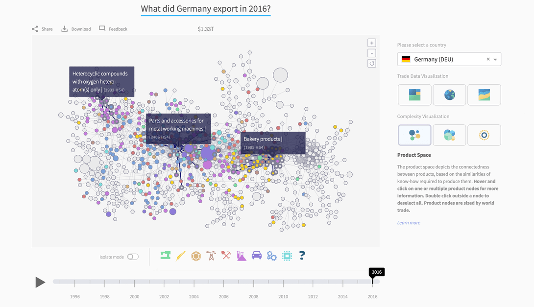
Summary: Atlas of Economic Complexity is not just a data story or an interactive. It’s a research portal and data visualisation tool that explores ‘global trade dynamics’ and ‘new growth opportunities’ for every country worldwide.
Why we love it: It’s a treasure chest of knowledge that you can spend weeks exploring and its useful and easy to use.
Be Inspired: To be a respected thought leader, package all your hard work beautifully and then give it all away without restriction or barriers.
7.
Best Visual Effects Award
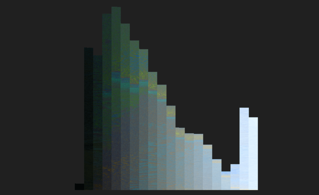
Summary: Use this data visualisation tool to upload any picture. Once uploaded, the tool splits the image into thousands of pixels which then arrange themselves by colour in a histogram.
Why we love it: The animation of the images disintegrating and morphing into a chart is hypnotic. We’re sure that the tool has a high dwell time.
Be Inspired: Delight your users with something unexpected. Most people don’t think about images as an arrangement of thousands of pixels, but by splitting them up it creates an intriguing learning experience.
8.
The Ryan Gosling Award
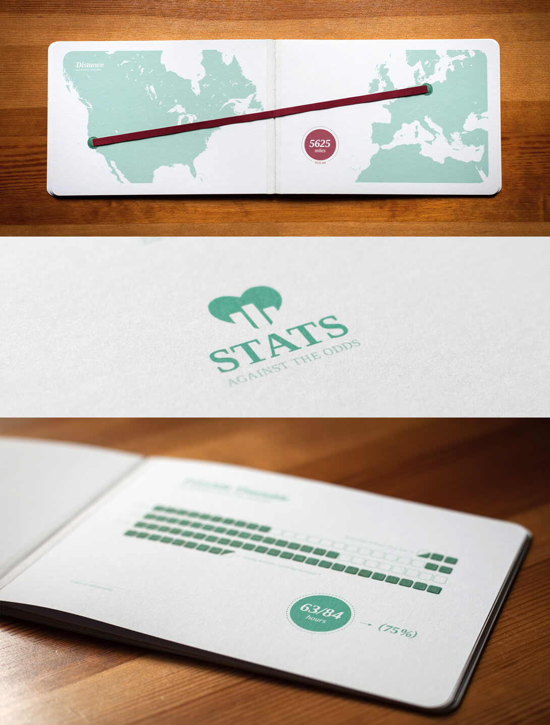
Summary: Stats Against the Odds is a print data visualisation. It’s also a love letter. The work is a gift to the creator’s partner, telling the story of their romance through data.
Why we love it: It’s an innovative, thoughtful piece that includes minimalist chart styles, different textiles for physical textures and beautiful design.
Be Inspired: Data visualisation doesn’t have to use complex technology- it just needs to illustrate data in a compelling way.
Like what you see? Click here to explore infogr8’s data-led content products.