Missing your data-led visual content fix? Fear not, we got you. The team at infogr8 have curated the most inspiring and interesting visual content we have stumbled on this week.
Free Visual Keyword Research and Content Ideas Tool
AnswerThePublic
Data Visualisation
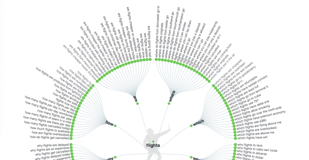
Google is the place where we go to ask questions. And because so many people use it, there is a gigantic amount of data available to essentially read your mind and suggest what you’re thinking. This is a feature which has become useful for marketers to get a hint of the motivations and emotions of the people behind each search query. AnswerThePublic have created a great tool that takes your keyword and gives you a visualisation of the queries asked using that keyword.
Ballon d’Or at 60: What makes the perfect winner?
BBC
Infographic

In it’s 60th year, the Ballon d’Or was awarded last week to Lionel Messi for a record fourth time. The BBC have created an Infographic breaking down the stats of all the winners since the football award was first awarded in 1956. Using various charts alongside illustrations, this piece gets into details such as the hair colour and kicking-foot of all the winners.
Paul McCartney: ‘Out There’ Tour
Infogr8
Infographic
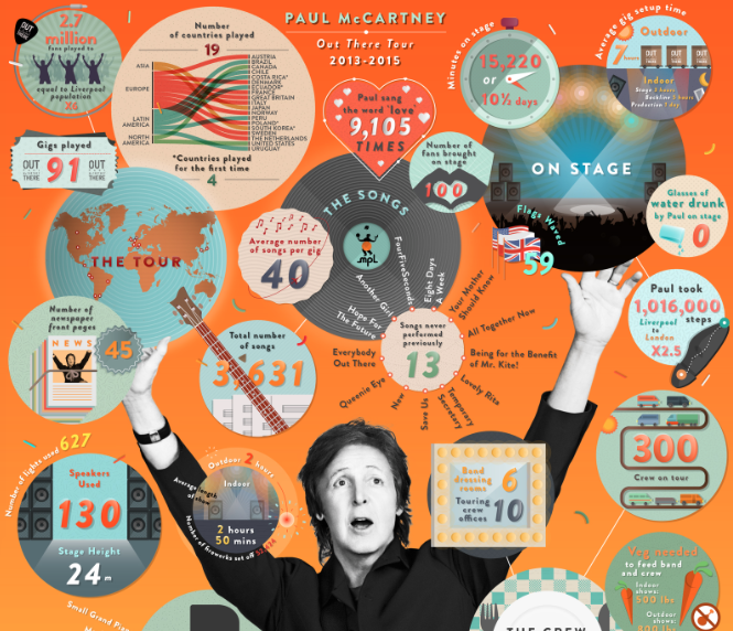
Paul McCartney’s world tour ‘Out There’ ended last year and we were asked to create a piece of content that would resonate with Paul’s rabid fanbase with the potential to become a keeper item following his extensive World Tour. We created a premium, creative infographic positioning Paul as the central figure whilst journaling a range of intriguing and illuminating facts around him visually. The data was grouped and organised to give balance and even weight of facts, illustrations were intricately detailed to align with iconic elements of the tour. Elements were produced agile to allow MPL to drip feed snippets of the content via datagrams.
How Millennials, Gen Xers, and Boomers Consume Content Differently
Contently
Infographic

Content is everywhere! With the rise of smartphones and tablets, we have even more screens to occupy our time with. However, we’re all consuming content differently according to this infographic by Contently. See whether your content consumption habits are similar to those outlined in the infographic.
Fjord Trend 2016
Fjord Annual Trends
Interactive Trend Report

Fjord’s Annual Trends focus on the digital developments they expect to disrupt organizations and society in the year ahead. They’ve drawn insight and inspiration from their team of 750+ designers, developers and thought leaders to create this year’s 10 trends. This detailed report provides actionable insights to help businesses and society move forward in the coming year.
American Panorama Is an Interactive Atlas for the 21st Century
Wired
Interactive Data Visualisation

Looking at atlases and maps is interesting, but imagine being able to see the history of immigration in certain states at specific year points. That’s what these interactive data visualisations allow you to do and it’s quite fascinating.
One in 292 Million
The Wall Street Journal
Data Visualisation
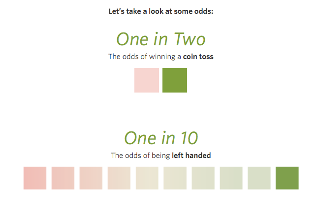
Here’s a fun one! This week in the U.S. the Powerball lottery jackpot was $1.6 billion. Worth a punt, right? I guess you’d want to know what your chances are of winning? Click the link and keep on scrolling, my friend!
How The World Searched For The Paris Attacks
Google Trends
Interactive Module
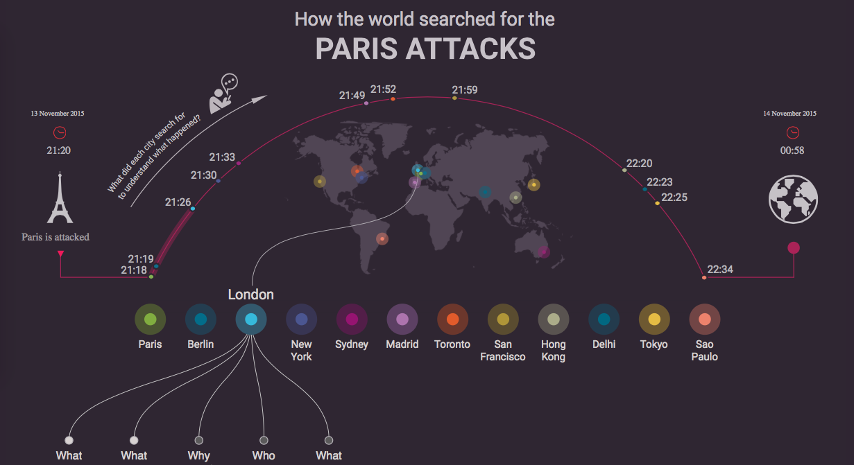
Good interactive modules present data in a way which is intuitive for users to interactive with. This module by Google Trends is really well done, with nice animations which are not obtrusive. You can see how the world searched for the Paris attacks by clicking on the major cities and seeing the phrases used and the times these searches were made.