Following on from last weeks ‘twist’ 😉 we have decided to now shortlist out favourite infographics for this years The Information is Beautiful Awards. Some of us found it a struggle, and others will remain nameless! But for now, these are the team’s top picks…
Ben’s top picks
Melanie Patrick
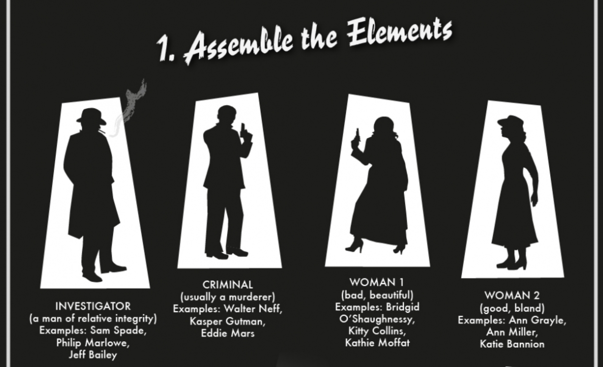
Regular readers of our weekly ICYMI will probably have cottoned on to the fact that the team here at infogr8 are mad for movies, and Monday morning often involves some fairly heated discussion about our trips to the cinema over the weekend. But if there is one genre that had passed me by until recently, it’s film noir. It just so happened that the BFI produced this infographic at the same time that the 1958 crime thriller Touch of Evil saw a limited re-release in cinemas. I fell in love instantly with both, and we featured the infographic in our ICYMI back in volume 26. We are shown all of the hallmarks to look out for in a typical film noir, and it was great seeing how many I could identify when watching this Orson Welles classic in the days which followed on the big screen. We even discover which is the “noirest” film of all time, it’s just a shame they don’t make them like they used to.
World ice creams consumption | La Lettura
Sara Piccolomini
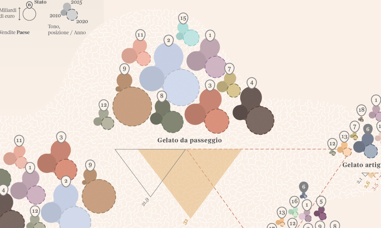
It just so happens that we featured this piece only two weeks ago in volume 41 of this very blog. Too much ice cream can give you brain freeze, but when it comes to data viz, we don’t think you can have too much of a good thing. We were surprised to see this served up in the IIB infographic, and not the visualisation category, but we were just pleased to see it wasn’t left out in the cold. Milan-based information designer Sara Piccolomini has treated us to a distinctive look at ice cream sales across different countries past, present and future, and it would appear that thanks to developing countries, the market is still dripping with potential. We don’t remember product sales being visualised in quite such a mouth-watering style as they are here, so consider this a rare treat.
David’s top picks
Daniel Mora, Carlos Fonseca, Gloriana Corrales, Marco Hernández
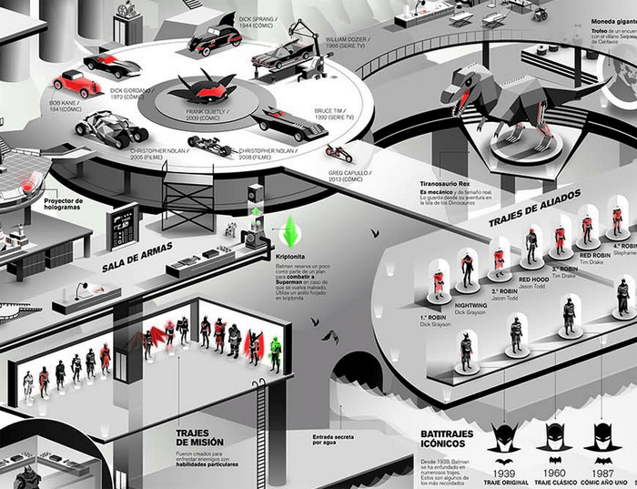
Excuse me as I geek out for just a moment! Growing up I alway knew what I was going to do, there was no question, I was going to draw for a living. A big reason for that? The Batman! I can’t remember a time when Batman hasn’t been a part of my life. Whether it was re-runs of William Dozier’s and Adam West’s ever campy Batman 1966 tv show, the incredibly stylistic and surprisingly deep 90’s Batman: The Animated Series, the dark and twisted Tim Burton big screen flicks and more recently the very serious Christopher Nolan’s Dark Knight trilogy, and of course the countless dog-eared comic books that have always littered my bedroom (and now studio) floor. There has been a tonne of versions of Batman but the hero’s, the villains, the costumes, the art, the gadgets, the storylines, the vehicles, the symbolism and Lord of the Dark Knight has always influenced me to follow a path into the creative industries. This is why upon seeing a Batman superfan’s dream, an infographic mapping the visual history of Batman in the greatest hideout in comics the Bat-cave, created by Daniel Mora, Carlos Fonseca, Gloriana Corrales, and Marco Hernández, bat-a-ranged me right back to my childhood. The team loving collected and rendered a huge variety of the different Batman’s gadgets, costumes, vehicles, side-kicks and trophies in a fantastic isometric style illustration that is just a joy to explore. A a must for any fan of Bats through the ages, and with a latest adaptation of Batman to come in the form of Ben Affleck in the first half of next year its a good time to get reacquainted with the history to now. An epic infographic, oh and keep a sharp eye Bat-fans and see if you can spot a certain web-slinging superhero and pizza eating sewer dweller infiltrate the dark knights stronghold.
Sherlock Holmes Examining the Evidence
Data! Data! Data! I can’t build make bricks without clay! – Sherlock Holmes.

Did you know if been over 100 years since we were graced by the first case of the world’s most famous literary detective (could we even claim data-scientist?) Sherlock Holmes and his confidant Dr.John Watson, and over the last few years Holmes fever has been stronger than ever. Between the BBC giant Sherlock starring now mega-stars Benedict Cumberbatch and Martin Freeman, and its American equivalent Elementary starring Jonny Lee Miller and Lucy lui as Dr. Watson, to the high-budget Guy Richie movies starring the ever charming duo of Robert Downy Jr. and Jude Law. A few years ago, there always seem to be a mystery to get us scratching our heads under our deerstalker hats. Examining this trend Adam Frost and Jim Kynvin go back to the stories in search of data to explain his enduring appeal. By coupling data visualisations, charts and techniques with beautiful pen and ink art direction, Adam and Jim create a visual story outlining through the characters, the clients, the crimes, the stories and the methods that make the detective a truly classic charter in the hearts of people all over the world. How they packaged the infographic together makes it an engaging read and stands out against the infographic output we see regularly.
Julien Guillet and Camille Beurton
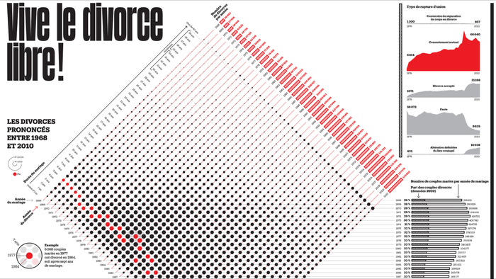
Infographic design should be accessible and universal, no matter who you are you should be able to understand the information because it’s visualised, in infographic design the text supports the visuals, not the other way around. This is why this infographic by Julien Guillet and Camille Beurton visualising 40 years of divorce data on the 40th anniversary of the law establishing divorce by mutual consent is so great, even though I don’t read the French language by understanding the context of the graph on display you can easily digest and explore the 40-year-old data set. For instance by glancing at the red markers on the graph we can very easily see that if a couple does get past the 5 year mark, they are very likely to remain together, and looking at the total number of divorces year by year over the span of the whole data set we can see that a number of divorces almost tripled between 1968 and 2010. This infographic proves that while language has barriers, data is universal.
Aaron’s top picks
John Nelson, IDV Solutions

Now UFO’s don’t crop up in conversation very much these days like they used to in the 80’s. I’m not sure if this is down to the 101 topics that end up trending on Twitter each week or the fact our slight eccentric friends across the pond in the US spot have more time on their hands than the rest of us. However, the National UFO Reporting Centre created an eerie visualisation to much applause by the UFO community no less. The centre depicted UFO sightings vs. US census data. If you spent a little time on this one, you would see a clear pattern of when the optimal time will be to try and spots potential UFO!
Turning 30 in Charts and Graphs
Cecilia Rabess (Bolditalic)
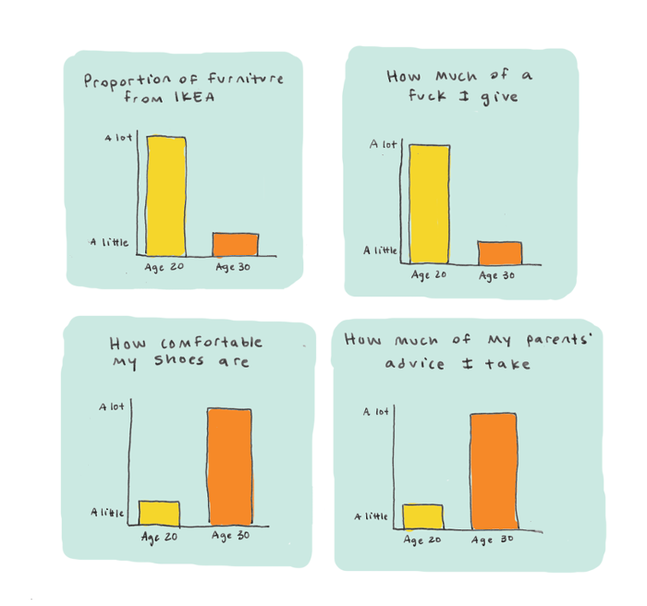
This collection of illustrated charts just speaks for itself, whether you are leaving your 20’s or well into your 30’s this chart simply nailed it for me. Upon stumbling across the project by Cecilia and sharing on my Facebook the likes came rolling in, needless to say, I’d clearly touch a nerve or everyone just knowingly agreed! 😉 What do you think?
Shine Pulikathara
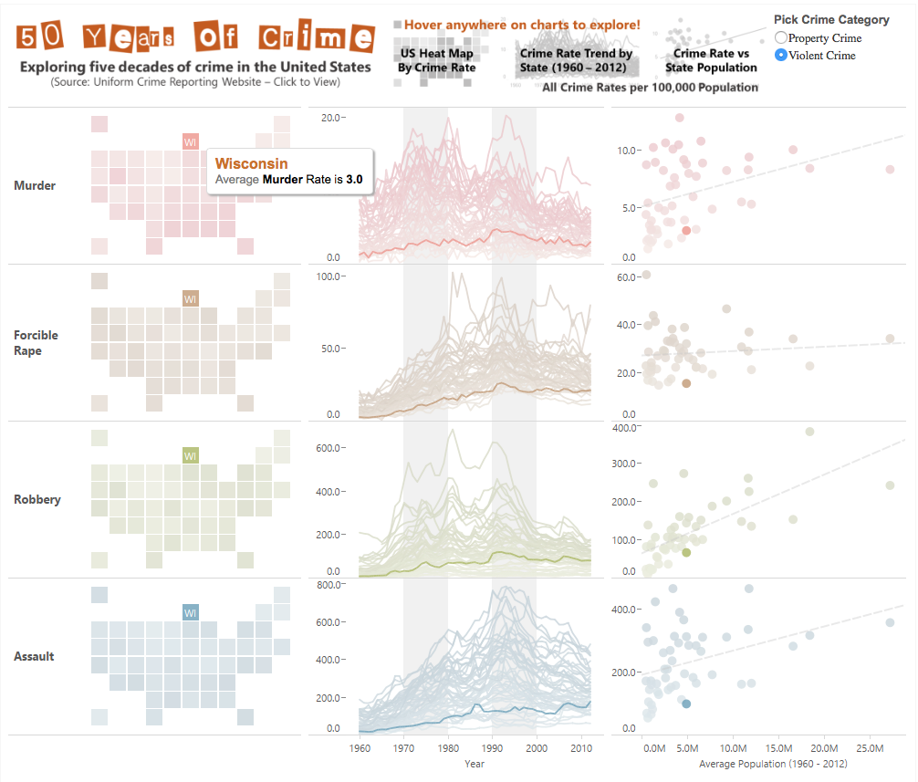
As much as this is my pick the team at infogr8 are all fans of Tableau too, we don’t get the opportunity to feature projects built using the tool enough. (Note to improve this in 2016) But we’ve included this project by Shine, yes Shine for a few reasons. The project allows us to explore US crimes rates and examine the crimes statistics for over 50 states between 1960 – 2012. Some of you will find it intriguing how some states over this period, have consistently been the worst of California the bunch a real outlier in it all, compare to states like Hawaii and New York. In this case crime truly does discriminate across the US.