ICYMI – Weekly round up of inspiring visual content Vol. 41
Reading time
Category
Missing your data-led visual content fix? Fear not, we got you. From a the rules of attraction in filmography to World’s ice cream consumption, the team at infogr8 have curated the most inspiring and interesting visual content we have stumbled on this week.
BFI
Infographic
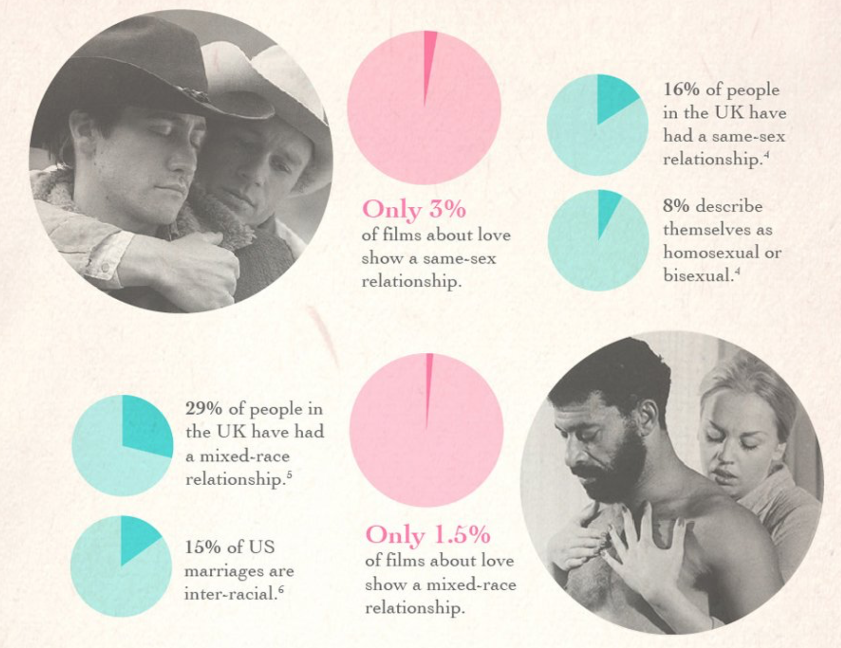
Some of our favourite movies of the year so far, including Ex Machina, The Diary of a Teenage Girl and The Lobster all tell stories of finding love in challenging circumstances. To be fair, these examples can hardly be described as typical romances, however it does raise the question of whether Hollywood is failing to paint an accurate picture of love in the real world. This infographic from the BFI examines where these discrepancies lie, as well as breaking down the formula to the perfect love story. Apparently, in 44% of films about love, the lovers not not end up being together, and in a quarter of cased one or both of them die, proving that unfortunately they don’t always live happily ever after.
The UK’s top 30 Design Studios
Caroline Beavon
Interactive one-pager

If ever proof were needed that the heart of the of the UK’s design community beats within our mighty capital, look no further. A list of the top 30 design studios across the UK was recently published in Computer Arts magazine, and infogr8 family friend Caroline Beavon has breathed life into the data surrounding them in this interactive one-pager created with Tableau public. Amazingly, most are barely 10 years old, and by also visualising the number of staff, the percentage of creative roles and more, this is essential viewing for those targeting a job within these fine organisations, or anyone that’s just curious about the groups housing some of the most creative minds in the country.
Berliner Morgenpost
Scrollable story

Berlin is a city on the grow. New building developments have been sprouting up in recent decades, and architects are striving to even greater heights in their latest plans to create modern office space and flaunt the prosperity of the city. This scrollable story from the Berliner Morgenpost allows us to soar in three-dimensions through the city as it expands ever closer towards the sky. How fast and how high it will go from here remains to be seen.
New York City Marathon in Six Charts
The New York Times
Data blog

On Sunday, New York City hosted it’s 45th marathon, with over 50,000 runners registering and taking part. The event has changed dramatically since the early races in the 1970s, which the New York Times has kindly illustrated through a series of beautifully simple, yet revealing charts. The first event had just 55 runners crossing the finish line, none of whom were woman. Today around 40% are female, and half of all runners come from countries other than the US. Get your running shoes on and go check it out.
Sara Piccolomini
Data Visualisation
As winter fast approaches, the last thing on most of our minds at the moment is ice cream. However sales of this frozen treat are ever increasing, and thanks to emerging economies such as China and India the market is dripping with potential. This scoop comes form Milan based information designer Sara Piccolomini, who has created a data visualisation of how much different countries spend, and how this is expected to continue. The big surprise is Venezuela where sales are projected to quadruple in the next 5 years alone, whatever could it be that is whipping them up into such an ice cream frenzy?
CityLab
Data blog

Craigslist’s famous missed connection thread has inspired books, comics and video shorts and know it’s inspired the data world in this incredibly compelling data blog, brought to us by CityLab this article by Tanvi Misra and data visualisations by Ilia Blinderman. A missed connection is a type of personal advertisement which arises after two people meet but are too shy or otherwise unable to exchange contact details. The Missed Connections section of Craigslist gets thousands of ads of this type every month for cities such as New York and San Francisco. Blinderman who had posted 2 missed connections himself, and always wanted to be the subject of one, indulged his fascination with the forum by collecting and analysing over 10.000 posts from Jan 2015 from 9 major us cities. Breaking these analysis into a series of data viz charts and graphs assessing when different genders time of posting, which cities had the most missed connections, to which day is the loneliest. All of this weaved into a great narrative using real world stories by Misra showing how data can both inspire and support stories.
How to measure your digital marketing?
Constant Contact
Infographic

Did you know that 60% of social media marketers say that measuring the ROI of social media is one of their biggest challenge? Digital marketing is essential in today’s business world, but after you’ve crafted the perfect post, carefully cropped your visual, conceived the hashtag that will help spread your message, hit send and away it goes, but how do you know all that effort is actually working. Well it’s not easy, in fact it’s a challenge for most businesses but thanks to this great infographic from Constant Contact you needn’t be one of them. Check it out and solve digital marketings measurement problem.
We’ll be sharing more inspiration next Friday, for now you can follow the team on Twitter @infogr8. Please tweet & share your viz spotting stories to be considered for our future rounds ups. #vizspotting #ddj.