Pradeep Kumar on how HR analytics dashboards drive actionable insights at organisation level
Reading time
Category
Pradeep Kumar recently won an Information is Beautiful Award for his HR Attrition Dashboard. Here, he deep-dives into his dashboard and elaborates on why HR analytics are so necessary in the modern-day workforce.
Why are HR analytics becoming so necessary to organisations?
HR analytics provide vital information about the workforce in an organisation. By analysing employee behaviour, organisations can develop strategies to enhance engagement and productivity. It also helps to identify potential reasons for employee attrition, such as poor working conditions, inadequate compensation, lack of career growth opportunities and incompatibility with company culture.
Organisations typically rely on HR dashboards to gain insight into their workforce, but visualising and interpreting HR data can be challenging. A poorly designed dashboard or one that’s overloaded with information can be daunting and may not serve its intended purposes. Fortunately, there are some specific approaches we can take to visualise HR data more effectively and to present actionable insights to organisations.
Last year, I participated in the RWFD Real World Fake Data challenge, hosted by Mark Bradbourne. The dataset provided for the challenge included various HR information such as employee demographics, survey results, salary and attrition/retention status. The main objective was to create a business-style dashboard that would assist the HR team to:
- Identify the factors contributing to attrition in the company
- Monitor current drivers of attrition and prevent new ones from emerging
- Identify the KPIs that should be tracked to address attrition at the organisation level
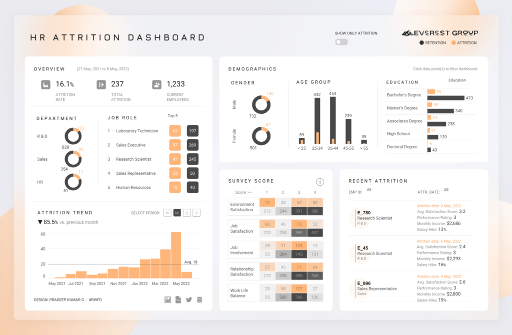
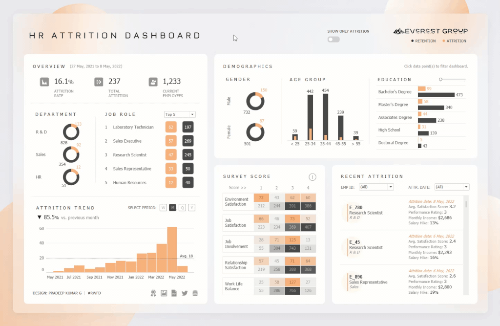
After reviewing the dataset, I decided to create a dashboard that utilises easy-to-understand charts and subtle colours to present the significant insights clearly to the audience. I used Tableau to visualise and analyse the data, and Figma to design the UI/UX elements.
How to craft a compelling story with HR analytics data
1. Identify user goals
The primary goal of HR is to reduce employee attrition rates organisation-wide. To achieve this, we need to identify the root causes of employee turnover and analyse the data to unearth patterns or trends.
To achieve this, I created a data dashboard that allows for a side-by-side comparison of attrited and retained employees. This provides HR leadership with valuable insights to understand why some employees leave while others stay, which can then inform more effective talent retention strategies.
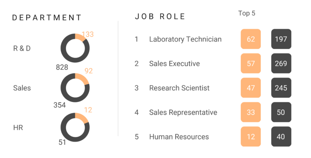
In addition, I wanted to provide users with the flexibility to view results for different departments and job roles. This would help identify any department-specific issues that may have been contributing to high employee turnover rates.
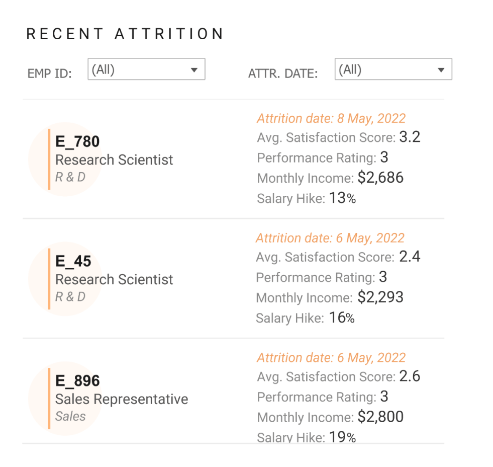
Another important function was the ability to search and view details for individual employees. The aim here was to assist HR professionals in identifying any at-risk employees and to take appropriate action to retain them.
2. Choose the right data visualisations
Choosing the right visualisation is critical for corporate data dashboards as it impacts their readability, usability and effectiveness. The right visualisation can make complex data understandable and aid in identifying patterns and trends that may not be immediately visible in the raw data. This stage also ensures that the dashboard is visually appealing, engaging, accessible and understandable to a wide range of users, regardless of their technical or analytical expertise.
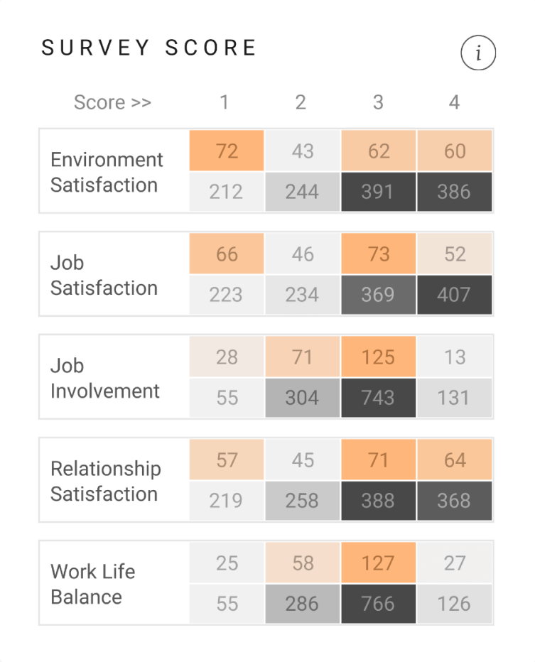
For example, a heatmap is an effective method for presenting the results of an employee survey, as it allows users to easily identify higher or lower values and detect any underlying patterns or trends. It is also effective in highlighting outliers or anomalies, since these values are easily spotted due to their distinct colours.
3. Enable dashboard interactivity
Interactivity matters in business data dashboards because it enhances the user experience by allowing users to explore data and derive insights in a more intuitive and engaging manner.
Interactive dashboards enable users to manipulate and interact with the data in real-time, enabling them to quickly identify trends, patterns and outliers. Users can perform ad-hoc analysis and derive insights that may not have been immediately evident when presented as a static dashboard.
Additionally, interactivity allows users to customise the dashboard to suit their specific needs and preferences, making the dashboard more relevant and useful to them as individuals.
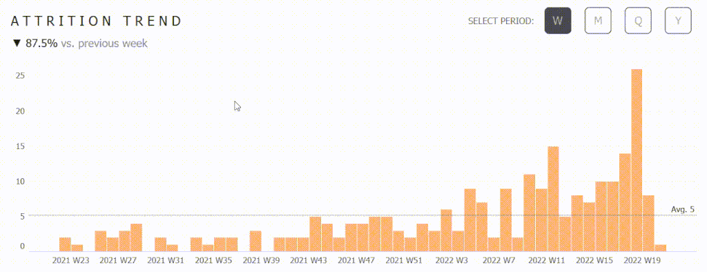
For example, I incorporated basic interactivity into the HR Attrition Dashboard to toggle between attrition trends by Year, Quarter, Month and Week using buttons.
Pradeep highlights a very important outcome of interactivity, which is to enable ad-hoc analysis on the fly. Interactivity also acknowledges that users have unique needs. In our work with the Association for Financial Professionals, we created an interactive insights tool to help professionals progress through subject-matter-specific certification and training. The tool also features a pathway function that users can interact with to view and compare various advancement opportunities based on their existing roles.
4. Highlight the key HR insights
Highlighting the key data insights from an HR perspective focuses the user’s attention on information that is most critical for decision-making. This saves the user time so they aren’t bogged down with irrelevant details.
There are several ways to highlight key insights in a data visualisation, but here are three effective methods to consider:
- Colour: Use colour to draw attention to specific data points or trends. For example, I used a bright colour to highlight the attrition numbers to make them stand out from the current employees.
- Annotations: Adding annotations can provide additional context and help highlight key insights. Annotations can include titles, subtitles, captions or callout text that provide supplementary information about the data while emphasising key findings.
- Interactive elements: Incorporating interactive elements into a business dashboard, such as click actions, toggles or pop-ups (tooltips), can help highlight the key data insights by providing additional detail and context. For example, in my HR Attrition Dashboard, I included a toggle button that allows users to view only the attrition details. This feature temporarily hides the current employees, allowing users to focus solely on attrition and highlight the most business-critical areas of concern.
5. Focus on the user experience
Focusing on UX design for a business dashboard is crucial because it can have a significant impact on the dashboard’s effectiveness in achieving its goals. A well-designed dashboard should consider such factors as information architecture, usability, accessibility, visual design and interaction design.
Here are some of the techniques that I applied to enhance the overall user experience of my HR Attrition Dashboard:
- Subtle colours can make a data dashboard more visually appealing and less overwhelming to users
- Simplify the dashboard layout and prioritise the most important information.
- Effective use of white space can help improve the readability and organisation of the dashboard, making it easier for users to find the information they need
- Including UX elements such as clear navigation, tooltips and search functionality can improve a data dashboard’s usability and facilitate the fast and effortless discovery of information
- Integrating user feedback into the design process can continually improve the dashboard’s usability and usefulness
Make more informed decisions with an HR dashboard
An HR dashboard is an essential tool for any organisation, as it helps the HR team make informed decisions, monitor employee performance, identify HR-related issues and align HR with business objectives. To do so effectively, it’s crucial to present data in a visually clear and easy-to-understand manner while ensuring that the tool offers actionable insights overall.
Based on my experience working with HR data, I found it interesting and challenging to focus on highlighting key information and to experiment with various chart types, layouts, colour schemes and interactive functionalities. This allowed me to determine the best approach to presenting data based on specific scenarios. I also found that seeking feedback from colleagues and managers is an excellent way to understand how different people perceive the information presented on the dashboard. This feedback can help identify areas for improvement and ensure that the finished dashboard provides relevant and useful information to all stakeholders.
We love a good data dashboard that drives actionable insights, so we’re delighted to have Pradeep share how he created his HR Attrition dashboard. If you’re looking to create one for your organisation, reach out to us at [email protected].
About Pradeep

Pradeep Kumar is a Data Visualization Lead based in Tamil Nadu, India, with over five years of expertise in dataviz and business intelligence. He is a Tableau Public Ambassador, a bronze winner at the Information is Beautiful Awards 2022, a Vizzie Award winner and an Iron Viz 2021 finalist. He is also the second most favourited author on Tableau Public. He loves designing infographics and business dashboards using Tableau and Figma, and enjoys sharing his dataviz knowledge with different audiences. He is also passionate about exploring the latest UI/UX trends and creating data visualisations that convey compelling data stories using simple chart types.