Claire Santoro on nudging climate action through information design
Reading time
Category
Claire Santoro delves into how nudge theory can help policymakers enforce policies to reduce the effects of climate change.

When I think about how to use data to drive climate action, I tend to think in terms of behavioural economics.
Behavioural economics is the study of how people make everyday decisions—specifically, the fact that we do not always make the best, most rational choice, even when we know it would be in our best interest. We choose not to exercise; we procrastinate over signing up for a retirement savings account; we keep scrolling on social media even when we’re not even enjoying it anymore.
The same paradox holds true for climate action: we don’t take action even when we know it would be an all-around good idea to do so.
The classic example is energy efficiency. Even when we know we’d save money, be more comfortable, and reduce air pollution by improving our buildings’ energy efficiency, we don’t do it.
So what can we, as data analysts and data visualizers who do not set policy, do to prompt and promote changes in behaviour?
This is where I turn to one specific framework in behavioural economics—nudge theory.
Nudge theory (popularised by economist Richard Thaler and legal scholar Cass Sunstein in their 2008 book Nudge) suggests that by changing the way choices are presented to people, we can increase the likelihood that they will choose the desired option. This often involves little design tweaks, like changing default options, making the desired option easier and more obvious, and emphasising social norms. (Nudge theory has received pushback in recent years, but most of that boils down to the fact that nudges will not, by themselves, change the world. Instead, they are a way to achieve small benefits on the margins.)
Once you know about nudges, you start seeing them everywhere. They’re ubiquitous in advertisements, but they’re also pretty common when trying to change behaviour. A shared workspace may try to nudge healthier snacking by leaving a bowl of fresh fruit out in the kitchen, for example. You probably even use nudges yourself!
Nudges are baked into a number of best practices in dataviz and information design.
Let’s walk through a more detailed example taken from work I did with the city of St. Louis, Missouri. Beginning in 2019, I worked with the city’s Building Division as an analyst and advisor as they developed a Building Energy Performance Standard, which is a set of performance-based targets designed to achieve consistent, long-term reductions in building energy use.
I had access to two years of energy use data, which was beginning to be collected as part of their building energy benchmarking ordinance. I was tasked with helping to analyse it and report it back to building owners and policymakers in a way that would, hopefully, encourage energy savings, emissions reductions and policy change.
Nudge Step 1: Clarify Complex Data
One of the most foundational ways to nudge someone towards action is to simply make the desired option easier and more obvious. Presenting too many options, or too much data, can overwhelm or distract the decision-maker.
To incorporate this nudge into your dataviz, ask yourself: What, specifically, does the decision-maker need to know? Anything they do not need to know can be excluded or relegated to an appendix.
For example, when the Building Division asked for a one-page summary of energy usage data, I knew they intended to present the information to policymakers in conversations about the performance standard they were hoping to pass. Those policymakers were likely to focus on basic questions, like “Why should we care about energy efficiency?” or “Which types of buildings would a performance standard affect most?” I aggregated the data, selected a couple key metrics that could answer those questions, used simple visuals, and focused attention with colour and hierarchy. Our goal was to give policymakers just enough information to pique their interest without overwhelming them.
Claire makes a great point on clarifying complex data, rather than merely simplifying it, which requires a strong understanding of who the key stakeholders are. When addressing multiple stakeholders, a climate action dashboard is an accessible approach to meet various needs. They provide real-time insights into climate activities and allow for at-a-glance performance comparisons.
Nudge Step 2: Clarify the Desired Action
Another foundational nudge is to make it clear what you want someone to do. In dataviz, this often means asking yourself: What metric do you want decision-makers to use to track their progress, and where are they now relative to the target?
In St. Louis, once the performance standard was enacted, we wanted building owners to track their progress using one particular energy efficiency metric (site energy use intensity), which was the metric used by the standard. To comply, buildings would need to perform at a certain level by a particular year. So, to make it easier for building owners to gauge the magnitude of change needed, we created building-level energy scorecards that showed how energy efficiency at each building had changed over time and how their current performance compared to the target.
Nudge Step 3: Establish Social Norms
Establishing social norms can also nudge behaviour change. This builds implicit social pressure for decision-makers to take action so they aren’t left behind. “Everyone else is already doing this thing, and I’m expected to, too,” you want them to think.
To establish social norms in your dataviz, ask yourself: What data do you have showing that others have already taken action?
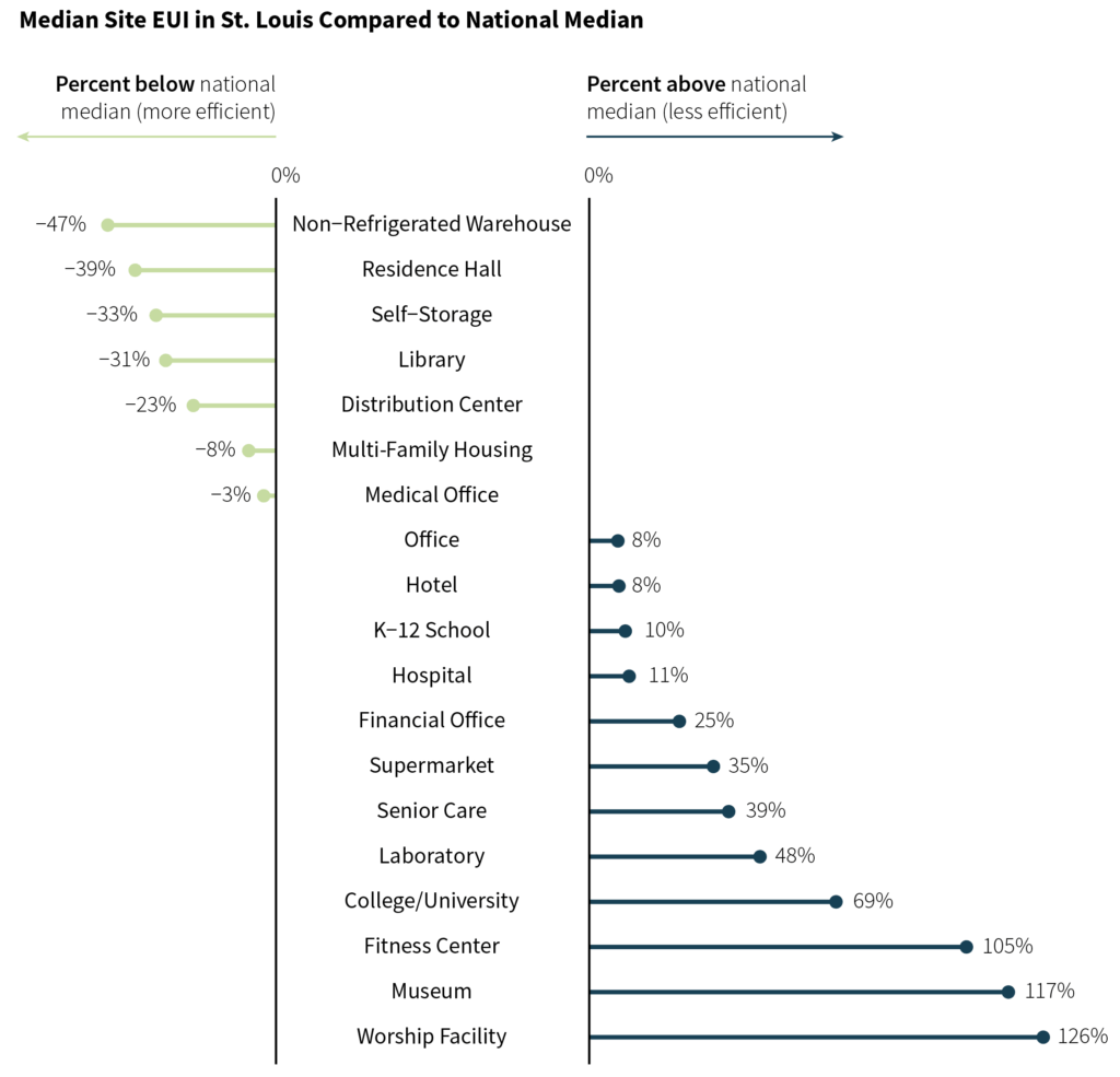
For example, when working with the data from St. Louis, I created charts comparing local data to national benchmarks, since most building types in St. Louis were underperforming relative to the comparable national median. Through the building-level energy scorecards, I also showed how each building compared to their peer buildings of the same type.
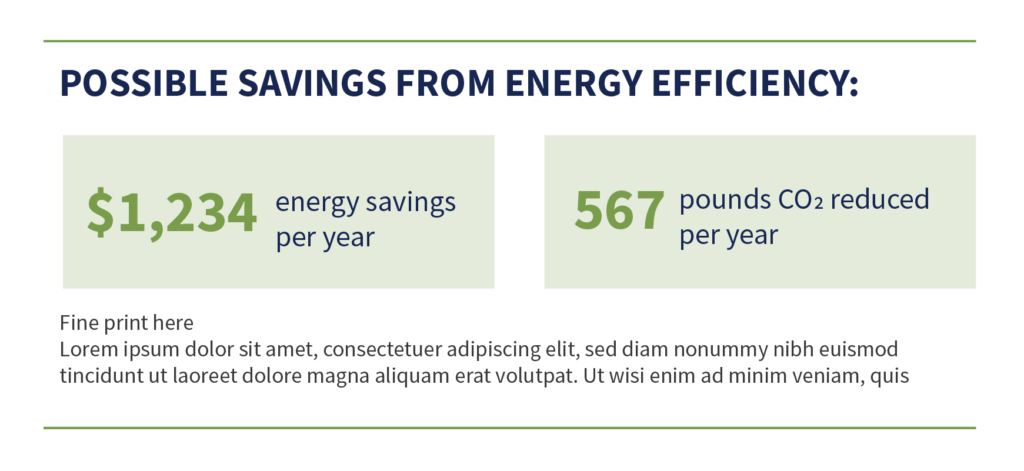
Nudge Step 4: Make the Benefits More Salient
You can also nudge behavioural change by making the benefits of taking action more pronounced. People are often well aware of the costs of taking action, whether those are financial costs, time, effort, etc. Emphasising the benefits makes it more likely that they will understand that those costs are worth it.
In dataviz, this often means translating your data into metrics that the decision-maker cares about. You, as a data analyst, may care an awful lot about site energy use intensity, but building owners and policymakers probably do not. Instead, they may care about things like money saved, emissions reduced, or recognition and awards, to name a few.
For this reason, our building energy scorecards called out two specific benefits likely to be of interest to different types of building owners—cost savings and emissions reductions. (And, more broadly, most communications about St. Louis’s building energy performance standard emphasised that the city would be only the 4th in the U.S. to enact such a policy, a point which would bring a great deal of positive attention to a city not known for being an environmental leader.)
How Can You Nudge Climate Action?
As a data analyst and data visualiser, it often feels like the impact I can have on climate policy is limited. I’m not setting policy, after all. But what I can do is ensure that I take a thoughtful approach to communicating data in a way that makes it as easy as possible for decision-makers to take the desired action.
How can you nudge climate action in your own work? The next time you’re working on a piece aimed at driving action, think about incorporating some of these strategies into your information design. Clarify complex data and the desired action. Establish social norms. Make the benefits more salient. These little tricks may not lead to big changes, but even little changes help.
Climate change feels like a daunting problem to tackle, but as Claire has shared, paying attention to the smaller things in data design can make a big difference. If you want to move the needle on climate action through data, reach out to us at [email protected].
About Claire

Claire Santoro is an independent information designer with a background in economics and environmental science. She combines analysis and design to help social-good organizations communicate complex information in an engaging, approachable way. In addition, she is Content Editor at Nightingale, the journal of the Data Visualization Society.