 Insight
5 Data Trends That You Can Put Into Your Strategy Now For Success In 2020
It’s been some year to round up a decade, now that awareness of ‘fake news’ has hit an all time high we’ll keep it rooted in the manifesto and turn our attention to some of the biggest and most exciting trends in the use of data that you can take advantage of for the coming year.
Organisations around the world are either sitting on mountains of data or have an opportunity to pivot their business to ensure everything they do is collecting, analysing and most importantly taking action on the metrics that matter to your business, partners and future clients. Or continue as you are and see the data tell you what you could have done, ah hindsight!
1. Data Platforms get human

Microsoft Excel and Tableau have joined platforms like Google Analytics and PowerBI in empowering users to ask questions from their data in plain English and get immediate answers. The process, called natural language query, is just another example of how data insights are becoming increasingly more accessible to people of all skills and experience.
Organisations are also increasingly pushing for more data literacy. Gartner estimates that by next year, 80% of organisations will initiate deliberate competency development in the field of data literacy. The 2019 Tableau conference gathered over 20,000 people in Las Vegas, indicating the importance of accessible data insights in the business world.
Reference: Driving Data Decisions Through Natural Language
2. Data Design for Social Good

Climate change, war, inequality, human rights and “fake news” have all been important topics in this year’s public discourse. Brands are increasingly under pressure to do their part in supporting social causes and the brands that do it well have a lot to gain.
Organisations can use data to start conversations about important challenges facing their audiences making sure they’re informed and enable them to do collective good.
Reference: ShamePlane
3. Automated Dynamic Content

Let the data work for you! Think of the opportunity to automate the publishing of beautiful, always up-to-date images, videos and other media specifically crafted for different channels to get the right messages to the right audience at the right time.
There’s generally two areas to this trend.. high production value event based activations and dynamic content platforms. Starting with activations, we’re seeing forward thinking Sports specifically being more insightful and leveraging data to enrich the experience. Would football be as interesting if you couldn’t look back at it?! (ok, but we’ll skip the VAR debate). The Royal Dutch Cycling Federation really got this sentiment and could see the value of bringing dynamic content to a Sport that is currently organic to its core, BMX’ing. Clever Franke did a decent job of seeing the vision play out into reality bringing a spectacle to the audience and also a tool for judges to supplement against.
Onto dynamic content platforms, B2B Algo appear to have the right idea offering property companies the opportunity to automate 1,000’s of feature rich videos of their property list in minutes by leveraging assets and stitching them together into social ready videos. What other industries could utilise this type of tech to utilise archives of info that goes into each product or service?
We highlighted this trend in its infancy back in our 2013 trend report with IBM’s impressive datagrams, fast forward 7 years and we’re starting to see apps and platforms that can take the huge effort required to pull something timely and truly automated off in a rich, immersive way.
Reference: Property Simple
4. Responsive reports

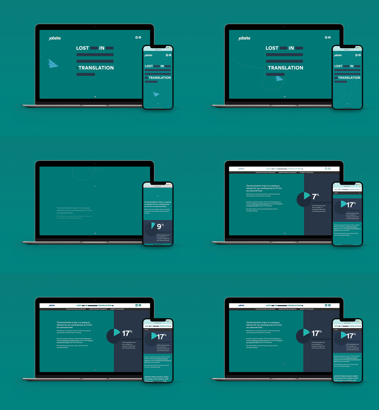
You’re probably familiar with annual reports. They tend to be information-rich but can be a drag to read or over cooked with the superfluous. Digital reports are a great way for an organisation to present their purposeful activities and insights in stunning, interactive ways. When compared to the static PDF reports you’re used to, responsive reports are accessible for different devices and screen sizes, allow for in-depth exploration of the numbers and encourage your users engage with the page in the way you want them to. Moreover, they can be built to delight through hierarchy, highlights and the detail when applicable.
Do treat this key asset as you would a campaign. That means putting the users pains into the build process and accessibility being a basic hygiene tick. Don’t think accessibility means adding pretty pictures to your usual narrative. It takes a multi-disciplinary approach so get your team synced up on what good looks like and utilise the right team to execute on it.
Reference: Gold Council
5. Data Sonification

Podcasts have taken the world by storm in the past few years, with around 144 million Americans (more than half!) having listened to at least one. Organisations can make an impact by using sound to represent scale and dial up their message. This is especially attractive when the desire is to ensure a strong message gets across that has data informing it. (Cue social good in point 2).
Imagine noises representing mental health flagged on socials, Spotify doing a different take on artist performance through sonics or audio signals to represent healthy startup factors across industries. CBInsights could do something interesting here!
Reference: BBC
