Missing your weekly infographic and data viz fix? Fear not, in case you missed it, the infogr8 team have curated some of the best bits we’ve stumbled on this week.
Vitamin Atlas: An Interactive Guide to Nutrition and the Human Body
GOOD and Walgreens

We all know that vitamins are essential for our health and well-being, but are you able to tell your B1s apart from your B9s? To help us navigate through the complicated science, GOOD and Walgreens have produced the Vitamin Atlas, an interactive guide featuring beautifully designed animations to explain the complex interactions that take place when they enter our bodies. The psychedelic colour palette is certainly a treat for the eyes (which by the way rely on a good dose of vitamin A to function at their best).
2014: The Hottest Year
Bloomberg

The baking sun of summer 2014 seams like a distant memory to our London based team, however recently published data suggests that it was actually the warmest year on record globally. Researchers have also pointed out that 13 of the 14 hottest years recorded have taken place since the turn of the millennium. An animated chart from Bloomberg makes this fact alarmingly clear, and makes us wonder where our weather is heading in the future. However if the UK’s cold snap doesn’t end soon, we would be tempted to suggest that increasingly warmer temperatures are no bad thing at all.
Data Journalism Standards Check
Jon Schwabish

Image credit: Data Journalism Handbook
Although still relatively unknown to the wider masses, as economist and data viz expert Jon Schwabish puts it 2014 was the year of data journalism. Just before the year closed he posted a debate on raising the standards of data journalism.
Referencing several examples of growing pains in the industry its an interesting post at highlighting just how sensitive data is with the importance of accuracy and clear explanation when coming to conclusions.
We will cover this topic in more detail within infogr8’s 2015 trend report, for now this is a great read for anyone interested in understanding the challenges with data journalism.
Cost of Living Around the World
MoveHub

Whoever coined the term “Rip-off Britain” certainly seams to have been on to something. The UK has been highlighted as one of the ten most expensive countries to live in thanks to an infographic from MoveHub, taking into account the price of groceries, transportation, restaurants and utilities across countries in all continents. Visualising the world in this way highlights just how uneven our economies have become, with neighbouring countries sometimes featuring on completely different ends of the scale. For those simply looking where to take a cheap holiday, this infographic could prove invaluable.
A World of Belonging
Airbnb

We could not help falling in love with this quirky interactive globe from Airbnb, apparently using real-time location data from their travellers. The piece also features recent interesting statistics (26,000 Airbnb-ers stayed in Paris on New Year’s Eve, for instance), but it’s the charming animations and subtle details which make us really want to explore every inch of this amazing planet.
VeInteractive acquires qunb
VeInteractive
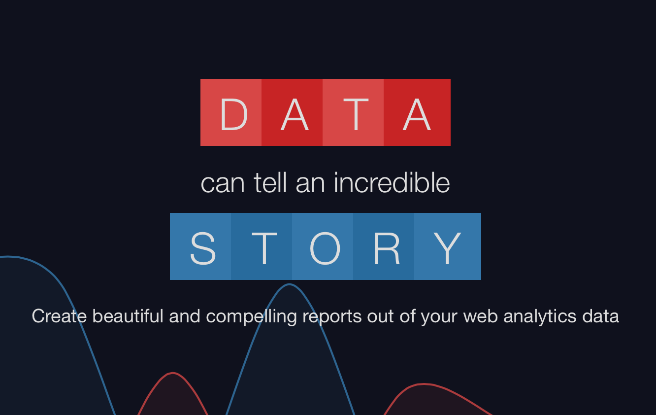
The french data science specialist team have certainly been on to something special when joining up their forces to create the ultimate reporting tool – qunb. Qunb analyses your web data and turns the results into beautiful visualisations. Last week, VeInteractive announced that they acquired qunb, which made a lot of sense in their endeavours to expand their Big Data capabilities. We are excited to see what they have in line for 2015 on the data viz front!
Dog map: Find the top pooch in your postcode
BBC

We are a self-confessed nation of dog lovers, however it turns out our geographic location plays a major role in determining our canine companion. This interactive map from the BBC uses microchipping data across the UK to help identify the pooch of choice per region. The Labrador retriever came out as top dog overall, while Londoners are statistically more likely to share a doghouse with a Staffordshire bull terrier. Our guess is that smaller flats and less countryside to roam through is probably the reason here, however we could be barking up the wrong tree entirely.