[vc_row][vc_column][vc_column_text]Following on from the Information is Beautiful Awards at the end of September, we’ve decided to discover who the most influential Tweeters are in the world of dataviz. With followings varying between just over 1,000 to more than 30,000, the list looks at a number of different specialists from the industry, ranging from designers, data scientists, authors and CEOs. (At the time of writing, the average number of followers, for those interested, was 7,649.)[/vc_column_text][vc_row_inner][vc_column_inner width=”1/1″][vc_column_text]
Edward Tufte
@EdwardTufte[/vc_column_text][vc_column_text]
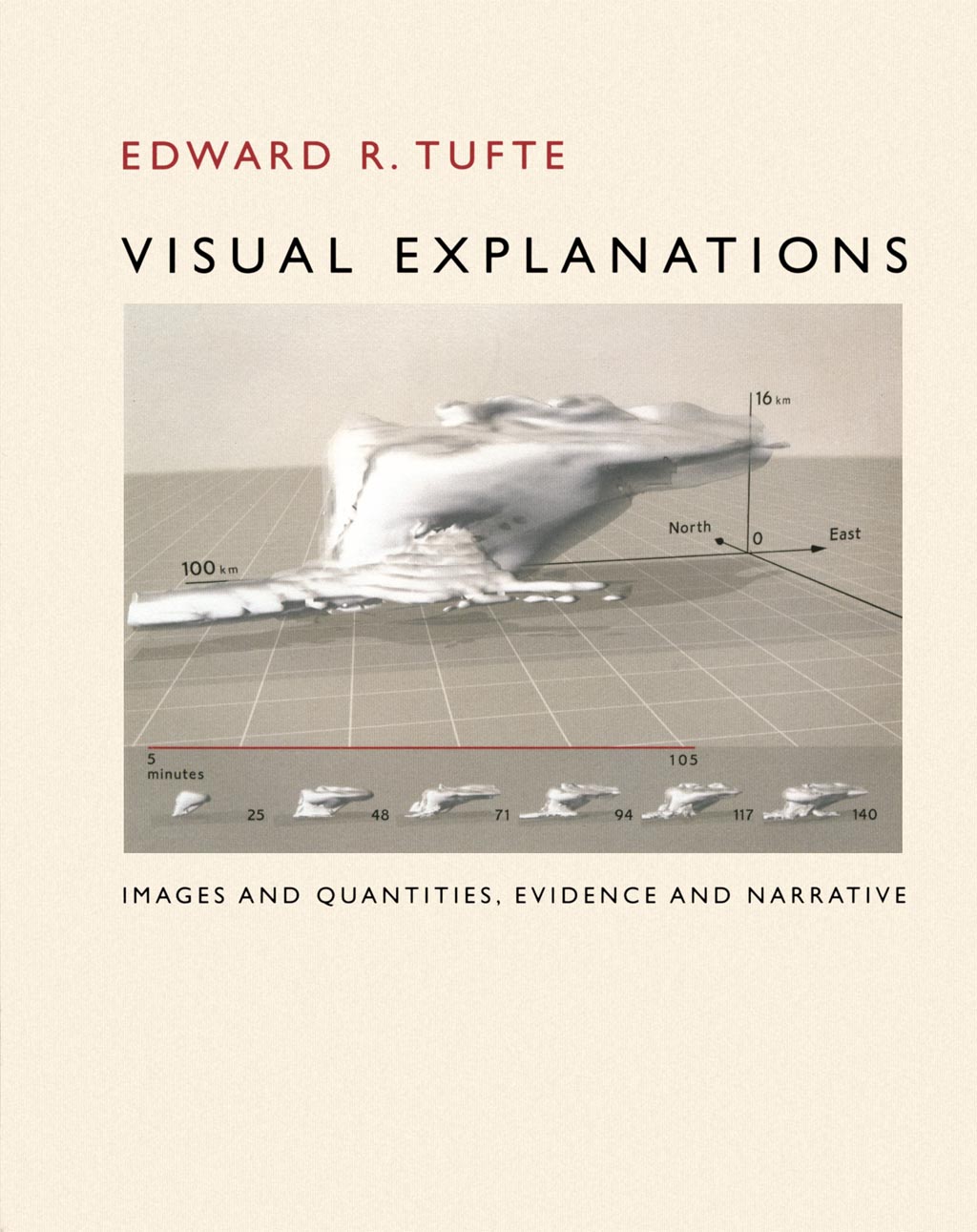
A true pioneer of the data visualisation world – a statistician, data scientist, Professor and artworker with four books on data visualisation (the third of which, Visual Explanations, below). Founded Graphics Press.[/vc_column_text][/vc_column_inner][/vc_row_inner][vc_column_text]
Nicholas Felton
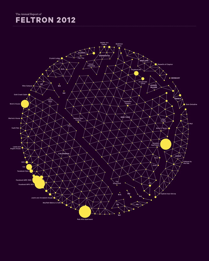
An information designer, and the Co-founder of Daytum.com; using reams of data including airline ticket stubs and his music archives, Felton decided to make an annual report about his life.
Simon Rogers
@smfrogers
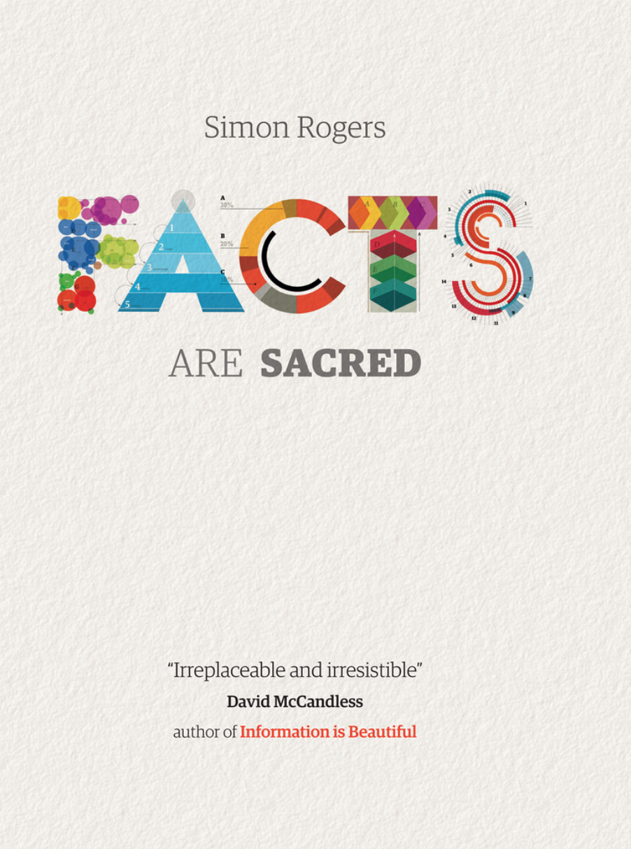
http://www.guardian.co.uk/data/
Data journalist, Data Editor at Twitter, and author of Facts are Sacred: the Power of Data. Also one of the judges for the Information is Beautiful Awards.
Benjamin Wiederkehr
@weiderkehr

Datavisualization.ch editor; a great source of news and knowledge for data visualization and infographics. A founding member of Interactive Things design studio, managing director of @ixt and editor of @datavis.
Jason Lankow
@jasonlankow
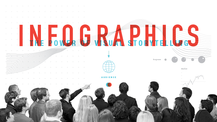
http://www.columnfivemedia.com/
The Co-founder of Column Five – a pioneering digital infographic design company – and co-author of Infographics: The Power of Visual Storytelling.
Andy Kirk
@visualisingdata
![]()
http://www.visualisingdata.com/
The ever-humble founder of Visualising Data LTD; a UK-based data visualisation architect, consultant, worldwide training provider (as tried and tested by infogr8!) and author.
Moritz Stefaner
@moritz_stefaner
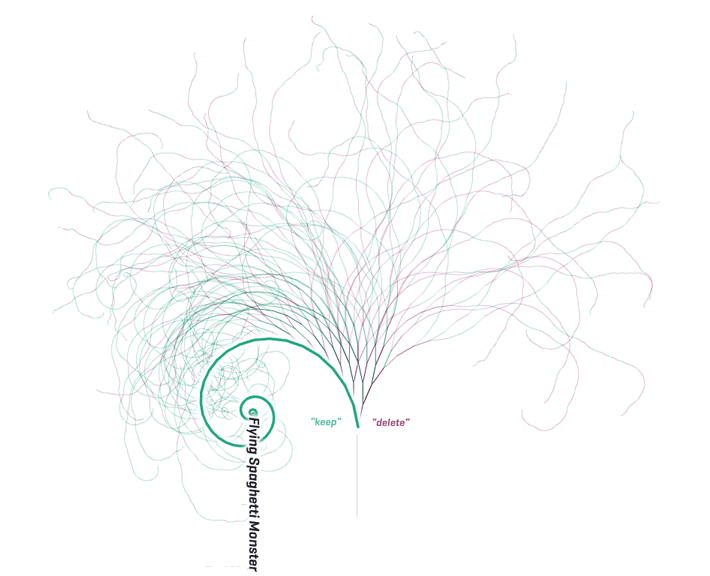
Won awards for best interactive visualisation (for Notabilia, above) and the best individual contribution at the Information is Beautiful Awards.
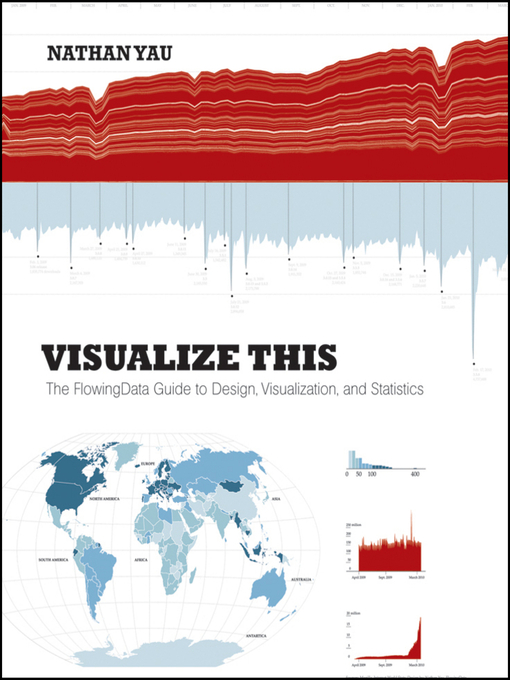
Nathan Yau
@flowingdata
The writer for Flowing Data, author of Vizualize This. A statistician and data visualizer of the highest order.
Adam Bly
@adambly
The founder of VisualizingOrg, Seed Media Group and Seed Magazine. Provides a great link between science and design.
David McCandless
@mccandelish
http://informationisbeautiful.net/
The main man behind Information is Beautiful; his book has crossed over to the mainstream in the UK, and has provided inspiration to us here at infogr8 many a time!
Aaron Koblin
@aaronkoblin
Artist and designer specializing in data and digital technologies, previous leader of the Data Arts Team at Google’s Creative Lab and now co-founder and CTO at Vrse. Winner of National Science Foundation’s award for science visualization, and has two Grammy nominations for his music video collaborations.
Stew Langille
@slangille
http://visual.ly
As co-founder of Visually, Stew is to thank for the creation of perhaps the leading infographic and visual data curation site on the web. Prior to this he was VP marketing for mint.com, helping develop them into one of the most successful Web 2.0 brands.
Jesse Thomas & Leslie Bradshaw
@jessethomas & @LeslieBradshaw
CEO and COO of JESS3, respectively, a creative agency specializing in data visualization and social strategy. Bradshaw was named as one of Fast Company’s Most Influential Women in Technology.
Fernanda Viegas & Martin Wattenberg
@viegasf & @wattenberg
Viegas founded Flowing Media, Inc., a visualization studio focused on media and consumer-oriented projects. She and Wattenberg are now a co-leaders of Google’s Big Picture data visualization group. The pair are currently well known for the beautiful U.S. wind map – a living portrait of the wind currents over the U.S.
Ben Fry
@ben_fry
Principal of Boston-based design and software consultancy Fathom. His research has focused on combining fields such as computer science, statistics, graphic design and data visualization as a means for understanding information.
Andrew Vande Moere
@infosthetics
The Associate Professor at KU Leuven, Belgium, is also the author of infosthetics.com. His research looks at the representation of information and explorative, creative design.
Jer Thorp
@blprnt
A Brooklyn-based software artist, writer and educator, Jer Thorp is the co-founder of The Office for Creative Research, previously Data Artist in Residence at the NYTimes.
Manuel Lima
@mslima
Manuel is Design Lead at Codecademy, previously researcher and Senior UX Design Lead at Microsoft, as well as the founder of VisualComplexity and author of Visual Complexity – Mapping Patterns of Information.
Jess Bachman
@mibi
Originally created Death and Taxes in 2004 as a way of conceptualizing the United States federal budget, now runs WallStats.com.
Shane Snow
@shanesnow
A tech-journalist and the co-founder of Contently, which empowers and connects quality reporters and publishers. Has created several modern infographics and visual stories for MTV and the viral Farmville vs. Real Farmers infographic.
Sandro Saitta
@DataMiningBlog
Started Data Mining Reseach in 2006, now covers both research and applications in data mining. Posts discuss research issues, recent applications, important events, interviews, trends and book reviews.
Robert Kosara
@eagereyes
Researcher at Tableau Software – a new tool in statistical visualizations. Author of a number of articles and journal pieces on visualization.
Chiqui Esteban
@infographic & @chiquiesteban
An experienced visual journalist, previously Digital Narratives Director at lainformation.com and Graphics Consultant at Innovation Media Consulting and now Visual Journalist at The Boston Globe. Also the owner of the @infographic Twitter handle!
We hope you’ve found the list insightful – apologies to the many of you we’re sure to have missed! Keep an eye out for future posts across specific viz disciplines, and give us a follow too: @infogr8!
![]() [/vc_column_text][/vc_column][/vc_row]
[/vc_column_text][/vc_column][/vc_row]