Richard Silvester
September 8, 2025
As many Londoners settle back into work mode after the summer holidays, Transport for London strikes are set to bring the capital to a standstill. From Sunday 7th through Thursday 11th September, there will be little or no service on the Tube.
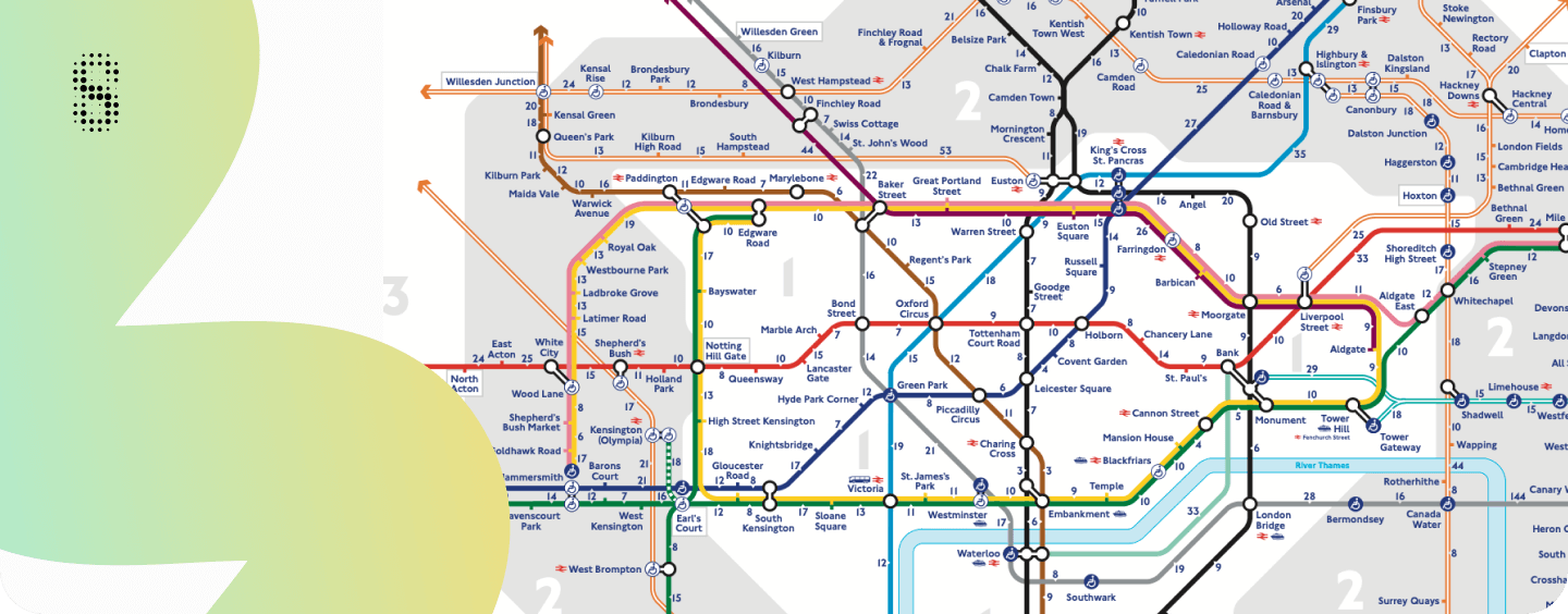
One of the smartest responses to moments like this didn’t come from TfL itself, but from the design community. Back in 2014, creatives Joe Watson and Ary Arasen released an unofficial Walking Tube Map — an early example of utility-based user-generated content. By reframing how we visualise the city, their map revealed just how many stations are within easy walking distance of each other.
This piece of information design quickly became a cultural touchpoint, showing how design can cut through disruption and empower people to navigate differently. Next week, it may prove more relevant than ever.
The Walking Tube Map works because it challenges our defaults. Instead of instinctively heading for trains, buses, or bikes, it reminds us that the fastest and greenest option is often already under our feet.
A modern equivalent could go much further. Imagine:
One map, in real time, offering the quickest and most sustainable choice.

At Infogr8, we see this as more than a clever workaround for short-term disruption. Information design of this kind has the power to reshape how we think about mobility, sustainability, and wellbeing in our cities.
What once felt like a future facing idea, is becoming possible now. With the advancement of data intelligence and agentic AI systems, we can integrate live transport feeds, real life step counts, bike availability, and even air quality into one coherent view.
This is where design and data converge: not just clarifying disruption, but actively guiding better choices. The opportunity is to move towards adaptive, intelligent systems that help our London community navigate smarter, live healthier, and make more sustainable decisions.
Soho Works White City,
Television Centre,
101 Wood Lane,
London,
W12 7RJ