ICYMI – Weekly round up of inspiring visual content Vol. 33
Reading time
Category
Missing your data-led visual content fix? Fear not, we got you. From a tasty data cuisine micro content, to a colourful Google consumer barometer, the team at infogr8 have curated the most inspiring and interesting visual content we have stumbled on this week.
The Assets
Data Visualization
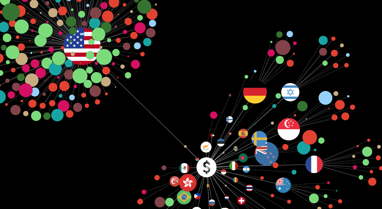
There is a sea of Financial technology companies out there, and this week we caught sight of The FinTech Jellyfish, a interactive data visualisation developed by Samuel Fillon for The Assets which allows us to view and compare companies by sector, where they originated, and money raised. Light green circles are visibly dominant, showing that lending companies are particularly dominant. Less like a jellyfish then, more like a shark.
We had a similar approach on showing the contrast in popularity of tweets across hashtags and speakers over at Bubble, infogr8’s lead designer Ben Willers helped produce Visual.ly’s startup Universe , with data extracted from Crunchbase back in 2013 there was no ‘financial’ category, a testament to how fast the tech sector is moving.
Moritz Stefaner & Susanne Jeschko
Micro Content Pack

Have you a hunger for data? Well look no further than Moritz Stefaner and Susanne Jaschko, and their group Data Cuisine. Data Cuisine is an experimental research group exploring the representation of data with culinary means, and recently they held one of their dinners to represent some data in the tastiest way possible. By staging the food or ‘edible diagrams’ the group looks to represent the data using food and ingredients, such as the gender inequality between in-home and restaurants kitchens using sausages to represent men and potato salad for women, producing some mouth watering micro content packs.
While the medium of food presents some very unique challenges when it comes to representing the stats with a 100% degree accuracy, the concept and art direction behind these pieces, as food is one of those things that is common to us all, helps to connect the data with the viewer on a very human level. High in both impact and calories, the Data Cuisine micro content pack collection helps us to digest information in a simple way and leave us a little hungry every time see them.
The Mediterranean is now a graveyard for refugees
The Washington Post
Infographic

Migration has been a hot topic in the news this week, and it seams the music shows no sign of slowing in this world-wide game of musical chairs, and in fact it seems to be speeding up. This week we learned that 2,850 refugees have been recorded killed or missing while crossing the Mediterranean Sea this year alone. The Washington Post has produced a shocking infographic which visualises this saddening statistic, however we can’t help feel that photograph of a single 3 year old boy lying lifeless on the beach is even more horrifying. The chart that follows show a sharp increase in the number of migrants arriving by sea in recent years, which unfortunately points to further upsetting stories in the future.
Clay Bavor
Gifographic

Jets tend to be a fascination for most although that fascination can easily switch off for the most of us once academia starts to enter into the equation. This is where visuals can help break through that sound barrier and Clay Bavor does just that through this fine visual comparison. The 3 second animated clip is all it needs for you to get a sense of what it would be like to look out the window of an airplane flying at the speed of the New Horizons space probe.
As Clay states “To put 36,000 mph in perspective, at that speed, you’d be able to fly from San Francisco to New York in about five minutes.” For us Londoners, thats Heathrow to New York in just a whisker over five minutes, right then, Xmas shopping at Fifth avenue it is.
Future of travel report – how will travel look over the next 10 years
Skyscanner
Scrollable story

As the September blues start to cast over the UK like pea soup, we thought we’d jump onto a bright page and start scouring for that next holiday in the Sun. As the data geeks we are, in no time at all we found our way onto this ray of visualised information – The future of travel report.
How will we be planning our trips? What’s the journey going to be like? Where are we going to, and where are we going to stay? Its fun to imagine what the future may hold, and travel search company Skyscanner wants to share their vision of the future with you. Choosing to create an illustrated scrollable story, you can work your way through simple and engaging animations to keep the readers attention in an experience that’s not possible with a normal website or blog post. When you turn considered, reliable information into a visual story it becomes more relatable, engaging and memorable to a reader and can have huge impact in a very content saturated environment. For more examples of well considered scrollable stories look no further than the The Evolution of Windows in Vol.29 and The Science Behind Why Native Ads Work from Vol.24.
Consumer Barometer with Google
Data cards

Today people are more connected than they have ever been, with the ability to access the internet from a huge number of devices, especially the smartphone. When marketers and planners need to promote a product or service in this day and age they need to asses a huge amount of data to ensure they are connecting with the right audience at the right time on the right audience with the right content, right then! To help you meander, tech giant Google has compiled a collection of interactive data cards using a clean and clear chart approach to illustrate the key statistics for several key areas of interest when it comes to our behaviour online. Jump over to the site and explore the information Google has amassed Globally as well as a breakdown for over 60 individual countries with the support of data partner TNS.
Africa in numbers – how its countries compare
The Guardian
Data visualisation

Africa is a big continent, with a big population and big data ripe for visualising. The Guardian has focused on five indicators that provide a measure of wealth and development so we can see how the 54 countries compare when it comes to mobile phone subscriptions, average age, and children per woman. While some commentary is provided, it’s really up to us to venture on our own and hunt for those interesting nuggets of information. Each indicator has its own scale, and while we do do miss traditional axes labelling, we see huge potential if this piece were to make the leap and be turned into an interactive. Until then, we are we are left with a tantalising glimpse of how nations compare across one of the largest and most populous continents on Earth.
Content Marketing Reimagined: How brands can earn attention in 2015
Visual.ly/Percolate
White paper

With today’s consumers becoming more selective about what content they consume, many are finding it increasingly challenging to engage with their audience. Visually are no strangers to creating beautiful content, and they have partnered with Percolate to create a report which discusses how brands can command more attention from their existing and potential followers in 2015. The team here at infogr8 produced a similar trend report earlier in the year, helping to outline the challenges an opportunities faced in the current digital landscape. Take a look at both, and discover how to deliver more value with your content.
We’ll be sharing more inspiration next Friday, for now you can follow the team on Twitter @infogr8. Please tweet & share your viz spotting stories to be considered for our future rounds ups. #vizspotting #ddj.
We’re hiring! Several new awesome roles within the infogr8 family including account management, digital PR manager & web development.