ICYMI – Weekly round up of inspiring visual content Vol. 32
Reading time
Category
Missing your data-led visual content fix? Fear not, we got you. From a fantastic selection of data cards – those little snippets of juicy content, to a gorgeous 3D Animation counting trees in the whole world, the team at infogr8 have curated the most inspiring and interesting visual content we have stumbled on this week.
How many trees are there in the world?
nature
3D Animation
We were surprised to learn this week that our planet is home to over 3 trillion trees. It sounds like even the experts were amazed by this new finding as well, as this is more than seven times the number previously estimated using satellite imagery. This new estimate has been made using thousands of people counting trees at ground level, and the results have been mapped to a glorious spinning globe in this 3D animation by Jan Willem Tulp for nature. The average density of trees in each location is represented by the hight of the green lines, and as the globe spins it reveals dense forests across Scandinavia, America and Russia. By comparison, the UK hardly registers on the map at all. We found the video to be a great way to showcase these new findings, and is surely enough to give data visualisation fanatic wood.
When Will Everyone I Know Be Married?
FiveThirtyEight
Data tiles
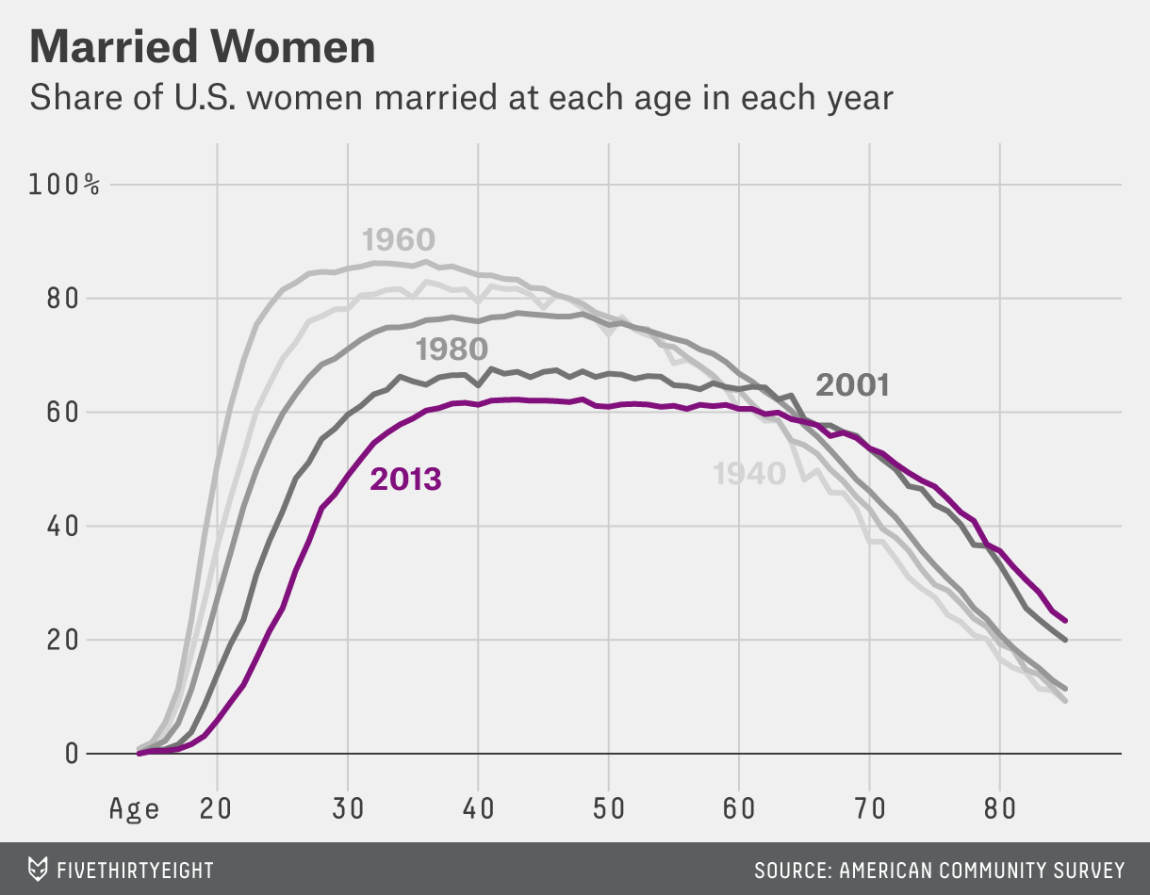
Do you ever feel like you are the only person at your age who has not yet found the time to tie the knot? Well now you can see exactly how unusual your circumstances are, using this collection of data tiles from FiveThirtyEight. They portray a series fascinating snapshots of the percentage of men and woman who are married by age group, and it would appear that both sexes across the US are leaving it later and later in life to make the ultimate commitment. If you are tired of your parents asking when you intend to marry and settle down, these charts could be just the evidence you need to prove that you are not so unusual after all.
Application Developers Alliance
Infographic (editorial)

Every developer is different, however at the same time there are key components that the majority share. The Application Developers Alliance have just compiled a global survey of today’s developers, and asked the team here at infogr8 to spark life into the key findings by creating a fun and sharable infographic. From being fluent in multiple programming languages, to being excited about emerging platforms such as wearables and robotics, it would appear that the majority of developers have all the right bits in place to help create electrifying content.
Apple vs. Android: The Wearable Effect
Crittercism
Infographic (branded)

If you want to get into argument in room full of nerds, one of the best strategies is to bring up the subject of Apple vs. Android. Helping to provide an impartial view, Crittercism is a company that monitors mobile app performance across a range of platforms, and they have just released an infographic which compares adoption, wearable compatibility and stability across the the two leading mobile operating systems. The charts are beautifully presented and clearly show that Apple is leading the way in all areas. But you did not really need an infographic to tell you that, did you? 🙂
How much time it took to reach 100 Million users worldwide
Business Insider
Data card

Hitting milestones is always something to celebrate, for social media platforms and internet services hitting 100million users is definitely something to shout about. What’s really interesting as highlighted in this data card by Business Insider, is the amount of time it takes for a social media channel to make the 100million mark. If we look back to before the internet our main form of communication, the telephone took 75years to reach 100million users since its launch in 1878, and it’s footloose little brother the mobile phone took nearly 60 years less to make the milestone since its beginnings in 1979. In comparison the adoption of social media across the world over the last decade has been a game changer.
Looking at the chart we can see that in comparison to the phone and mobile phone, social media sites and services are the sprinters of the communication world with social media channels such as Facebook, instagram, and services like itunes, the App store, whatsapp and candy crush taking under ten years to hit the golden landmark of 100M. This data card is a prime example of how we can show interesting stories at a glance. Similar examples can be seen with Every Possible Emotional Overlap in Pixar movie Inside Out in vol.26 of our ICYMI.
No Place Like Home – Is it Cheaper to Rent or Buy
Money Advice Service
Data cards

As we understand it, back in the good old days if you could not afford to buy your own home, you rented. Well, that was before the credit crunch a few years ago, and since then things have gone a bit crazy. Average monthly mortgage costs are now actually less than rental payments, and not just in London either. As part of our long standing partnership with the the Money Advice Service we recently created a series of data cards to highlight the difference in costs and help explain what is going on. Is renting or buying the best option for you? Take a look and find out.
Which countries produce the most waste?
Agenda (World Economic Forum)
Data Card

According to an article on Agenda, by the 2025 it is estimated that there will be 1.4 billion more people living in cities worldwide, that’s a lot, but whats a even more shocking is the amount of waste being produced in these cities is growing faster according to the World Bank’s report What a Waste: A Global Review of Solid Waste Management. Currently we produce 0.64 kg of municipal solid waste (MSW) per day but this is estimated to jump to a whopping 1.42kg. This jump estimates that the Annual worldwide urban waste will more than triple, from 0.68 to 2.2 billion tonnes per year. To support the article and ground it in the ‘real-world’ this data card showing the countries that currently produce the most waste per person is an ideal solution to add an extra layer of information, using colour to simply communicate the heaviest wasters to the lightest.
We’ll be sharing more inspiration next Friday, for now you can follow the team on Twitter @infogr8. Please tweet & share your viz spotting stories to be considered for our future rounds ups. #vizspotting #ddj.
We’re hiring! Several new awesome roles within the infogr8 family including account management, digital PR manager & web development.