ICYMI – Weekly round up of inspiring visual content Vol. 29
Reading time
Category
Missing your data-led visual content fix? Fear not, we got you. From a gamified data arcade that can predict cancer to a scrollable story depicting the evolution of Windows, the team at infogr8 have curated the most inspiring and interesting visual content we have stumbled on this week.
Jung Zhang
Infographic
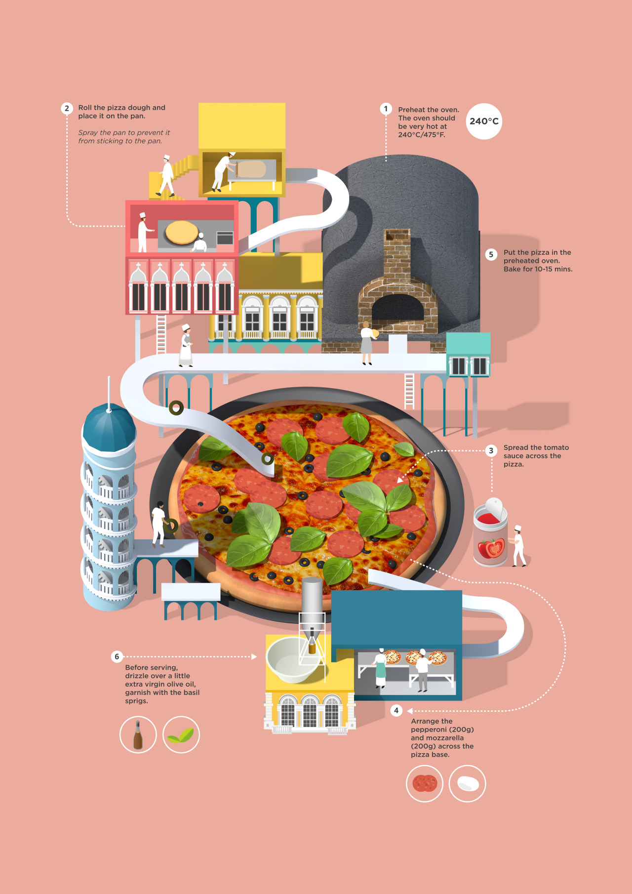
Recipe books are everywhere, from chef superstars to a-list celebs everyone seem to be offering up their processes, tips and tricks when come to making a bang-up meal. Only problem, the information is always presented the same way. Step-by-step guide?…check. Table of ingredient? … check. Mouth-watering photo of recipe?… check. No matter how well produced the book is, it can start to become very similar very quickly. Well, illustrator and designer Jing Zhang decided to make recipe cards more interesting, taking on some of the worlds favourite dishes she has produced 5 very tasty infographics. Breaking up the dishes step by step, Jing weaves the stages with the dish, choosing illustrate them with some great characters and mini scenes leading the viewer through the process in a delightful, fun style.
On Stride Financial
Interactive Map

How far will you get with a £1000 in the bank? Well to be honest it depends of everything around you. Accommodation, travel, food and drink, and entertainment costs vary greatly depending on where you live, but it is a very interesting question how long will £1000 last you? Wishing to explain this in a interactive and interesting way, On stride financial have created a great interactive map to answer this. Taking 10 of Europe’s major cities they worked out the daily cost of living based on accommodation, utilities, travel, food and drink, and entertainment how long, down to the hour, £1000 will last you. Using city icons and colour indicators to quickly show the most expensive to cost effective city on the map, clicking into one of the city icons reveals a more in-depth analysis of the daily cost of living, breaking it down to individual costs for accommodation and utilities, travel, food and drink, and entertainment for each of the cities. A great indicator for showing the cost of living or visiting some of Europe’s most popular cities, for instance £1000 will last you 50 Days, 18 hours in Budapest in comparison to cash strapping London where you wouldn’t even last a week. Yikes.
IIB Studio
Dynamic Dashboard
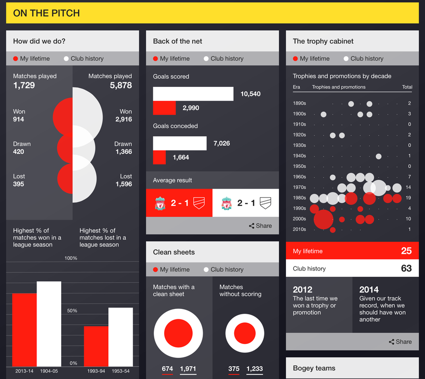
Many of today’s top football teams have an extensive history stretching way back before our year of birth. Have you ever wondered how your favourite team fared before you were around, or how successful they have been since you begin supporting them? A personalised dynamic dashboard by IIB Studio for BBC Sport allows us to see match success, total crowd attendance, trophies won and much more across the history of the club, as well as in the years we have been alive. There’s enough data in here for even the largest football trivia fanatics to go head over heels for, while the clean, simple charts allow even non fans to get a kick out of the information on display.
Earlier this year we saw a slew of companies like Facebook offering personalised year in review reports, showcasing our memorable moments form the previous year in a condensed form. With so many of us now leaving data footprints wherever we go, personalised dashboards are surely set to take over our lives very soon.
Puzzle: Are You Smarter Than Other New York Times Readers?
The NY Times
Quiz

The task is simple. Pick a number from 0 to 100. The goal is to find a number which represents two-thirds of the average of all other numbers picked by all other participants. Before reading any further, head over and take the latest quiz from the New York Times now before we spoil the fun. It will only take a minute. Go. Now! Seriously, we’re not even joking.
So, did you manage to outwit your fellow readers? As you now know, the key to success is always thinking several steps ahead, something that does not come naturally to the majority of us. The article which follows has been personalised specifically to our responses, providing us with feedback on how we did, while also giving us with a fascinating insight into k-step thinking. Under normal circumstances, we doubt this would have been all that interesting, however the mental exercise we preformed beforehand allows us understand and relate to this intriguing weakness that may of us process. We still managed to do better than 86% of all other readers, so at least that makes us feel a little better about our apparent mental Inadequacies.
OnTheHub
Scrollable story

In celebration of the release of Windows 10 OnTheHub, provider of academic software, has created a scrollable timeline highlighting some of the unique aspects of the past Windows operating systems, there are even some hidden facts for you to find by yourself. For instance back in 1985 when windows was making it debut it was almost called “Interface Manager”, Windows was chosen as it better represents what the interface looked like. Or how the font of every designers nightmares, the dreaded Comic Sans, first made its debut in Windows 3.1. A great example on how an interactive scrolling website can express a timeline in a fun, engaging way. Follow the link and work your way through the history of Windows operating systems from its humble beginnings to the latest and greatest Windows 10, and when you’ve scrolled through that site make sure that you check out this video Microsoft and Column Five created about the evolution and future for web standards.
Why We Need More Women in Tech
Next Generation Recruitment
Infographic

More women are in entering third level education than ever before, but the number of women pursuing the STEM (science, technology, engineering, and mathematics) subjects is actually falling. And with less entering this field it leads to less equal and diverse workforce in tech companies across the world. Why do we need more women in tech? Well apart from the obvious, that we just need more people studying STEM subjects to meet future tech workforce demands, the current annual shortfall on STEM skilled workers in the UK is around 40,000, there are several reasons to work towards a more diverse environment. First, well, its diverse… different people think different ways, tech companies create solutions for all types of people and diversity of taught is good for business. There are other good reasons for a more diverse tech workforce, as highlighted in the is great infographic by Next Generation recruitment. For instance businesses with a woman on the executive team are more likely to have higher valuations at both first and last funding, 64% larger at first and 49% larger at last. The infographic illustrates the issues why the problem exists, the advantages to a diverse workforce and whats currently being done to ensure more women enter STEM education and workforces in the future.
Tellart + Specular
Physical Visualisation Interface
Going to the doctors here in the UK is hard work, if you haven’t pre-booked your GP appointment in advance (which can be up to a two week wait) you are left to the mercy of a walk in service where waiting times can creep into the hours. It wouldn’t be so bad if you didn’t have to sit in sterile waiting room, with little more than year old magazines for entertainment, only to visit another bland examination room. Wouldn’t it be so much better if visiting the doctors was like visiting old-school arcades of the past? Well an idea conceived by Tellart and produced by Specular is looking to change things. They have created Fitzania, an physical visualisation interface that was on display at the UAE’s recent Museum of the Future installation. Fitzania is like a body-tracking game, imagined for the year 2030, where players are challenged to swing a four-pound ball to match onscreen prompts, all while being engulfed by the game interface in a projection mapped room. The idea is while playing the game the system would, in theory, be tracking different sorts of biometric information. Things like heart rate, respiration, reflexes and cognitive speed would all be recorded. The data would be uploaded to their private medical records, serving as an automated checkup, or another data point before their next physical. Combining this concept with the application and increasing popularity of wearable tech, we may start to see the benefit of a more regular snapshot of our health rather than the once a year checkup with the GP.
We’ll be sharing more inspiration next Friday, for now you can follow the team on Twitter @infogr8. Please tweet & share your viz spotting stories to be considered for our future rounds ups. #vizspotting #ddj.
We’re hiring! Several new awesome roles within the infogr8 family including account management, digital PR manager & web development.