Phew! What a nail-biter. The Democrats’ victory in the US election looked certain, until it didn’t. In the end it all came down to Pennsylvania and its postal votes. Biden eventually clinched the state by the slimmest of margins, securing the next presidency with vice president-elect Kamala Harris. And we all breathed out.
Needless to say, it was a week of many data visualisations, the best of which present a clearer picture and ensuring we’re informed on what’s set to come. Here are three standout examples:
1. An unusual ‘snake chart’
FiveThirtyEight

Renowned statistical soothsayers FiveThirtyEight made this elegant ‘snake chart’ predicting the outcome of the election.
Each state is represented by a segment of the snake, sized by the number of Electoral College votes. The segments are ordered and coloured by the predicted vote margin for each party, according to FiveThirtyEight’s statistical model. (An alternative view shows which states it forecast were most likely to be the tipping point in the election.)
They didn’t call every state correctly, but they got a lot right. The result is a winding yellow red blue brick road to a Biden victory that leads straight through, yes, Pennsylvania.
In a world awash with charts, original and well-executed visualisations can help your message stand out from the crowd. Harness the power of visual metaphor and use unusual chart types to entice readers to take a second look, or a third.
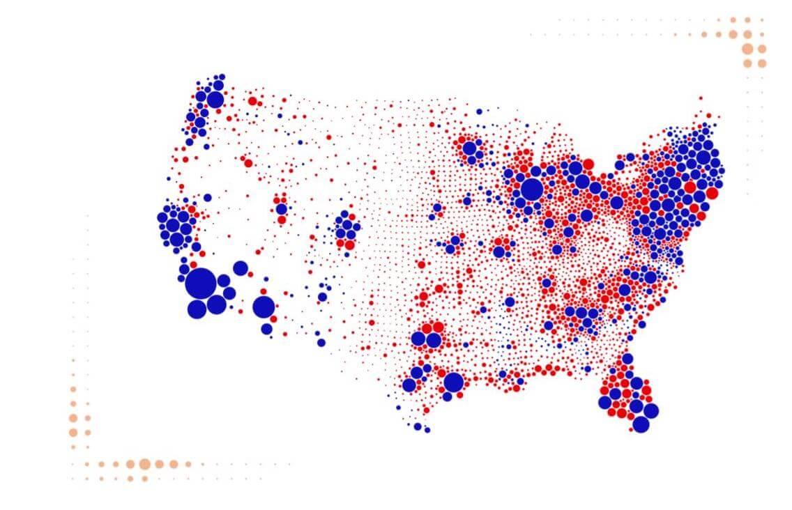
2. Why so many maps suck
Karim Douïeb
 Thanks to Karim Douïeb for the images
It wouldn’t be US election week without maps. But not all maps are created equal.
This clever animation from Brussels-based data scientist Karim Douïeb replaces the familiar land-area-based map with one with bubbles scaled by county population size. It shows, once again, how misleading traditional election maps are. By visually over-representing sparsely populated rural counties and under-representing densely populated urban ones, they make the US look way more Republican than it really is.
Watch that transition!
As politics becomes ever more polarised, charts have become campaign tools and audiences are increasingly questioning what they see. Consumers, particularly millennials, demand transparency, honesty and openness from brands like never before. A 2016 survey [PDF] found 94% of respondents were likely to be loyal to a brand that offered complete transparency – and 56% said they’d likely stay loyal to them for life.
3. Into the mind of America
Google News Initiative

This impressive interactive site, Waves of Interest, was launched just before the US election by Google News Initiative and Moritz Stefaner’s Truth & Beauty. It takes a deep dive into the mind of America by visualising the hidden patterns its Google searches.
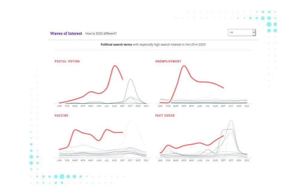
Beautifully rendered contour maps show shifts in search interest during recent election years, revealing that the topics people care about are more fluid than you might think. Searches for terms like ‘postal voting’, ‘unemployment’ and ‘vaccine’ are up considerably in 2020.
Data drives modern elections – and understanding voters’ interests, values and priorities is key for any political party. The same goes for brands. Customer knowledge really is power – and power means revenue. The big evolutions in brand tracking, psychographic profiling and deeptech consumer insight – as illustrated by StreetBee’s recent $40m funding – go to show just how sophisticated data-orientated audience insight is becoming.