2020 was a ‘breakthrough moment’ for data visualisation, wrote computer science Professor Ben Shneiderman. Thanks to COVID-19 and the plethora of charts it generated, dataviz is now “center stage in worldwide discussions”.
In such a year, choosing a shortlist will always be a challenge. But, here at infogr8, we’ve taken that challenge on. Here are three visualisations that – we believe – sum up Pandemic Year 2020.
1. An iconic dashboard
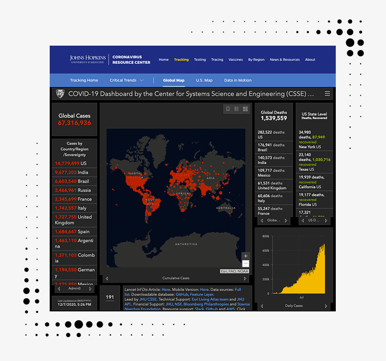
Johns Hopkins University / Esri
With its iconic black and red bubble map, JHU’s COVID-19 dashboard has become the go-to source for national coronavirus statistics for everyone from CNN to your local GP.
It was launched back in January by engineering PhD student Ensheng Dong, who initially updated it twice a day – manually. As cases rose, this became an increasingly Herculean task. “For a month, I barely slept – five hours a day or less,” he told mapping software giant Esri. So Esri helped him scrape the data and the current dashboard was born.

This year, vast numbers of people became newly familiar with complex data concepts – from logarithmic scales and exponential growth to the R number. In 2021, organisations must up their game to speak to increasingly data-literate audiences.
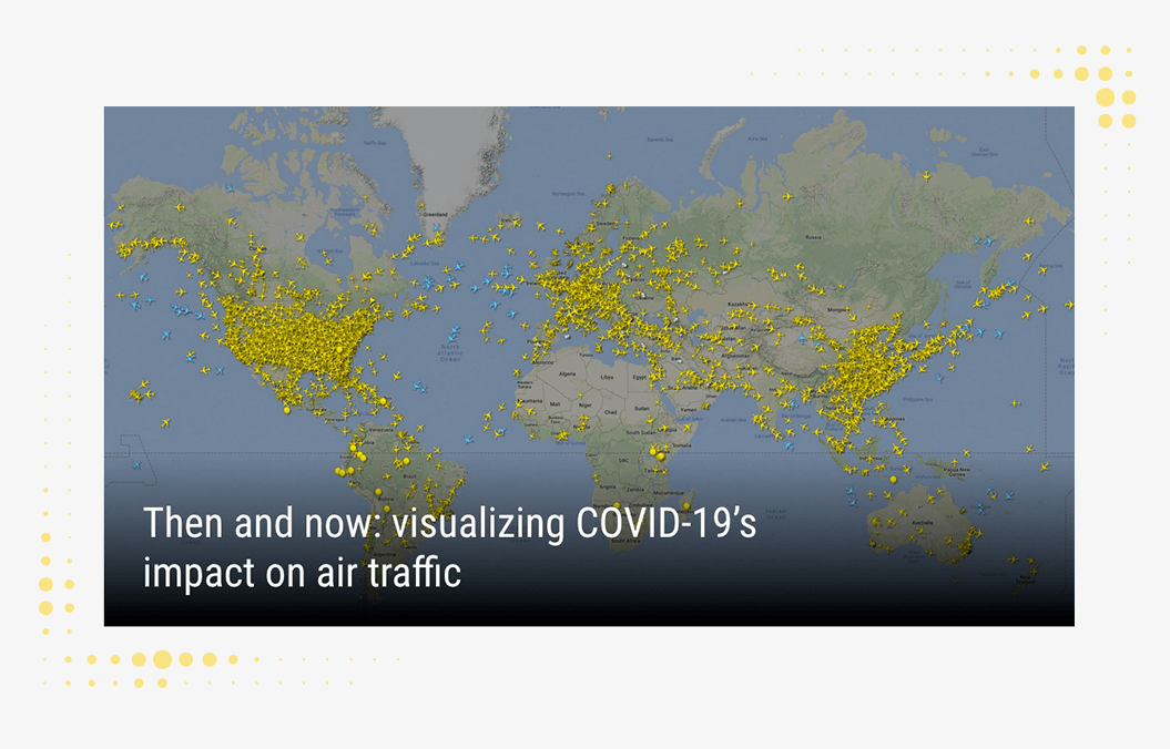
2. Then and now
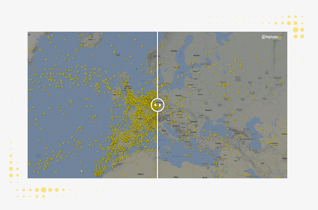
FlightRadar24
Back in April, global flight tracking service FlightRadar24 visualised the dramatic decline in air traffic caused by the virus as a series of ‘before and after’ images. You can drag the slider to see the impact COVID had on global travel patterns between March (left, in the image above) and April 2020 (right).
As the welcome effect of vaccines kicks in and the virus comes under control in the next few months, will people pick up their earlier global travel habits again? Or will the 2020 effect prove permanent, encouraging people to stay closer to home? The future of many airlines and travel operators will depend on the answer.
3. A game of cooperation
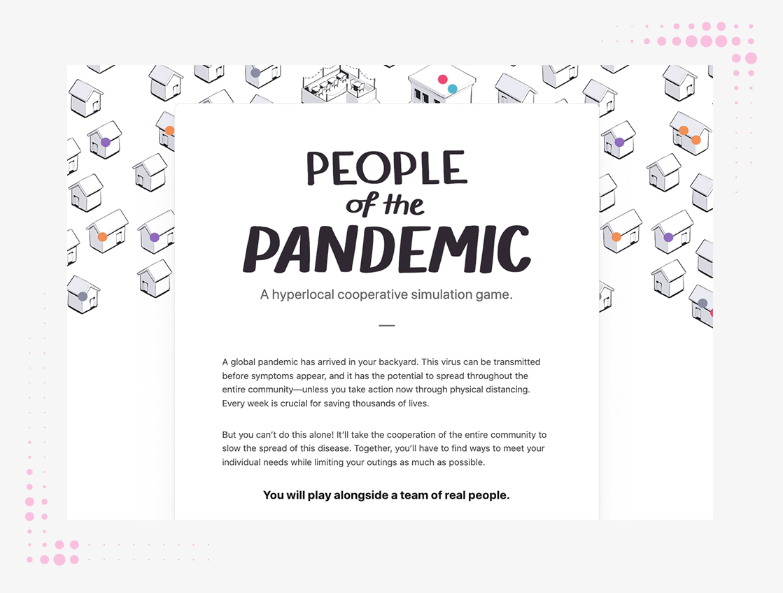
Shirley Wu and Stephen Osserman
In May, information designer Shirley Wu and Stephen Osserman launched People of the Pandemic. It’s an online game-cum-disease simulator that invites you to decide how often to leave the house. Then it models the effect on cases of a (hypothetical) virus based on the real number of hospital beds available in your community (US postcodes only). The clincher: the decisions of 19 past players are also taken into account when modelling.
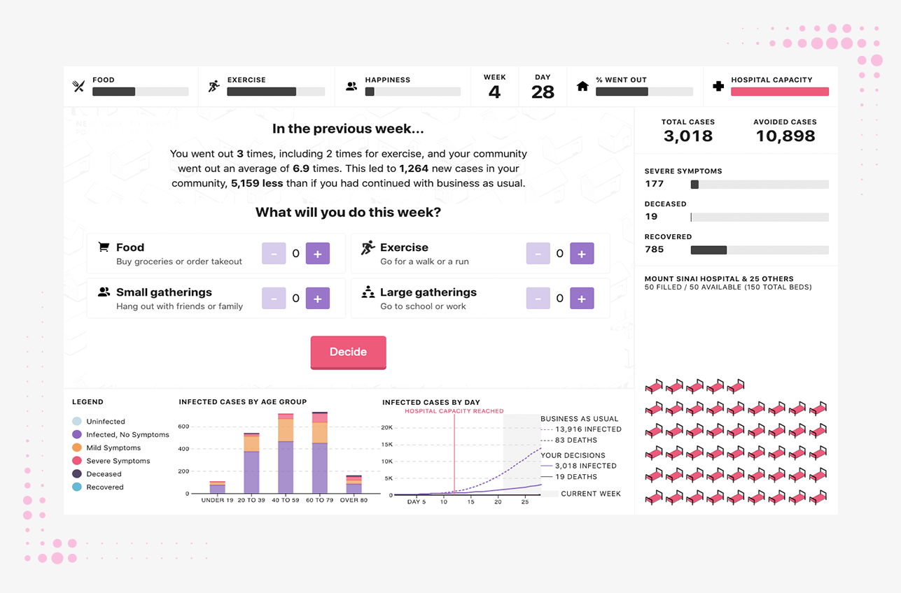
The key takeaway of this innovative game is that it doesn’t matter much if you stay home or not. It matters a great deal, however, if your entire community does. If there’s one thing we’ve learned this weird year, it’s the power of collective action.