For our ‘Best of Data For Everyone’ roundup, we’ve asked members of the team to name their favourite examples from the year in data storytelling.
.
Climate Spiral – UN Climate Change
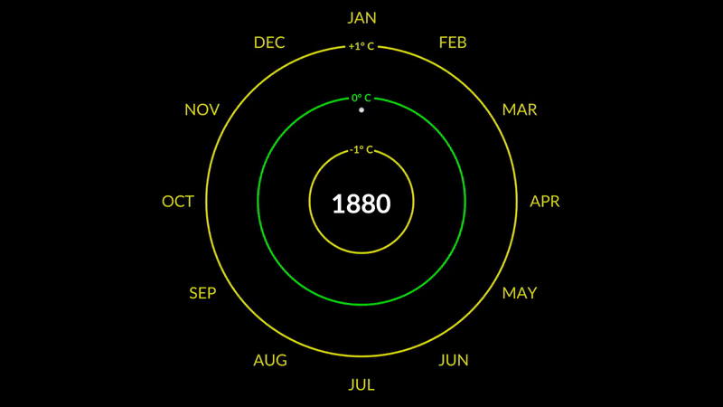

Stewart Pickering, Sustainability Pod GM
My choice for ‘Viz of the Year’ has to be The Climate Spiral by Ed Hawkins from the National Centre for Atmospheric Sciences at the University of Reading. Incidentally, Ed is no stranger to striking climate-related visuals, having already created the instantly recognisable Climate Stripes back in 2018.
The Climate Spiral draws on the same reds-and-blues colour palette as the Stripes, painting a picture of rising global temperatures over the past 150 years. By the end of the spiral, we’re left with the visual metaphor that things are spiralling out of control.
It doesn’t end there, though. Just as you reach what you think is the end, the entire chart flips momentarily in three dimensions to reveal a tornado chart, showing you the data from a different perspective. Genius!
Why it matters?
While the debate on whether climate change exists or whether it’s caused by human activity is largely over, the governments of the world just don’t seem to get it. Not enough action is being taken, and we’re not treating the climate emergency as though our house really is on fire at all. Visualisations like this leave a lasting impact and spur individuals into action, whether that’s learning more about the reality of the situation or making those small lifestyle changes that count.
“Visualising climate change data is essential not only to help everyone understand the gravity of the current situation, but also to express hope for the future.”
.
The Collapse of Insects – Reuters
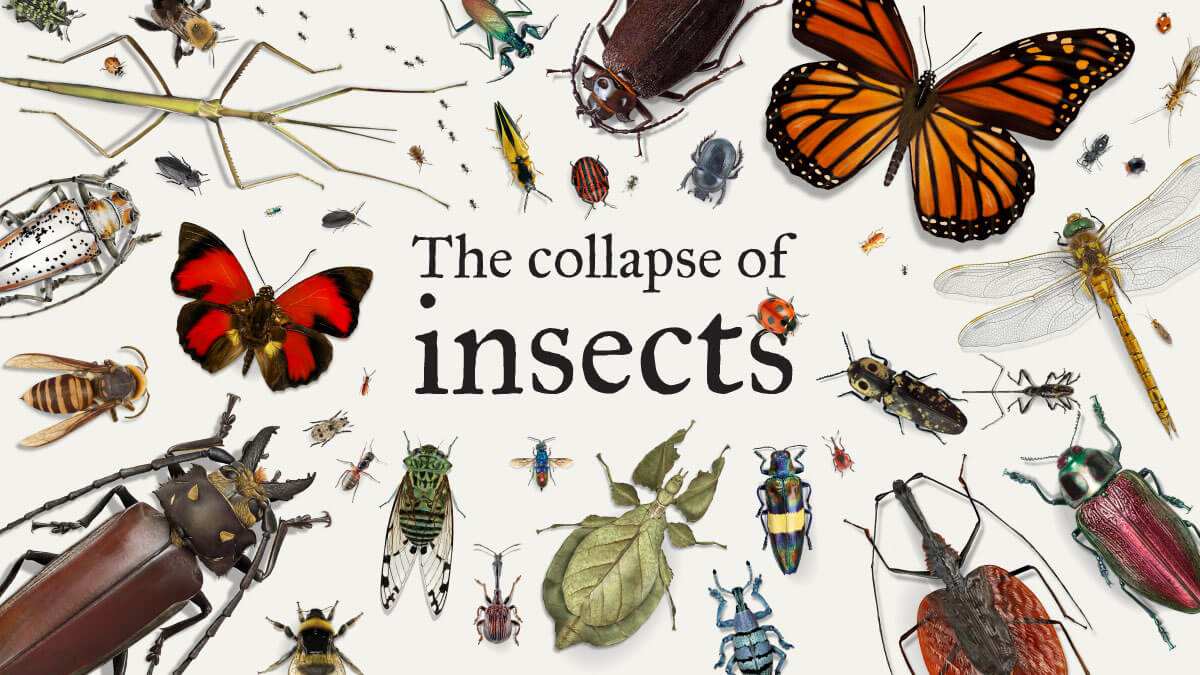

Razvan Zamfira, Information Designer
Although it’s not a particularly jolly topic, insect extinction is a one that I’ve been pondering about for a while. Ever since I first heard about Anders Pape Moller’s experimental research, I’ve been a lot more conscious about this issue. For two decades he drove every summer on Danish roads and counted the number of insects killed on his windscreen and discovered an 80-97% reduction in their numbers between 1997 and 2017. This is why “The collapse of insects” article caught up my attention.
The article is a great data storytelling example. It mixes great charting and data with very well structured reporting sections, combining first person experiences with data about the importance of insects in the ecosystem, as well as detailed data about their decline.
Why it matters?
The Reuters piece makes a very compelling case about insect extinction by combining beautiful botanical drawings with flow diagrams and ‘scrollytelling’ sections in order to set the scene and explain their unprecedented rate of decline, 2% per year.
“Insects are all around us but unfortunately most of us either consider them a nuisance or are all out scared of them. Having such strong feelings about them combined with their fast and very noticeable disappearance might make us a bit more conscious about the impact humans have on the environment as well as climate change.”
.
Climate Game – Financial Times
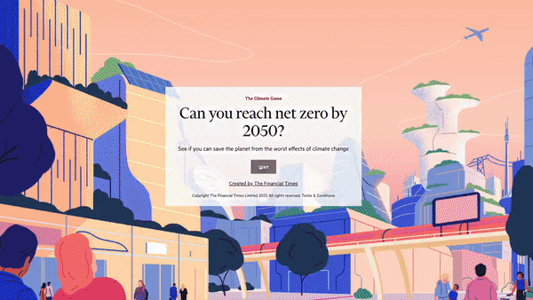

Josephine Brown, Sustainability Pod Strategist
My choice for ‘Viz of the Year’ 2022 has to be The Climate Game created by the Financial Times in partnership with Infosys. The Climate Game uses a gamification approach to get users to choose their persona as a global minister making crucial decisions to keep the planet below the 1.5°C increase in global warming by 2050.
It’s a masterclass in how to both engage and educate audiences on complex climate issues. And the cherry on the cake is that through the use of gamification, it’s actually entertaining too. By making the user the decision-maker, actively participating in the decisions that matter, this viz encourages them to consider the facts on a more substantial level. It also adds empathy and emotion to the content, which is a powerful persuasive tool.
Finally, whether it’s about emissions, temperature, carbon reductions, or investment in green energy, the narrative throughout is data-led without being intimidating. The data becomes ever more important, as you need to care about the numbers to ‘win’ the game.
Why it matters?
We’re already seeing the impacts of climate change and have set targets to stop the rate of temperature increase by 2050. The game highlights that these changes have to be substantial, and they require contribution from everyone, in every aspect of our lives. The more we can educate the wider public, to understand it and to care enough to take action, the better chance we have to create a sustainable future.
“It is rare to find a piece of work that educates the public without them even realising it, because it is engaging, simple and fun, and this does just that!”
.
Covid-19 Visualisation With a Music Box and Punch Cards – Simon Huwiler


David Bumbeishvili, Senior Data Visualisation Developer
My pick for 2022 is this visualisation of Covid-19 deaths with a music box and punch cards, made by Simon Hiwiler. It visualises Covid-19 deaths in Switzerland, but in an unusual and unexpected way.
Instead of sight, this viz uses the sense of hearing to tell a story. Each beat from the music box represents a day in the pandemic, and each note represents a single victim of Covid-19. When you realise the above, listening to the video hits hard and leaves you heartbroken after it finishes. I haven’t seen a single visualisation of the pandemic that has such a deep impact on the viewer.
Why it matters?
One of the goals of data visualisation is to make viewers relate to the subject matter. This example shows what sound can do if we use it correctly.
“Sound is an often overlooked yet very powerful aid in data visualisation – it can have an impact on the audience and make them care.”
.
How Long Does Data Viz Take – 3 Is A Pattern
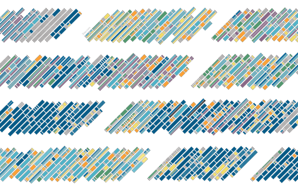

Jane Zhang, Community Manager
My pick for 2022 is Timely Advice – How Long Does Dataviz Take?, in which Eli Holder tracks and visualises over 1,500 hours spent across 10 data viz client projects. I love how this visualisation captures Eli’s working process, which is normally invisible. So much of data viz work is outcomes-driven – we see the final product, but not the work and effort that went into creating it.
Why it matters?
For anyone who is freelancing or looking to start, this viz gives you insight into what to expect. For example, I found it interesting that 40% of Eli’s time overall was spent doing non-data viz work, such as data wrangling, client communications, and research. A fun variable he also measured was ‘chaos’, which is ‘time lost due to client shenanigans’. Overall, this visualisation is a really fun piece for anyone working in the industry to explore and learn from.
“Data visualisation as a medium enables us to show information that would otherwise be challenging to express.”
.
Brexit Charts – Financial Times
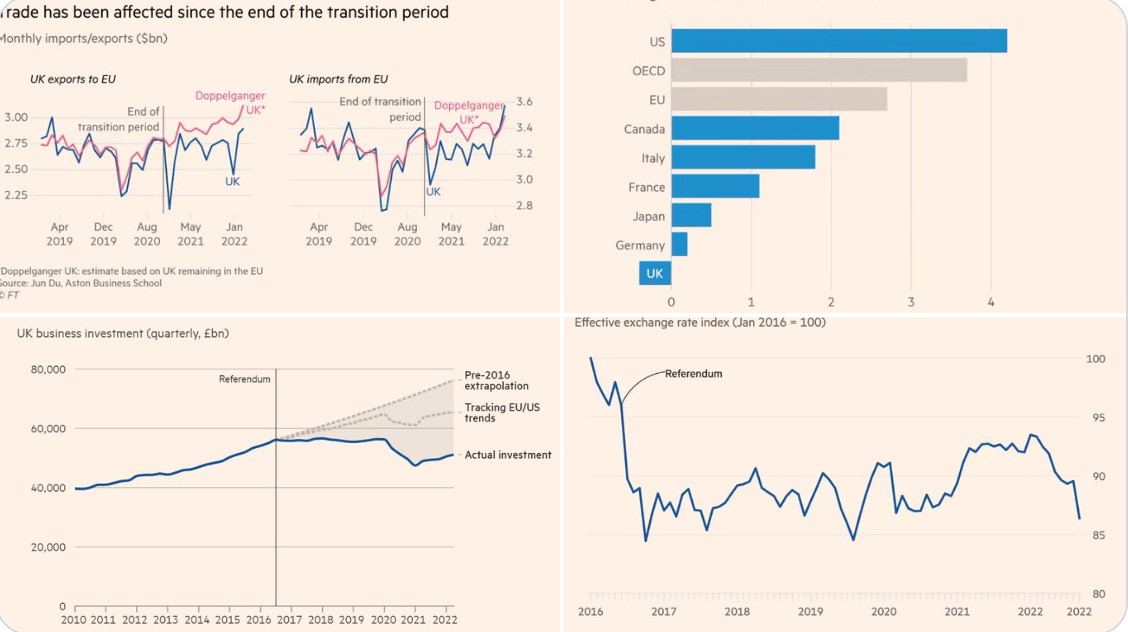

Jake Madsen, EdTech Pod Producer
In the UK, there’s a sense of political paralysis whenever the ‘B’ word is mentioned. Putting politics aside, now that the dust is beginning to settle, we can see the true outlook of Britain in a post-Brexit world. And it makes for grim reading/visualising.
In this viz, the FT’s chief economist Chris Giles tells the story of Brexit in four simple yet powerful charts.
Why it matters?
Data has the power to tell the story without spin or caveats.
“With these four charts, a clear, concise picture emerges that can hopefully enable the politicians and policy-makers to address the burning issues post-Brexit head-on.”
Interested in finding out how to unlock the value of data for 2023?
Check out our most recent case studies