Wrapping up 2016 we have compiled some of our favourite content pieces that have won awards at some of the biggest content marketing award ceremonies in the country. These awarding winning pieces highlight strategic content brilliance as well as inspiring design and execution.
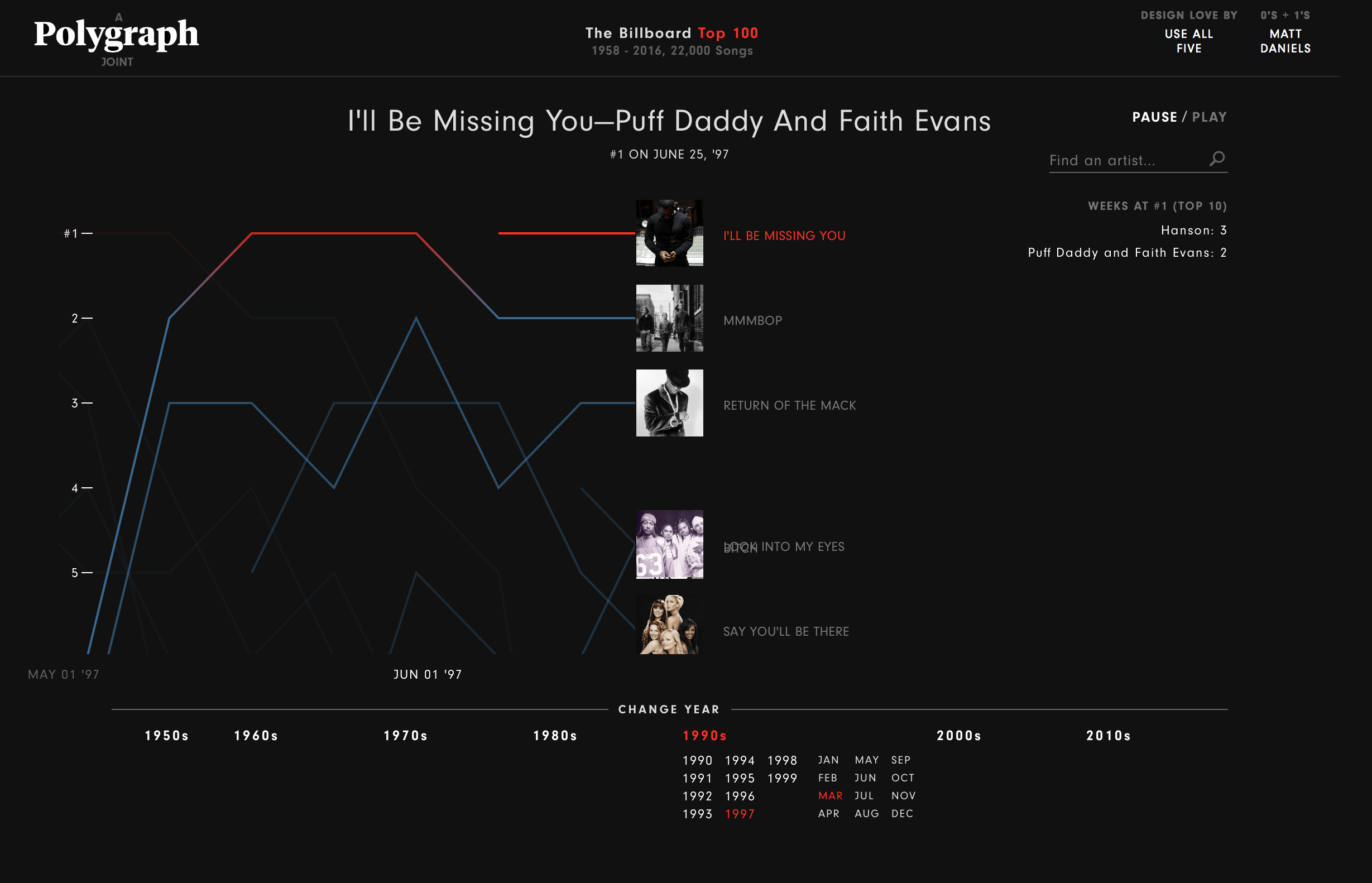
Polygraph
Interactive Graph
Information is Beautiful Awards — Interactive
If you are a Billboard 100 music junkie over the last 60 years or just enjoy reminiscing over how music has changed over the decades, then Polygraph Joint have created the perfect interactive tool to allow you to jump through and play every top 5 song from 1958-2016. Stopping the need to argue about when music was still good…

The Washington Post
Data Visualisation
Information is Beautiful Awards — Honourable Mention
While this piece didn’t win the award for Data Journalism at the Information is Beautiful Awards, it definitely deserves the honourable award it got. This article includes interactive graphics of spine chilling facts of the deadliest mass shootings of the past 50 years. The graphics creatively fill the morbid fascination by telling the stories of the murdered, the type of gun used and the shooters.

What’s your Pay Gap?
The Wall Street Journal
Data Visualisation
Information is Beautiful Awards — Interactive
Is 2017 the year where we finally even out the pay gap between the sexes? The Wall Street Journal illustrates the pay discrepancy in the US where men still earn substantially more than woman in more than 98% of occupations. Interestingly a few of the industries where woman earn more than men are telecommunications line installers and crane and tower operators. The graphic shows that typically the more you earn the higher the gap will be and that there is still a long way to go until there is equality in the working place.

Woman’s Aid
Interactive Billboard
Marketing Week Awards Winner — Marketing for Society
Woman’s Aid took on the task of taking interactive advertising outdoors and has cleverly created digital billboards. They created images of beaten and bruised woman which when interacted with would visually heal. The message of the campaign was extremely powerful and really hit home with the audience where if you continued to ignore the problem then nothing would change. So if passers by ignore the woman the images remain the same. But, once they get noticed the faces start to heal. The screen recognises when passers-by are looking at the screen using facial-recognition technology and starts the healing process.

APIs: The Building Blocks of the App Economy
The New York Times
Scrollable Story
CMA Award Winner (US) — Native Advertising/Sponsored Content as part of a Content Marketing Program
A lot of what we rely on these days is usually in an app — getting a cab (or should I say an Uber?), booking a table at a restaurant, checking in with friends and family, and dare I say, finding a date! What goes on behind the like button and swipes is a world of its own — the world of Application Programming Interfaces (APIs). This award-winning scrollable story by CA Technologies explores the story of APIs and how companies are using them to power their digital futures.

Peter Aldhous and Charles Seife
Data Visualisation
Information is Beautiful Awards Winner — Data Journalism
Edward Snowden shocked many of us with his revelations on the United States government surveillance programs. Now, you’re probably not surprised when you see this kind of news. This award-winning piece of data journalism by Peter Aldhous and Charles Seife takes a deep dive into how the U.S. is being watched from above with government surveillance planes routinely circle over most major cities. The data visualisations created for this piece are wonderfully detailed, supporting the story and giving the piece a nice rhythm.

Introducing “RecoVR Mosul”, The Economist’s first VR experience
The Economist
Virtual Reality
Jury Prize for Great Innovation Winner 2016
The coming together of ancient history and modern technology can be quite remarkable, and in this case it’s absolutely necessary. After the destruction of the ancient city of Mosul in Northern Iraq by the militant group known as Islamic State, The Economist collaborated with Rekrei to create a virtual reality experience, recreating the museum and many of the lost artefacts. The result is “RecoVR Mosul: A collective reconstruction”, which is now available to experience via Google Cardboard apps for Android and iOS and on Facebook and YouTube 360 channels.

Project Ukko
Interactive Tool
Moritz Stefaner
Forecasting the winners at the Information Is Beautiful Awards usually bears little fruit, but predicting the wind is now a whole lot easier. Project Ukko is a data driven interactive tool which blew us all away when we first saw it, and clearly swept the judges off their feet too. It takes thousands of historical readings and future projections the world over, and visualises these so that the energy industry can anticipate change. Data is encoded though line thickness, orientation, colour and opacity, producing maps that are as beautiful as they are data rich. But then we would not have expected anything less from designer Moritz Stefaner, who trumped everyone and picked up the Outstanding Individual award on the night.