Sarah Bartlett on Design Thinking in Data Viz: Why Understanding the User is Key to Success
Reading time
Category
Design thinking has been widely talked about to the point it has become a buzzword in the business and design community. But don’t let its reputation dissuade you from learning about its potential in designing user-centric data visualisations. Sarah draws from over a decade of data visualisation and data analytics experience on how you can incorporate design thinking to your process through her favourite tools, together with live examples from a recent data dashboard project.
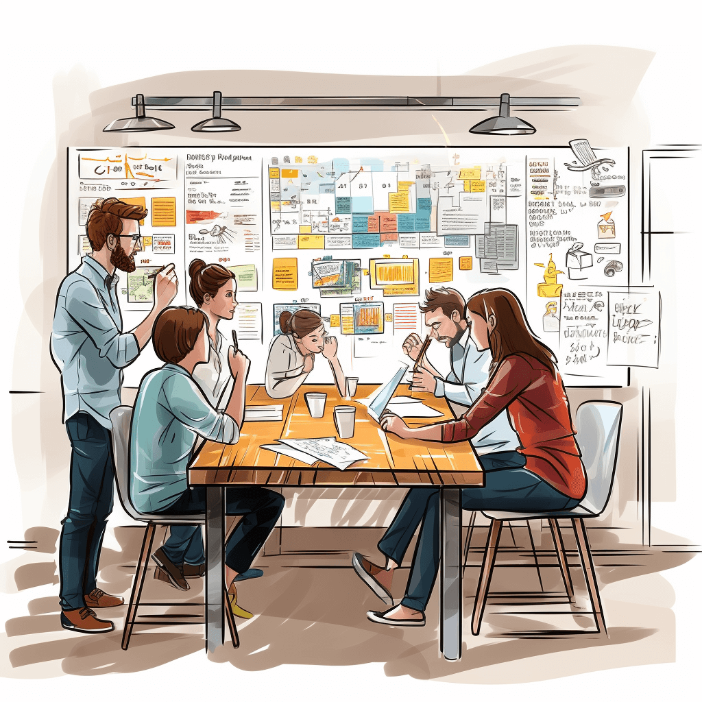
Image generated in Midjourney
Beyond hitting the brief: An introduction to design thinking
As a data visualisation practitioner, I’ve worked on multiple projects with the goal to deliver a data visualisation to a client or stakeholder. Often, such projects begin with a requirements-gathering phase to understand what is required in terms of deliverables. In theory, it’s a simple transaction where the requestor asks for something and the practitioner works their magic to bring the idea to life. However, this process often focuses too heavily on data analysis and technical skills, thus overlooking the user and, most importantly, their needs and perspectives. The end result of this process is a data visualisation that meets the specified requirements as described by the stakeholder, but does not deliver what was actually needed.
Data visualisation practitioners want nothing more than for our visualisations to be adopted, not left to gather dust and go unused. However, by focusing too heavily on the data and requirements, we can easily overlook the human experience in the design process and neglect the user.
A data visualisation that makes users feel confident, inspired, or empowered is more likely to lead to informed and positive decision-making. Conversely, when users feel frustrated, confused, or overwhelmed by a data visualisation or dashboard, their ability to comprehend the information may be impaired. And they’re unlikely to adopt such a solution and will instead find their own alternative.
By considering how our data visualisations make our users feel, we can create more engaging, effective, and user-centred data visualisations or dashboards that resonate with our audience and drive better outcomes. Design thinking is an approach that can help us to achieve this.
Design thinking is a problem-solving and innovation-based approach that focuses on understanding the needs and perspectives of users to create effective solutions. It has been widely adopted in various fields – including product design, software development and business strategy – for its ability to foster innovation, improve user experiences, and solve complex problems effectively. It can help designers and data analysts create data visualisations that are not only informative but also user-centred; placing the user at the centre of the problem-solving process and prioritising an understanding of user needs and experiences, in addition to strategic outcomes, is fundamental to the design thinking process.
The design thinking process in four phases
Due to its popularity, design thinking methodology has evolved over the years into various different approaches and interpretations. Here’s the design thinking process I like to follow and apply to my data visualisation work. My work largely focuses on data dashboard design, and I’ve found this process to be useful for both greenfield dashboard design projects as well as dashboard redesigns.
Let’s briefly explore each phase of the process:
- Discover
In this initial phase, the focus is on deeply understanding the problem or challenge I’m trying to solve. This often involves conducting user research via surveys, interviews and user observations to collect information about our target audience and to gain insights into the scope and context of the challenge or problem at hand.
For a data visualisation project, I’m looking to understand as much as I can about the intended audience, including what they want to achieve and any challenges they are facing today. The more I know about this audience, their preferences and their goals, the better I can design a data visualisation solution that meets their needs. This phase is typically where any requirements will be shared, but unlike traditional data visualisation development methods, I’ll look to dig deeper and understand the “why behind the what” and, in essence, the reasoning behind any pre-defined requirements.
- Distil
By the end of the Discover phase, I’ll have gathered a lot of information about the intended audience and the challenge at hand. Now I need to seek to understand everything I’ve collected to help narrow the focus and articulate exactly what I’m building and for whom, synthesising and distilling my research into a clear and concise problem statement. The aim of this statement is to articulate the core challenge or problem I’m trying to address with this particular dashboard or data visualisation. Especially important here is a clear understanding of the business impact that will result from interacting with the end product.
When looking into why data solutions fail, a common reason cited is their failure to create business value. As such, it’s crucial that the intended goals and organisational value are clearly stated at the beginning of the project if they are to ever be realised. This is a critical step that ensures everyone involved is aligned on the problem to be solved, and that subsequent efforts are directed toward addressing them effectively and empathetically. In line with this, it can be helpful during the distil phase to develop user personas that segment and describe your audience. These serve as a useful reference point while the makers continue through the design process.
- Ideate
As the name suggests, the ideate phase is where I start to generate ideas for potential data visualisation solutions to address the core challenges or problems identified. Here, there’s an emphasis on divergent thinking and encouraging creativity and the exploration of various ideas, no matter how unconventional they may seem. After generating a multitude of ideas, a series of activities can be conducted to narrow down and prioritise them. This can involve criteria such as feasibility, impact, and alignment with user needs and insights.
For a dashboard project, I’ll typically take the requirements gathered during the prior phases and distil them into a dashboard format. This will include converting business questions into measurable KPIs, as well as selecting the optimal charts for the dashboard and determining the desired user action (i.e. the action the user will take if a metric is underperforming). During this phase, I’ll typically start to develop prototypes of certain selected ideas, ready for testing with users or stakeholders. These prototypes can vary in fidelity, from rough sketches to interactive data visualisation wireframes.
- Validate
In the final phase, I’ll seek to test and refine the wireframe prototypes with end users or stakeholders. The primary goal here is to gather feedback and insights to ensure that the proposed solutions effectively address the defined problem and meet stakeholder and user needs. This phase is intended to be iterative and dynamic, with an emphasis on learning from user feedback and making informed design decisions. Involving stakeholders and end users in the testing process in this way ensures that the final solutions are user-centred, effective, and capable of addressing the identified problem successfully.
Another common challenge with data visualisation projects is that end users don’t have the opportunity to interact with a dashboard until it has been fully developed – this is too late in the process. If the dashboard does not meet their requirements, substantial rework may be required, which is both time-consuming and costly. This is where wireframes can offer a lightweight, agile solution; users have something to interact with and provide feedback on, while still being easy for the data visualisation practitioner to modify.
It’s important to practise empathy throughout the design thinking process. This is not always easy, as we have a natural tendency to consider our own experiences and biases first. However, as data visualisation practitioners, we need to be able to place ourselves in our audience’s shoes – to consider their needs, motivations and perspectives without judgement – to help us create innovative solutions. Just because something meets data visualisation best practices doesn’t mean that it will be the best solution for our users. The best solution will be one that they adopt and use, not the one we would have designed if we were building something for our own use.
Three powerful tools to incorporate into your data visualisation design process
A multitude of tools and techniques are available to support each phase of the design thinking process. I’ve touched on my favourites in the summary above, so let’s explore them in more detail. I’ve found these tools particularly effective in helping me to understand and empathise with users, as well as gathering feedback throughout the dashboard design process.
1. User personas
Based on the data collected on users during the Discover phase, I can start to build a set of user personas. Personas are fictional characters, based on research, designed to represent the different user types who might use the data visualisation or dashboard. Personas can help us empathise with users by better understanding their unique needs, experiences, behaviours and goals.
First, I’ll look for common goals and challenges across the user base, then I’ll group users with similar characteristics, needs, and behaviours into distinct segments. These segments will become the basis of my user personas. For each user segment, I’ll create a user persona. It can be helpful to use a template for this, similar to the one below. Templates can form part of my project artefacts and serve as a helpful reference point as I move through the development process.
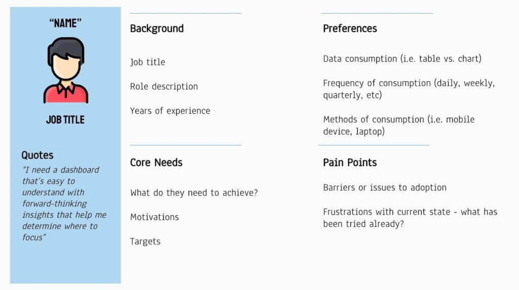
A user persona template, split into four key sections; background, preferences, core needs and pain points. Each section contains prompts to help define the type of information to be included. Credit: Sarah Bartlett
A user persona typically includes:
- A fictional name
- A photo (usually stock images)
- Some demographic or background information (education, experience, etc.)
- Preferences
- Core needs
- Motivations
- Pain points
I recommend adding narrative elements to these user personas to make them more relatable. For instance, they could include anonymous quotes collected during the research that help to describe a user’s typical day, their frustrations, and their aspirations related to data.
Just because a group of users undertake the same role, it doesn’t necessarily mean they will share the same persona. For instance, while all sales managers are likely to share similar goals, a group of sales managers based in one region may have vastly different motivations and pain points from sales managers in another region. Perhaps certain products are more popular in certain areas, or logistical challenges mean they take a different approach to their work. Personas are particularly useful here for digging deeper into the wants and needs of users while avoiding grouping them into generic buckets where they may be represented inaccurately or misunderstood.
It’s also important to validate any personas by sharing them with stakeholders and, if possible, with end users for feedback and adjustments. The goal here is to ensure that the personas accurately represent the end user segments. When embarking on a data visualisation project, it can be helpful to recruit a selection of users from each persona group to serve as a feedback committee, involving them in each step of the dashboard design process.
Live example: Redesigning an HR data dashboard
I once worked on a major HR dashboard redesign project. The existing dashboards had been broadly adopted by thousands of users across the organisation, but they didn’t offer the best user experience – to the point that some users had stopped using them altogether.
At the beginning of the project, we identified various target audiences for the dashboards, including executives, people managers and HR business partners. They each had unique needs, goals, challenges and preferences, making a ‘one-size-fits-all’ approach to dashboard design difficult. To help us understand and target each group more effectively, we decided to leverage user personas. We gathered a lot of information about our users via interviews and workshops during the initial phases of the project – enough to give us something to start building personas from.
As we began to distil the information into personas, we discovered that there were more personas than we had first anticipated. For instance, people managers were a broad group, with some having people manager responsibilities for one person, whereas others were responsible for managing entire departments. As a result, the ways in which they needed to consume data on a dashboard were vastly different. People managers responsible for small teams were likely to have a good knowledge of their team members and their performance and were unlikely to reference the dashboard for this information. These users required data at a granular level and would reference the dashboard less frequently. In contrast, departmental managers were far more likely to leverage the dashboard to review aggregated performance KPIs or to monitor how their department was performing compared to others. They needed the ability to view the data at an aggregated level and drill into the details as often as required.
In response to this business reality, we came up with a solution that offered two distinct views: one for people managers of small to medium teams and one for those responsible for entire departments. By leveraging user personas, we were able to surface deeper user insights and design a solution that better met our audience’s needs, not our own assumptions.
In my experience, personas serve as a useful reference point throughout the design process, and beyond. They can serve as a living artefact after the solution goes live, and they can be updated as user needs and preferences evolve.
2. Wireframing
Wireframing is a fundamental step in the design and development of digital interfaces and interactive products. It involves creating a visual representation of a user interface (UI). Wireframes can vary in fidelity, from low-fidelity sketches and hand-drawn diagrams to mid-to-high-fidelity digital wireframes created using design software or specialised tools. A wireframe itself is not fully functional but it can be used to represent the layout, design and functionality that the data visualisation will eventually contain. They are useful as a means to gather feedback on ideas without committing too much time to design and development.
In my design thinking process, I’ll begin wireframing during the ideation phase, before validating the design ideas with stakeholders or users. Wireframing plays a pivotal role in this process as it provides stakeholders with a simplified depiction of the intended data visualisation or dashboard layout and functionality. This facilitates their ability to offer feedback and propose design modifications early in the development process, ensuring that the design aligns with the problem statement, their objectives, and aspirations.
When designing data visualisation wireframes, I’ll typically start with something very simple, such as a low-fi, hand-drawn design on paper similar to the one below. If I’m running design workshops with stakeholders, these could even be drawn on a whiteboard while everyone is gathered in the room, allowing for easy modifications.
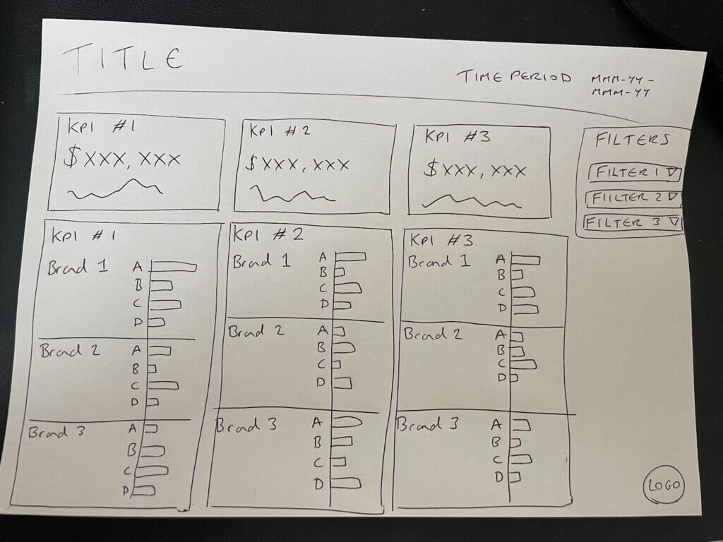
An example of a hand-drawn dashboard wireframe, designed using pen and paper. Credit: Sarah Bartlett
Low-fi wireframes are particularly useful for generating and communicating ideas quickly, without getting distracted by colours, fonts or data specifics. They’re easy to modify and iterate on as feedback is gathered from users and stakeholders. I usually advise against adding any specific values (i.e. KPIs) to the wireframes at this stage. Stakeholders can easily get distracted by numbers that may appear to be wrong, even if they are added for visual purposes only.
Once feedback has been incorporated into the design, I can move on to a higher-fidelity wireframe. These can be created in tools such as PowerPoint or Google Slides, or more sophisticated design tools such as Figma, InDesign, XD or Illustrator. Specialist tools can be used to create a more realistic, interactive experience, designed to mimic the final proposed design.
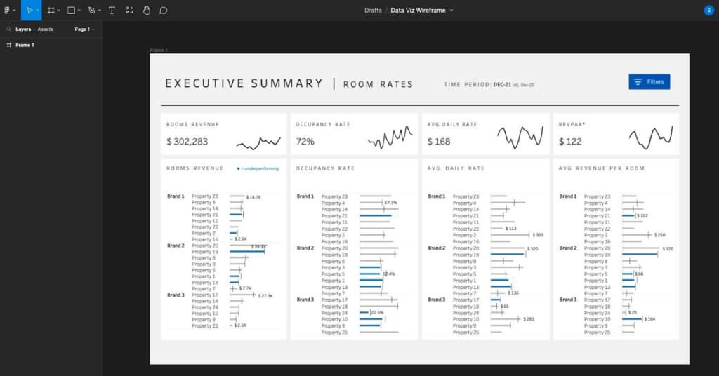
An example of a mid-fidelity dashboard wireframe, designed using Figma. Credit: Sarah Bartlett
Live example: Iterative wireframing in Figma
While working on the HR dashboard redesign project mentioned above, we incorporated wireframing into our design process. The project team and stakeholders worked in different locations remotely, so hand-drawn, low-fi wireframes were more challenging for us to use.
Instead, we started with a mid-fidelity wireframe designed in Figma. This is not something I would usually recommend: starting here resulted in more modifications of the Figma designs than one would typically expect at this stage. While these aren’t particularly difficult to implement, it’s certainly not as quick as modifying something on paper or on a whiteboard. That said, working in Figma was well received by our stakeholders. The interface was easy to use and provided a more ‘life-like’ experience. They particularly appreciated being involved in the design process and having the opportunity to view and provide feedback on the proposed designs early on – something they hadn’t had the opportunity to do in the past. Previously, developers would share dashboards with them for feedback when they were in a near-complete state. As a result, iterations were more difficult to enforce, leading to delays in the development process.
We prioritised designing the initial Figma wireframes in grayscale using a sample of the real data set. In my experience, colour can be an emotional topic when designing data visualisations! To overcome this, I’ve found that designing wireframes in grayscale helps to keep attention focused on the charts, data and user experience in the early design phases. Colours can be incorporated once the initial designs have been agreed upon. Likewise, you don’t need a complete dataset to build a wireframe, but you do need an understanding of the data and trends you might expect to see. For instance, if sales tend to be significantly higher or lower in a particular region, it’s best to consider this in the wireframe design as it could influence your chart choices as part of the design process. The size or trend of data points doesn’t need to be exact, but it does need to broadly follow what you might expect to see.
We gathered feedback on our initial wireframes before creating high-fidelity versions of the same designs. High-fidelity wireframes will typically include the proposed colours, fonts and brand elements. As we were using Figma, we were able to incorporate interactivity into our wireframes too. This gave us space to consider the overall user flow and the interactive elements to include before moving to our chosen data visualisation tool.
Incorporating interactivity into the wireframing process saved us from lots of potential re-work later in the design process. Instead, we were able to gather feedback on interactivity in the validation phase and make the necessary modifications to our wireframes without investing a lot of time in complex coding or technical work. Our stakeholders enjoyed using Figma for this, with some mentioning that it felt like they were interacting with a real dashboard when testing our wireframe designs!

Caption: Image generated in Midjourney
3. User testing
After reaching the validate phase, the data visualisation is ready to be tested with users. Here, I’m looking to gather user feedback to determine if the design effectively meets the stakeholder’s or end user’s needs.
In my experience, this phase is particularly insightful. Not only does testing help me understand which elements of the proposed design are delivering the desired outcomes, but it also gives rare insight into the way users interact with the proposed data visualisations in real life. For instance, users may not be aware of specific functionality available in data visualisation tools, or they may expect certain UI elements to behave differently from the way they have been designed.
Before testing begins, it’s important to define the following:
- Test objectives
What specific aspects of the data visualisation do you want to assess? This could include usability, understandability, engagement, or specific user tasks. - Target audience
Who should be invited to participate in the test process? This might mean leveraging those user personas to help identify and recruit target users. - Test scenarios
What exactly are we testing? This involves developing realistic and relevant testing scenarios or tasks that reflect how users would interact with the data visualisation in real-life situations. Ideally, these scenarios should align with the test objectives. - Test environment
Where will we conduct the test? For instance, will you ask users to gather in person or remotely?
Live example: Running virtual feedback sessions
As part of the HR dashboard redesign project I worked on, we ran a series of user feedback sessions virtually, using our interactive Figma wireframes as the basis of our test. While we experimented with running both one-to-one and group sessions with targeted end users, we had the most success with the one-to-one sessions (although these were more time-consuming as we could only meet with one user at a time). We learned that some users felt nervous about participating in the test, particularly those who were less familiar with data visualisation tools or techniques; it was hence important that they were made to feel at ease. We reminded them that we weren’t testing them as individuals, but rather they were testing the data visualisation and its effectiveness.
During the test, we asked participants to complete a series of realistic test scenarios or tasks that reflected how they would interact with the data dashboards in real-life situations. Here, we were seeking to understand exactly how the dashboard would be used and if the key business questions could be answered using the information presented. The test scenarios involved interacting with the charts and dashboards, applying filters and navigating between different dashboards.
As participants completed the testing scenarios, they shared their computer screens with us so we could observe their interactions, paying close attention to their actions, feedback, and verbalisations, encouraging them to think out loud so we could unpack their thought processes and pinpoint any areas of struggle or confusion. Some participants were naturally more vocal than others; to encourage more feedback and conversation, we prompted them to describe what they thought worked well and what could be improved as they worked through the test scenarios. We recorded and classified any qualitative feedback we received by sentiment: positive, negative or neutral. This enabled us to identify areas for improvement, particularly where multiple users shared the same feedback or struggled with similar tasks.
After completing the testing sessions, we analysed the data, which included user feedback, observations, and task completion rates. Here, we were looking to identify common patterns, issues, and areas of improvement from the data collected. For instance, did the majority of users struggle with the same interaction, or did certain personas request a modification to the same chart design?
Once the results had been analysed, we prioritised the changes that needed to be made, before actioning the changes and repeating the process again. For this project, we were able to invite the same group of users back for a second round of testing, following the same test scenarios to validate that the implemented changes had effectively addressed the identified issues. This was useful as the users were already familiar with the dashboard and the test scenarios, meaning they could immediately provide feedback on any changes we had made. Of course, I appreciate that this may not always be possible. In some cases, it can be useful to invite new users to participate in the second round of testing to gather fresh perspectives.
For this project, the user feedback sessions were particularly insightful. In addition to the obvious dashboard feedback we were looking for, we were able to gather insights into frustrations with the existing dashboards, as well as identify areas that may require more training in our chosen data visualisation tool. This additional knowledge was helpful as we continued to finalise our dashboard designs and consider how the finished dashboards would be implemented.
I believe that user testing is a powerful tool that can help us understand users better and design user-centred, usable, effective visualisations. Unlike traditional development methods that may exclude users, user testing at the wireframing phase helps involve users and gather feedback early in the development process and before time has been invested in building the final solution. What’s more, I’ve found that users who share their feedback during the development process are more likely to get behind the initiative and adopt the final data visualisation product.
Remember: design thinking is not a linear process
It’s important to note that design thinking is not meant to be linear. It’s designed so you can pick and choose different tools from the process at various stages in your work. For instance, you might find yourself entering a later phase to validate an idea, before iterating some more. Likewise, you can go back to the Discover phase if you find you need to collect more data regarding your users or the challenge at hand. It’s all about iteration, empathy, and collaboration, to come up with the best solution to the challenge you’re looking to solve.
The ultimate goal of the design thinking process is to create user-centred data visualisation solutions that effectively address the identified problem or challenge and are successfully adopted by end users. By focusing on discovery, distillation, ideation, and validation, data visualisation designers can approach problem-solving in a structured and user-centric manner, leading to more innovation, greater adoption and more impactful outcomes.
Thank you Sarah for providing a detailed overview of the design thinking process and its application to creating data visualisation and dashboards. If you’re interested in finding out more about our in-house Data for Everyone™ design framework, do drop us a line.
About Sarah Bartlett

Sarah is a UK-based four-time Tableau Visionary and independent data visualisation consultant. She is passionate about making careers in data more accessible for young people and regularly speaks and presents on data visualisation and enablement topics. She has documented her career journey on her blog Sarah Loves Data, where she also hosts Iron Quest, a popular community data visualisation project. Since its inception in 2019, the project has received over 800 submissions.