Ronald Ongori on unlocking data’s potential for a fashion retailer
Reading time
Category
Ronald Ongori, an accountant turned data scientist, was approached by a fashion retailer to help them understand their marketing strategies by developing a Power BI data dashboard. Here’s how Ronald helped his client, who didn’t have a clear understanding of their needs, from needs discovery to the final interactive marketing report.
When it comes to data-driven decision-making, a dashboard does much more than merely present the numbers. It tells a story, weaving together threads of data into a tapestry of insights that can propel a business forward.
It’s not just about the metrics – it’s about creating a visual symphony where each chart, graph and indicator plays a pivotal role in orchestrating strategic moves. Effective data dashboards are not just functional; they captivate, inform, and inspire action. They transform the mundane into the extraordinary, turning everyday data into a wellspring of actionable intelligence.
As we delve into the art and science of dashboard design, we uncover the secrets to crafting these powerful tools that not only serve information but enchant the very users they are designed to assist.
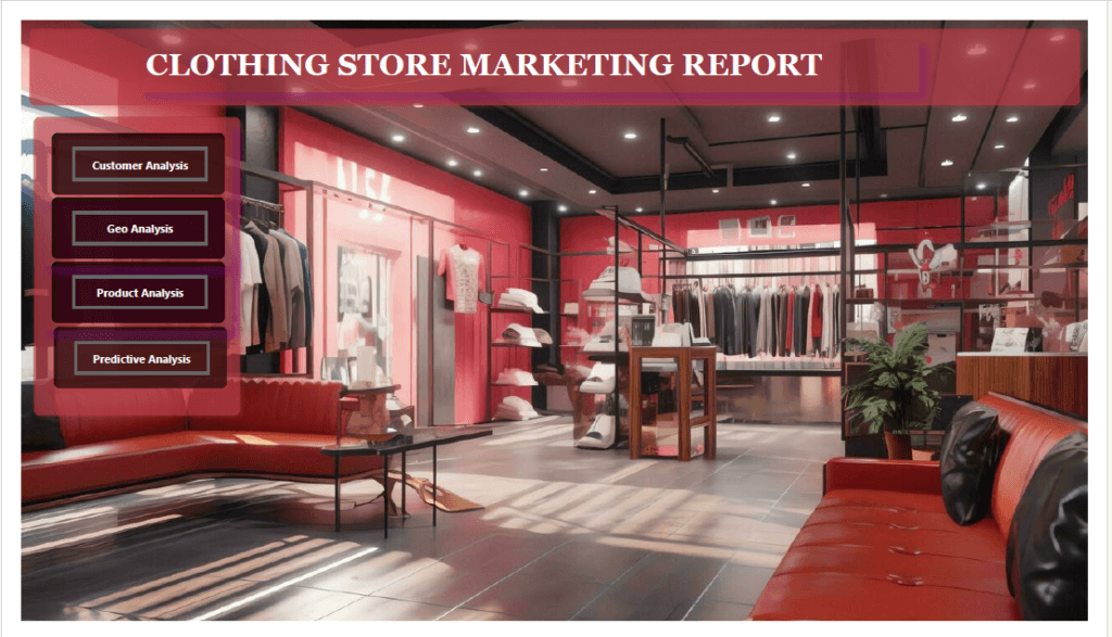
Dashboard landing page: Image by permission of Ronald Ongori
Bringing objective eyes to the subjective world of fashion retail
A luxury contemporary fashion client from Oceanside, California, recently reached out to me for expertise in data-driven strategy. With no existing data dashboard or analyst on board, they had observed how their competitors were leveraging analytical dashboards to gain strategic insights into their business operations. Recognising the need to harness the same power to sharpen their market position, the client wanted to uncover underlying patterns and opportunities within their own business data.
Tasked with crafting their first analytical tool, I used Power BI to integrate demographic intelligence from the US Census Bureau with their unique blend of business, customer and local weather data.
The resulting data dashboard was not just a bespoke tool; it was a compass pointing towards a more informed, data-centric approach in curating their fashion collections – from the latest trends in shirts to the finest leather goods and cosy sweaters. My role was to illuminate the path for this chic retailer to navigate the competitive tides of fashion retailing with confidence, harnessing data to tailor experiences that would resonate with their clientele and solidify their standing in the marketplace.
Phase 1: Client needs analysis
At the start of the project, I had a call with both their Business Development and Finance heads, and our discussion revealed a mix of both ambition and ambiguity around the chain’s use of data. Their data was vast but untamed – a hidden treasure waiting to be mapped.
Our initial talks helped unearth the client’s unspoken needs:
- Visibility with precision – They needed a strategy to highlight select items in a way that resonated deeply with consumer tastes.
- Distinct market identity – Amid the noise of a competitive marketplace, they sought a unique voice. They needed bespoke strategies to not only compete but also to set the trend.
- Analytics-driven leadership – They set out an ambition to lead with data, to move beyond gut feelings to decisions powered by data intelligence.
- Customer-centric strategy – A wish to understand and cater to customer preferences emerged. They aimed to align marketing efforts with consumer desires, ensuring every strategy was a nod to customer inclinations.
Phase 2: Identifying data dashboard KPIs
With the client’s implicit needs as my compass, I was able to set clear KPIs that resonated with their vision:
I. Geographical targeting effectiveness
- KPI – Track the success of pinpointed advertising campaigns in dense, high-income locales.
- Connection to needs – This KPI arose from the geographical insights of the client’s consumer base, aiming to cast marketing nets where the fish were plenty, and optimising effort for the richest catch.
II. Customer purchase behaviour metrics
- KPI – Gauge the interplay between customer income brackets and their engagement with product features.
- Connection to needs – Stemming from a deep-dive into customer behaviours, this KPI targeted fashion marketing strategies that influenced purchases through a profound understanding of consumer inclinations.
III. Product performance index
- KPI – Develop an index reflecting the synergy between product appeal, weather patterns and pricing elasticity.
- Connection to needs – In line with the product analysis, this KPI crafted a narrative of desirability, ensuring the spotlight shone brightest on products that spoke directly to consumer desires, as influenced by the seasons.
Phase 3. Dashboard design considerations
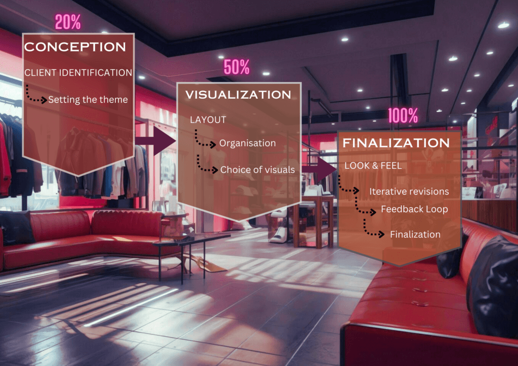
Design flowchart: Image by permission of Ronald Ongori
In the process of creating the dashboard UI, my primary objective was to synthesise the distinct brand aesthetics of the client with practical functionality that catered to end-users’ needs. To accomplish this, I selected a colour scheme that not only aligns with the client’s brand (emphasising reds, along with complementary shades of pink and purple) but also facilitates a visually coherent user experience.
To ensure that the design decisions were deeply rooted in user-centric principles, I initiated a series of user interviews that provided rich insights into the users’ preferences, pain points and desired functionalities.
Leveraging the data gathered from these interviews, I found that the client sought simplicity and clarity, particularly because this dashboard would be their primary interface for interpreting performance metrics. Given the users’ preference for a non-intimidating introduction to the dashboard’s capabilities, and the client’s explicit request for an interface free from visual overload, a carefully structured design was paramount.
Accordingly, I sculpted the UI architecture to offer distinct pages, each devoted to different KPIs. This layout serves a twofold purpose: it negates the potential for information bombardment and facilitates easy navigation through thoughtfully spaced, uncluttered visuals. The emphasis throughout was on a clean, organised presentation that maintains continuity with the brand colours yet remains intuitively operational.
Functionality was deliberately straightforward, with each element (be it visual cues or interactive components) judiciously labelled and integrated. The data dashboard needed to streamline complex data into accessible insights, thereby resonating with the user’s expectation for simplicity and the brand’s narrative of elegance and efficiency.
In the spirit of haute couture, I began with rough digital sketches in Canva, crafting a storyboard that maps out the user’s analytical journey. Only then did I translate these concepts into the digital realm, bringing to life a dashboard that not only informs but captivates.
Dashboard rough draft in Canva Sketch: Image by permission of Ronald Ongori
Like the iterative nature of fashion design, our dashboard underwent a series of refinements, with each version sharpening the focus on actionable insights. I blended art and analysis to highlight the geographic sweet spots for ad targeting, dissect customer purchase patterns, and showcase product performance – all through a lens that is clear, engaging and decisively on-brand.
Phase 4: Technical considerations
As with most simple things, the workings beneath needed to be technically sound and robust:
Data sources and integration
The foundation of our data-driven dashboard lay in the aggregation and integration of various data sources. This integration process encompassed demographic insights from the US Census Bureau, detailed business and customer data recorded by the client, and weather patterns sourced from the National Centers for Environment Information.
Understanding and cleaning data
The initial technical work involved a thorough examination of the datasets to grasp their structure and content. Using Power BI’s robust data transformation capabilities, I embarked on the data cleaning – a critical phase in which inconsistencies are resolved, missing values addressed, and irrelevant data pruned. This ensures that the data, in its raw form, is refined into a structured and coherent format, paving the way for effective analysis.
Establishing data relationships
The core of my integration strategy hinged on establishing logical relationships between the datasets. Power BI’s Manage Relationships feature was instrumental here, offering functionalities for both auto-detecting potential relationships and manual linkages through drag-and-drop interactions between relevant data columns across tables.
The establishment of these relationships is predicated on understanding the cardinality (the nature and dynamics) of the connections: one-to-one, one-to-many, or many-to-many. This not only clarifies the data landscape but also streamlines the querying processes by reducing complexity and enhancing filter operations across multiple tables.
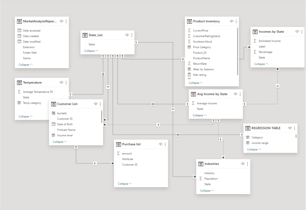
Table relationships displayed: Image by permission of Ronald Ongori
Insightful data connections
By meticulously mapping the interconnections within the data, I was able to transform the data dashboard from a mere visual representation into a dynamic, interactive analytics instrument. The inherent design of these relationships within the dashboard’s architecture fosters a user experience that is intuitive and insightful. It empowers users to effortlessly distil trends, discern patterns and identify correlations that might otherwise remain obscured or lost in the matrix of biased assumption.
Take, for instance, the discernible relationship between product purchases and seasonal weather fluctuations. Here, the dashboard allows users to clearly observe how specific clothing items gain popularity as the temperature drops, paralleling the onset of colder weather, while their demand plunges as the climate warms. This kind of insight may seem obvious, but capturing and validating it requires a logical connection between the datasets that goes beyond mere assumption.
Phase 5: Deploying Power BI tools and features
The data integration described above opens up a realm of possibilities of what tools and visuals can be deployed to address project KPIs. The tools I used can be divided into three categories:
- Visual tools
- Navigation tools
- Filter buttons
Let’s address each in more detail.
Visual tools
The following visualisations were deemed most appropriate for our set of KPIs:
- Geographical analysis
Here, Power BI’s filled maps and bar graphs, enriched with customisable colour scales, allow for an in-depth analysis of market demographics, climate effects and population density. This enables a visually intuitive identification of key geographic areas ripe for business expansion or targeted marketing efforts.
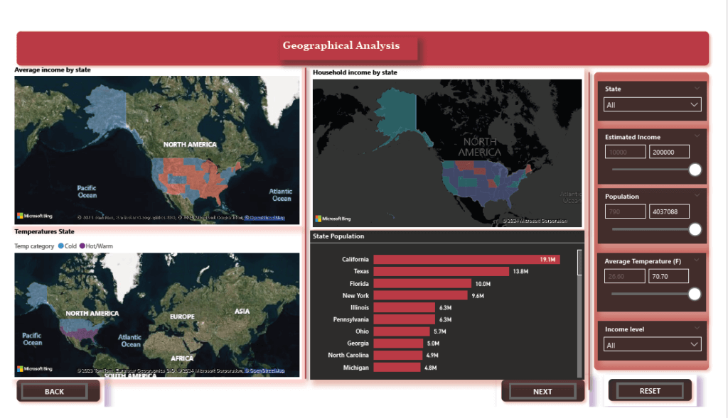
Geographical analysis dashboard: Image by permission of Ronald Ongori
- Customer behaviour analysis
Decomposition trees and waterfall charts offer a hierarchical view of customer decisions, tracking the journey from initial interest to final purchase. In addition, the integration of AI through the Key Influencers feature identifies patterns and predictors of consumer behaviour, making these tools indispensable for deep behavioural insights.
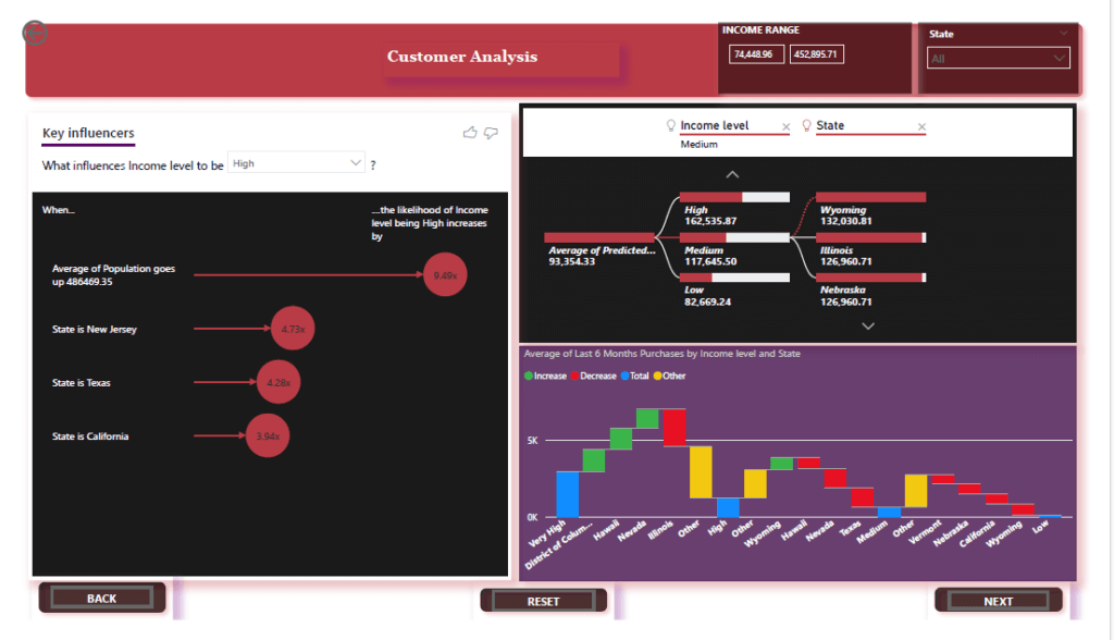
Customer analysis dashboard: Image by permission of Ronald Ongori
- Product analysis
The combination of gauges, bar graphs, cards and a decomposition tree offers a comprehensive view of how products perform across various dimensions such as price, seasons, consumer ratings and return rates. The decomposition tree in particular vividly brings to life the dynamic relationship between seasonal changes and consumer preferences. It also allows for a deep-dive into how different factors – price adjustments, seasonality, product ratings and return frequencies – interact and influence consumer buying behaviour.
This analytical approach not only uncovers the lifecycle of a product’s popularity but also helps in understanding the nuanced shifts in consumer interests, enabling more targeted marketing and inventory strategies. By mapping out these complex relationships, the visuals effectively narrate the story of a product’s journey through the market, highlighting opportunities for further optimization and growth.
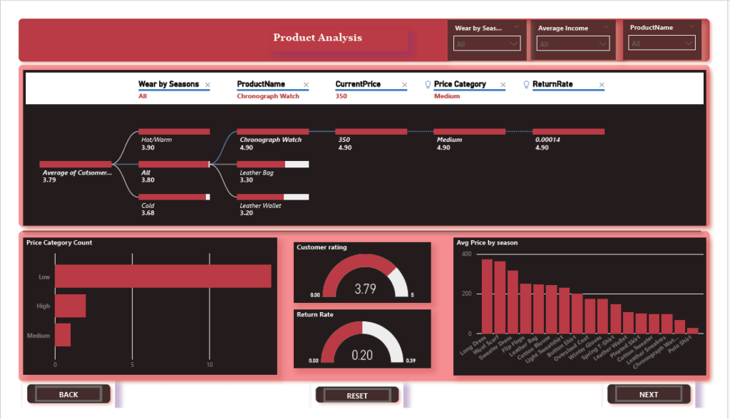
Product analysis dashboard: Image by permission of Ronald Ongori
- Navigation tools
To elevate the UX within the data dashboard, I incorporated a suite of navigation tools aimed at ensuring fluidity and interactivity. The design includes standard ‘Back’ and ‘Next’ buttons placed strategically throughout the interface, enabling users to seamlessly navigate between different sections and pages. These buttons are designed to provide an intuitive and straightforward exploration journey.
At the initial presentation page, prominent page navigation buttons have been integrated, serving as direct links to key sections or analyses within the dashboard. This design choice allows users to swiftly jump to specific areas of interest, enhancing efficiency and enabling a more targeted exploration based on individual preferences.
The data dashboard also features bookmark buttons distributed across various sections. These buttons act as shortcuts to predefined states or views, empowering users to instantly access saved configurations. Whether it’s specific filter settings, preferred visualisations or contextual overlays, these bookmarks streamline the analytical journey for a more personalised experience.
- Filter buttons
In the context of integrating weather, location, products and price ranges, Power BI’s filter buttons become instrumental in dissecting the data landscape. These filters allow users to pinpoint specific data segments, such as sales performance during different weather conditions or consumer preferences across various locations.
By applying the filters, analysts can explore how seasonal weather patterns affect product demand, discern location-based price sensitivity, and evaluate product popularity shifts. This granular analysis enables a more tailored approach, uncovering hidden trends and informing strategies that resonate with the dynamic interplay of external factors and consumer behaviour.
Phase 6: Boosting dashboard engagement and interactivity

Adding depth to the data presentation
A deep-dive approach focuses on delivering insightful analysis on specific variables, such as how seasonal weather impacts sales, or the relationship between product popularity and regional pricing strategies. This method encourages thorough exploration, fostering a more meaningful connection with the data as opposed to a broader, surface-level overview.
Advanced data visualisation techniques include dynamic storytelling, where data narratives evolve based on user interaction. Scenario analysis tools can be incorporated to simulate how changes in weather or market trends could affect operational outcomes. These interactive dashboards can also include personalised data views that adapt based on the user’s interests or past interactions, significantly increasing engagement by providing a more tailored analytical experience.
Linking data tables for more comprehensive insights
Linking the diverse datasets – weather, geographic location, product details and pricing – creates a cohesive data narrative. By ensuring coherence among these datasets, we can map out how external factors like income and seasonal changes impact consumer behaviour and product performance across different regions.
This connectivity provides a holistic view of business operations, revealing patterns and trends that might otherwise have remained hidden. For instance, by correlating weather data with sales and products data, we could identify products that performed well in specific climates or seasons, guiding inventory and marketing strategies to align with anticipated consumer needs as the seasons change.
Phase 7: Client feedback, reaction and outcomes
The feedback loop became an essential part of our process, with the client’s insights leading to further refinements, enhancing both functionality and UX. This iterative approach to collaboration ensured that the dashboard not only met but exceeded the client’s expectations, empowering them with actionable insights to drive their business forward.
Upon presenting the final dashboard, the client was immediately captivated by the seamless integration of complex datasets into a coherent and visually appealing narrative. Particular praise was given to the dashboard’s ability to delineate the nuanced effects of income and location on product preferences and sales, tailored precisely to the overarching business model.

Well-designed data dashboards can help you gain a competitive advantage. In particular, deeply understanding and exceeding client expectations can lead to transformative outcomes. In this project, the output of our collaboration not only met the specific needs of the fashion-forward client but also provided them with insights that were previously unattainable, showcasing the profound impact of a client-centric approach in data analytics in a more visually captivating and compelling manner.
Dashboards have emerged as crucial tools in business, empowering decision-makers with the ability to visualise complex datasets and extract meaningful insights. Based on my experiences with this project, I would encourage businesses and analysts alike to venture into the realm of advanced data visualisation with tools like Power BI and Tableau. In doing so, you too can embrace the journey of discovery through data, harness the power of dashboards to illuminate your strategic decisions, and drive your business to new heights of analytical acumen and strategic foresight.
Our thanks to Ronald for his insights on how to lead clients through a Power BI project and deliver a product that provides in-depth analysis and data exploration. At infogr8, we have a world-class team of designers who know the ins and outs of creating class-leading data dashboards. Contact us to learn how we can help you do more with your data.
About Ronald Ongori

Ronald Ongori, adept data scientist with expertise in business analytics and predictive modeling. Passionate about data storytelling, transforming complex datasets into actionable insights through captivating dashboards