Quinsy Brenda on navigating the tech landscape of data visualisation
Reading time
Category
From Tableau to D3 to Plotly to Matplotlib, there’s a dizzying array of data visualisation tools to choose from. Quinsy shares key considerations from a data scientist’s perspective to help you pick the right tools that help you communicate visual data insights more effectively.
Data visualisation is a bridge between raw data and meaningful insights. As a data scientist, my primary goal is to extract knowledge and tell a compelling story from a vast amount of data. By leveraging visual representations, we can uncover hidden patterns, identify trends and reveal correlations that might otherwise remain buried in the complexity of raw data. Data visualisation also facilitates effective decision-making by providing stakeholders with a visual context that is easier to comprehend and interpret.
As data scientists, we’re fortunate to have a plethora of data visualisation tools at our disposal. This abundance, however, may sometimes be overwhelming, so it’s crucial to navigate these tools strategically.
Here are my key considerations for selecting the right data visualisation tools:
- Purpose and audience Through experience, I’ve learnt to pick a tool depending on the needs of my audience, as different tools excel in different areas.
- Data compatibility Since some tools are tailored for certain data formats, it makes sense to choose a tool that seamlessly integrates with your ecosystem to avoid the extra hassle.
- Flexibility and compatibility Because I often need to customise and adapt visuals to suit specific analytical needs and/or guidelines, I tend to look for tools with a wide range of customisation options.
- Learning curve and support A tool with a strong community and extensive documentation will accelerate your learning and help overcome challenges along the way.
Picking and choosing which data visualisation tools to use is always project-specific and requires careful consideration. Only by making the proper choices can we elevate our work to new heights.
Code or no-code? An intro to data visualisation tools on the market
No code options
No-code tools have gained significant popularity in recent years because of their ease of use and accessibility. These tools allow us to create beautiful visuals without requiring extensive coding knowledge. The two giants in this space are Tableau (now part of Salesforce) and Power BI from Microsoft. Other options are out there, such as Infogram and Datawrapper, but it’s important to note that these tools are more commonly used by journalists and marketing professionals, rather than being widely adopted as an industry standard in the data science field. This is because they don’t usually offer the same level of customisation and may not be as prevalent in industries outside of journalism and marketing.
Tableau
Tableau is a widely used, widely recognised and highly regarded data visualisation tool that offers a suite of features for creating interactive and visually appealing visualisations. With Tableau, we’re able to connect to various data sources, transform and clean data, and build interactive dashboards and reports. With its user-friendly interface and powerful features, Tableau allows companies to effectively analyse and present data in a visually compelling manner. As of May 2023, Tableau proudly boasts a staggering 3 million profiles on Tableau Public, a platform that was introduced in 2010.
The success of Tableau can be attributed to its commitment to innovation and continuous improvement. The company regularly updates its software, introducing new features and functionalities that further enhance the user experience. Additionally, Tableau’s strong online community and extensive support resources make it easier for users to learn, collaborate, and stay up-to-date with the latest trends and best practices in data visualisation.
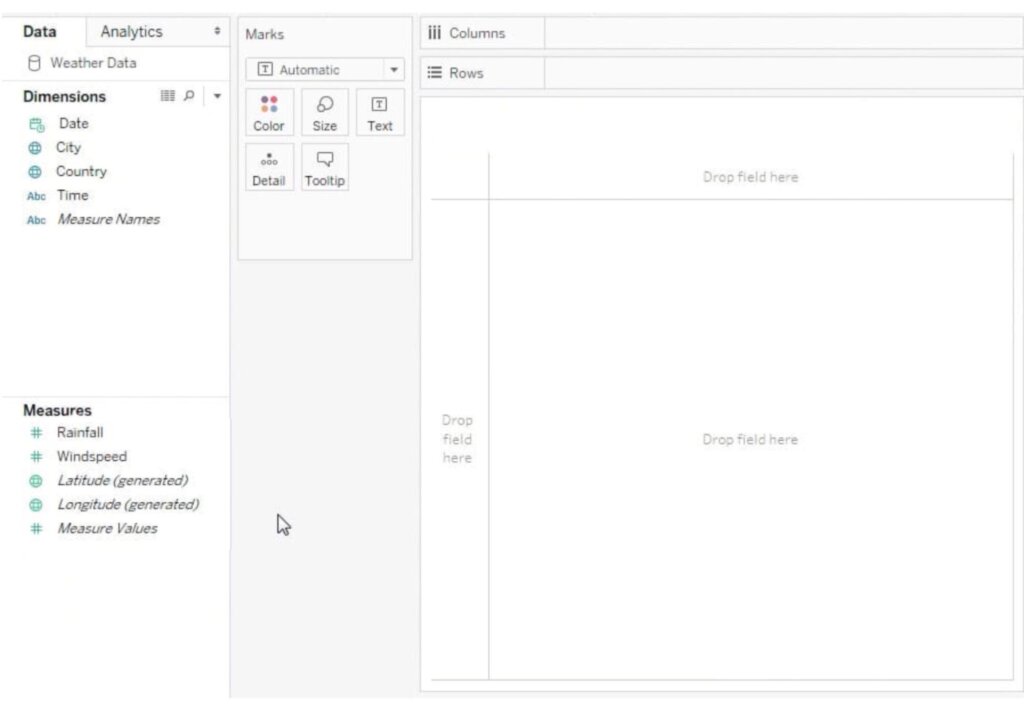
Screenshot of the Tableau Public Workbook by Quinsy Brenda
Here’s what I’ve learned from using Tableau so far:
- Tableau is flexible and versatile, providing a wide range of options from basic charts to whatever one can imagine.
- Tableau’s intuitive drag-and-drop interface makes it easy to explore different visual representations effortlessly.
- The user community and abundance of resources have made it easier to go through the basics of the tool.
- There is a public platform where people in the community get to share their work, serving as a hub for inspiration when we run out of ideas!
Power BI
While it shares similarities with Tableau, users of Microsoft products will find the Power BI option more intuitive. With Power BI, users can also connect to various data sources to build rich dashboards and presentations. Microsoft has been recognised as a Leader in the 2023 Gartner Magic Quadrant for Analytics and Business Intelligence Platforms, marking their 16th consecutive year in this position. This recognition highlights Microsoft’s ongoing commitment to innovation and delivering impactful solutions for data-driven decision-making.

Screenshot of Power BI Dashboard by Quinsy Brenda
What I’ve learned while using Power BI:
- Power BI seamlessly integrates with other Microsoft tools such as Excel, Azure and SQL Server, making it an excellent choice for those familiar with this ecosystem.
- It offers collaboration and sharing capabilities, making it easy to share visualisations, reports and dashboards with team members and enabling collaborative working.
- Scalability and performance: Power BI can handle large datasets and provides efficient performance even with complex visualisations. Its scalability ensures quality and responsiveness.
I would say no-code options are a choice backed by the industry due to their accessibility, rapid prototyping capabilities, efficiency, empowerment of non-technical users, and integration and collaboration features. These tools democratise data visualisation, enabling a broader audience to leverage data efficiently and make data-driven decisions. Perhaps you prefer using SQL to transform data and would rather not code but would like to explore different visual options? Or if you’d rather use a dashboard, then this could be the way to go.
Coding options
Where no-code tools offer convenience and ease of use, their coding counterparts offer control and flexibility. Most importantly, they offer power.
Python offers a range of powerful libraries for data visualisation, including Matplotlib, Seaborn and Plotly. For those familiar with JavaScript and DOM manipulation, there is the option of using D3.js for data visualisation. Exciting, right?
Matplotlib
Matplotlib provides tools for creating static, animated and interactive visualisations. It’s also the basic library for visualisation with Python.
- Matplotlib allows for minute control over all aspects, allowing for highly tailored visuals. This is especially useful when specific design choices or complex visualisations are required.
- It seamlessly integrates with other libraries in the Python ecosystem, like numpy and pandas. The ability to combine data manipulation easily with visualisation in a single environment increases productivity and efficiency.
- Matplotlib has a moderate learning curve, especially for more advanced visualisation techniques. Nevertheless, extensive documentation, tutorials and examples are offered.
Seaborn
Seaborn is another Python library built on top of Matplotlib, specialised in aesthetically pleasing graphs. Seaborn simplifies the process of creating plots, providing a high-level interface for generating informative and visually appealing charts. As a result, Seaborn is perfect for statistical charts.
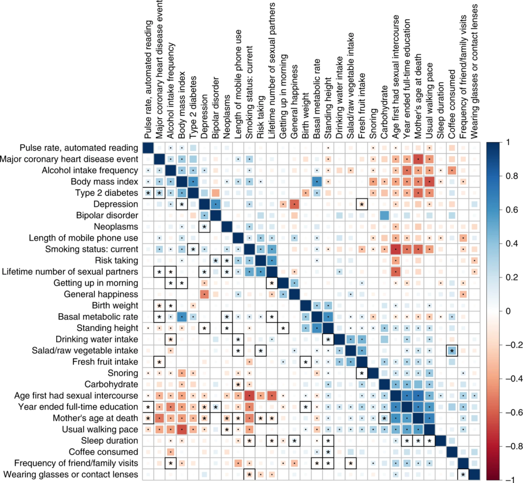
A correlation matrix shows how strong and in what direction different variables are related, as in this high-definition likelihood inference of genetic correlations across human complex traits.
The advantages of using Seaborn include:
- Wide variety of specialised statistical visualisations.
- Integration with pandas for data manipulation, which simplifies working with structured data.
- Built-in themes and styles that enhance visual appeal.
- Because Seaborn is built on Matplotlib, the customisations applied in Matplotlib can also be carried on it.
Plotly
Plotly is a versatile Python library for the creation of interactive and dynamic visualisations. It provides a high-level interface for creating interactive plots, dashboards and web interfaces, usually exported through streamlit.
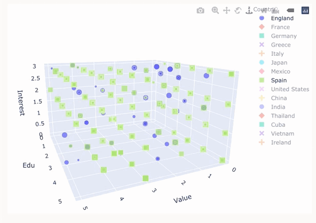
Chart created in plotly comparing rating, knowledge and interest in various country cuisines. Visualisation by Quinsy Brenda.
- Plotly excels in creating interactive plots that allow users to explore the data by interacting with the various elements. These interactive abilities are especially useful for real-time analysis.
- Plotly (as well as all other Python libraries) seamlessly integrates with Jupyter Notebooks. This integration lets us create dynamic visuals directly in the notebook, enhancing the data analysis workflow.
- Although it has a definite learning curve, there is also a community and sharing platform to ask for help.
Plotly is an excellent choice for those who require rich interactivity in their data visualisations and want to stay within the Python ecosystem. However, D3.js is also an option for this level of interactivity.
D3
D3.js is a powerful Javascript library for creating dynamic and interactive plots in the browser. The kinds of customisations we can do with D3.js really are endless.
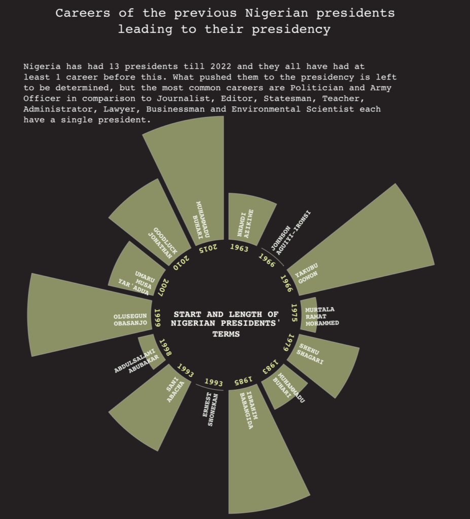
Lengths of Nigerian Presidency terms. Visualisation by Quinsy Brenda.
- D3.js provides unparalleled flexibility in creating custom, interactive and highly expressive data visualisations. With D3.js, the limit is your mind, and then some. It is my go-to whenever I’m going for complex and unique charts.
- Working with D3.js requires a strong understanding of web development concepts, DOM manipulation and styling.
- D3.js lets us create engaging charts with intricate animations, transitions and user interactions. This level of interactivity can greatly improve the user experience and facilitate understanding and exploration of data.
When it comes to code versus no-code in data visualisation, it is up to the developer which is more important: ease of use and convenience, or control, flexibility and customisation. Out of the coding options, Matplotlib stands pretty much front-and-centre for customising plots, while D3.js gives the greatest amount of customisations and interactivity, with the only downside being the need to get familiar with JavaScript.
Selecting the appropriate visualisation tools: 3 typical scenarios for data scientists
1. Exploratory data analysis and quick prototyping
When it comes to exploratory data analysis and quick prototyping, Python libraries like Matplotlib and Seaborn shine as they offer a wide range of visualisation options. They also provide the flexibility and customisation needed for initial data exploration.
Matplotlib allows for the creation of static and interactive visualisations, making it suitable for exploring relationships, trends and distributions in datasets.
Seaborn, meanwhile, specialises in statistical visualisations, making it ideal for tasks such as uncovering correlations, analysing distributions, and conducting multivariate analysis.
In scenarios where data scientists need to rapidly iterate and prototype visualisations to gain initial insights, Matplotlib and Seaborn offer the necessary tools and flexibility to quickly explore and visualise data.
2. Interactive dashboards and storytelling visuals
When the goal is to create interactive dashboards or storytelling visuals that engage stakeholders and facilitate data-driven decision-making, tools like Tableau and Power BI come to the forefront because they offer a user-friendly interface, powerful data connection capabilities, and interactive features that enhance the data storytelling experience.
In scenarios where data scientists need to create interactive dashboards or storytelling visuals that engage stakeholders and provide a user-friendly experience, Tableau and Power BI offer powerful tools to achieve these goals.
3. Web-based and custom visualisations
For scenarios that require web-based and highly customised visualisations, tools like Plotly and D3.js emerge as the top choices. These tools provide data scientists with the flexibility to create interactive and dynamic visualisations tailored to specific needs.
Plotly’s integration with Jupyter Notebooks and its support for web-based deployment make it a suitable choice for data scientists who want to create interactive visuals that can be easily shared and embedded in web applications.
D3.js’s flexibility and extensive capabilities make it the go-to choice for those who require complete control over their visualisations and want to push the boundaries of what is possible.
In scenarios where data scientists need to create web-based and highly customised data visualisations, Plotly and D3.js offer the necessary tools to create visually stunning and interactive visuals.
Challenges when visualising large datasets
Scalability vs performance
A primary challenge in visualising data is striking a balance between scalability and performance. As the dataset grows, rendering visualisations becomes more taxing, and that’s where most no-code options fail. Power BI and Tableau, for example, try their best to accommodate large datasets where other options refuse large data volumes.
With a no-code visualisation tool like Datawrapper, scalability and performance can be influenced by the size and complexity of the data being analysed. Here are some considerations:
- Datawrapper has limitations on the amount of data that can be effectively analysed and visualised. Handling very large datasets with millions of data points poses challenges in terms of performance and responsiveness.
- Datawrapper experiences performance constraints when dealing with complex calculations or real-time data analysis. Processing large amounts of data or performing intricate calculations will impact the tool’s performance.
- If you need to perform complex data manipulations or aggregations before visualisation, you may encounter limitations in terms of scale and performance.
Importantly, it remains the job of the data scientist to find ways to create data visualisations that can handle the increasing volume of data without sacrificing performance. This challenge involves optimising the data processing pipelines, sampling the data, or leveraging parallel computing to maintain visual responsiveness.
Interactivity vs data complexity and clutter
Another challenge arises when balancing interactivity with the complexity and clutter of large datasets. Interactivity is essential for exploration and understanding data, allowing the user to drill into, filter and interact with the data. However, the more complex the visualisation gets, the more cluttered it becomes, making it difficult to spot patterns.
Interactivity offers a promising solution to engage users and enhance their understanding of the data as it is being presented. Interactive features empower users to explore different dimensions, filter specific variables, and customise their visual experience. This level of engagement allows users to interact with the data on a personal level, leading to deeper comprehension and more informed decision-making.
But interactivity also introduces its own set of challenges. As more interactive elements are added, there is a risk of overwhelming the user with options and controls. Excessive interactivity can lead to confusion, distraction, and ultimately a loss of focus on the core message of the visualisation. Striking the right balance between interactivity and simplicity is an art that data visualisation professionals must master.

Notice in these charts how a proper axis, fewer colours and a key remove clutter and complexity. Image by permission of Simon Rowe in Storytelling with Data.
When dealing with intricate datasets, there is an inherent temptation to include as much information as possible, resulting in cluttered and overwhelming visualisations like what we get on the left above. While these graphs may contain a treasure trove of data, their sheer complexity can hinder the viewer’s ability to extract meaningful insights.
By prioritising simplicity, clarity, and user experience, we can create visualisations that effectively communicate complex data without overwhelming the viewer. We must be mindful when creating interactive visualisations so as to properly juggle exploratory capabilities while ensuring clarity and ease of interpretation.
Working with large datasets – 5 benefits of data visualisation tools
I find data visualisation is important to data scientists working with large datasets because:
- Data visualisation tools provide a visual representation of large datasets, enabling them to gain a deeper understanding of the underlying patterns, trends, and relationships.
- We can use data visualisations to distil complex information into intuitive visuals that are easier to understand and interpret. By leveraging data visualisation tools, data scientists can present findings, tell compelling stories, and engage stakeholders, ultimately driving better decision-making based on the insights derived from big data.
- By visualising data, outliers can be easily identified, correlations can be visualised, and patterns can be observed at a glance. These visual cues enable data scientists to uncover valuable insights and make data-driven recommendations.
- These tools provide an interactive environment for exploratory data analysis, allowing data scientists to interact with visualisations, filter data, and drill down into specific subsets of the dataset. This capability empowers data scientists to perform ad-hoc analyses, test hypotheses, and explore different perspectives on the data, leading to a deeper understanding of the underlying patterns and relationships within large datasets.
- Speed and efficiency in decision-making can be crucial in fast-paced business environments.
Building a diverse data toolkit and keeping an open mind
Each data visualisation tool has its strengths and weaknesses. You might even find more strengths or more weaknesses specific to you. In this way, having a diverse portfolio of tools allows for greater flexibility and adaptability to different scenarios. A diverse data toolkit empowers us to tackle complex challenges, effectively communicate insights, and derive meaningful insights from data. It also opens doors to new opportunities and expands the possibilities for more innovative and creative visualisations.
I encourage you to embrace curiosity, push boundaries, step out of familiar tools, and experiment with new approaches. In the rapidly evolving field of data visualisation, the only constant is change. Embrace the ever-expanding array of tools and techniques available, continuously learn and adapt, and stay curious. With an open mind and an adventurous spirit, data scientists can navigate the exciting world of data visualisation and unlock the true potential of their data. Happy exploring!
Thanks to Quinsy for sharing lessons she’s learned from exploring the tools listed in this article. Creating data visualisation that brings meaningful impact at scale extends beyond choosing the right tools. It also demands the expertise of a team with diverse backgrounds in strategy, design and development. If you’re interested in how we could help your organisation do more with your data, connect with us to learn more.
About Quinsy Brenda

Quinsy Brenda is a data scientist and web developer from Cameroon, currently based in Spain. She’s passionate about data engineering, visualisation and analysis, as they offer diverse perspectives to explore complex datasets.