Sport England - Participation by the numbers

Challenge
-
Sport England are a nationwide organisation dedicated to increasing the number of people participating in sporting activities and raising the profile of sports in the country.
Sport England initially provided infogr8 with six years’ worth of data on sports participation, broken down into various categories and demographic groups. Our challenge was then to choose the parts of the dataset that could be visualised most effectively.
Solution
-
We produced an interactive data visualisation sitting on a dedicated microsite.
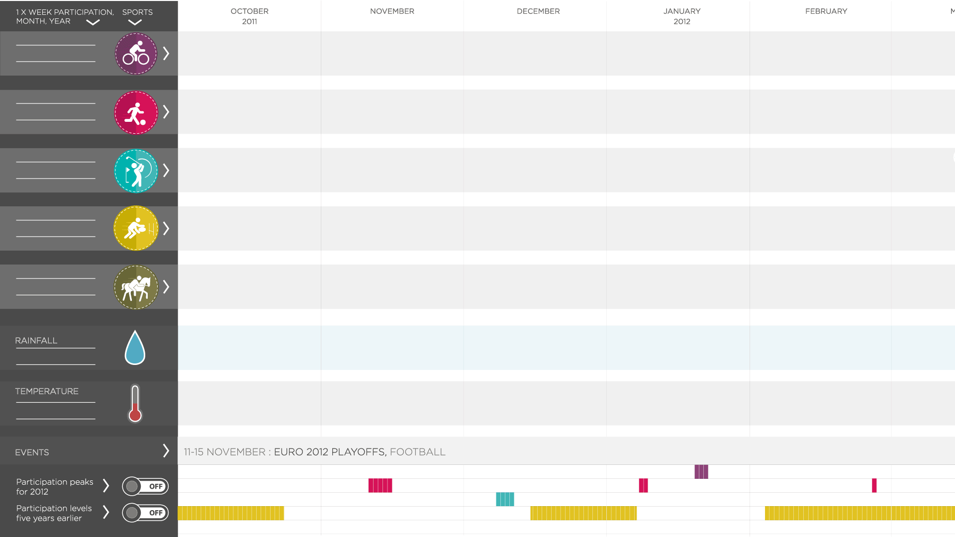
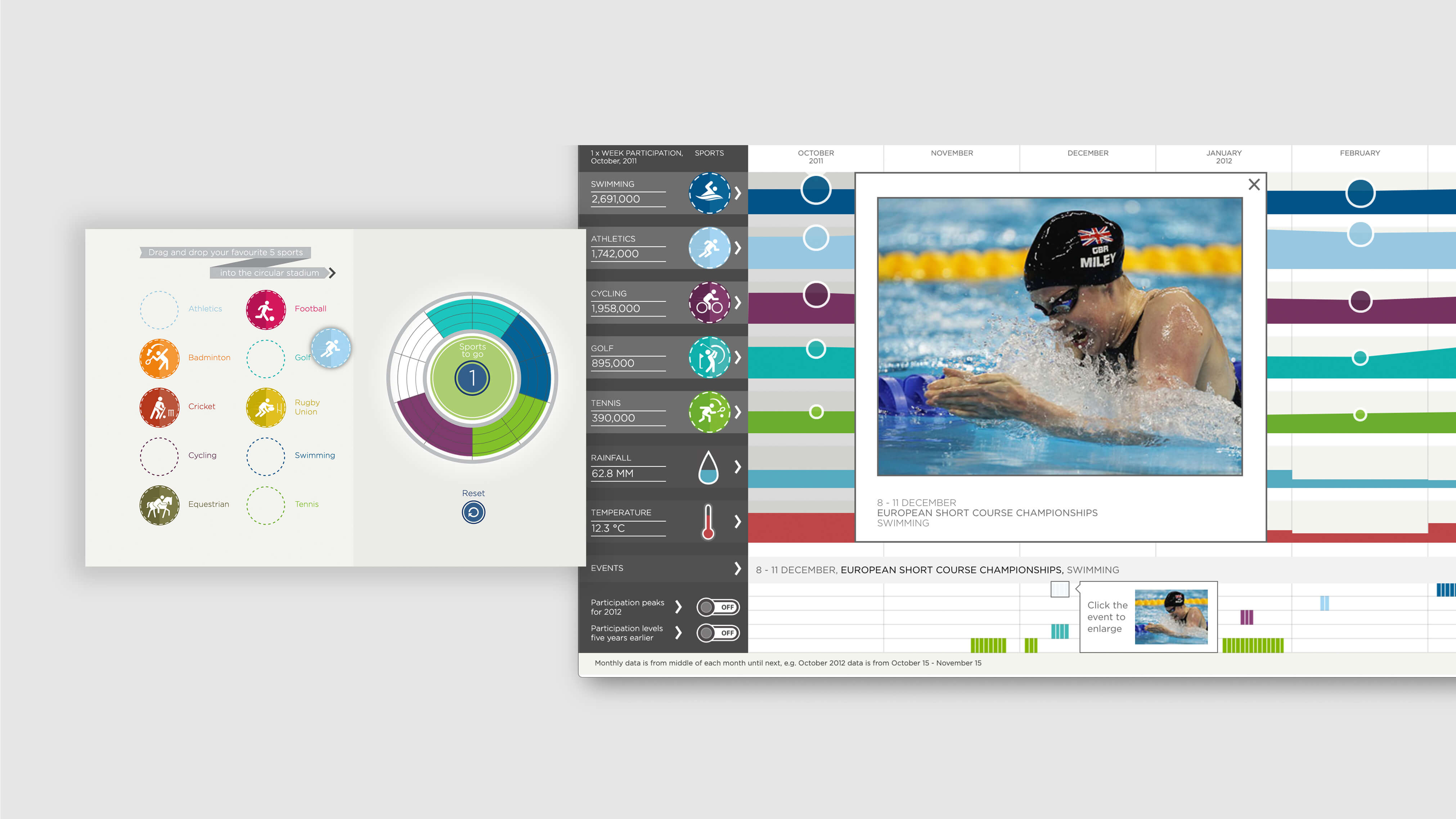
The welcome screen asks the user to select their five favourite sports by dragging them into the circle. Then the user is taken through to a screen visualising data on how many people, of all ages, participate in sports at least once a week, broken down by the five chosen sports. The data is for 2011/12, the latest year for which data was available.
The data is organised by month and scrolling right reveals the data for the whole year. Toggles allow you to highlight the months of peak participation – badminton in January, football in March, swimming in sunny August – and compare the participation figures with five years earlier.
The interactive also looks at how external events might influence sports participation. We include data on temperature and rainfall from the Met Office for 2011/12 to highlight the seasonal patterns in sport participation further. And we display the dates of professional events in each sport’s annual calendar.
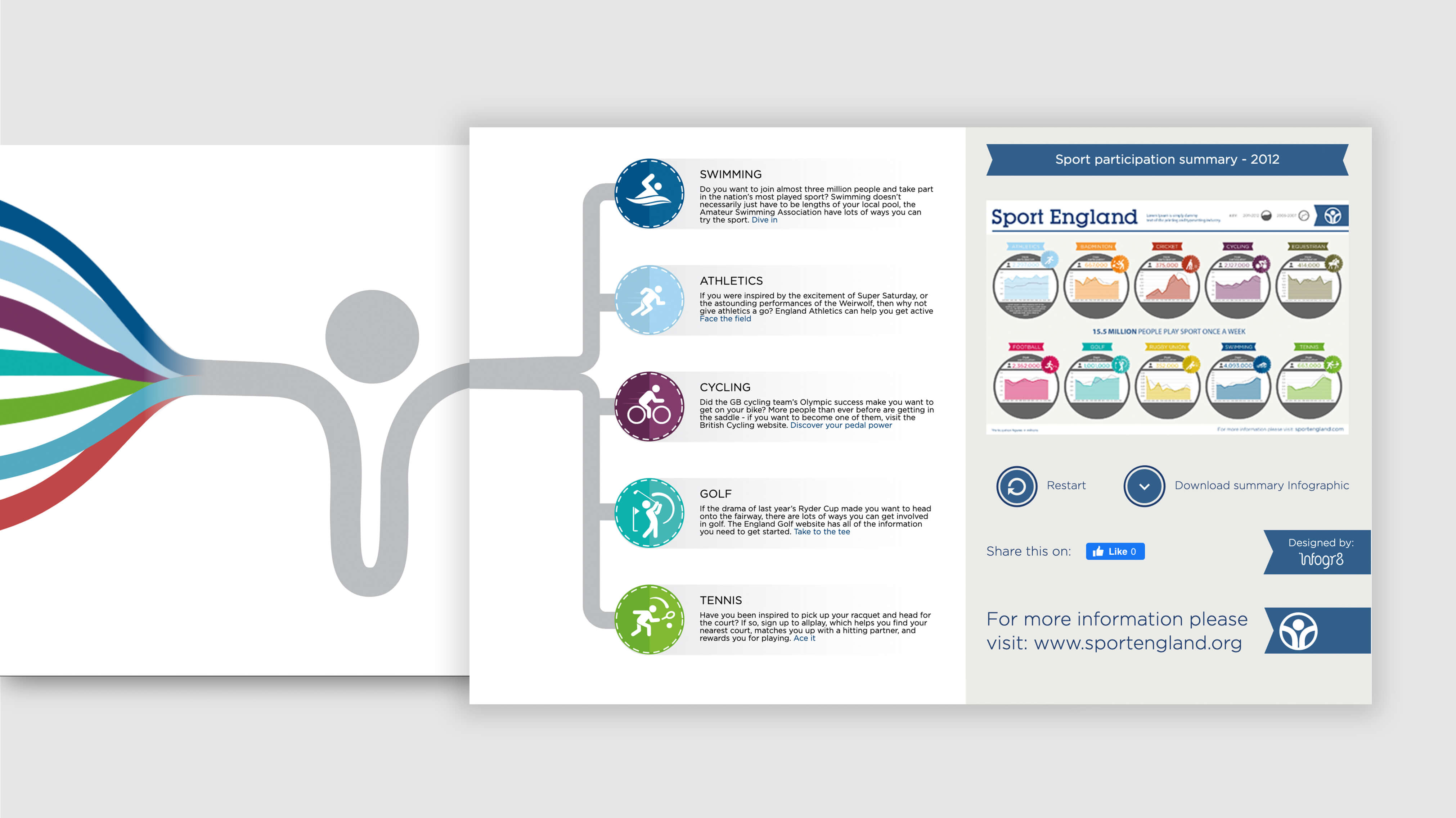
After scrolling through the full year, the user comes to the outro section, where they’re able to read more about getting involved in each of the five sports they selected. Also in the outro is a static, print-friendly infographic showing quick summaries of the changes in participation levels for each sport over each year, and some basic analysis of the reasons for these changes.