Infographic Partner
Money Advice Service
Challenge
-
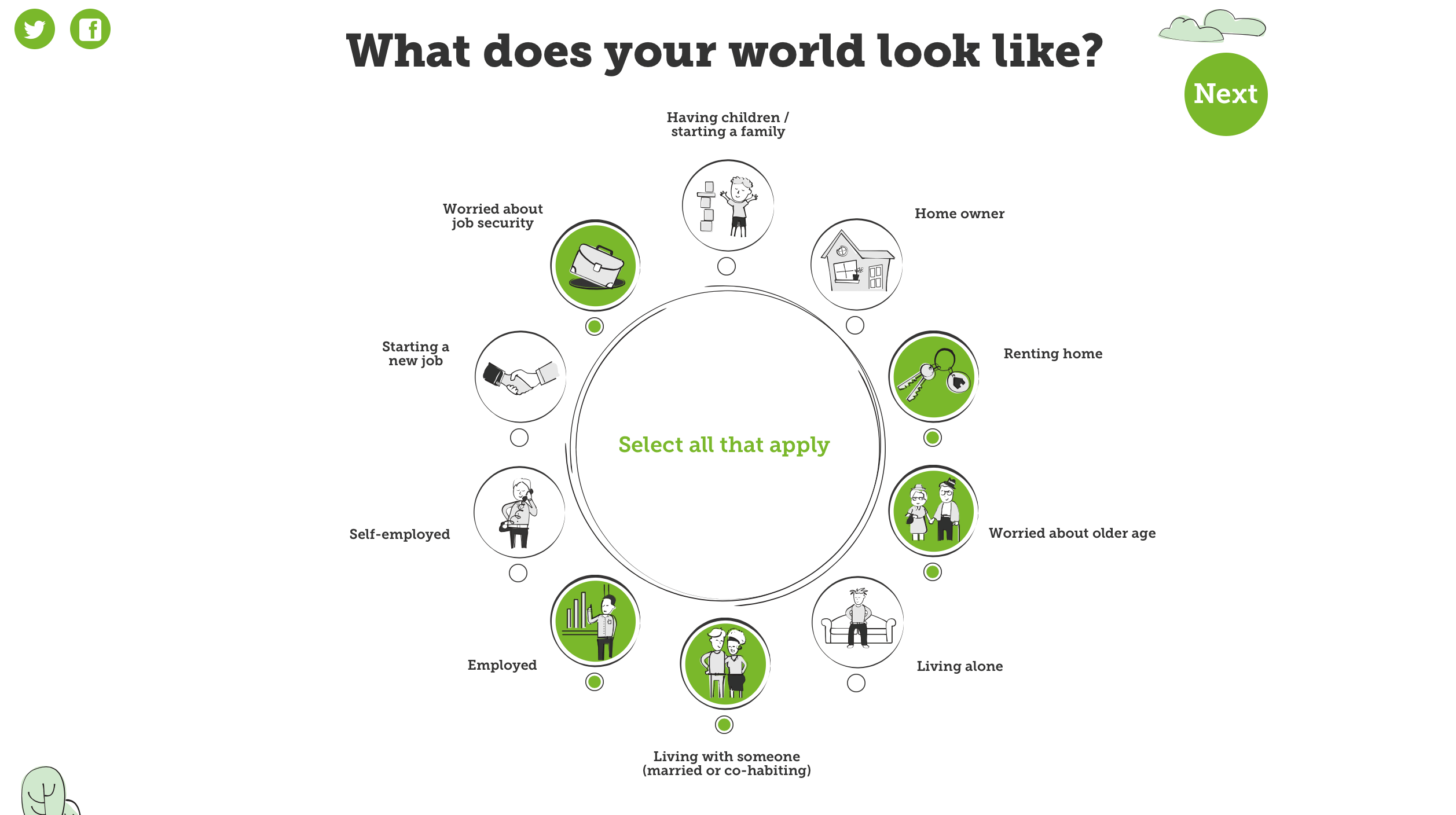
Insurance is a fact of life, but we all need different kinds of policy. Money Advice Service wanted to allow people to see, at a glance, which insurance packages best suit their personal circumstances – whether they’re renters or homeowners, starting a new job or starting a family, for example. It soon became clear to us that there were too many options and variables for a static web-based design.
We needed to take a different approach.
Solution
-
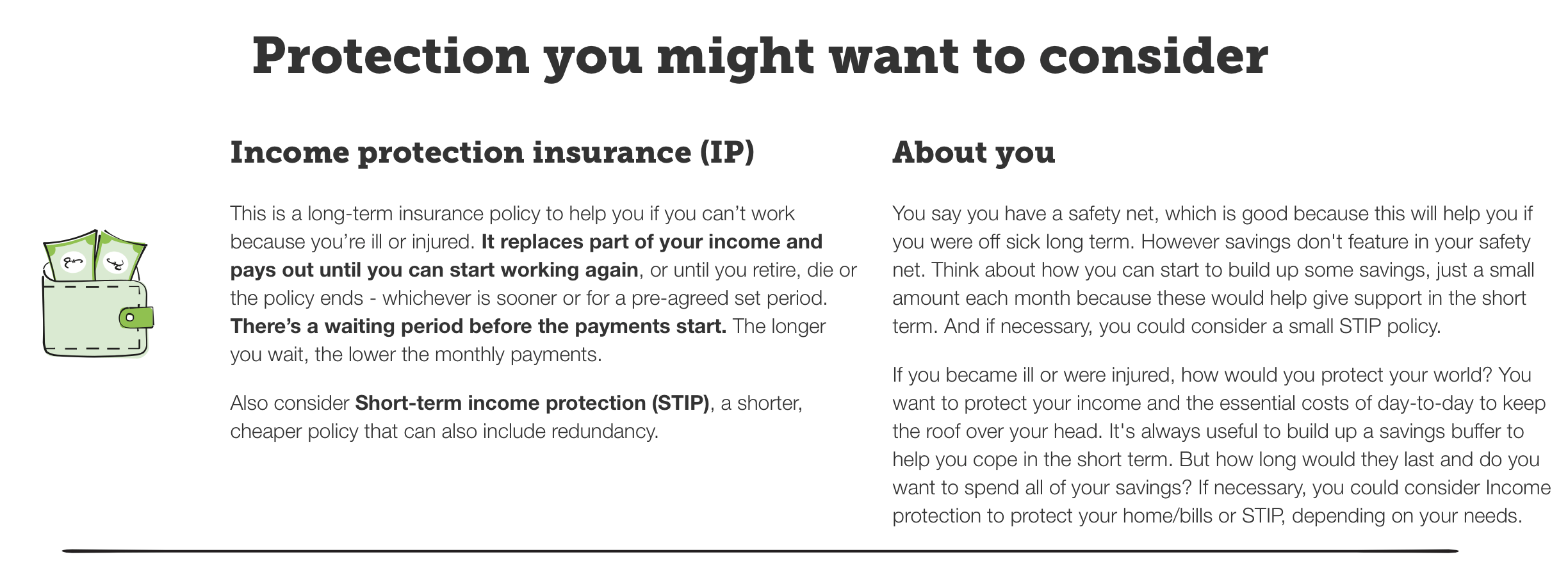
Our team developed an interactive, illustrated microsite: each user selects from a number of options that best describe their own situation and is guided through a series of circular diagrams. They are then offered advice on the policies that best suit their own life circumstances.
We’ve been working exclusively with the Money Advice Service since they first starting producing infographics. In fact, we developed their infographic brand guidelines. This has helped us understand the best way of visualising information for them without overloading the audience with a labyrinth of windows, toggles and drop down menus. We’ve used their house style of illustration and introduced features like social share buttons to help support social, search and PR objectives.
Results
According to the Content Marketing Institute, educating an audience is the number one reason why brands create interactive content.
This highlights how effective it can be as a format for finance companies, whose remit is often more about communicating information rather than entertaining or inspiring. We’ve found that interactive visual content and tools can deliver impressive results in terms of engagement; by its nature, the format draws the user into a branded online space in a personal way. For finance brands, this is an invaluable opportunity to positively connect and offer value to the customer, as well as an effective way to improve sentiment.


